Using his brain and a piece of chalk, Albert Einstein was able to clearly communicate complex ideas that would change our views on space, time, mass, and energy. He believed,
"If you can't explain it simply, you don't understand it well enough."
Today, simple clear communication is still the key to success, despite the advances in presentation technology. There are more than 500 million people worldwide who communicate their ideas using presentation software programs, such as PowerPoint, Keynote, Prezi, and many others--and with good reason. Research shows that using simple well-designed slides with a clear message deliver the following benefits:
--Increase the likelihood of persuading an audience by 43% (3M and University of Minnesota)
--Enhance the speaker's credibility (Stanford University)
--Improve audiences' learning by 200% (University of Wisconsin)
--Increase audiences' retention of content by 38% (Harvard University)
To ensure your next slide presentation benefits you and your audience, consider following these guidelines:
1. Face the audience, not the screen. As the presenter, YOU are the most important visual aid. It's fine to give a brief two or three second glance at your slides from time to time; otherwise, strive to keep your head facing forward with your eyes on the audience.
2. Ensure readability. Be sure every word on every slide is readable from the back of the room. This usually requires using a 30 point font. The larger font enables your audience to visibly see and read the slide. It also requires you to select only the most important points and explain them clearly and simply.
3. Apply the 6x6 Rule. Limit the text on each slide to six bullet points or less, with no more than six words per line.
4. Use single words or short phrases not full sentences. Sentences take up too much space, require a smaller font, and clutter the message.
In the below photos, notice how the presenter on the right optimizes the first four guidelines, and the presenter on the left does not. Which looks more engaging to you?
5. Use a sans serif font
. This is a
category of typefaces that does not use serifs, which are small lines or curls at the ends of characters. Use easy-to-read sans serif fonts such as Arial,
Calibri, or
Verdana
. Avoid serif or cursive fonts such as
Times
,
Baskerville
, Garamond
, and
Apple Chancery
.
Use the same font throughout the slides to ensure a consistent look.
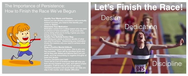
6. Use high quality photos.
Notice the two slides below. They both contain the same message. Stay away from the style on the left; avoid using
clipart in professional business presentations. Instead, find
compelling relevant images to express your message. Keep the text and bullet points to a minimum.
7. Contrast the background color with text color.
For example, use a white background with navy or black text. This ensures that the text is clear and readable. In the above left example, notice how the white text on the light grey background is difficult to see.
8. Simplify graphics.
In the two photos below, both speakers are presenting the basic steps of a process improvement program known as Six Sigma. Avoid busy complex diagrams like the one on the left. Instead, strive for a clear, simple, and easy-to-understand graphic like the one on the right.
9.
Plan the correct number of slides.
The number of slides you use depends on the amount of time you have to speak.
The average time a presenter spends speaking about a slide is two minutes; therefore, let's say you have one hour to present. Deduct the time you want to spend for Q&A and audience discussion--for example, 15 minutes. Deduct another five minutes in case there's a late start. This leaves 40 minutes for your actual speaking time. Forty minutes divided by two minutes per slide equals 20 slides. If you limit the number of slides to 20, you will likely cover all your points in a deliberate unrushed fashion with plenty of time left for audience discussion and Q&A.
10.
Apply the 10-20-30 Rule for executive level presentations.
Use no more than 10 slides; speak no more than 20 minutes; and use a 30-point font. This guideline especially holds true when you are presenting to chief officers and results-driven decision makers who are usually short on time, have limited attention spans, and want the crux of the message right away.
The key to remember is this: You are the message. Slides do not persuade, inspire, or connect with an audience--only people do. Slides can support you, but they can never replace you. As Einstein advised, prove to your audience you thoroughly understand your message by explaining it simply and clearly--and that begins with using effective well-designed slides.
To learn more about designing effective slides and delivering a powerful persuasive presentation, please read my book Well Said! Presentations and Conversations That Get Results (available in Hardcover, Kindle, and Audio).
http://www.amazon.com/Well-Said-Presentations-Conversations-Results/dp/0814417876
Feel free to contact me directly to schedule an in-house corporate training event for your team. I would be honored to support your speaking success.