| Quick
Links |
|
Coming
December 15th
-
Twelve
Questions - Nicholas Simmons
-
FREE! Duckling drawing tutorial
-
FREE! art gift tags
-
Monthly Collector
-
Strategic planning for artists
-
Artists'
Resale Right
-
Ask
me!
|
| Join
My List |
 |
|
|
 Greetings! Greetings!
November already! Halloween
is behind us. Remembrance Day just gone and now for my friends
south of the border, Thanksgiving is on the horizon.
I've had my hands full since we last
spoke. I've been working on my gyotaku series, creating new pieces
and starting the framing process. My studio is a mishmash of all
kinds of paper, paint, frames and general chaos. I tell myself
that I will sort it out over the Christmas break when I have a
little more time on my hands. Keep your fingers
crossed!
Thank you for the wonderful emails
and comments on the October newsletter. I so appreciate you taking
the time to tell me what you like about it. And wasn't Jonathan
Aller's work amazing?
I have a bevy of equally amazing
artists lined up over the next few months to share their work and
their thoughts with you. I can't wait to see what they will
offer. Casey Klahn, The Colorist, was kind enough to answer my Twelve Questions this month. Casey is a generous artist
and holds a wealth of knowledge, I am delighted that he will share
some of that with us.
Enjoy the newsletter, enjoy the
season, continue to send me your
comments and questions. I love hearing from you!
Best wishes
Jeanette Jobson
|
Framing
your Art
|
|
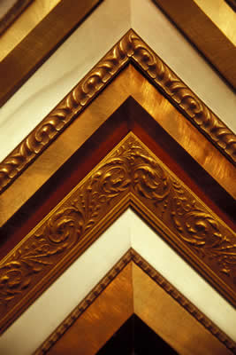 Tips
for collectors Tips
for collectors
When collectors purchase art
directly from the artist, it rarely is matted or framed. This is
done for several reasons.
One is that many people prefer to
make their own choices in colours of mats and styles of frames.
You may want something to fit in with your decor which could be
contemporary or traditional and a piece framed to someone else's
taste may not be what you want.
The other reason for selling art
unframed and without a mat is shipping concerns. Framed art
becomes very heavy, especially if glass is used and shipping
becomes a nightmare as well as being very expensive to ensure that
the piece arrives intact at the buyer's residence.
So now you have your piece of
original art. What should you consider when framing and matting
it?
You can use standard size frames if
your piece fits into one. If you are using a mat (and most pieces
of art do look better when bordered by a mat) make sure your
picture extends about 1/4 of an inch beyond the frame of the mat.
This allows the picture to lay flat and not fall out of the
mat.
The mat and frame should enhance
the artwork, not overwhelm it. Choose muted colours that don't
clash or become the focal point, drawing the eye away from the art
itself.
The art itself often steers the
direction of the mat and frame. Perhaps a strong accent colour in
the painting can be picked up in a mat layer or core
colour.
Traditionally most oil or acrylic
paintings do not use mats or are housed behind glass. They are
often varnished which acts as the protection for the surface unlike
paper based paintings such as watercolour or graphite which need to
be protected from the environment.
 |
| White pelican - J Jobson
watercolour |
Do you want to get an idea of how a
piece will look with a particular mat colour or frame type before
you head to the framer? You can do so online through a number of
different options. Here I have used Matshop's MatoMatic
program. Just
upload a photo of your image and then play around with mat colours
and frame types until you find something you like.
This pelican is a crop of a
watercolour that I did earlier this year. I added a double mat and
frame from the online options I chose colours that reflect or
complement the colours in the painting, not compete with
it.
Glass, acrylic or museum
glass?
One of the purposes of the mat is to keep the artwork from
touching from the glass. If you are framing an extremely large
piece you may want to choose acrylic because it weighs much less
than glass and will be safer.
Acrylic should not be used on chalk,
pastel, charcoal or any other powdery surface, as static
electricity may disturb the surface of the piece.
Conservation clear glass gives sharp
clarity to the art but can also have a glare in the some lighting
conditions. Conservation
non-glare will not have the glare but will blur out at certain
angles. Non-glare does not work well that have a sheen to them such
as glossy photographs.
Museum glass is expensive but has such good visibility it seems
almost invisible at times. Your budget and what you want the
finished piece to achieve will influence your decision about how to
glaze your art. Very often the most common form of glazing is
glass due to pricing appeal.
Framing
Choose the right frame for your
piece of art. A thin steel frame on a luscious European oil
painting just won't look right. Choose a frame that complements
the art and doesn't overwhelm it. The art is the focal point,
always remember that.
Don't have your mat and frame the
same width. You want one to set off the other and complement your
art. Tradionally, the mat, if using one, is wider than the
frame.
Choose a reputable framing shop and
shop around to find one that you are comfortable with. A good
framer is there to advise and guide you in choosing the best way to
enhance and protect your piece of art.
Wiring your
frame
Avoid using the sawtooth hangers
that come with many frames, they are rarely strong enough to hold a
piece on the wall and you don't want your newly framed art to fall
and risk breaking the glass, the frame or damaging the art
itself.
Use D hooks, or eye hooks and wire
to hang your art piece.
Place the hooks 1/3 of the way down
from the top of the frame, making sure they are an even distance
from the edge of the frame.
Loop the wire through the D hook
twice, then wind the excess along the main wire like a
noose
If you purchase your frame from a
frame shop, wiring will already be on the piece in most
cases.
Where to hang
it?
All pieces of art should be hung
away from direct sunlight and sources of heat or smoke, such as a
fireplace to avoid potential for fading or discolouration. The
majority of pigments available to artists have various levels of
lightfastness, which means that they are resistant to fading under
normal circumstances. For those looking for more technical
information on pigment lightfastness have a look at this article in
Handprint.
Don't hang your piece too high.
Commonly, eye level hanging is recommended, but what is eye level
for one person may not be for another, so judge where to hang the
piece by the activity and furniture in that room. A large piece of
furniture such as a sofa or side table can have art hanging
starting 8 - 10 inches above it.
If its a hallway, most people will
be standing while passing by, so the average 'eye level' would work
there - 65" to 68" above the floor level. In a living room where
people are seated most of the time, art can be hung at a lower
level and tie in around a larger piece of furniture either singly
or in a group.
Here are some more tips on hanging
art from The Art of Hanging Art by Michele Symonds.
|
 Twelve Questions Twelve Questions
|
|
This
month I'm so happy that Casey Klahn - The Colorist - has agreed to
answer my Twelve Questions. I have followed Casey's blog and
admired his strong pastel images for quite awhile.
I'd encourage you to explore
his art and rabsorb the information that he so readily shares. You
won't be disappointed.
Casey Klahn is a husband,
father and artist living in Washington state. His art is influenced
by the art of post impressionists and abstract expressionists.
Casey likes to leverage the strong suits of his medium, which is
pastel. He is a member of the Pastel Society of America.
1. When did you
realize you wanted to make art a career and how did you pursue that
decision?
I was always considered "the
artist" at home and in grade school. Drawing was something I did
for hours on end as a kid. Luckily, my dad was a janitor at a paper
factory. Not only did he bring home whole reams of surplus paper,
but pencils that the engineers threw away.
My wife encouraged me to pursue the
career in my mid or late forties. Actually, I had taken a night
class in Seattle with the long name, "Start your art career now,"
or something like that. It opened my eyes to the fact that I could
be in fine art, not just illustration or commercial art. That was
what I really felt right about.
2. Which artists have
influenced your work and how?
I know the first fine artist I
admired was Vincent van Gogh. Everything he does is electrified -
exciting. All elements are in motion.
I did read a lot of comic books and
draw from them, so all of those illustrators count in my
upbringing. My current lights are Wolf Kahn, Edgar Degas, Henri
Matisse, Willem deKooning and recently I've had a thing for
Modigliani's art. Also I recently have been looking at Andrew
Wyeth. They are figurative guys - even Kahn does
nature.
3. What subject matter
inspires you most and why?
Trees and liquid, but mostly
moisture in the air, not neccesarily bodies of water. Many people
incorrectly describe my paintings as being about light. The
Impressionists painted light, and we ought to be well past that
now. I didn't have any light growing up on the Washington coast,
and so I am lucky to have a "pass" on that element. I paint gloom,
and if anything, diffused light. I work hard to avoid shadows,
except to use them as value sumps. Those are Modernist ideas. Once
you undertsand the Northwest School painters, like Morris Graves
and Mark Tobey, you begin to see the effects that the coastal
environment has on an artist. Think of "Twilight," except for
real.
4. Every artist has his or
her favourite brands of pastels, papers or paints. What are your
every day favourites that you reach for over and
over?
I'm doing my pastel work on Sennelier La Carte paper and on Rives
BFK Heavyweight paper. In every session that I paint, I reach for
Diane Townsend's terrages, and my own homemade sticks. It isn't
often that I fail to use Sennelier le a'clu sticks. My palette has
a lot of Schminke and Unison, too.
5. You received the First
Place Award in the Drawing category, at the Sausalito Art Festival
for the last two years in a row. How important do you believe
drawing ability is to the process of creating
art?
The masters were great daughtsmen,
Matisse and Degas for instance. Two years ago I changed from
marking in my initial lines with a hard pastel, to drawing a
charcoal design first. All of a sudden, I was rooted back in
drawing. I had always done a thumbnail sketch in graphite, but
getting the drawing on the board has now become a big thing for
me.
People ask me about my
simplification - how do I spare the details and get the big masses
and elements? It baffles me, really. Its just the way I draw - the
way I approach the landscape. I don't think consciously about
eliminating details. I guess in making a good image, you have to
generalize first and foremost, and assess the details very
closely.
7. Art marketing and the
business side of art are necessary to promote art work. What do
you consider important areas to concentrate on in the business of
marketing and selling your art?
 The Colorist
Daily The Colorist
Daily
8. What other interests
do you have besides creating art?
I am the stay-at-home daddy. The
Mister Mom. Other than church and kids' activities, I try to stay
healthy by hunting game like deer and turkey. We live way out in
the country - wheat land and forested canyonland. Of course, the
farm needs maintenance, which is like a hobby in
itself.
We don't farm, though. Our thirty
acres are retired, and so its just a matter of
maintenance.
9. When inspiration hits
the wall, as it does for most artists at various times, what
motivates you to keep going?
I look at my recent works that I
consider good. I can't copy them, then things get stale real quick.
But, I use them as inspiration. I seem to be okay in the
inspiration department - for me the trouble comes with not enough
time in the studio, or else I might be tired, or my work just isn't
any good and I need to get in the groove. I am capable of making
really bad art sometimes, and then I make sveral of those in a row.
I don't let that worry me, though. I know I am the same guy who
made those ones I love, except I can't remember how I did them. I
just keep plugging away until they get better.
10. Your series of essays in your
How to Paint for the Prize series of posts are very informative and
useful for artists aiming for success in competition and
exhibition. Why did you decide to create these
essays?
I was gob-smacked to get the award
the first year, and then I realized that I had actually set out to
do that. I didn't have hubris, though. I didn't really expect it,
but I knew I needed to do my best - try my hardest. I thought that
was a good story, and felt that others could use it for motivation
and maybe get some tricks to use, too. It was a lot of fun to
write, and I think the series on artist's traits was essential to
my studio life that year.
Then, this year, I just felt
pressure to paint at that level. I thought that I would either
crump, or do better, and considered it a clutch play. I don't mean
that I wanted the award again - I just wanted to feel that I had
done well. I thought that if I got the award again I'd probably
cry. I didn't, but I almost did.
11. What is the most
valuable piece of advice you have been given that has influenced
your art career?
I'm still looking for
that.
12. What advice would you
give to an artist just starting out in their
career?
Draw a lot. Keep up your drawing,
it is the first link in being your best.
Show your work. It is imperative to
exhibit whatever you are doing, and so this should drive you to
improve and also to make your best presentation of your work. But,
be self-critical. Show the best few things you've got, but that
comes later in one's career. At first, just get it out
there.
|
| Monthly
Collector |
|
Special
offers only for subscribers 
On the
edge of autumn
Winter Solstice officially begins in
the northern hemisphere on December 21st, the shortest day of the
year, but until then, I'm firmly hanging on to autumn.
This watercolour is of a maple leaf
from one of the trees in my garden. Shorter days changed its
colours to oranges and reds but it defiantly hung on with a little
green. It mimics how I feel about going into winter. I don't want
to!
This original watercolour will keep
a bit of fall with you during the coming months. The sheet
measures 5.5 x 8.5" and the image is approximately 4.5 x
4.5"
$35.00 +
$3.00 shipping
$10 off the regular price
|
Tutorials - Part II
|
|
The
art of simplicity
If there is any way that a person
can misunderstand something that is written, they will. That is
the principle that I learned early on in writing the text that goes
along with my drawings for tutorials. And that fact has nothing to
do with the intellectual level of the reader or the artist. It has
everything to do with the ability of the artist to put into words
what they have created without the benefit of the reader actually
seeing the process being done live.
This information is based on
tutorials for beginning artists. The principle of clarity remains
the same for intermediate and advanced levels.

Let's try it. Draw a circle and
fill it in with graphite. Now explain exactly what you did. " I
drew a circle and shaded it." That's perfect if you're talking to
another artist who knows the techniques already, but its a foreign
language to someone who doesn't know where to start.
These are some the questions that
need to be explained in a tutorial: How did you draw the circle?
Was your arm resting on the paper or not? What type of pencil did
you use? How much pressure was used in applying the pencil to the
paper? What kind of paper was used? What technique did you use to
cover the circle with graphite? Did you blend it?
How?
See what I mean? What the average
artist does without even thinking, becomes challenging to put into
words at times. A whole new language of simplicity needs to be
considered when explaining art techniques when the viewer cannot
see the actual process being done. Yes there is an option of video
to share information and that will be looked at in a future
article. But the most common form of tutorial is the written one,
using images to further explain and clarify what is being
written.
Clarity
of form
When writing a tutorial, using the
same terminology throughout helps avoid confusion for the user.
Explanation of art terms, techniques or equipment can be placed in
boxes to highlight them.
Formatting tutorials is fairly
straightforward and can be completed in most word processing
programs. There are some points to remember when creating your
tutorial that will help make it look professional and be a useful
tool for your audience.
1. Image size
Use high resolution images that should be scanned at a minimum of
400dpi or photographed at high resolution. Yes, the files will be
large, but can be adjusted in the document. You are relying on
the images to convey information and they need to be crystal
clear. Blurred images or images too small to be seen well are not
useful to readers.
The image should be take up at least
1/4 of the page so that it can be seen clearly. If you are showing
a technique, readers need to be able to see that level of
detail.
Scans are best for the progress
shots as the white of the paper stays true. In photographing
images, backgrounds tend to become blue or grey and compete with
the greyscale of the image itself. It can be adjusted with photo
editing software, but is rarely completely successful and few
artists have the technical knowledge to do this well.
2. Tutorial
size
The average file size for a
tutorial is usually no larger than 2MB, smaller if possible, so
that it is not rejected by servers and a manageable size for users
with slower computer systems or who may still be on dial
up.
3. Converting to PDF
file
To condense file size and make the
tutorial easily accessible to everyone, converting the document to
a PDF file is common practice. It also protects the tutorial from
any changes that could made if it were in a basic word processing
document.
Adobe is the
most well known name for converting files to PDF and you can
download a free trial to try it. There
are also many other other free or shareware programs that can be
easily used to create generic pdf files. They may not have all the
features that a program such as Adobe has, but they'll get the job
done for you.
Tip: The
more you resave a pdf file, the smaller it will become. Also
review the options that you have for saving the file. You can have
larger images or compress them; make the document available for
reading online only or for printing. Check out the options before
deciding on your final piece.
Next month - A free
download of The
Duckling tutorial in the December newsletter just for
subscribers!
|
| And
the winner is..... |
|
 Last month I
offered a free print of 'Middle Cove Fog'
to be drawn for on October 31st from the list of new subscribers to
my mailing list. Last month I
offered a free print of 'Middle Cove Fog'
to be drawn for on October 31st from the list of new subscribers to
my mailing list.
The
winner of this print is Connie
Mullen of Digby, Nova Scotia.
Congratulations
Connie, I hope you enjoy the piece!
There
will be other giveaways in the future, so stay
tuned!
|
|
|


