In honor of the start of a new school year we thought it would be fun to learn about some of the colors that grace the paintings in the gallery and paintings of the past. The origins and histories of colors are more diverse and surprising than you could imagine!
In this collection we are exploring some of the first colors used by artists:
Ochre
,
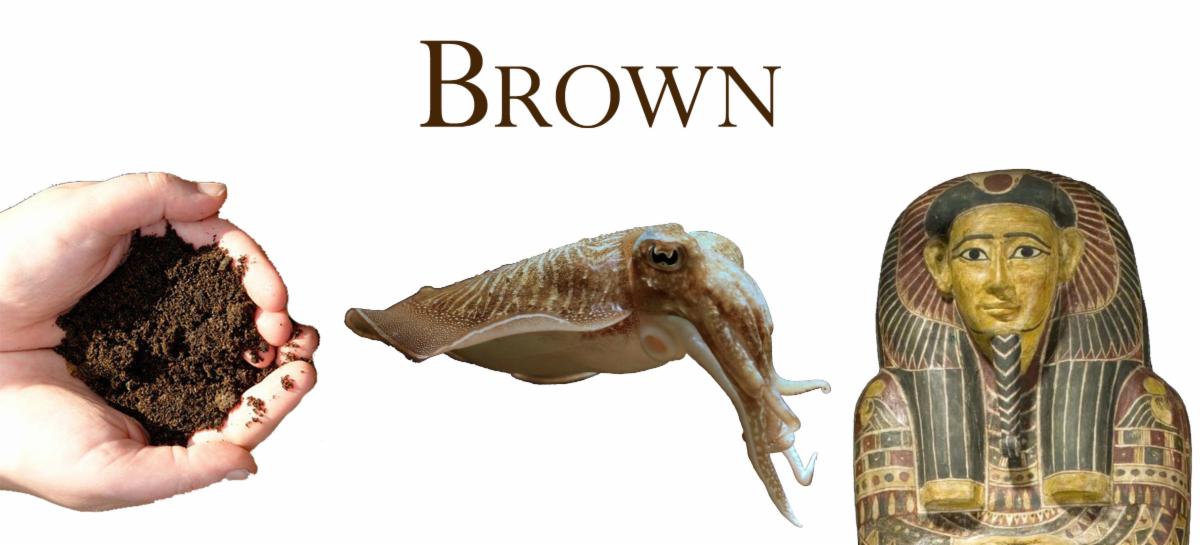
Brown
, and
White
.
But first, let's answer the question,"what
is
color?"
|
|
For this we have to travel back to 1665 where a 23-year-old Isaac Newton was sent home from school after his university closed amid the horrors of the Great Plague. That year began the expansion of human knowledge from behind his bedroom door. Newton formulated theories of the universe in terms of physical rules, he formulated theories of gravity and of the planets, and with the help of two prisms he purchased at a local fair, he gave us the colors of the rainbow. He discovered that the colors were all held within white light and that they were of varying wavelengths.
The average human eye can detect wavelengths between 0.00038 and 0.00075 millimeters. We know this section of electromagnetic waves as visible light. When our eyes see the whole range of this visible light together, they read it as “white”. When some wavelengths are missing, they see it as “colored”, and when all the wavelengths are absorbed by a substance it is seen as “black”. Colors appear because they absorb some of the wavelengths and reflect the rest. So, something we see as the color green is absorbing all the red and orange wavelengths from the white light around it and is rejecting the green – so that is what we “see”.
But, why should some substances absorb red light and some absorb blue? Think of it as a soprano singing a high C and shattering a glass because she catches its natural vibration. Something similar happens with electrons when a portion of the light happens to catch their natural vibration. It moves the electrons of the substance to another energy level and that wavelength of light, that glass-shattering “note”, is used-up and absorbed. The rest is reflected out and our brains read it as “color”. So, the atoms of a ripe red tomato are absorbing all the blue and yellow light and rejecting the red – meaning paradoxically that the “red” tomato is every color
but
red.
The wavelengths of visible light give us “colors”, but we give colors names and meanings and purpose. Painters throughout history have used color to express literal and symbolic human experiences. The colors have changed, expanded, disappeared, survived the natural elements, witnessed wars and traveled the world, all to end-up in the artist’s paint box.
|
|
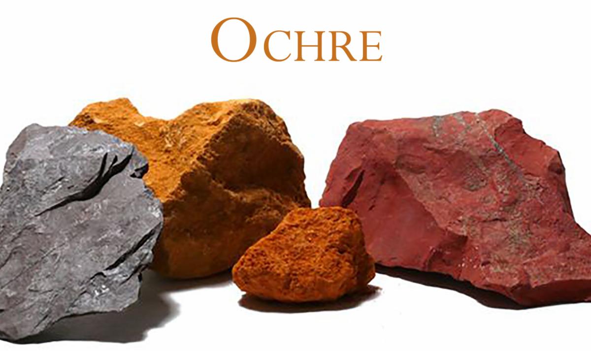
The first of those colors to be used was ochre – iron oxide. It has been used on every inhabited continent since painting began more than 40,000 years ago, and it has been around ever since, on the palettes of almost every artist in history.
|
|
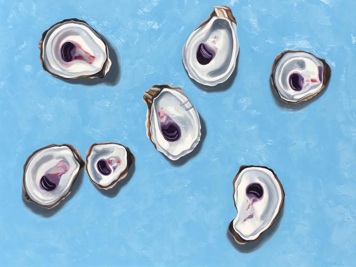
Debra Nadelhoffer
Sea Breezes
8x10
|
|
The word “ochre” comes from the Greek meaning “pale yellow”. Over time the word shifted to mean something redder or browner. Now it can be used to loosely refer to almost any natural earthly pigment, although it most accurately describes earth that contains a measure of hematite or iron ore.
In classical times, the best ochre came from the Black Sea city of Sinope and was so valuable that the paint was stamped with a special seal and was known as “sealed Sinope”; later the words “sinopia” or “sinoper” became general terms for red ochre.
|
|
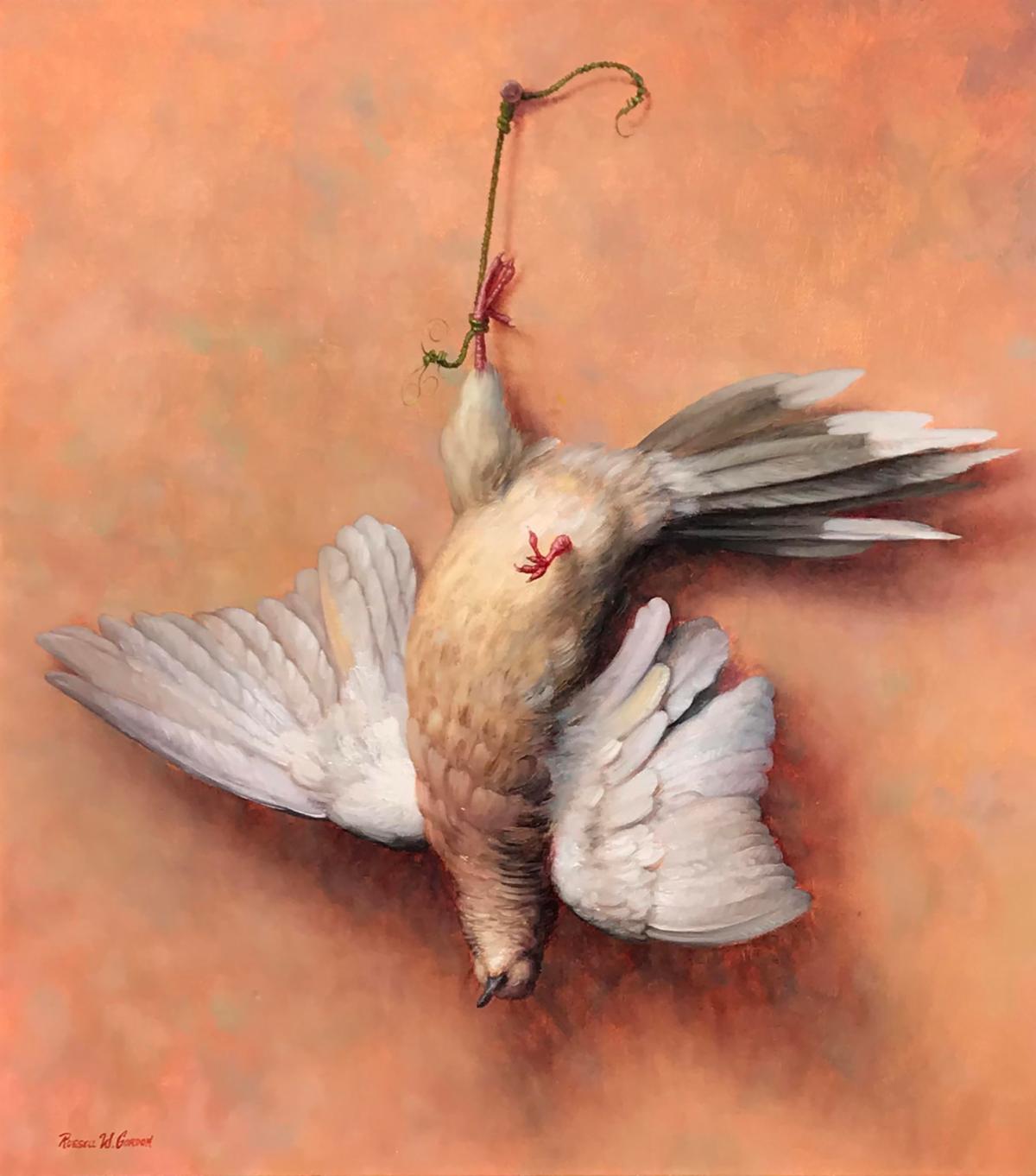
Russell Gordon
Aloft
46x42
|
|
Scientists in Italy can date frescos simply by examining the red ochre paint used in the painting. Red ochre contains iron, and the iron molecules act like compass needles. In the few minutes between daubing red ochre onto wet clay and the time it dries, the molecules realign themselves toward the direction of magnetic north (and if you don’t move the wall with the fresco then that’s how they stay). Magnetic north changes every year – it can fluctuate over a range of 18 degrees, so you can learn when the fresco was painted from the direction in which the red ochre is pointing.
|
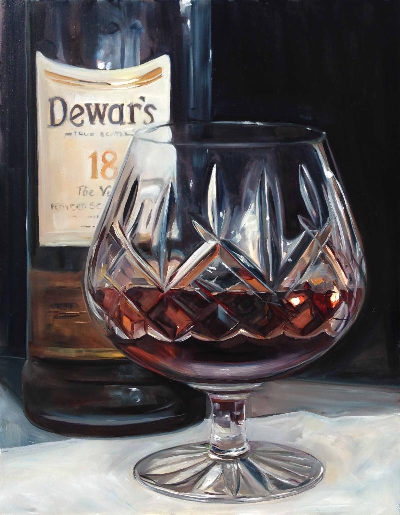
|
Glenn Harrington
River Course Cocktails
10x16
|
|
Natural red ochres are rare. Most red paints are made by cooking the yellow ochres. This is one extraordinary characteristic of this iron-oxide paint: heating the yellow ochre makes it turn red through a process called calcining. This process is so common that some paints have two names because of it. Sienna is matched by the redder “burnt sienna”, while in the 18
th
century Dutch paintmakers used to buy yellow ochre in France, heat it, and sell it as English Red.
The difference in natural and heated reds is that natural reds have a bit of a shine or gloss effect, where heated reds are flat and matte.
|
|
Matt Constantine
Early Morning
8x10
|
|
After the 18
th
century, brown ink was often made from sepia, the dark liquor secreted by cuttlefish when they are afraid, but most brown paints traditionally came from the earth.
|
|
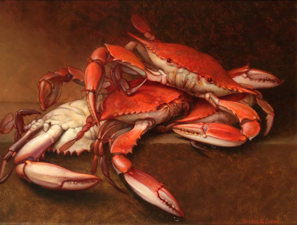
Russell Gordon
Kiawah River Bounty
11x14
|
|
Umber is an ochre sometimes thought to be named after the Italian province of Umbria, but it is more likely to get its name from the same Latin root as
umbrella
due to its effectiveness in making shadows. Along with burnt sienna – which
is
named after the Tuscan town – umber was a key color for Italian Renaissance artists in creating a sense of depth and a gentle transition from light to dark.
|
|
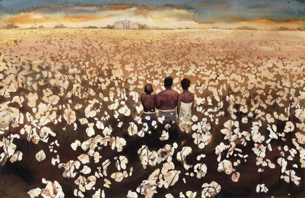
E.B. Lewis
The Plaintiffs, II
14x21
|
|
The most extraordinary brown was called mommia or “mummy” and it was, as its name promised, made of dead Ancient Egyptians. First made in the 16
th
and 17
th
centuries, but a favorite among 19
th
century painters, Mommia was a thick substance excellent for shading, although not good as a watercolor. This rich brown pigment was created by mixing human and feline mummy "crumbles" with white pitch and myrrh. It was reported by the colorman George Filed in 1809 as having “a strong smell resembling garlic and Ammonia”.
If the suppliers ran out of mommia, they could always make their own. In 1691 William Salmon a “Professor of Physick” provided a recipe for artificial mummy: “
Take the carcass of a young man (some say red hair’d) not dying of a disease but killed; let it lie 24 hours in clear water in the air: cut the flesh into pieces, to which add powder of Myrrh and a little Aloes, imbibe it 24 hours in the Spirit of Wine and Turpentine…
”.
|
|
The pigment wasn’t very stable, and it eventually fell out of favor. Rest assured, if you see the name “mummy brown” used today, it doesn’t contain any corpses. Probably.
|
|
White paint can come from chalk, zinc, barium, rice, seashells, bone, lead, and even pearls.
|
|
Spruill Hayes
Coming Out of Your Shell
18x24
|
|
European artists for hundreds of years have rated lead white as the best white and one of the most important paints on their palettes. In 27 BC the making of lead white entailed putting shavings of thin led over a bowl filled with vinegar. The action of the acid on the thin metal would cause a chemical reaction and leave a white deposit of lead carbonate. The lead carbonate was then powdered, flattened into small cakes and left to dry in the sun.
|
|
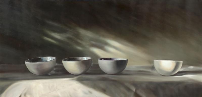
Sally Tharp
Follow Your Light
24x48
|
|
The small amount of lead white still made today basically follows the same formula of acid plus metal equals paint. Due to its toxicity, lead white was banned from sale in the European Union in 1994. While still available in the U.S. most artists opt for the safer (and less temperamental) Titanium White. True traditionalist artists will still use the lead – it’s worth the small risk for the paint to be right.
|
|
Russell Gordon
Game, II
18x16
|
|
Many art historians of today are thankful for the excessive use of lead white in the past because x-radiography of paintings depends on it. X rays are electromagnetic waves, just like light except they have a much smaller frequency than light and so can pass thorough more objects. The density of lead allows it to show-up in x-radiographs which can show the underpaintings, corrections, or restorations that have been performed on the piece by the original artist or conservators.
|
|
If you made it to the end and enjoyed this style of email please let us know by clicking the button below.
|
|
Keep checking your Inbox for emails from Wells Gallery.
Next time we will be exploring the colors Red, Orange, and Yellow.
You don't want to miss it!
|
|
Wells Gallery
1 Sanctuary Beach Dr.
Kiawah, SC 29455
(843)576-1290
kiawah@wellsgallery.com
www.wellsgallery.com
|
|
|
|
|
|
|