Oct. 9, 2025


Bringing data to life with Magic Charts


Yesterday we created new spreadsheets with Canva Sheets (click here for a refresher).


📊 Today we’re going to see how you can bring a dataset to life with Canva’s Magic Charts. This tool suggests charts for your project and will embed any data you select from your spreadsheet directly into your design. From there, you can download the chart to enhance and clarify your published story or incorporate it into your other Canva designs.


Added bonus: Magic Charts is included in all Canva plans.


Let’s get started:


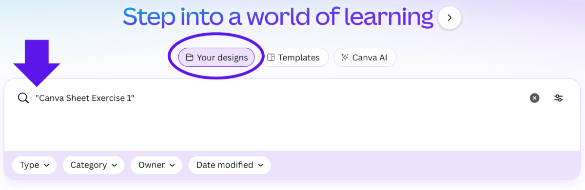
✅ Open the spreadsheet you created from the previous lesson that shows average temperature in the Mid-Atlantic Basin over the years. Reminder: You can find your saved work on the homepage by selecting the Your designs folder and typing the file name into the search bar:

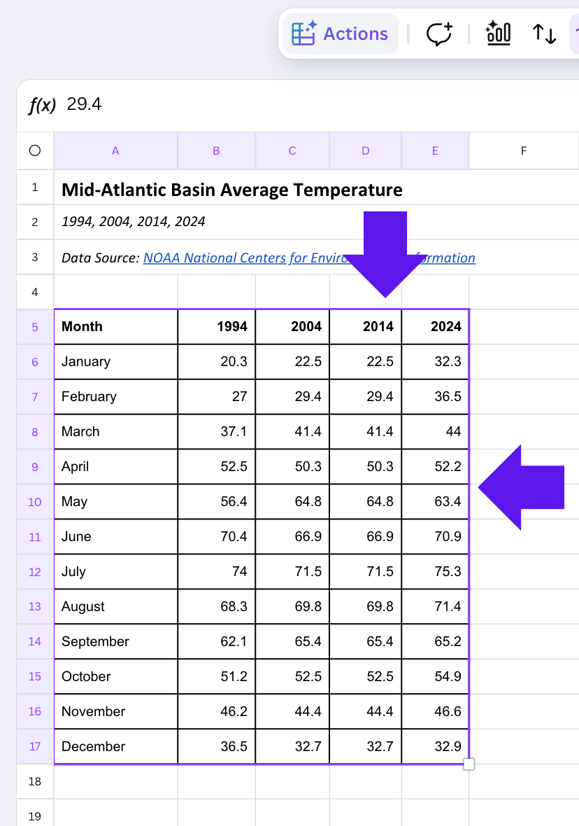
✅ Highlight the cells that you want to use to create a new chart. Let’s start by highlighting all the data in spreadsheet (drag your cursor from “Month” to “32.9"). You should now see a purple box highlighting all the cells: 

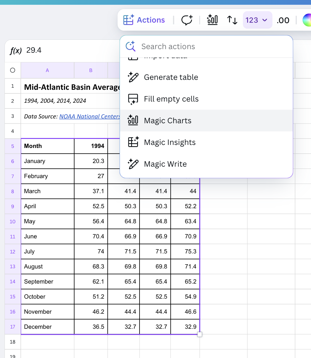
✅ Now, click on Actions from the top toolbar and find Magic Charts:

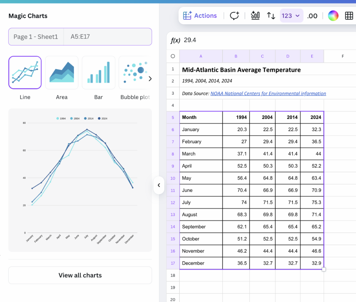
✅ From the side panel, you will see some chart options. Magic Charts will provide suggestions for you based on your data:

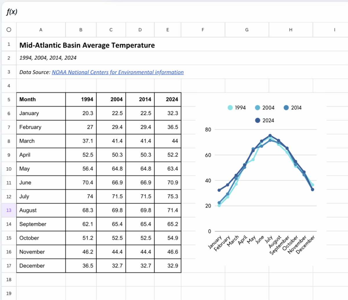
✅ Let’s open a Line Chart, which will now be added to your spreadsheet:

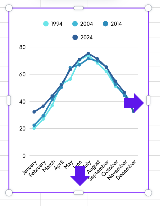
✅ Once your chart is incorporated into the design, you might need to make some minor adjustments. To resize your chart, click on the graph and start dragging the edges to make it wider or longer:

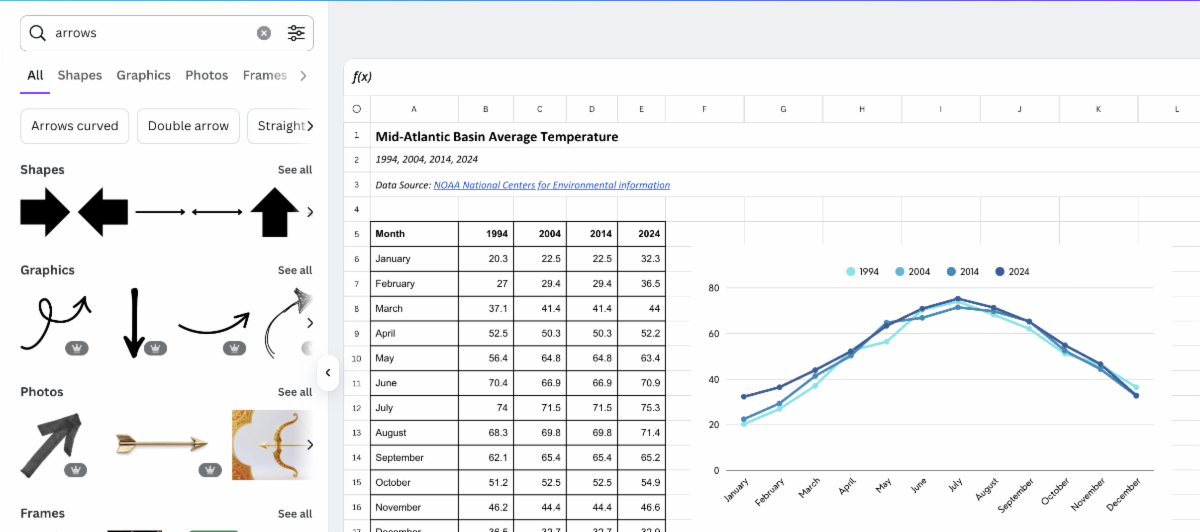
💡 You can also add text or other graphics to your chart. Select Elements from the left toolbar and start searching for different assets to add to the chart. Drag and drop graphics like arrows, lines, and circles directly into chart.

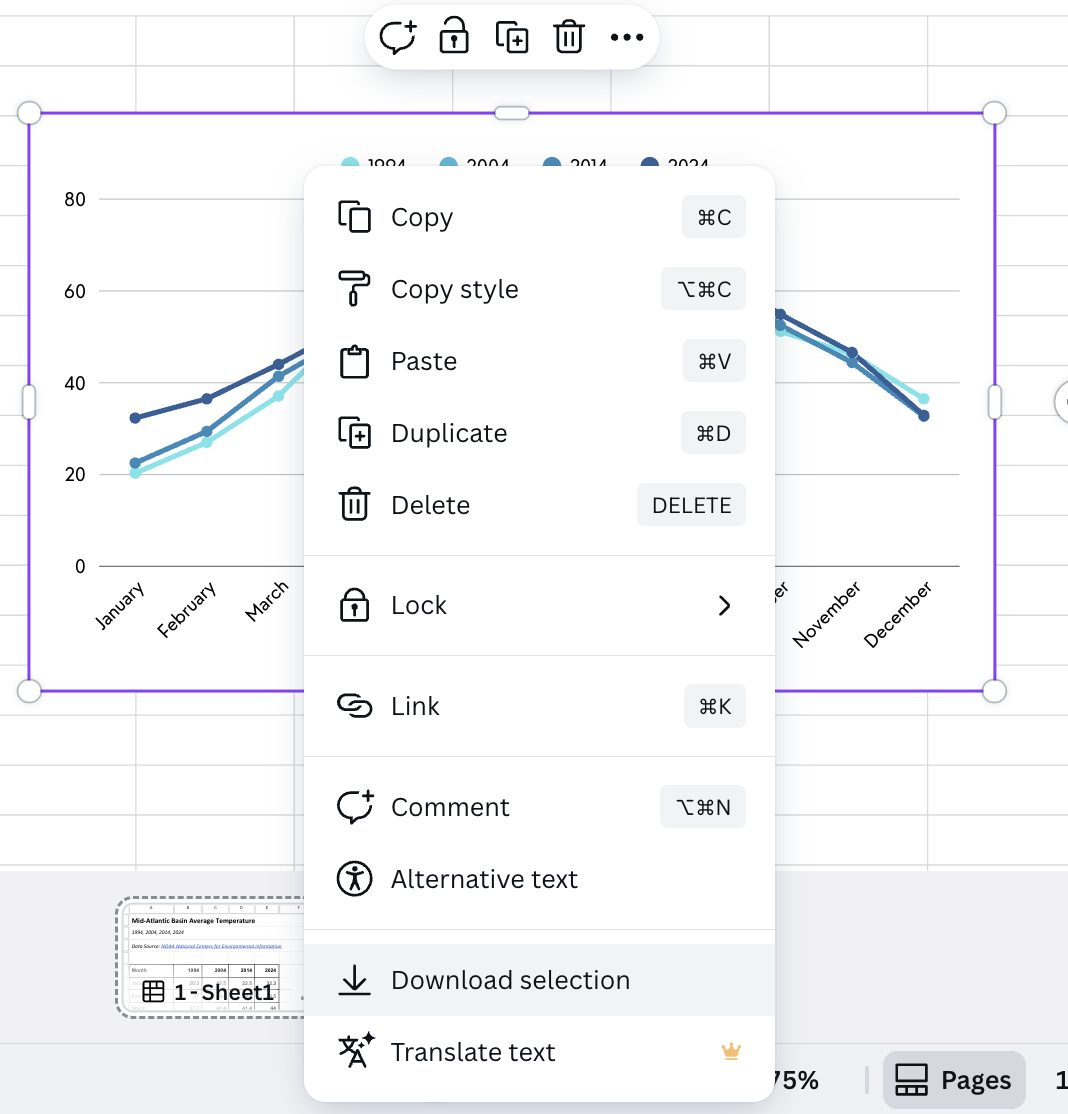
✅ Once you finish, you can download the chart as an image to use on your website or social media. Highlight the chart and right click. Then choose Download selection from the dropdown:

🚫 Not sure how to choose the right chart for your data? Check out these tips.


💡 Pro tip: If you need to update the data in the spreadsheet, any changes to the linked data will automatically sync with the chart.


🔍 See how this works in practice with a short demo:

Let’s try it out


📝 Build your own Magic Chart. You are reporting a climate story comparing average temperatures in the Mid-Atlantic Basin over time. Using the sample dataset from today’s lesson, create a new type of chart that shows how temperatures have changed since 1994.


✅ Start by using all the data within the spreadsheet to see what other ways you can visualize the temperature changes over time. Is there a different type of graph you like better than the line chart we made in the lesson? Did you notice any patterns in the data? 


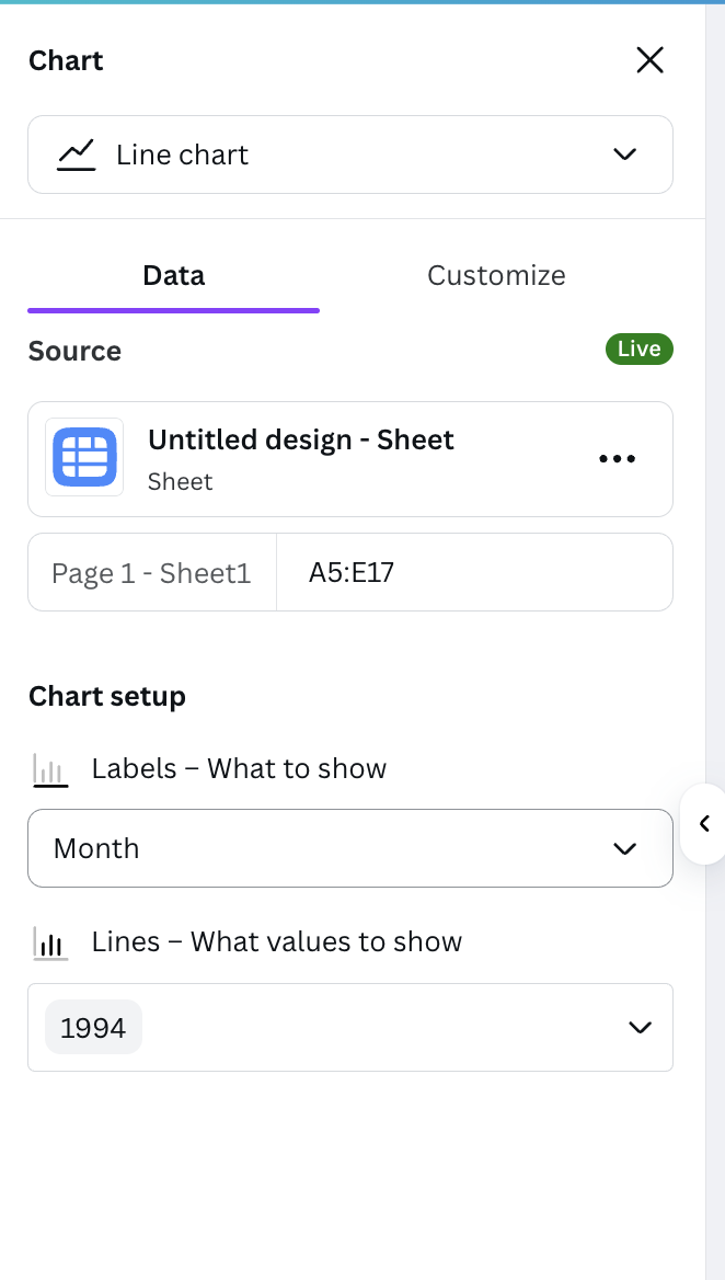
✅ Now let’s try narrowing down the information to focus on a specific year. You can change the settings on your graph from the left column. For example, if we wanted to look at just the year 1994, we can update the values under Chart setup to remove the years we don’t want:

💡 Think of ways you can apply these tools to your own reporting. Can you get more specific with your research and highlight datasets in visually interesting ways with Canva’s Magic Chart feature?


Let us know what you’re thinking, and we’ll be happy to provide feedback on your ideas.


🗣️ SHARE YOUR CHART: To quickly share your chart, select Share in the top right corner of your window, then select Public View Link. You can use this to showcase any of your designs without granting edit access to the viewer. Share your link on the social channel of your choice with #CampCanva25.

TOMORROW: Design Fundamentals Workshop

Join us from 11 a.m. to noon ET on Friday, Oct. 10, for a hands-on virtual workshop covering design fundamentals.


This free training is part of Camp Canva and will cover:


  • the fundamentals of solid graphic design;
  • tips for conceptualizing and producing graphics quickly;
  • hands-on, step-by-step examples; and
  • a look at specific Canva tools that can help maximize your work’s impact.

Camp Canva is a partnership between the National Press Club Journalism Institute and Canva to offer 31 days of free training for journalists today and continuing through the month of October. Camp Canva is a self-paced, opt-in e-mail learning series that offers quick tips and tricks for media professionals to supercharge storytelling and audience reach. Learn more about Canva's World Tour.


For any questions about this free program, contact Institute staff.


LinkedIn  YouTube  Web  Email