|
Data is your friend!
This week is all about data storytelling, which combines numbers, visuals, and narrative to turn complex information into clear, meaningful stories.
💥 Using Canva, journalists can quickly create compelling data visualizations — think charts, maps, and infographics — from raw data without additional software or coding skills.
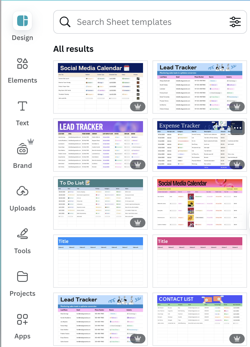
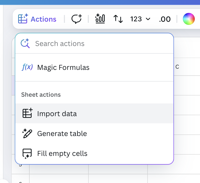
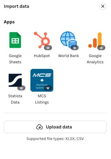
Over the next seven days, we’ll explore Canva’s AI-powered tools so that you can efficiently mine your data for key insights and turn datasets into exciting graphics. We’ll also show you where to find existing design templates within Canva that can be used for your breaking news coverage.
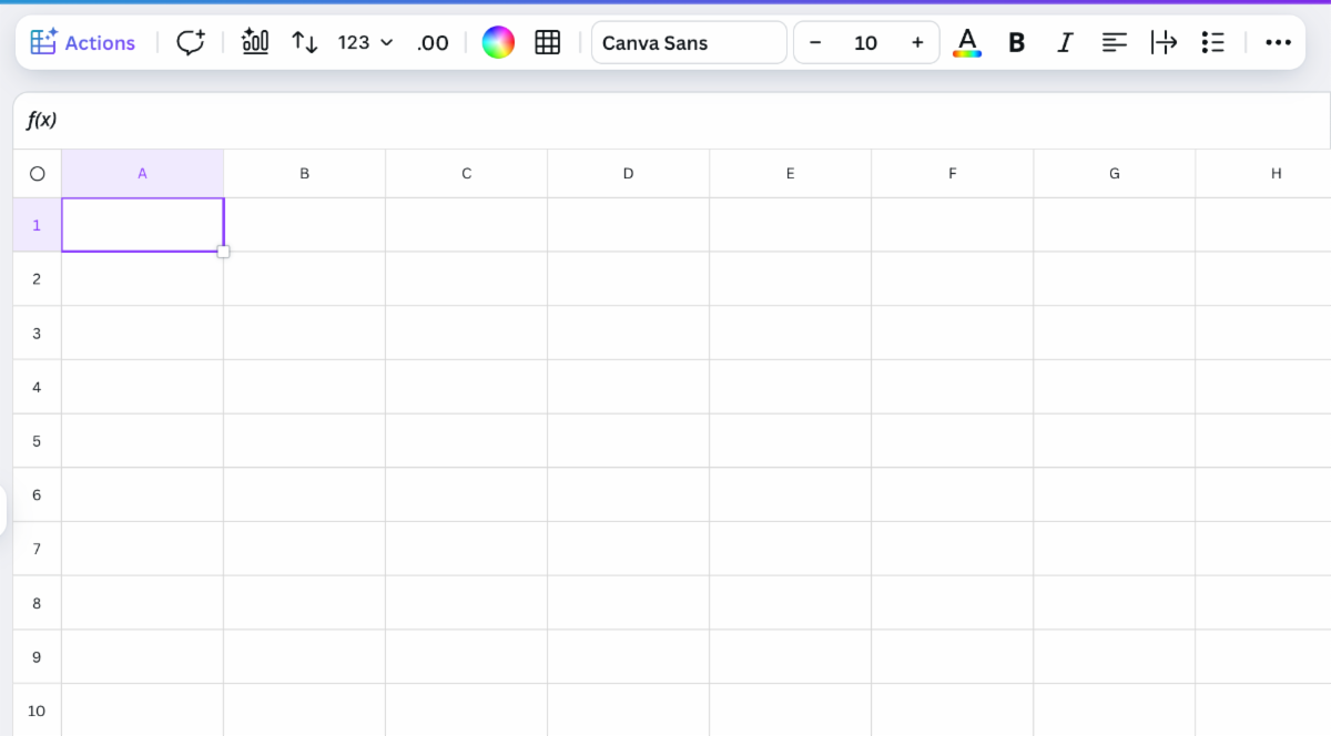
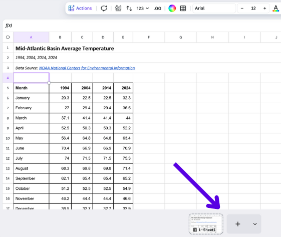
It all starts with Canva Sheets — a visual-first spreadsheet software included in Canva's free Visual Suite.
Create your own Canva Sheet
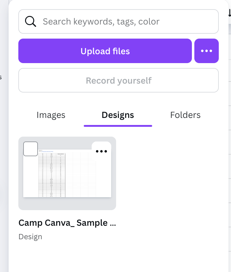
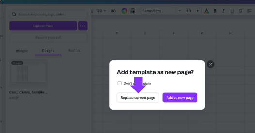
✅ Open Canva and find the Canva Sheets icon.
|