Oct. 13, 2025

Hands-on exercise: Let's design an infographic


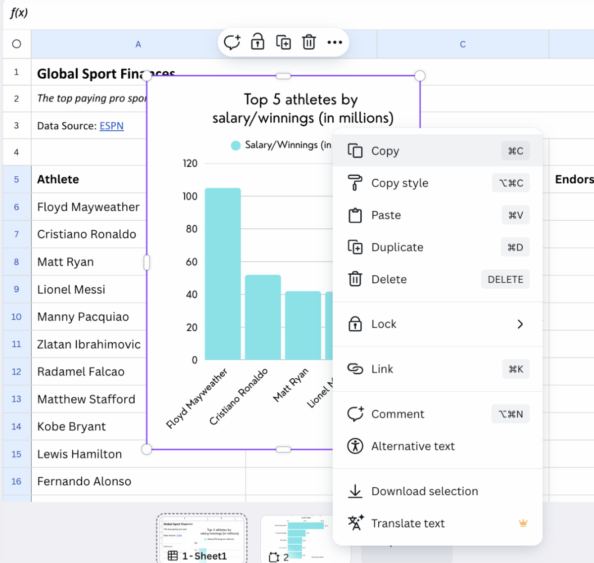
In Sunday's installment of Camp Canva, we introduced its Infographics tool as another format for visual storytelling. Today, we want you to take a few minutes to practice building an Infographic. Your assignment is to tell a visual story about the highest paid athletes in the world.


📝 Using this link, click View Template to open the dataset in Canva Sheets.


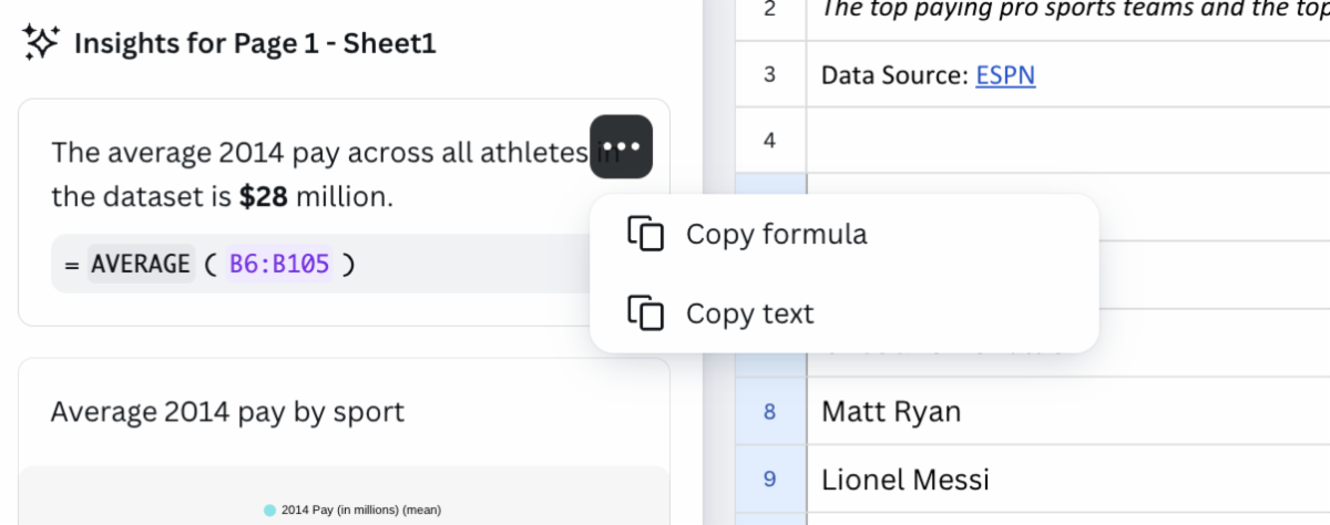
  • Start collecting interesting datapoints from your spreadsheet. First, run a Magic Insights query to see what trends emerge. 
    
  • Next, ask Magic Insights specific questions, such as “Which sport has the highest average pay?” 
    
  • Think about other pieces of information you can glean from Magic Insights or Magic Formulas. For example, try getting a breakdown of the average pay or the average endorsement by sport. 
    
  • Once you have some insights handy, it’s time to design your infographic!
    
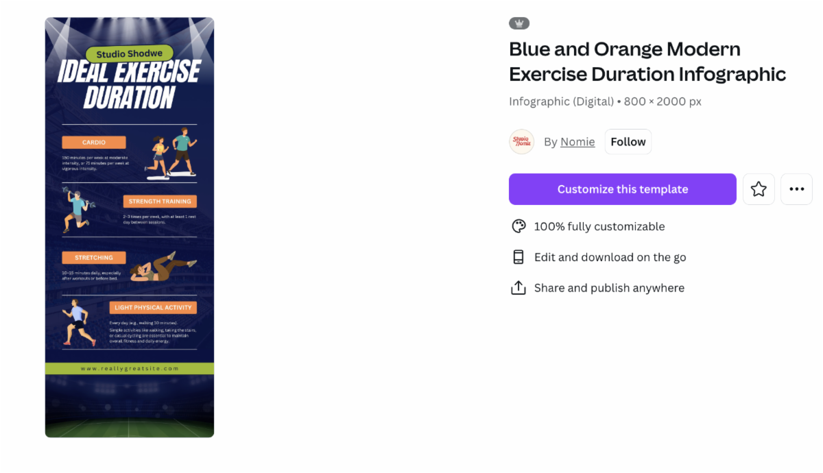
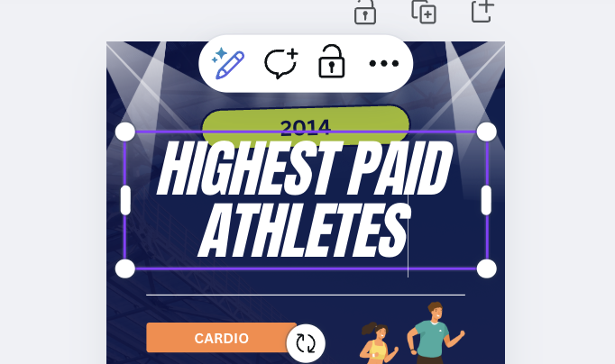
  • While keeping your Canva Sheet open, launch a new tab and search through these free sports infographic templates. 
    
  • Find a design you like and click on "Customize this template". (It’s okay if the text or images don’t line up exactly with your data — you will update each section with your own content.)  
  • Your infographic will open in a new tab. Click on each section to update the text, colors, or graphics. The section you are editing will appear in a purple box like this: 
  • Now start adding in the data you collected in your Canva Sheet. You can copy text directly from Magic Insights by selecting the three dots and clicking on Copy text:
  • Toggle between your Canva Sheet and your infographic to populate the information where you want it.
  • You can also add different images or elements by searching through Canva’s library in the left toolbar. Within the "elements" tab, you can search illustrations, photos, videos, and more.
  • After you’ve added details from Magic Insights, create a chart using either Magic Insights or Magic Charts. Once you have this ready, highlight your chart and right click. Select copy. 
  • Now go back to your infographic tab and paste the chart where you want it in your design.
  • Continue to finesse your design until you are satisfied with the story it tells visually.
  • Once you’ve finished your infographic, select "Share" and use the method of your choice to either download your image or share it directly from Canva.

Camp Canva is a partnership between the National Press Club Journalism Institute and Canva to offer 31 days of free training for journalists today and continuing through the month of October. Camp Canva is a self-paced, opt-in e-mail learning series that offers quick tips and tricks for media professionals to supercharge storytelling and audience reach. Learn more about Canva's World Tour.


For any questions about this free program, contact Institute staff.

LinkedIn  YouTube  Web  Email