By Landesberg Design | December 30, 2025 | brian@landesbergdesign.comGood design is often the result of good reading. Here's December's offering of insight, info, and intrigue. Indulge. | | | | |
by Kipp Madison, Art Director | | |
So. I’m retiring. At the end of the year. But given the holidays, it’s pretty much now. Many have asked me what I think about retirement. To be honest, I don’t know how to answer as I’ve never retired before.
But I do have mixed emotions regarding.
I remember my dad retiring. He worked for PPG Industries, and he couldn’t wait to retire. After a career of 40+ faithful years, he said "see you never" to the float glass plant in Carlisle. He received a sort-of-engraved something-or-other and a reasonable pension. Then my folks packed up and moved to Florida’s gulf coast. They bought a pontoon boat. Quintessential.
My dad never missed working.
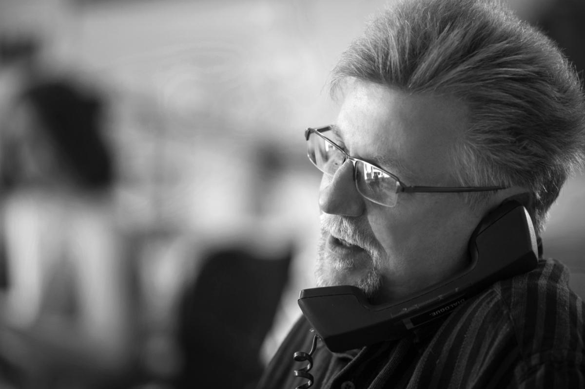
| Kipp Madison in the LD office circa 2015. Photo Credit: Annie O'Neill | |
I wonder what my retirement will look like? Move to a warmer climate (sans the pontoon boat)? Perhaps. Travel? Possibly. (I visualize visiting places like Lucerne, but realistically it will be places like Lake Erie.) A hobby? Sure. Flying a remote-controlled airplane is of interest. Actually, I would love to get a pilot’s license and fly a real plane (I get that from my mom.)
I do like spending time in the outdoors, but only under pristine and perfect conditions.
Golf? No way. Anyone I know who plays the game is just frustrated by it.
Here's where the mixed emotions come in. While the concepts of travel, flying a plane, or not playing golf all sound appealing, unlike my dad, I will miss working. I like what I do. I like learning a little about a lot of things. I like walking into an office of creative and engaging people. I like odd lunch time conversations (often about nothingness). I like our walks to the deli.
I’ll miss all of that. Which brings me to my final thought.
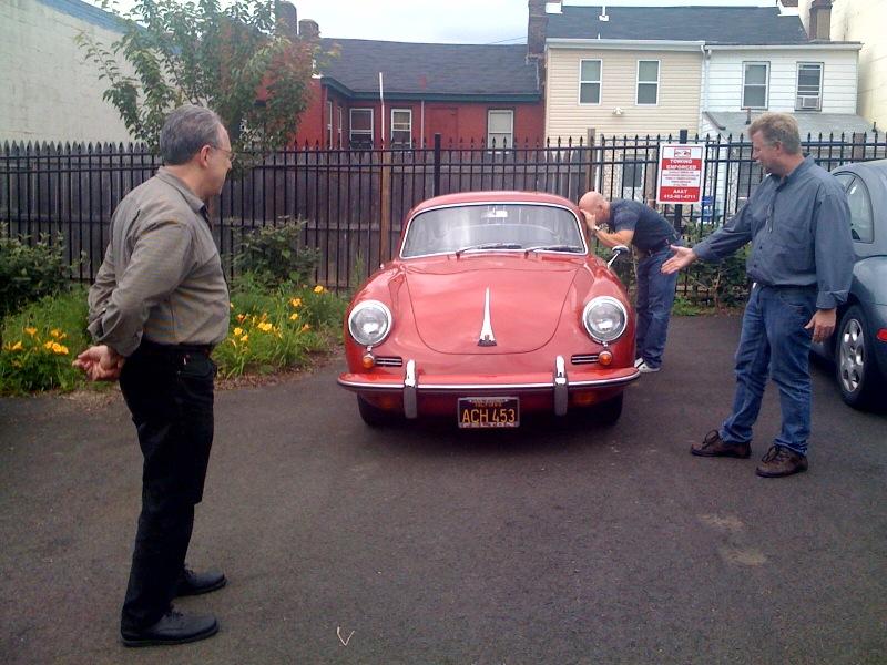
| | L-R: Rick Landesberg, Joe Petrina, and Kipp Madison admiring a vintage car. | | |
I would be remiss in not giving a shout out to so many along the way who will make me miss what I do: those who have mentored, counseled, challenged, flattered, criticized, praised me in my craft as a designer; to clients, designers, photographers, writers, illustrators, and printers I’ve teamed with; and certainly to my colleagues at Landesberg who have always pushed me to think deeply and differently about design. They are a stellar crew.
Fred Rogers once said, "Often when you think you’re at the end of something, you’re at the beginning of something else.” Closing my laptop later this week will close out a chapter I'm familiar with, and send me on to something that I can't quite envision.
Whatever "it" might be, it won't have a deadline or time sheets.
Those I won't miss.
| | | | |
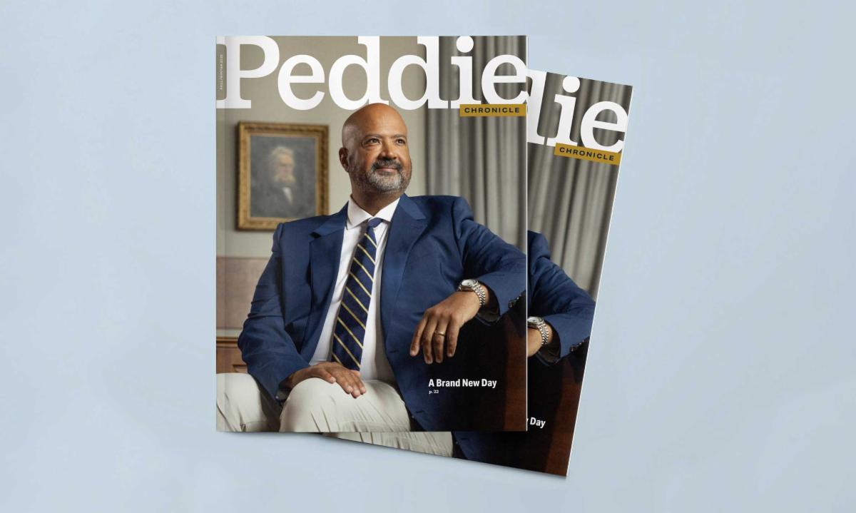
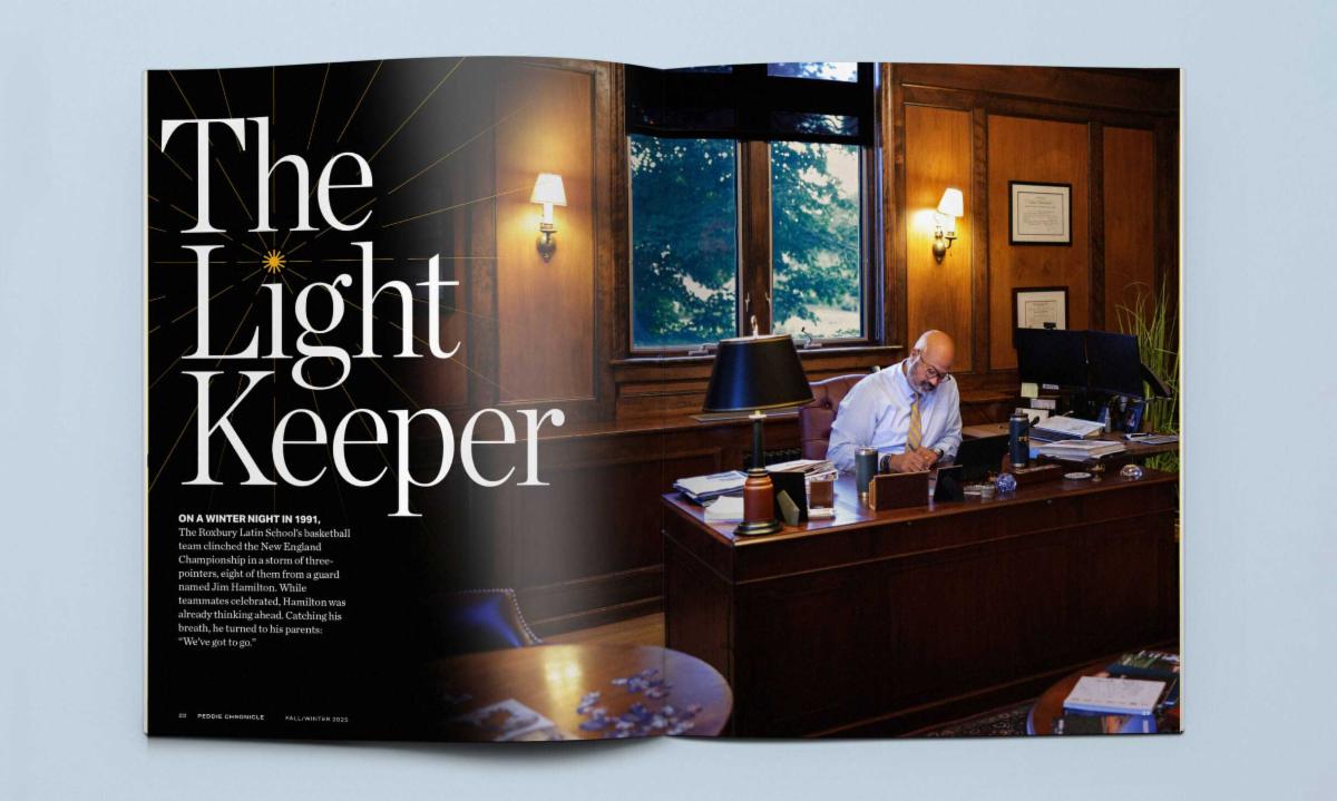
Overview. Peddie Chronicle has long served as a trusted connection point for alumni, families, and the broader school community. While the content was strong and deeply valued by readers, the publication’s visual presentation needed an update to truly capture the vitality, progress, and lived experience of The Peddie School. | Context. Reader surveys revealed an appetite for a more dynamic, engaging, and contemporary experience—one that honored tradition while embracing new formats, voices, and ways of connecting, particularly online. The redesign presented an opportunity to elevate the Chronicle into a primary—and preferred—media experience: one that feels uplifting, sophisticated yet playful, and connective across generations. A refreshed print format paired with a digital companion publication would better reflect Peddie’s past, present, and future while encouraging deeper engagement and shareability. | |
Implementation. Prior to the Discovery session, Landesberg conducted foundational research by reviewing past issues, aspirational publications, and the Strategic Plan, and by collaborating on a Peddie-administered readership survey. The on-campus Discovery session brought key stakeholders together to build consensus around the ideal future publication. Insights from this phase were synthesized into a Creative Brief, which clearly articulated the shared future vision and goals.
The resulting Peddie Chronicle builds on the magazine’s strong editorial foundation, introduces more varied visual and narrative approaches, and expands digital-specific flexibility and content.
| | | | |
1. Santa Cause and Effect | |
Did Thomas Nast invent Santa Claus? The short answer is no, but the figure most Americans recognize today owes more to him than to any other single figure. Before Nast put pen to paper, early American ideas of Santa were shaped by European traditions, especially the Dutch Sinterklaas and England’s Father Christmas.
These influences were given a distinctly American interpretation in 1823 with the publication of A Visit from St. Nicholas—better known as “’Twas the Night Before Christmas”—by Clement Clarke Moore. That poem introduced many of Santa’s enduring traits: a jolly demeanor, magical reindeer, rooftop landings, and nocturnal gift-giving. But what Santa "looked liked" was vague.
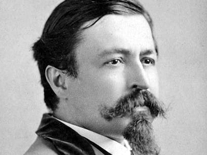
| Thomas Nast. Photo Credit: Napoleon Sarony | | |
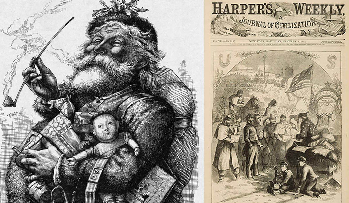
Until 1863. Nast published a series of Santa illustrations in Harper's Weekly. Over the next 20+ years, these images gradually defined Santa as a rotund, bearded figure dressed in fur-trimmed winter clothing. Nast also added key elements to Santa’s mythology: a workshop for making toys, a permanent home at the North Pole, and the now-familiar naughty-and-nice list.
| | Illustration Credits: Thomas Nast | | |
Notably, Nast’s early Santa appeared during the American Civil War, sometimes depicted supporting Union soldiers. Santa became a signifier of national identity, generosity, and moral order during a period of upheaval. By the 1880s, Nast’s Santa had settled into a form that looks strikingly familiar today.
So, Nast did not invent Santa Claus, nor did he finalize the glossy red-and-white version known worldwide. That last step came in the 20th century, particularly through mass advertising by companies such as The Coca-Cola Company, which standardized Santa’s appearance for a global audience.
The foundation was Nast’s. If Clement Clarke Moore gave Santa his personality and behavior, Thomas Nast gave him a face—and in doing so, fixed Santa Claus as a cultural icon.
| | Illustration Credits: The New York Times | |
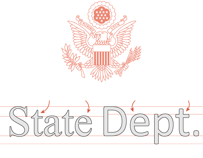
It's not often a typeface stimulates spirited debate outside of the design world. A recent New York Times article examines the State Department’s decision to abandon Calibri (instituted by the Biden administration) and return to Times New Roman. The policy change was framed as restoring tradition and professionalism; type designers, readability experts, and policy wonks from both sides of the aisle wonder whether anyone considered performance.
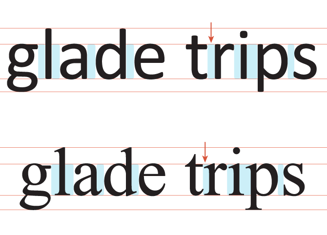
Calibri, a sans-serif designed for screens, features—larger x-height, open letterforms, and generous spacing—qualities that tend to improve legibility and accessibility, especially for digital reading and for readers with visual or cognitive challenges.
Times New Roman, by contrast, was designed for early-20th-century print and can appear cramped and fragile on screens, despite its long association with authority and formality.
| Calibri spacing top, Times New Roman bottom. Illustration credit: The New York Times | |
Accessibility is not a box that can be checked by font choice alone, and no single typeface serves all readers equally well. Typography will always operate at the intersection of function and beauty, and... politics(?)
Matthew Butterick, a designer and lawyer who wrote a brief history of Times New Roman, offers a perspective from his book, Typography for Lawyers: “Calibri works well on screen. But in print, its rounded corners make body text look soft.” He added, “It’s not that Times New Roman is a bad font. It’s just that you can and should do better.”
Tobias Frere-Jones, a type designer known for Gotham, Interstate and other ubiquitous typefaces chimes in, “There is a sort of conventional wisdom that serifs make things easier to read in long-form text. I used to believe that. I don’t really anymore.” Mr. Frere-Jones continued, “I think the more important aspect is the proportion of the letters and the amount of space in between them. And in that respect, Calibri does quite well in text and especially text on a screen, which I suspect was part of the previous decision to switch.”
Midterms are coming.
| | Photo credit: Read Only Memory | |
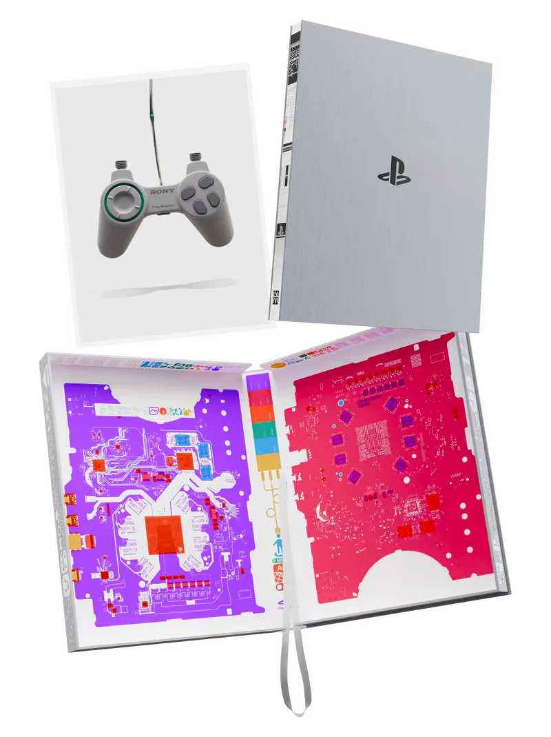
A recent It's Nice That article highlights Sony marking the 30th anniversary of its iconic PlayStation with PlayStation: The First 30 Years, a large-format photographic book created in collaboration with publisher Read-Only Memory and London-based photographer Benedict Redgrove.
The book features over 400 pages of previously unseen prototypes, consoles, controllers, and design studies from Sony’s archives. It pairs these clean, clinical images with insights from key engineers and designers such as Ken Kutaragi, Teiyu Goto, and Yujin Morisawa, emphasizing the evolution of the console’s form and engineering from early mock-ups to the machines familiar to millions of fans today.
Redgrove reflects personally on the PlayStation’s place in cultural memory, recalling his own rituals around playing the console and the emotional resonance of its hardware. “For me, these are also deeply personal objects. I remember playing PlayStation in my brother’s bedroom: the start-up sound, the flicker of the screen, the tiny green LED or the tray sliding out on the PS2 and gliding back with its cargo, ready to release its data,” says Redgrove. “It was a ritual, a kind of theatre. A slow reveal, a tease, the warm-up before the main event.”
His photography frames the hardware almost sculpturally, highlighting the “beautiful architecture” of the designs and the rich evolutionary process behind them. By presenting these objects with clarity and care, the book offers not just a nostalgic celebration but a deeper look at the creative and technical decisions that shaped the PlayStation’s identity over three decades.
| | | | |
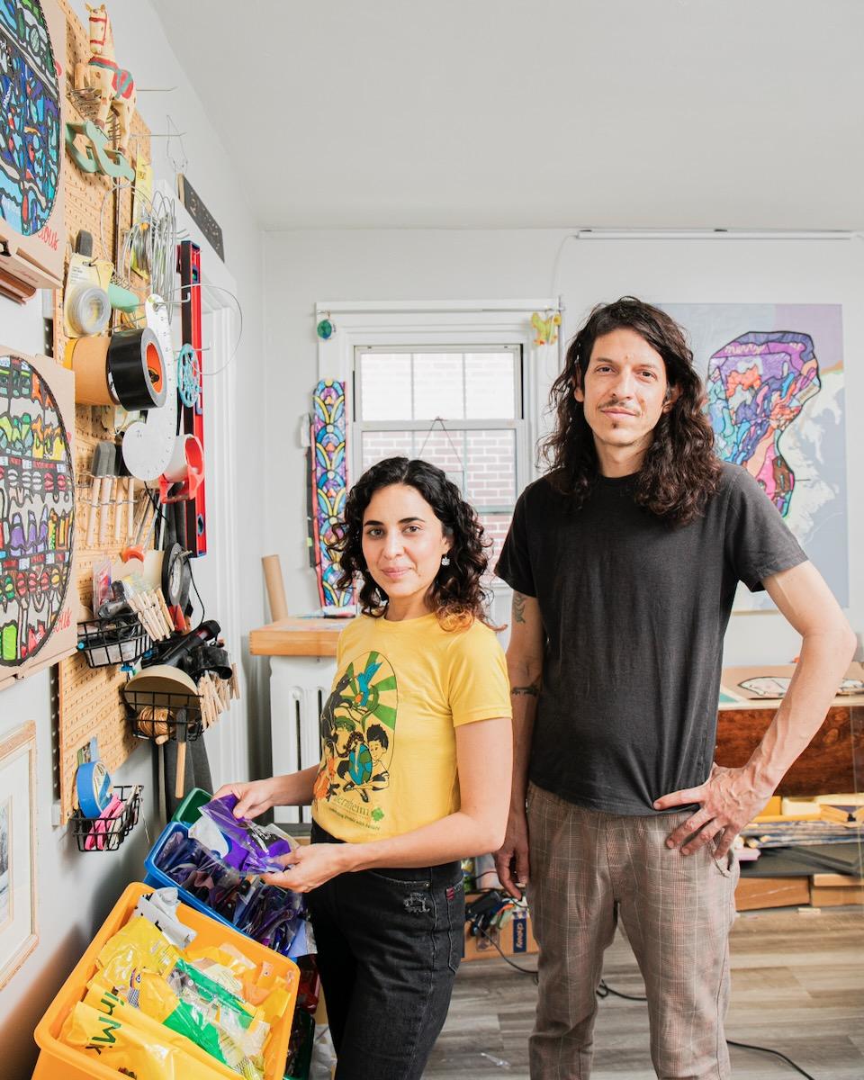
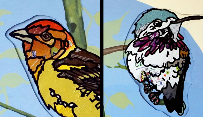
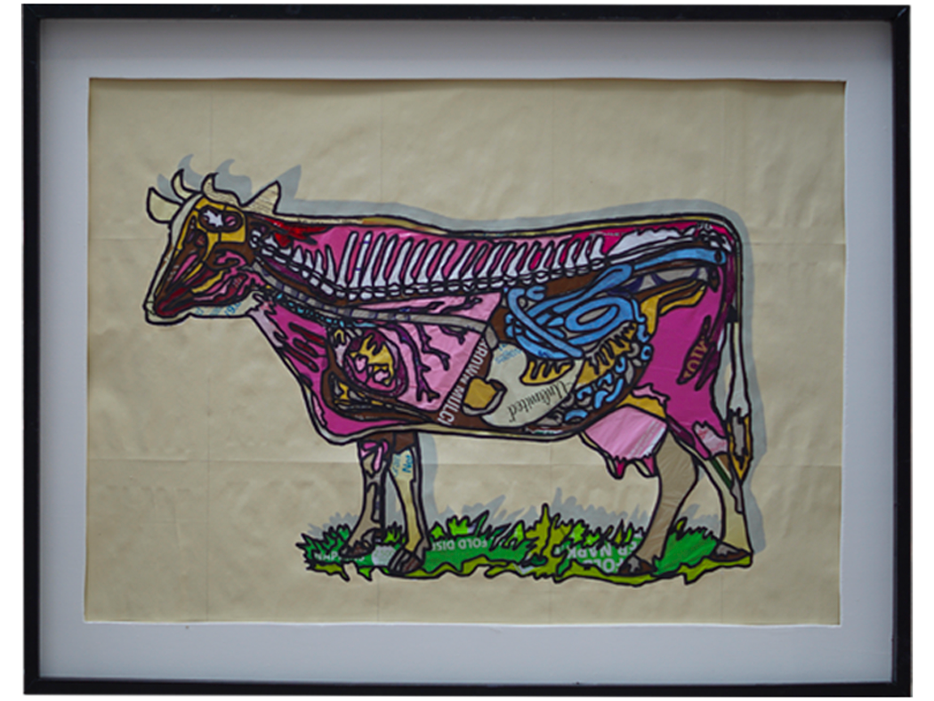
Kelly Jimenez and Alejandro Franco. Photo credit: Laura Petrilla for Table Pittsburgh | | La Vispera is an art collective formed by Colombian artists Kelly Jimenez and Alejandro Franco, whose collaborative practice spans installation, stop-motion animation, and set design. Rooted in a shared concern for the ecological crisis, their recent work focuses on creating stained-glass-like windows made entirely from single-use plastics. By transforming discarded materials into intricate, luminous compositions, they challenge perceptions of waste while drawing attention to the environmental consequences of plastic production, fossil fuel dependency, and long-term pollution. | Close ups of Seres Transitorios by La Vispera | After relocating to St. Louis in 2018, the artists became acutely aware of the abundance of packaging materials being discarded prematurely. This experience prompted them to reframe plastic—typically avoided in their individual practices because of its environmental symbolism—as both subject and medium. Now based in Pittsburgh, La Vispera continues to exhibit nationally, using found materials to give new meaning to transient objects and to spark dialogue about sustainability, consumption, and responsibility. Check out more of their work here. | | From the series, Anatomia, by La Vispera | | | | |