By Landesberg Design | July 3, 2026

Good design is often the result of good reading. Here’s our latest offering of insight, info, and intrigue. Indulge.

Familiarity Breeds Content

by Brian Bronaugh, Senior Advisor

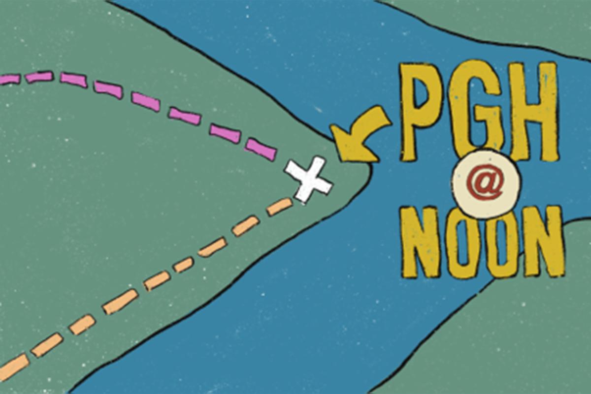
Illustration: Brian Bronaugh

The first path I became familiar with was walked when I was in nursery school in the mid-1960’s. My mother would walk me to school each morning. At the time, it felt like 4–5 miles, but it turns out it was only about 4–5 blocks away from our tiny apartment on the west side of Madison, Wisconsin where she, my younger sister and I lived.


There was a familiar visual rhythm which unfolded before us each day. Certain cracks in the sidewalk, a hollowed-out tree trunk to peer down into, a mailbox with airplane wings which was 6-feet off the ground and had “airmail” stenciled on its side, and the highlight of the journey—a massive rock ledge I could shimmy up to gaze upon my vast 6-year-old’s empire. Similar to the distance I thought we walked; time also turned my youthful El Capitan into a disappointing 2-foot drop back to the sidewalk.


Still, these and other focal points were all indexed into my brain and what started out as an unknown adventure became a familiar and comforting route. Sixty years later if my mother told me to meet her at “the boulder”—we would both know instantly where to go to find each other.


This first childhood path led to many others and eventually meandered into establishing several well-worn adult versions. The commute path became well-established—even with a job change shaking things up now and then I could quickly reform an everyday route and settle into knowing what was around the next corner.

I didn’t know it at the time, but what I was establishing with my mother and then on my own, was what economist and game theorist Thomas Schelling called “focal points”—later coined “Schelling Points”, which emanated from his landmark book from 1960, “The Strategy of Conflict”. Schelling’s book explored how people are able to coordinate decisions in situations where they cannot communicate directly. Through a series of experiments and thought exercises, he discovered that people often gravitate toward certain obvious or culturally significant choices—places, times, symbols, or ideas that naturally stand out within a shared social context—because they assume others will do the same.


This concept expanded into most facets of our daily lives in both micro and macro ways—economics, psychology, urban planning, politics, culture, and technology. And of course, as ever, it’s within the technological changes of the last 2–3 decades where this has been most radically altered.


Schelling’s most famous experiment asked people if they had to meet someone in NYC without communication—where and when would they meet? Grand Central Terminal at noon was the most popular answer. I suspect if I asked that same question for Pittsburgh, it might be The Point at noon. For certain generations—both had become physical civic anchors—places people could instinctively use as meeting places or a shared cultural shorthand for the city itself.


But we no longer—as frequently—interact with our physical civic anchors.

Our lease is up next year and our firm, like multitudes of others, is trying to decide what is the best way to integrate the post pandemic remote and in-person workforce. Expand? Contract? Mandate or cajole in-person? Turn your office into a coffee shop? Some want to nest, some want to plug and play, some don’t ever want to set foot in the office again.


Whatever happens—we’re hybrid now. Online communities frequently converge around dominant platforms, hashtags, file formats, communication tools, or social conventions because the users expect others to gather there as well. Social media trends and meme culture often do reflect Schelling Point dynamics—people coordinating around what feels most visible, trusted, or perhaps just attention getting.


And as a result, have our Schelling Points migrated to the digital and social spheres? Hashtags and emojis in Zoom rooms instead of handshakes and body language in conference rooms? This shift—and I grant you it’s a generational thing—feels hollow and siloed to me.


I disentangled myself from social media a couple years back, made a commitment to drive to work, and have tried to re-establish more physical, albeit personal, Schelling Points—reading certain signs in business windows, noting the various parents and kids at school bus stops, successfully navigating the confusing 5-way intersection, appreciating a freshly cut lawn, observing the skyline at sunset, and generally becoming familiar again with a route of passage. These small things feel grounding.

If there was just a massive boulder to survey my vast 65-year-old’s empire, I’d be set.

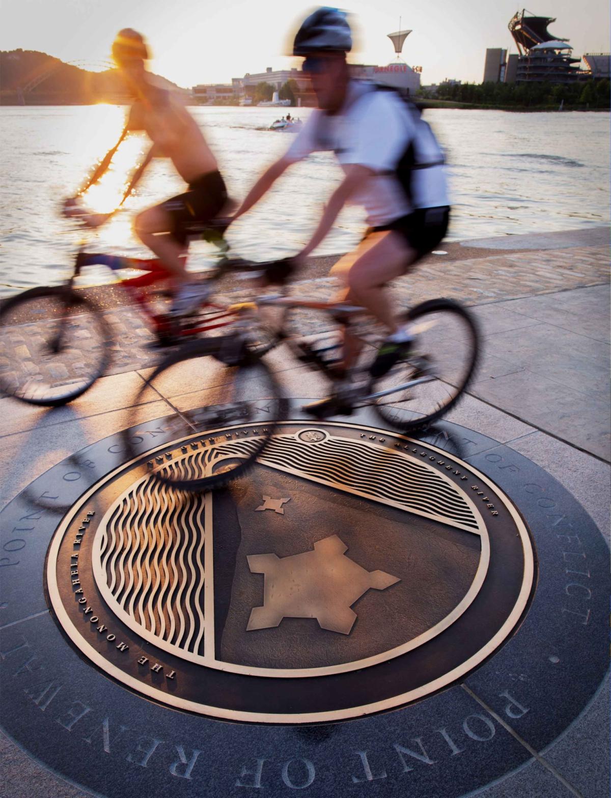
Point State Park Medallion

The narrow triangle of land where the Allegheny and Monongahela rivers meet to form the Ohio River has long been one of the most strategically significant places in North America.


Native peoples gathered here for centuries, recognizing the confluence as a place of trade, travel, and diplomacy. During the French and Indian War, control of this point became central to the struggle between Britain and France, setting in motion conflicts that would ultimately influence the nations founding.

Today, visitors encounter that history through more than the landscape alone. The Point State Park Medallion, designed by Joe Petrina of Landesberg Design, serves as both a trailhead marker for the Great Allegheny Passage and an interpretive landmark illustrating the significance of the place where two great rivers become one. Maps, historical context, and contemporary design work together to bring renewed attention to one of America’s defining landscapes.


As communities across the country commemorate Americas 250th anniversary, Point State Park’s confluence medallion, along with other interpretive signs throughout the park, demonstrates how design can extend the story of history, transforming a walk in the park into an introduction to one of the country's most consequential places.

1. When in the Course of Human Events, Design is Necessary

Images: Cooper Hewitt, Smithsonian Design Museum

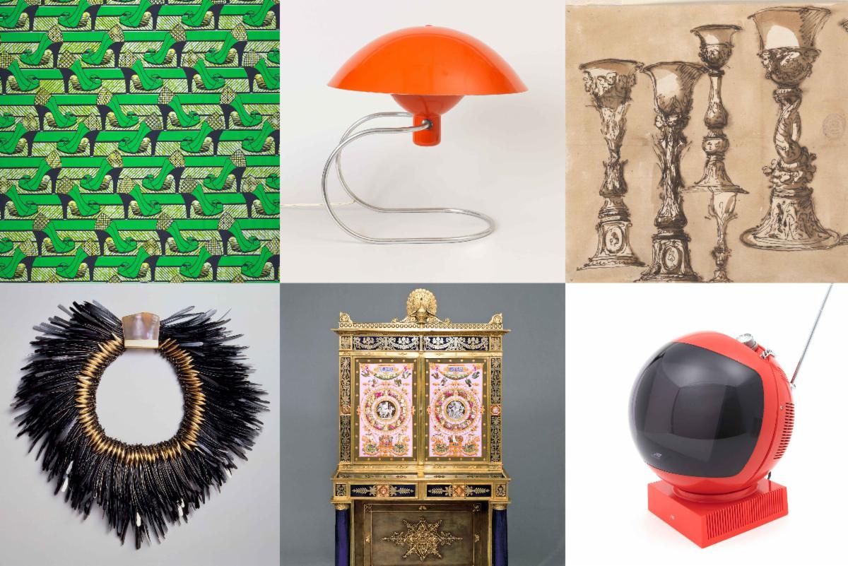
As the nation commemorates its 250th anniversary, the Smithsonians Cooper Hewitt, Smithsonian Design Museum is marking the occasion with an ambitious new exhibition that explores the role design has played in shaping the American experience.


What makes the exhibition particularly compelling is its broad definition of design. From handcrafted decorative arts to contemporary digital experiences, Design Across Time: Exploring the Smithsonians Design Collection highlights the people, ideas, and innovations that have influenced how Americans live, work, communicate, and connect.


The exhibit is a reminder that design has always been more than aesthetics—it is a powerful force for solving problems, expressing values, and improving everyday life. Now is a great time to reflect on how design has influenced society—and us—through two and a half centuries, and how it’ll shape us over the next 250 years and beyond.

2. The Declaration of Independence: Handwritten to Handset Typography

Images: Timothy Matlack Version (left), Dunlap Broadside (right)

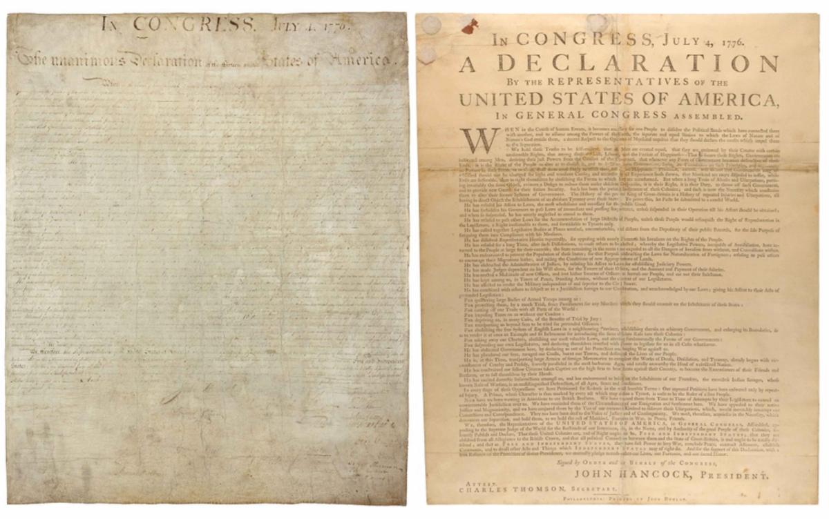
Continuing down the 250th pathwhen most people picture the Declaration of Independence, they imagine the elegant handwritten parchment preserved at the National Archives. Initially handwritten by TJ himself, it was then carefully engrossed by Timothy Matlack and anchored by John Hancocks unmistakable signature. It has become one of America's most recognizable visual icons. However, this document wasn't the first version Americans encountered.


In the hours after Congress approved the Declaration on July 4, 1776, printer John Dunlap rushed to produce the first official edition—the Dunlap Broadside. Using bold typography, generous margins, and a clean single-column layout, the broadside was designed for speed, readability, and public display in town squares, taverns, and meeting halls.

Image: Pennsylvania German Version

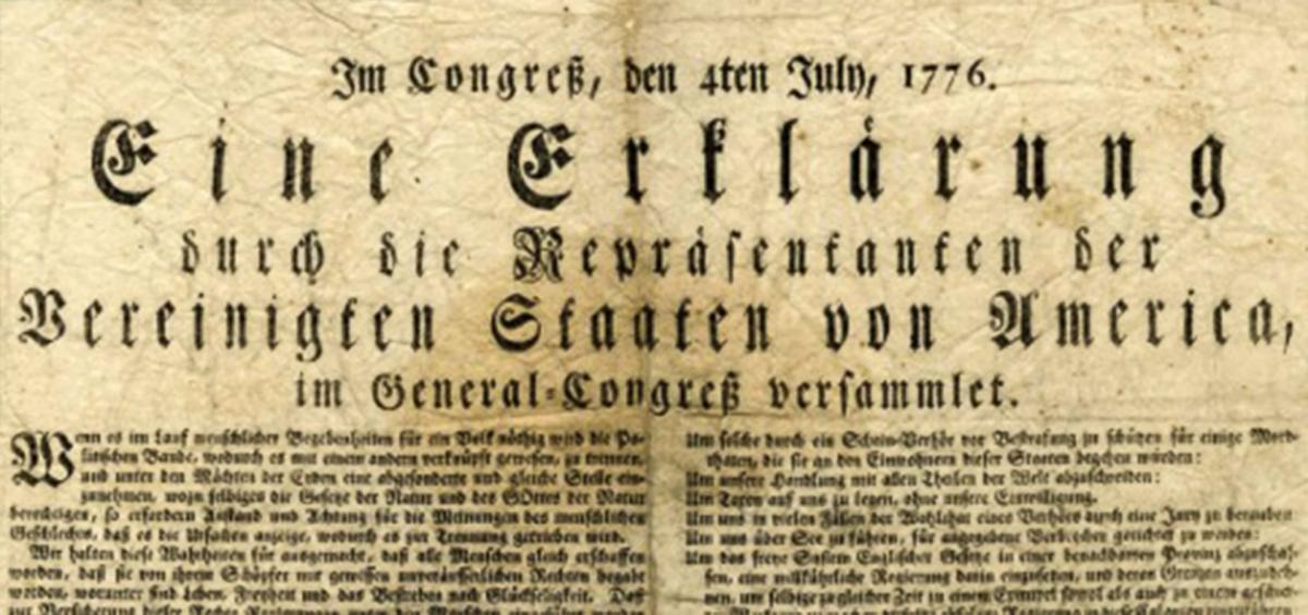
As the Declaration spread, German-language editions adopted Blackletter typefaces familiar to Pennsylvania's German-speaking communities, offering an early example of localized design. Together, these versions illustrate how typography, layout, and craftsmanship shaped the presentation of one of the nation's defining documents.

3. The Other, More Popular, Football

Illustration: Arsh Raziuddin & New York City Hall: World Cup Campaign (Copyright © Arsh Raziuddin & New York City Hall, 2026)

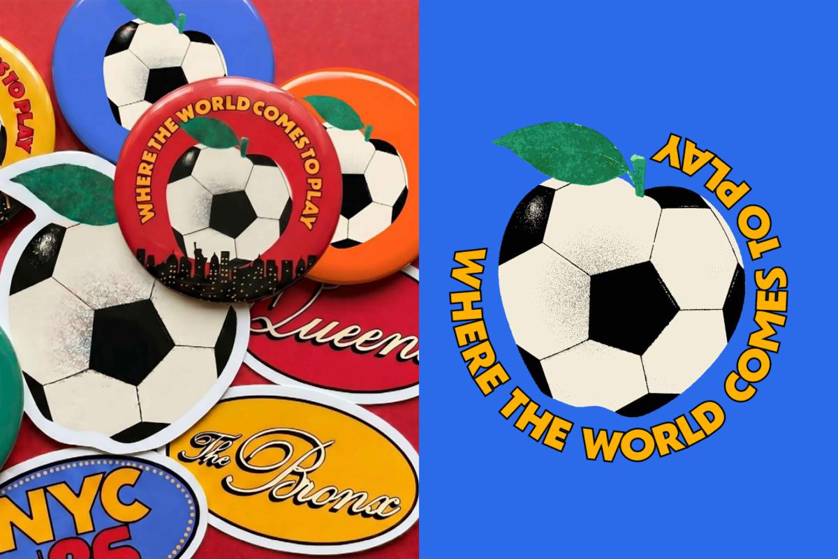
This recent It’s Nice That article showcases how New York City Mayor Zohran Mamdani welcomed the 2026 FIFA World Cup to The Big Apple. City Hall partnered with local designer and illustrator Arsh Raziuddin to create a visual identity that feels unmistakably New York. Instead of relying on predictable skyline imagery or international sports graphics, the campaign draws inspiration from the citys everyday visual language—subway signage, vintage sports ephemera, transit colors, neighborhood iconography, and hand-painted storefronts.


The identity appears across posters, transit shelters, ferries, restaurants, and merchandise, creating a cohesive system that feels authentic to the city. Its a compelling example of place-based design, carrying a message that resonates beyond the World Cup, proving that the strongest civic identities emerge by embracing the character thats already there.

Lenka Clayton

Pittsburgh, PA

Image: Bryan Conley © Carnegie Museum of Art

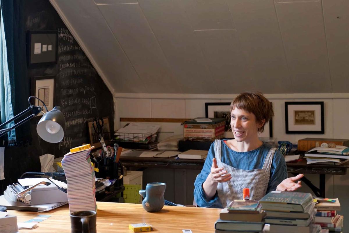
Given we are celebrating our 250th anniversary, it seemed natural to feature Pittsburgh-based British-American artist Lenka Clayton. Having built her career on both sides of the Atlantic, Clayton explores themes of identity, place, belonging, and the everyday experiences that connect us.


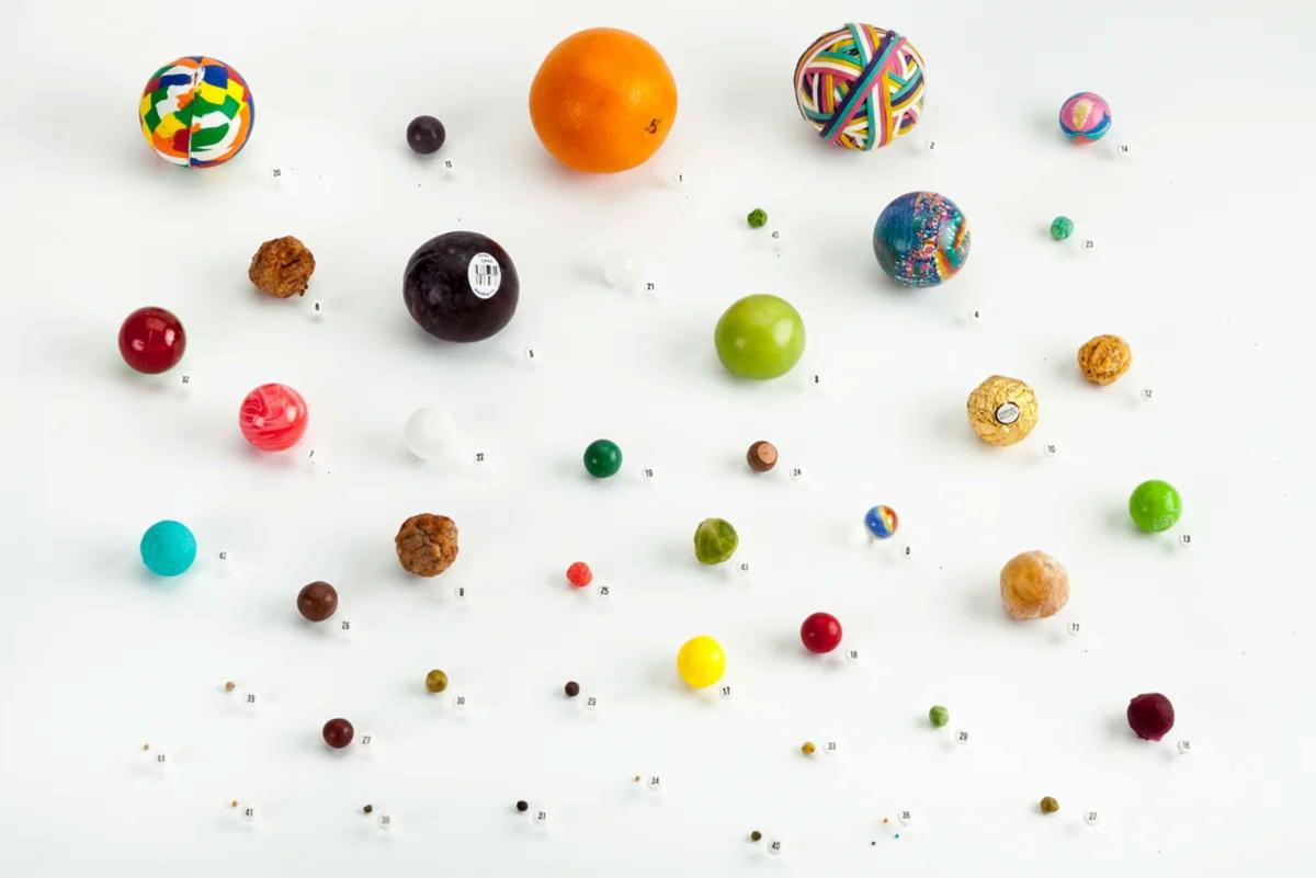
Through sculpture, photography, installation, performance, and social practice, Clayton has built an international reputation by transforming the ordinary into the extraordinary. Whether documenting every person mentioned in a newspaper, reconstructing a lost museum from a single archival sketch, or creating public artworks that spark curiosity, her projects blend humor, poetry, and thoughtful observation to reveal new ways of seeing the familiar.

Image: Lenka Clayton

In 2012, Clayton founded An Artist Residency in Motherhood, an innovative open-source residency program that reimagines the home as a site for artistic practice. What began as a personal response to balancing creativity and parenting has since grown into a global movement.


Clayton's work demonstrates that extraordinary ideas can emerge from the simplest moments. She champions creativity by paying close attention—not only to the objects around us, but also to the stories we choose to tell.


Her work has been exhibited at institutions including the Solomon R. Guggenheim Museum, The Metropolitan Museum of Art, Carnegie Museum of Art, the Pennsylvania Academy of the Fine Arts, and Pittsburghs Mattress Factory, and is held in the permanent collections of major museums across the United States and Europe.