|
These are crazy times but I wanted to email you to let you know I'm here to help.
My heart goes out to our seniors in assisted living, our families with children with schools shut down, our local businesses struggling, our neighbors at the hospitals, those brave healthcare workers that serve them, and unfortunately those who have lost loved ones due to the virus...we've all been impacted in some way by this pandemic.
In most states, and in accordance with the national guidelines, unless we are in what is considered an "essential business", we have been asked, if not mandated, to stay at home. Stagings, open houses and real estate showings have been put on hold.
In a few days we will be announcing how Designed to Appeal can help home sellers and home dwellers, virtually. We can easily video conference, instead of doing an in-home staging or design consultation for owner-occupied homes. We'll likely have enough information if the homeowner sends us their interior photos followed up with a Facetime or Zoom call to walk them through exactly what they can do to make each room show to its best advantage to buyers, and for those not selling, what they can do to make their home an attractive and functional place they want to live in.
These are tough times for all of us but I wanted you to know...I'm here. And I will be in touch in a few days.
Warm Regards,
Do
nna M. Dazzo, President
Designed To Appeal
|
|
"
I want to tell you what an amazing job you did with the apartment.
It's almost unrecognizable and it looks great! My family is astonished - as are we. LOVE IT! As soon as we met you, we all knew you were the one - there wasn't even a discussion. I thanked my real estate agent for finding you. Thank you, Donna for doing such an excellent job."
-Cindy D, Homeowner
New York, NY
"I am a longtime NYC broker, someone who frequently deals with vendors, contractors, and designers to help sell the homes that I represent. When I needed a stager for a condo on the Upper East Side, I chose Donna because she came across as knowledgeable and professional. Now that the apartment is sold, I am pleased with my decision. First and foremost, she executed everything perfectly, but even more importantly, she accommodated numerous changes and changing schedules. I recommend Donna wholeheartedly.
"
New York, NY
|
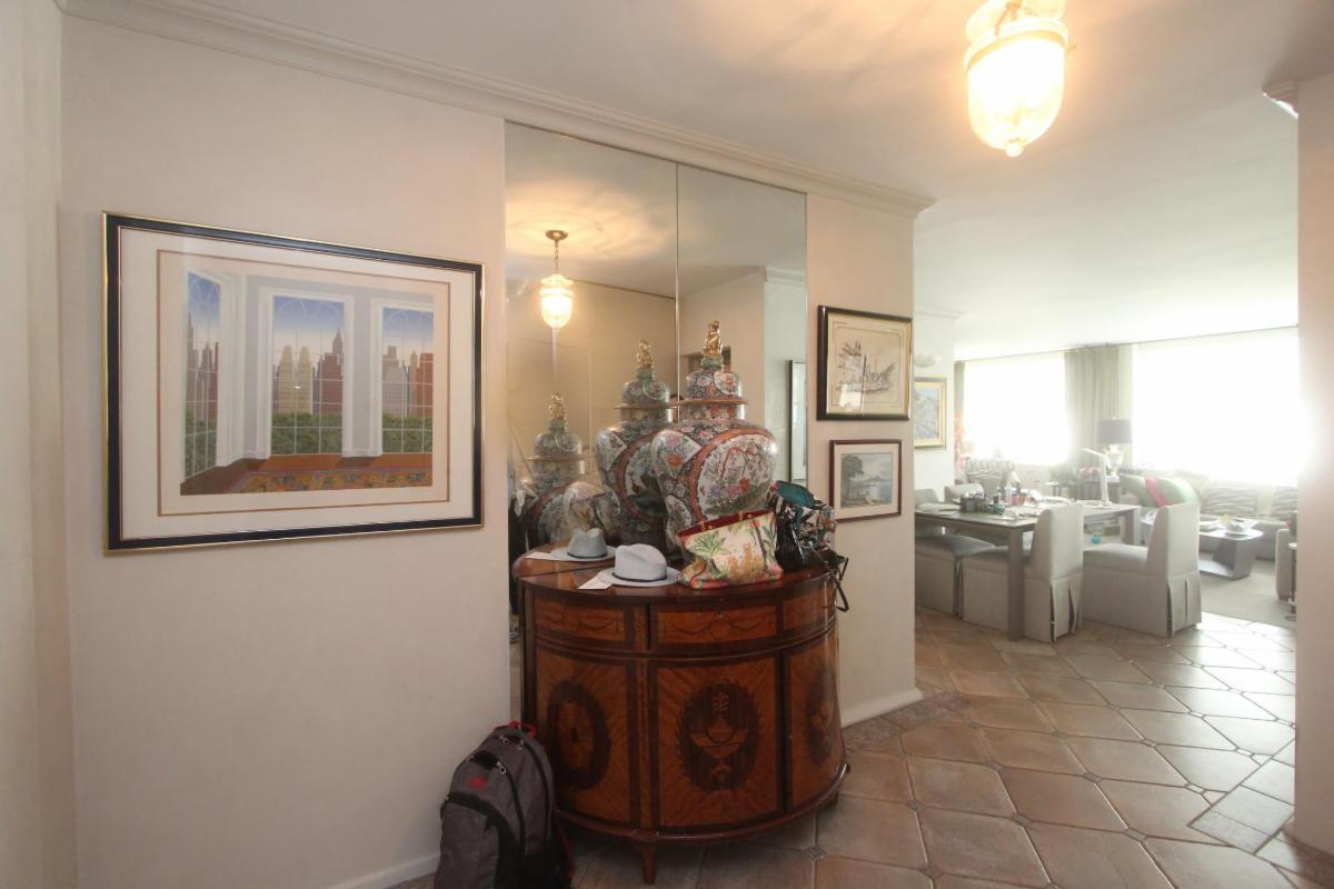
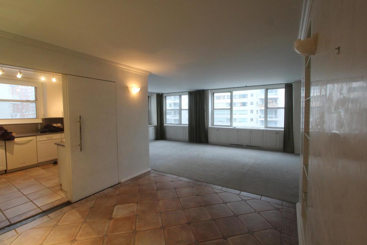
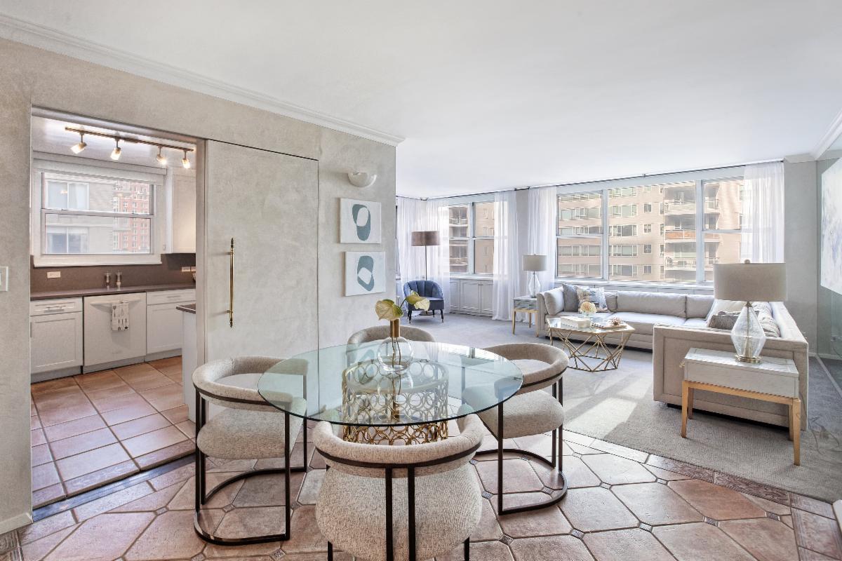
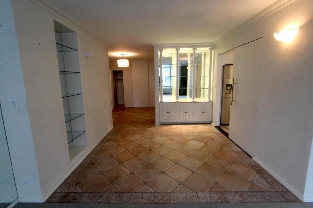
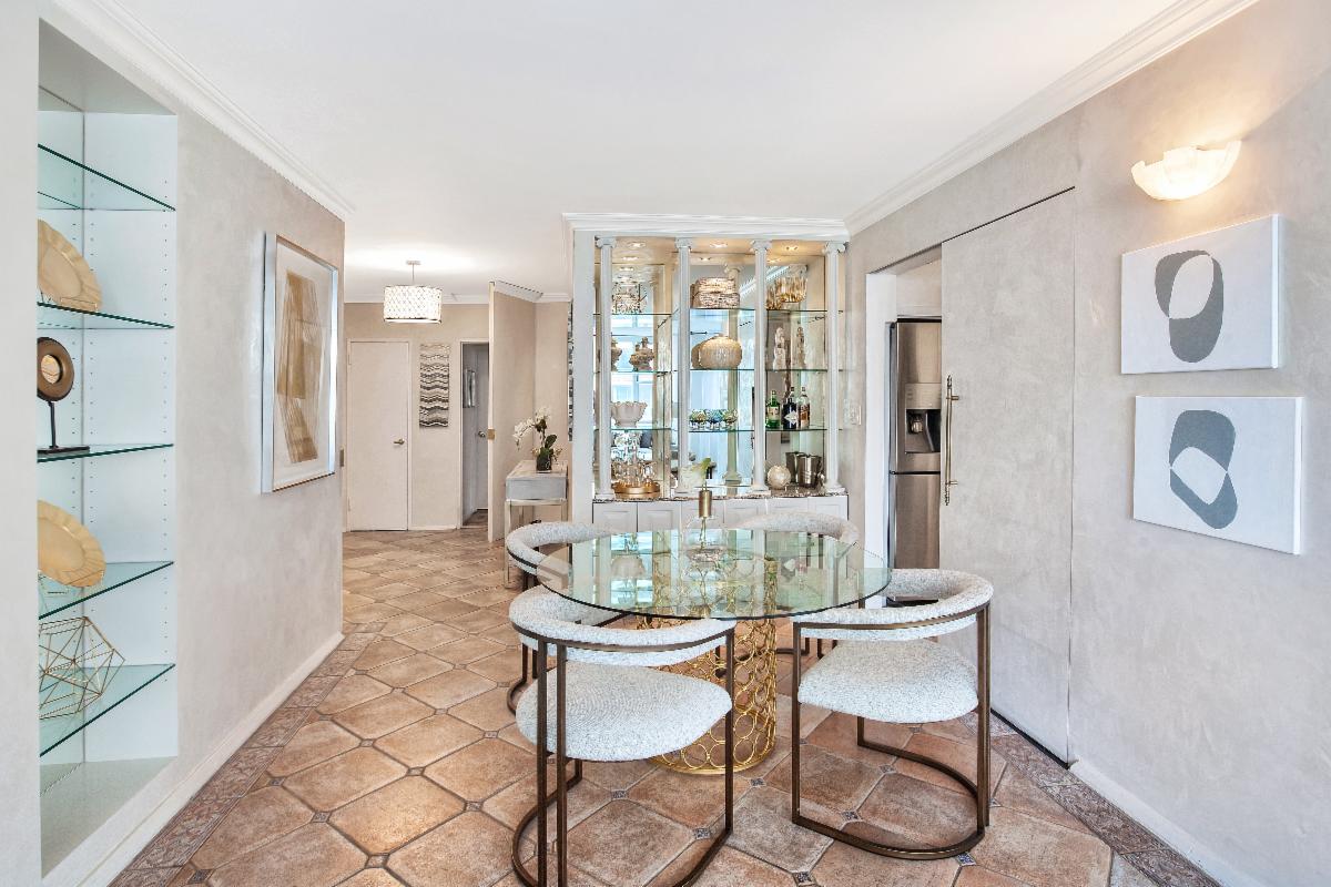
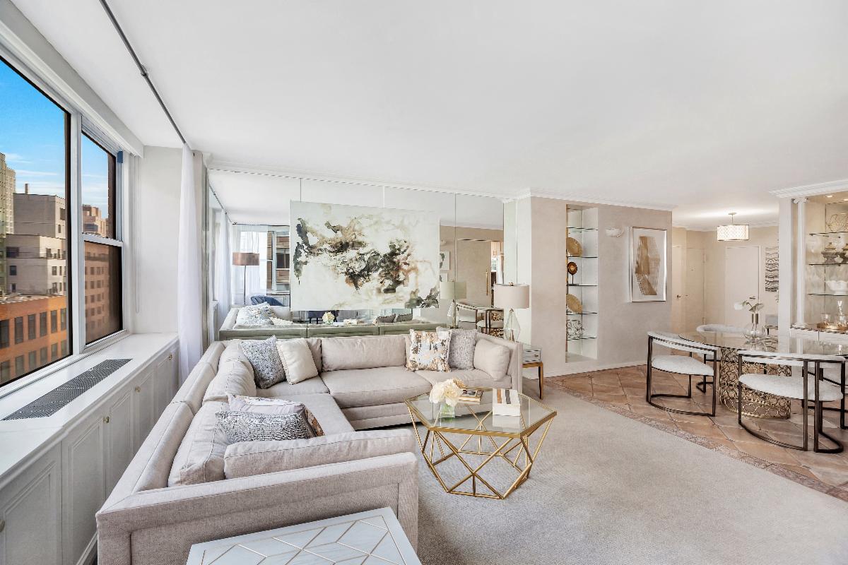
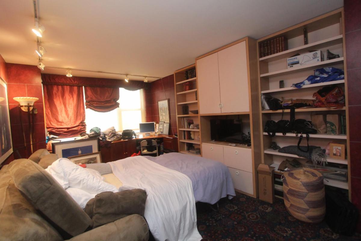
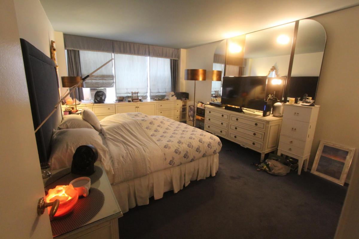
Staging Success Story:
"Sold" in One Week with Multiple Offers!
Foyer Before Staging
Foyer After Staging
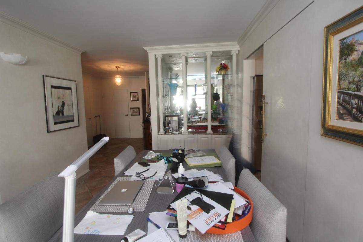
Dining Room Before Updates
Dining Room Before Staging
Dining Room After Staging
Dining Room Before Updates
Dining Room Before Staging
Dining Room After Staging
Living Room Before Updates

Living Room Before Staging
Living Room After Staging
Guest Bedroom Before Updates
Guest Bedroom Before Staging
Guest Bedroom After Staging
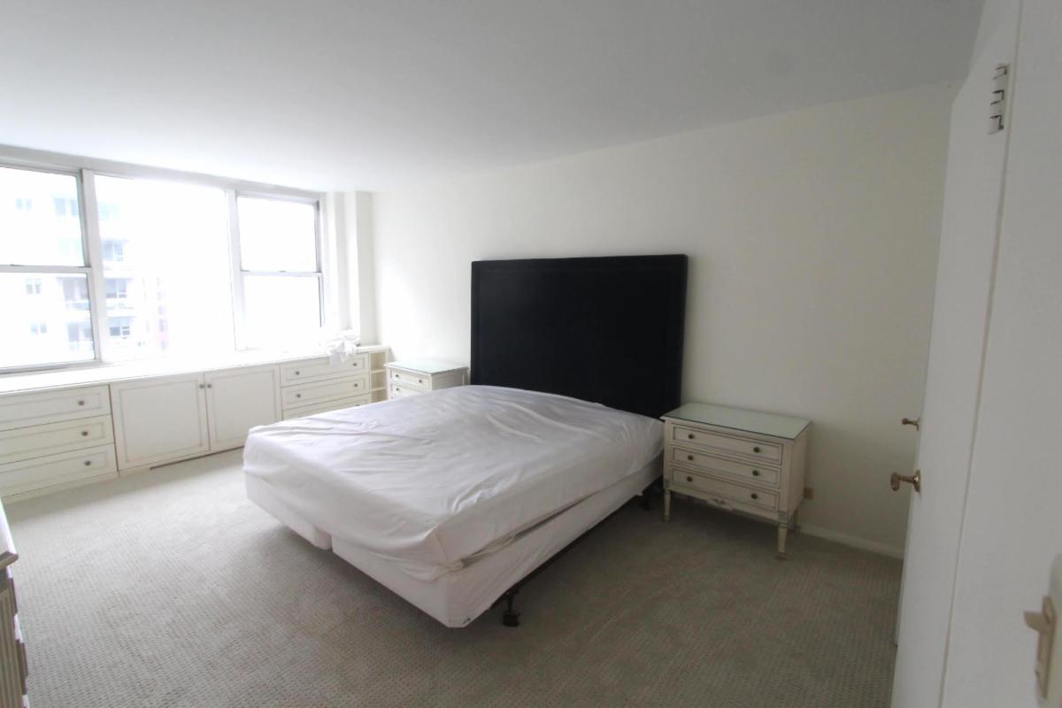
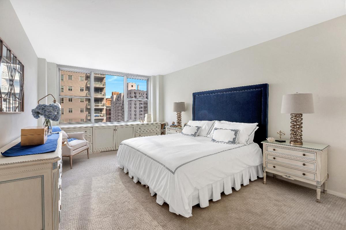
Master Bedroom Before Updates
Master Bedroom Before Staging
Master Bedroom After Staging
|
To view the entire report from Corcoran click
here.
|

Tips and Tricks of the Trade:
Ways to Create a Stylish Small Home Office
Don't think you have the extra space for a home office? Odds are that you do. A little creativity and perhaps some elbow grease is all it takes to carve out more room. So whether you are trying to squeeze in a small desk or a fully loaded workspace, these ideas will help you whip up a surprisingly stylish, small home office.
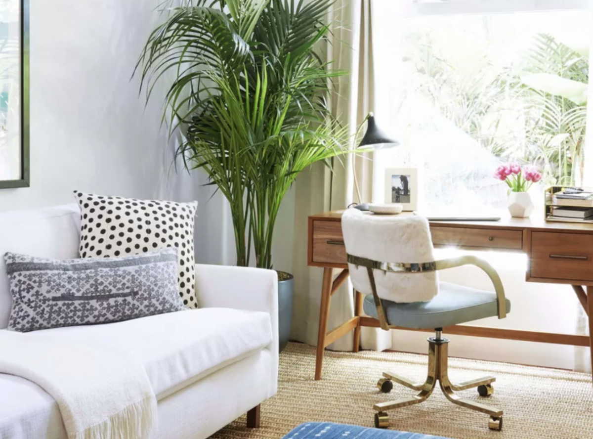
Change Your Living Room Layout
Switching up the furniture arrangement in this small living room created the space needed for a home office. To get the job done, we placed the sofa against the longest wall and then put the desk directly in front of the window. Doing so opened up square footage in the center of the space making the room feel open and airy instead of cramped and crowded.
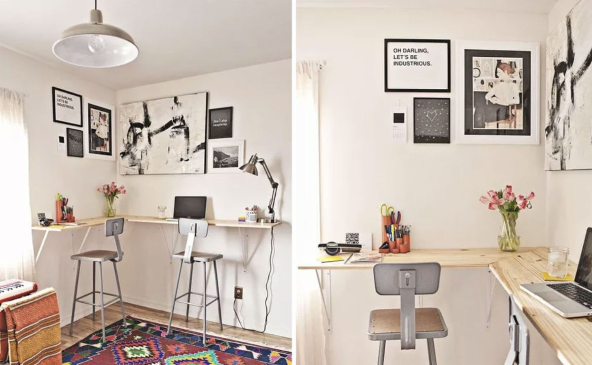
Sit or Stand Workstation
Sitting on your bum all day is not great for your health. In a nutshell, this project uses inexpensive wood and bargain basement shelf brackets to transform an untapped wall into a wrap around, bar height desk that you can use standing. When it is time to sit down, pull up a bar stool.
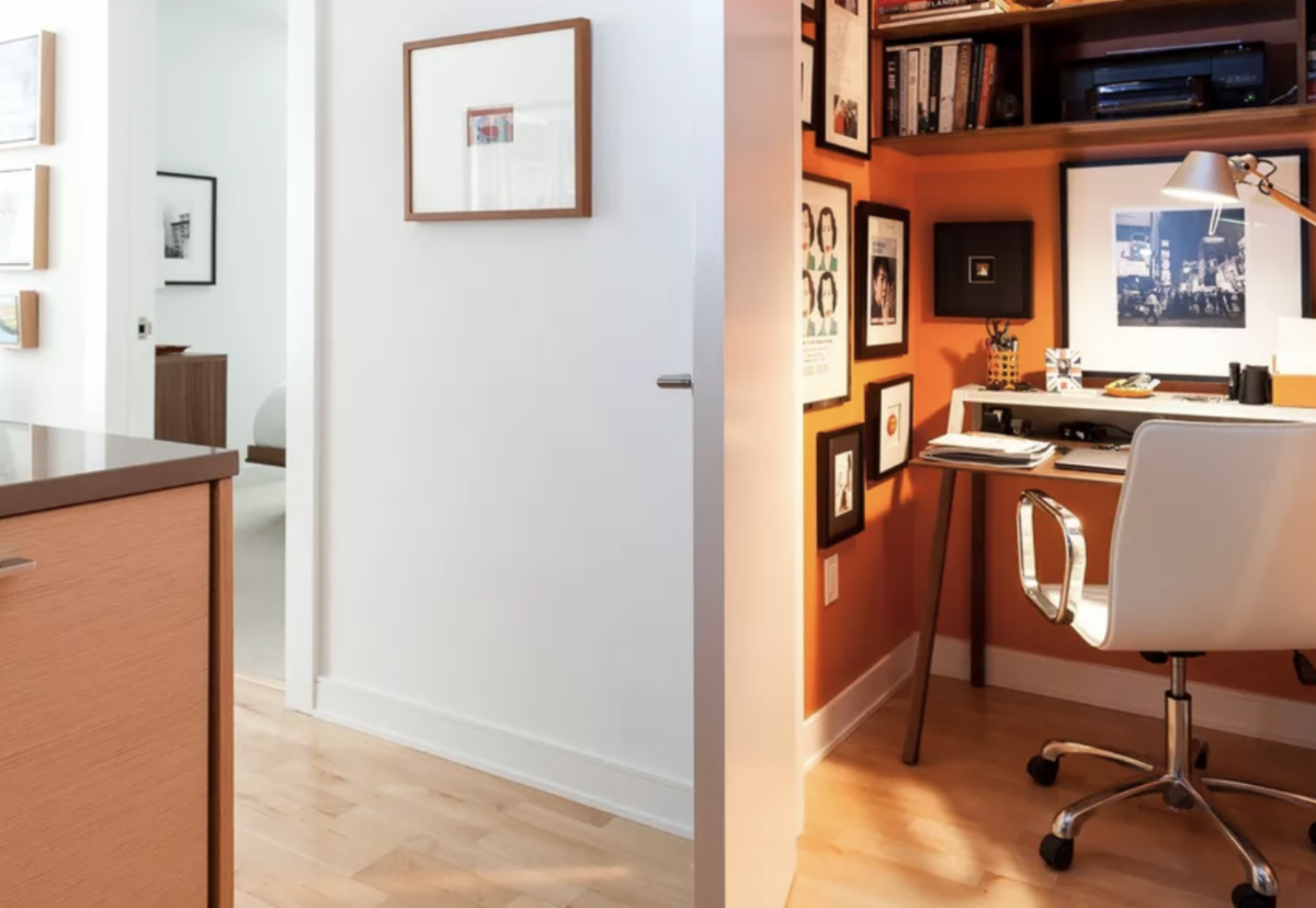
Turn a Closet into a Home Office
To make the most of the small space, the interior designer selected a narrow, low profile desk. The shelving above it makes room for books and a printer. Orange paint brightened up the nook with invigorating color. The best part is that when it is time to quit working, shutting the door keeps the office out of sight.
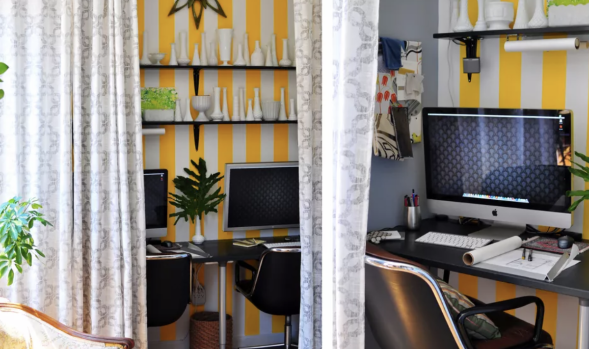
Room Divider Curtain
You can carve out a nook for your home office using a curtain as shown in this New York City apartment by Sheer and Company. The fabric "wall" spans the width of the space. When closed it separates the work area from the living room.
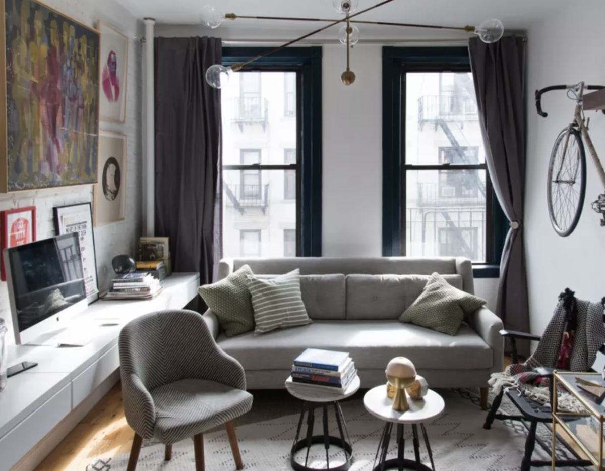
Floating Console
A floating wall unit that spans the left side of this New York City studio apartment doubles as a desk with drawer storage. To make it blend, the wall was painted the same shade of white. A collection of framed prints also keeps the small workspace from feeling obtrusive by drawing the eyes upward.
Wall-Mounted Furniture
A floating desk and wall-mounted storage unit transform the odd corner into a home office. The cute bar cart is stored underneath the desk when no one is working.
Cater-Cornered Home Office
Turn a vacant corner into a mini office by placing a desk cater-cornered.
To read more on Ways to Create a Stylish Small Home Office
here.
|
Did You Know.....?
These Are The 4 Color Rules
That Every Interior Design Fan Needs To Know
Color is often the most difficult part of a room for interior design fans to get right. That's because colors are fickle. There are so many shades to choose from and they need to be put together in the right proportions. Otherwise, they won't work together in harmony. Luckily, there are a few color rules that you can use to make sure your colors look balanced every time. We've listed them below. Read them over to master color in interior design once and for all.
The 60-30-10 rule
The 60-30-10 rule helps rooms feel balanced and visually interesting
The 60-30-10 rule is any interior design fan's best friend. No matter what your personal aesthetic may be or what you want your room to look like, you can use this rule to help make sure that your color palette stays balanced. In this setup, you'll use three colors. 60, 30 and 10 refer to the percentages of your design that each will make up.
Here's how it works: first, you'll choose one shade to be your dominant shade and take up approximately 60 percent of the room. Usually, this will be a neutral or some type of subdued hue that can take up a lot of space without feeling overwhelming. Next will be your secondary color, which is typically a bit bolder and takes up about 30 percent of the space. Finally, your accent color is your boldest shade and should make up the remaining 10 percent.
Take the photo above, for example. In this case, beige is the dominant color. You can see it on the walls and the sofa. Then, black is the secondary color. It's on the bookshelf, side table, pillows and dining chair and in the rug. Finally, coral is the accent shade. That can be seen in the throw pillows and potted plants.
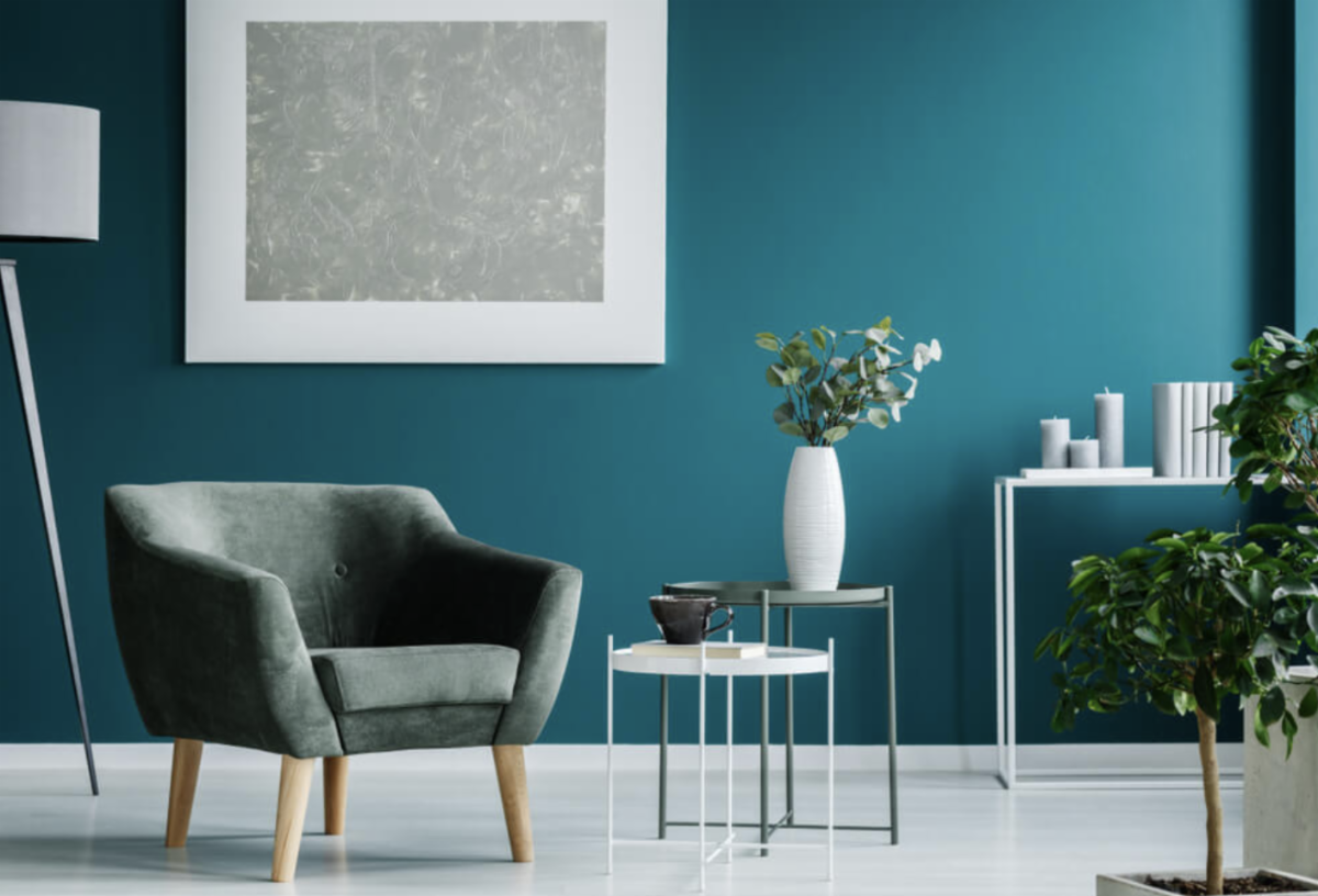
Warm vs. cool colors
Using warm or cool colors will set the tone for your space
The phrase "warm vs. cool colors" refers to where specific shades fall on the color wheel. Traditionally, shades like red, orange and yellow are thought of as warm colors because they are more vibrant. However, neutrals like brown and tan are also included in the mix. On the other side of the spectrum are the cool colors, or blue, green and purple, as well as gray.
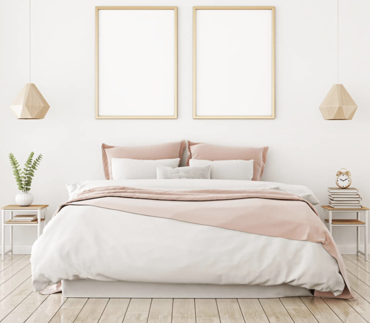
The choice of warm or cool colors will affect the energy of the space. Since warm colors tend to bring an upbeat and welcoming feel to a room, they're best in entertaining spaces. Think about using these shades in your dining room or kitchen. Cool colors, on the other hand, are more subdued. They work best in bedrooms and office spaces, where a calming energy is appreciated.
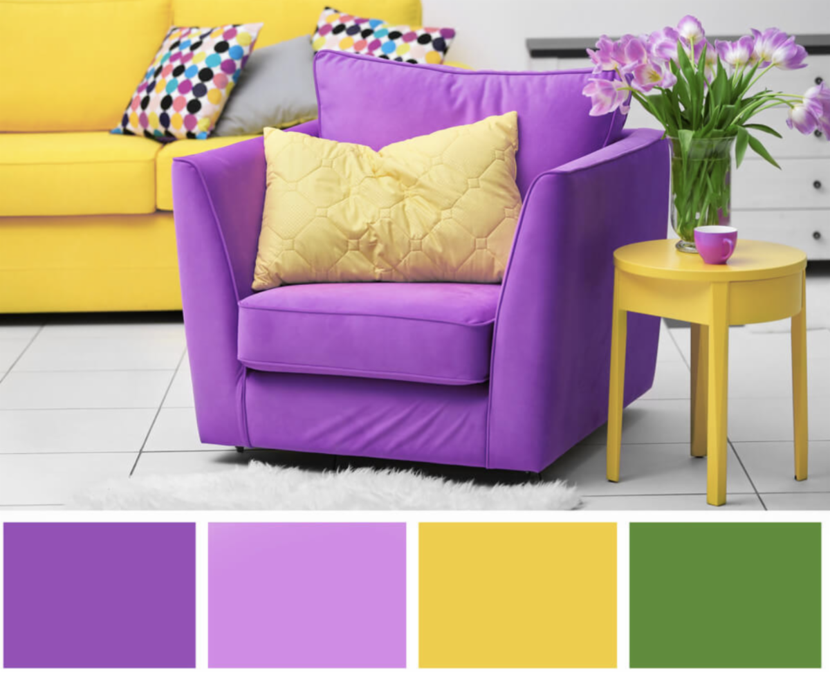
The complementary color scheme
Complementary colors are across from each other on the color wheel.
Of all the color rules that interior designers use, the complementary color scheme is often thought of as the simplest. That's because this color scheme only involves two shades. In particular, it uses two shades that are sitting directly opposite each other on the color wheel, meaning you get combinations like blue and orange, yellow and purple or red and green.
As you can see from the photo above, these color pairings are extremely high contrast, which means that - while they undoubtedly bring a strong energy into the space - they're ultimately best used in small doses. You should think of them as your accent colors and use plenty of neutrals to balance them out and provide a place for the eye to rest.
The analogous color scheme
If you have trouble navigating the color wheel, an analogous color scheme might be for you. For this one, all you have to do is pick a central color, then also use the colors on either side of it. Here, two colors will be primary colors and the third will be a mix of the two. For example, red, orange and yellow or red, purple and blue.
Since you're using three colors in this one, proportion will come in handy to make sure the space feels balanced. You may want to incorporate the 60-30-10 rule again to keep your proportions in check. And remember, you can always use different shades of the same color as another way to create visual variety.
Interestingly, if you're not a big fan of vibrant hues, you can also do an analogous color scheme using neutrals. Typically, this is referred to as a monochromatic color scheme. Here, all you need to do is mix black, white and gray together to create a sleek, modern look.
To read more on These Are The 4 Color Rules That Every Interior Design Fan Needs To Know, click
here!
|
|
|
|
| |
|
For More Info
During the Month...
|
|
| FREE Closet Organization, Open House, and Moving Checklists 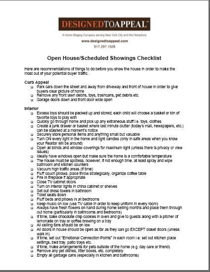 Download your FREE Closet Organization, Open House, and Moving Checklists. |
|
|
Try our
Home Staging Savings Calculator developed by the Real Estate Staging Association (RESA)
Click on the calculator above, which will launch in a new window. For more detailed instructions, click here.
|
|
|