|
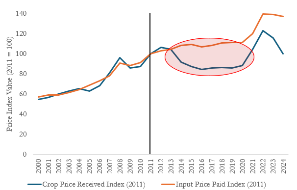
Figure 1 compares the annual index value from 2000-2024 for the two indices
with 2011 as the base year. The price received index in 2012 was 102.8%, meaning
that the crop price received, on average, in 2012 was 2.8% higher than in 2011
(base year = 100%) . The red circle in Figure 1 shows the beginning of a divergence between input and output prices. In 2013, when writing the 2014 farm bill, the index for input prices paid was almost exactly the index for output prices received. This is where most of our current farmer safety net support stems from, and since then, we’ve seen a major divergence in the two indices, with the widest gaps between 2014 – 2020 (USDA-NASS). From 2021 – 2022, we saw both indices increase, but the gap remained, and the divergence has grown wider in 2023 and 2024 due to declining commodity prices.
Another way to view the indices is to calculate how they change year to year.
Figure 2 plots the same indices as Figure 1 but shows the yearly change between
the index values. Using this percentage change helps producers understand 1) the
volatility of crop output prices and 2) the magnitude of change as compared to the
previous year. A key takeaway is that input prices are less volatile (in terms of
yearly % change) than output prices. Secondly, the percentage change in crop
output prices between 2023 and 2024 (-13.39%) is much larger than the
percentage decrease in input prices (-1.38%) during that period.
Without any relief in the form of improved crop prices received, figure 1 suggests
farmers will continue to suffer from cost/price squeezes and eroding profit
margins. Further, figure 2 shows the magnitude of that spread between the indices in Figure 1; if input and output prices continue this trajectory, an improved farm safety net will be warranted. This will be at the forefront of every producer’s mind, with ongoing Farm Bill debates in 2024.
|