|
In times like these some of us depend on photography to keep sane. Whether you are a photographer or a viewer, it is infinitely inspiring and entertaining.
It's good to know you are there and reading this Newsletter!
|
|
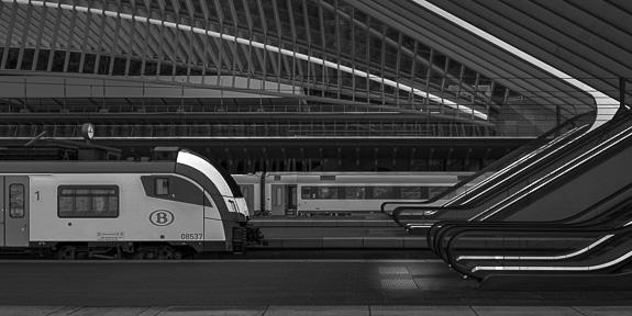
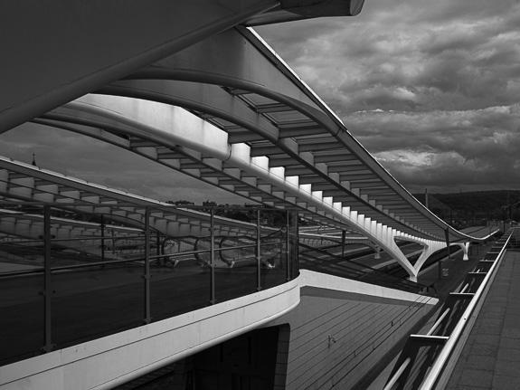
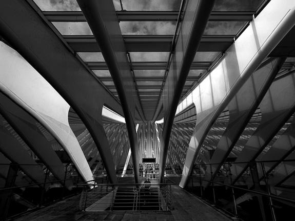
Liège-Guillemins Railway Station
|
When I traveled by train to this Belgian railway station in summer 2019, I felt visually excited and overwhelmed. I was immediately taken by architect Santiago Calatrava's flowing skeletal shapes and the sense that no two beams are the same anywhere. I noticed that the travelers were well protected from the weather, even on extended platforms, and that the sunlight poured in through the massive ceiling of skylights.
In spring 2020 I decided to dive into the photographs I had taken that day and get to work. Though it had been a bright, cheerful day when I traveled there, I chose to present the station as a dark, moody, almost deserted place, to symbolize our many months of hunkering down for the COVID-10 pandemic. This collection is a very different black-and-white interpretation from anything I've done before. Each photo is darkened way down, then light is restored only to those elements that most caught my attention. The process was intuitive and totally absent of a formulaic approach. A Gallery of these photos has been added to the website under the Special Projects Folder. Click here.
|
| |
"Covered Escalators to Platforms"
|
|
| |
"Level Above the Platforms"
|
|
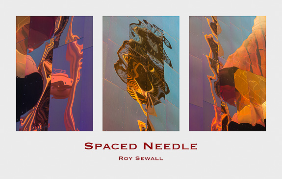
My April Newsletter indicated that Carol Walsh and I put our joint exhibit on hold because of the pandemic. We thought that might be two or three months; little did we know.
I've gone ahead and posted the photos that were going to be exhibited. Please click here. I believe the new triptychs and multi-photo posters are greater than than the sum of the parts. The Museum of Pop Culture in Seattle, designed by Frank Gehry, is wrapped with metal panels. In the poster's photos below the panels are reflecting the nearby Space Needle at sunset. Crazy stuff.
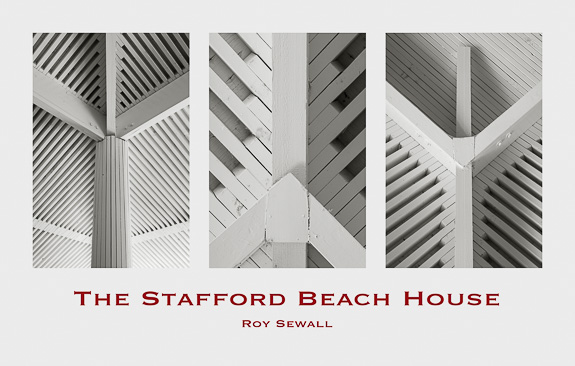
I showed the photos below before in the April 2018 Newsletter. I now believe they work together better as a triptych than as separate photos.
The Stafford Beach House was a grand old structure in Captiva, Florida The house has since been taken down.
Thanks to great friend Tom Field for the opportunity to stay there as his guest.
|
In the (extremely unlikely) event that you haven't yet examined my entire website, please check out
|
|
On-Line Purchase of Prints
|
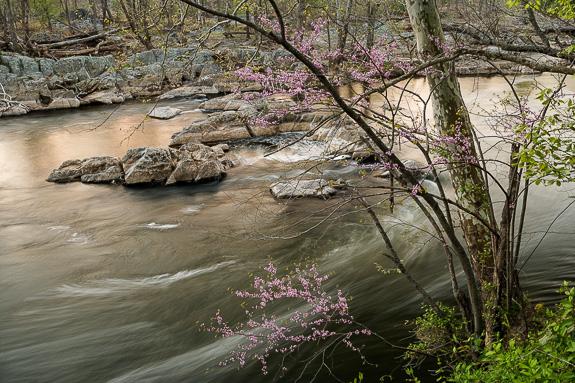
For the first time you can now purchase prints of selected photographs directly from my website, from the Potomac River and C&O Canal Galleries. For now, prints of traditionally shaped photos can be printed at 8x12, 10x10, 10x15, and 12x12, on Epson Exhibition Fiber, a sweet high-end fine art photo paper. Panoramic-shaped photos can be printed at 10x20, 10x28, and 10x30, on a relatively inexpensive glossy paper. When you purchase photos on-line, your order goes directly to a national-class third-party company; they do the printing and ship the prints directly to you.
|
| | A side-channel of the Potomac River next to the C&O Canal's towpath |
|
Photographer's Corner: Brightness and Visual Weight
|
I say there should be no rules in photography, but we should be aware of human nature - how people are likely to react.
We can observe that viewers' visceral reactions to photographs are driven by the subject, light, composition, and color (or black-and-white tones). I believe that all four of these "attractors" have to be in good condition to make a great photograph; we've observed that if any of them are lacking viewers will be less pleased with the photograph. However, even if they are all in good condition, there are over 60 "detractors" that can ruin a photo. Awareness of these issues is very helpful for creating successful photographs.
One of the most prevalent detractors I see in work by less experienced photographers is bright white or near white skies with no detail. When you look under the covers to figure out why this is a problem, you find that bright areas, like white skies, create a lot of "visual weight," meaning that the viewer cannot help but go look there. But when the viewer's eyes get there, there is nothing to see. It's totally counterproductive, as it takes the viewer away from what you want her/him to look at.
Take a look at the sample photograph below. While in Ireland in 2015, I stumbled onto a wedding photo session in progress on a country road. I snapped a few quick shots for fun but didn't want to interfere with the official photographers.
Do you notice how much the white sky in the upper left corner is a distraction that pulls the eye away from the couple, who are the point of the photograph? Even the little white triangle over their heads is distracting. These bright white areas have way too much visual weight.
My own solution to this is to avoid white skies in all serious photographs. They never help a photo, and if you work the scene hard enough you can get white skies out of the frame. (I don't worry about them in casual snapshots or record shots.)
As artists we need to direct the viewer's eyes to where we want them to look. Part of this process is to manage the visual weights of the various objects and areas. I call these objects and areas "elements," as in compositional elements. In the photo above, the elements are the people, the road, the trees, the bushes way in the back the sky - all the things in the scene. (Note that the word "elements" can have other definitions by other photographers.) So in analyzing a photograph I will identify elements with inappropriate visual weights that are creating a distraction, or conversely, not enough emphasis.
I'm aware of six contributors to an element's visual weight: size, position in the frame, brightness (white skies are an example), sharpness, contrast, and warm colors. In future Newsletters we'll talk more about visual weight.
|
|
Photography Instruction via Capital Photography Center
|
"Taking Your Photography to the Next Level" continues to be a well-attended on-line course with an interactive Zoom session. Interactive 2-hour Zoom Critique Groups are also scheduled every month or two. And we have started having One-on-One Critique sessions of one or two hours, tailored to the participant's particular goals.
In addition, one or two field trips are planned this fall to Great Falls at dawn, my favorite time of day and favorite time of year.
These on-line courses and field trips are typically scheduled by the Center one or two months in advance, so please check its website periodically.
|
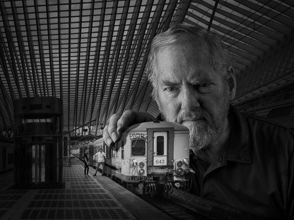
My frequent collaborator Carol Walsh recently did a series of selfies. They were mystical and humorous. Then she challenged me to do one.
|
| |
I never got to have my own train set as a kid. Sad!
|
|
|
Contact Info for Roy Sewall Photography
Commitment to:
Excellence
Continuous technical and artistic growth
Customer satisfaction
My community
Mentoring and supporting other local photographers
|
|
Hook your readers with a direct and compelling headline.
|
|
|
|
See what's happening on Facebook
| |
|
|
|
|
|
|