Pantone’s 2026 Color of the Year | | |
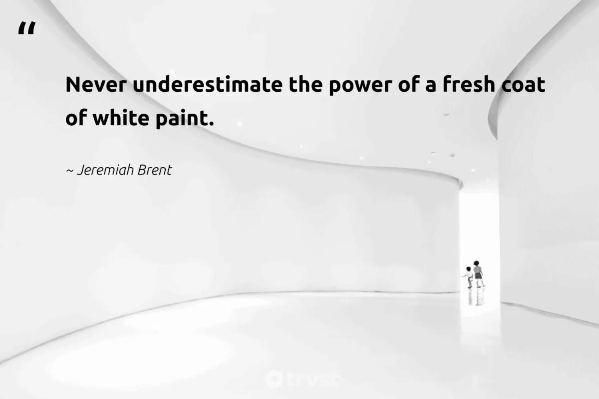
“In paint, every gallon begins as a white base, and color formulas are added to create every other shade. Beyond paint, white is the safest option across home, apparel and packaging because it is easy to live with, easy to match and rarely polarizing. Because white already serves as the starting point across categories, naming it “Color of the Year” reinforces an existing baseline rather than pushing consumer behavior in a new direction.”
Thomas McMillan, professor of practice in marketing and director of the Center for Retailing Innovation at Texas A&M University’s Mays Business School
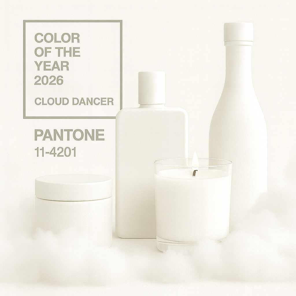
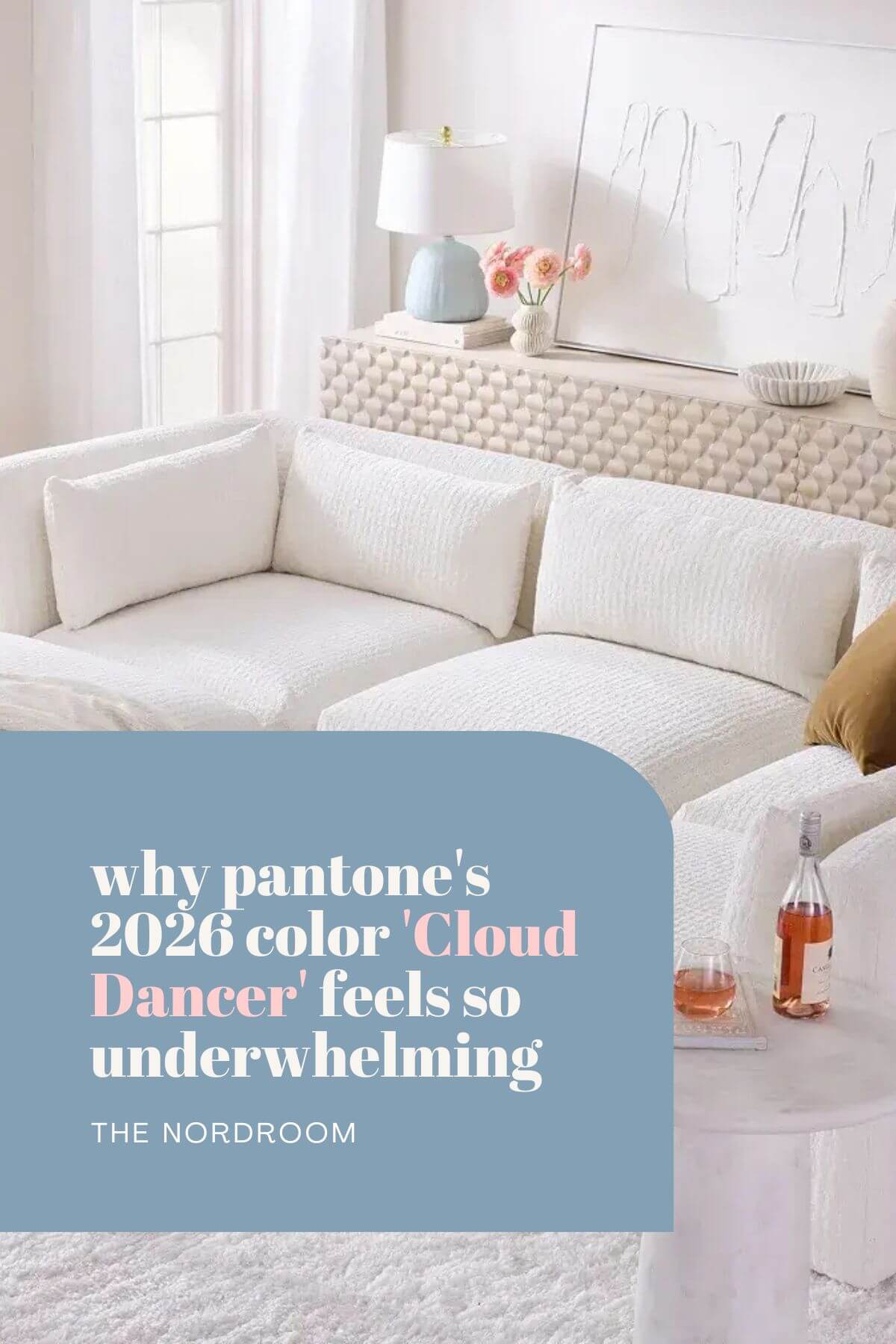
| | Pantone’s 2026 Color of the Year is a soft white called “Cloud Dancer,” and it has started a big argument because some people see it as peaceful and calming, while others see it as dull, out of touch, and even connected to ideas about race and “whiteness.” To understand this debate, it helps to look at what Pantone says the color means, what critics say it means, and then step back to think about the symbolism of white and the idea of “chromaphobia” , a fear of color itself. | | |
Pantone
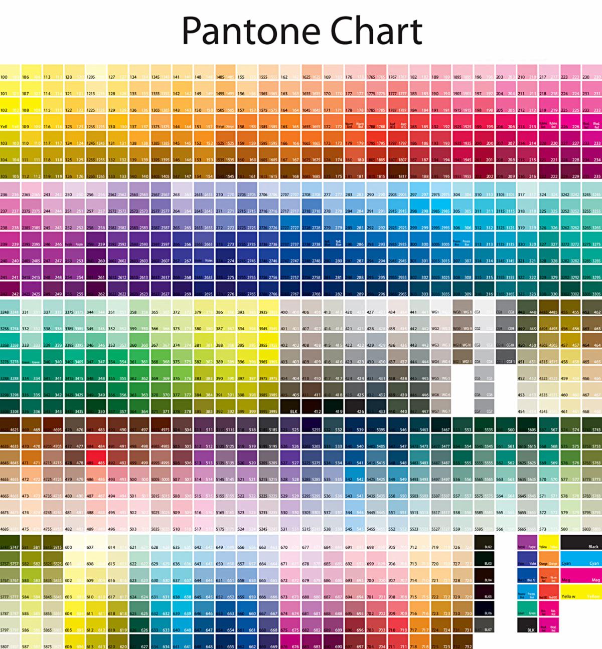
Pantone is a company that makes color systems that enable designers in different locations to perfectly match a color using an alpha-numeric code. That way a factory in China, or a printing press in London can be sure they are using the exact shade of red the designer or artist envisioned in their specifications.
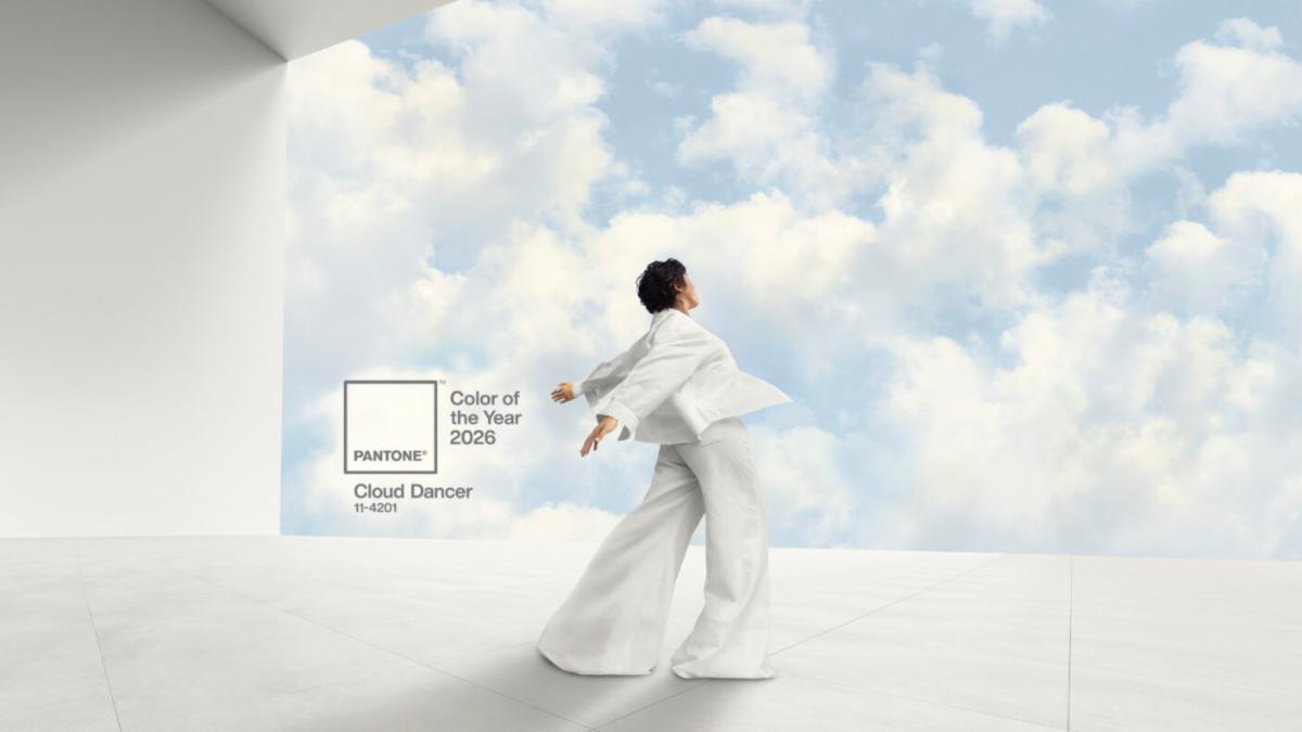
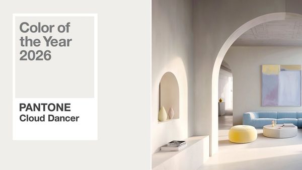
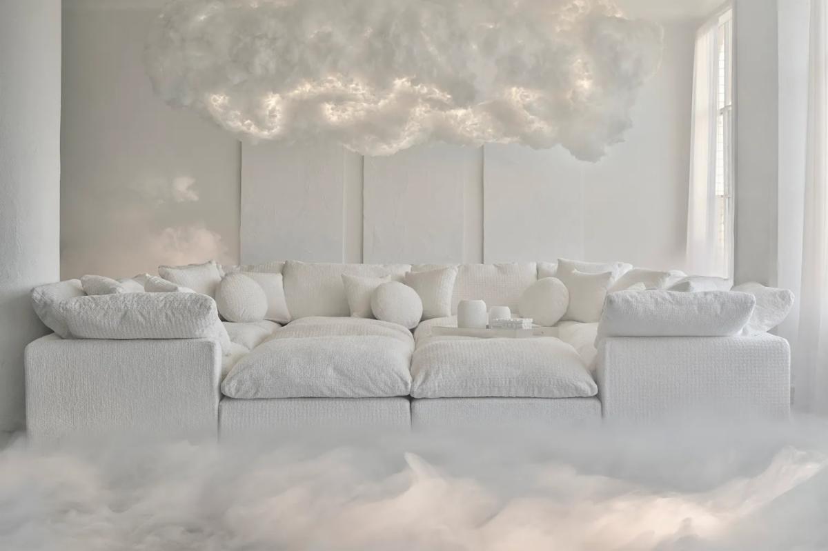
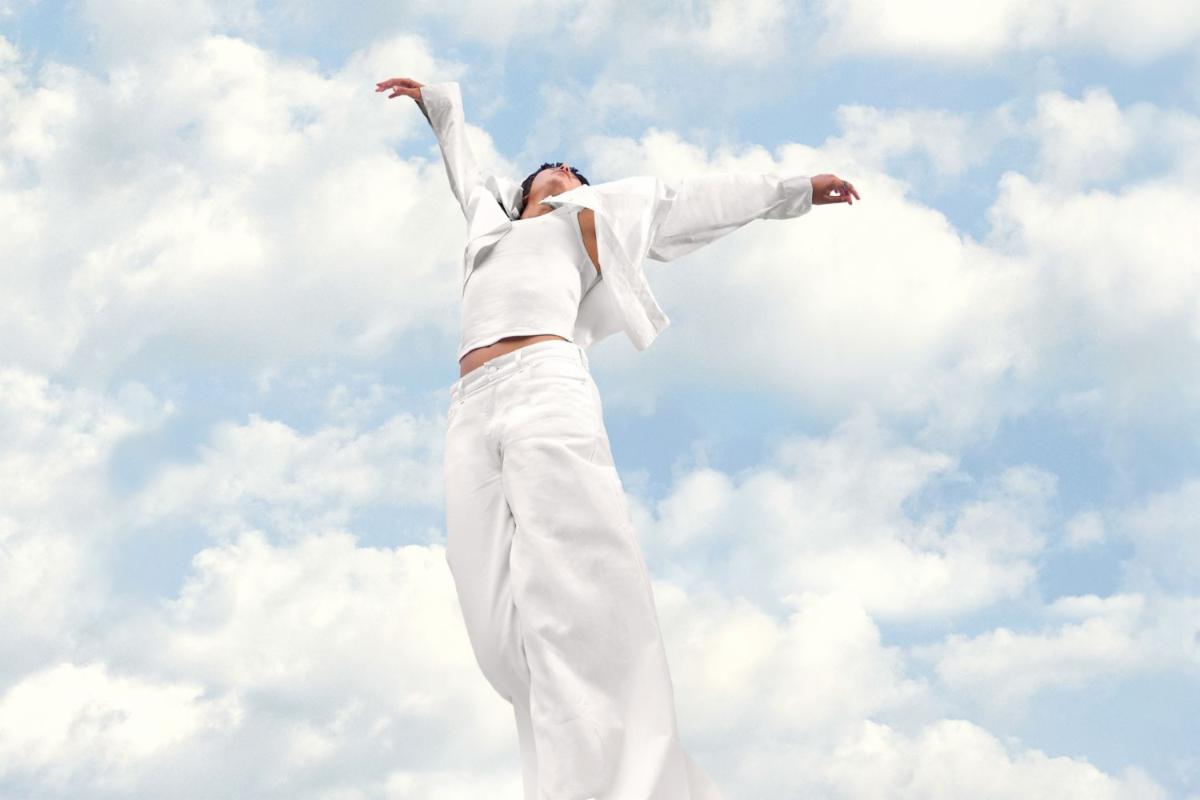
Pantone is also famous for picking a “Color of the Year” that designers, brands, and artists pay attention to. For 2026, they picked Cloud Dancer, which they describe as a “billowy, balanced white” that is calm, soft, and peaceful.
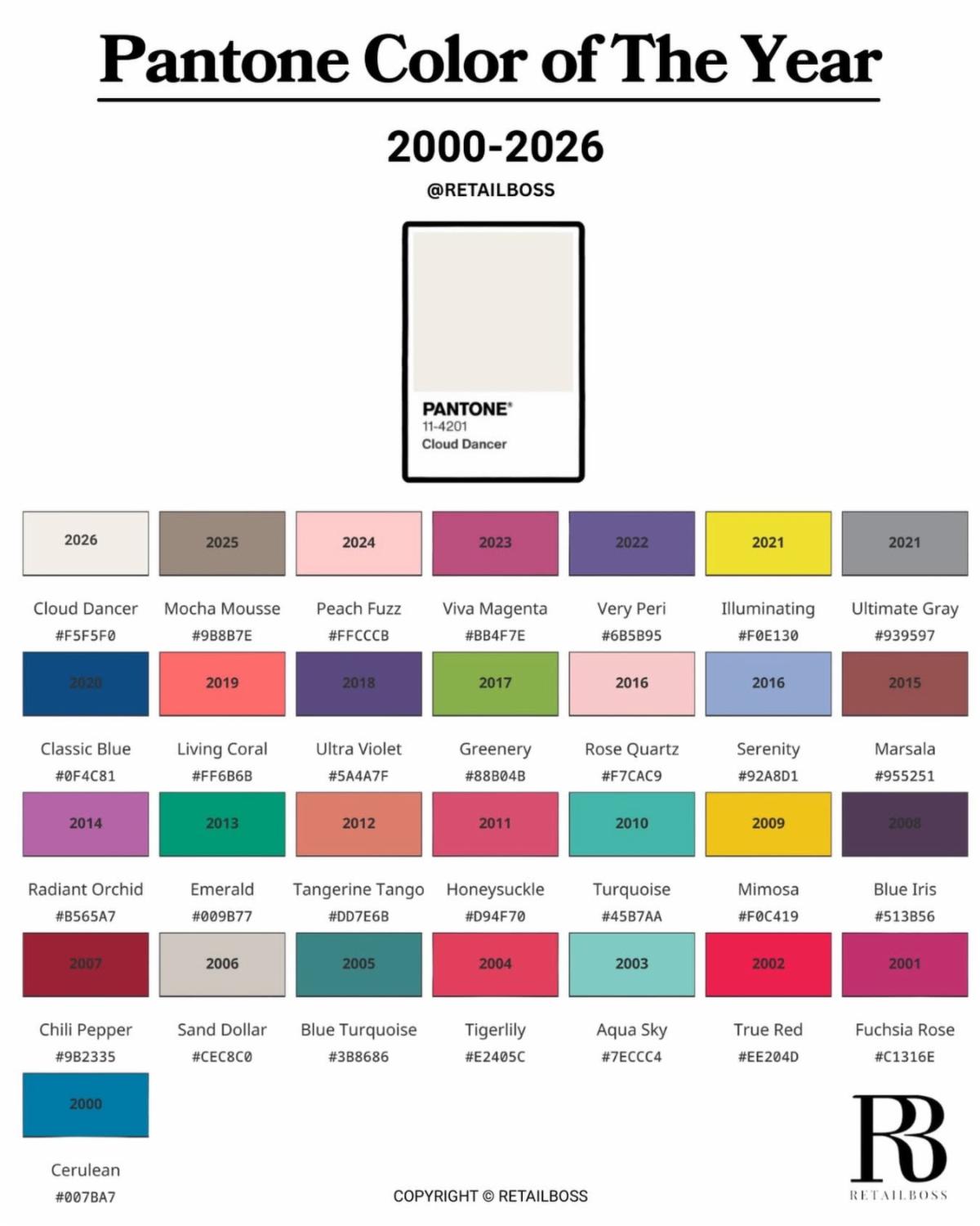
The Pantone Color Institute has been choosing an annual color of the year since late 1999 when it designated Cerulean Blue 2000’s Color of the Year. It called the soft blue shade the “Color of the Millennium” and said it inspired hope. Each year’s color is influenced by everything from movies and fashion to art and travel destinations, and more. Colors are also inspired by lifestyle trends, new technologies, sports and socio-economic conditions.
| | |
The company's vice president, Laurie Pressman, said in a 2023 interview that the Color of the Year initiative was created as an "educational program" to "engage the design community and color enthusiasts around the world in a conversation around color." "We wanted to draw attention to the relationship between culture and color," Pressman continued. "We wanted to highlight to our audience how what is taking place in our global culture is expressed and reflected through the language of color."
A Pantone spokesperson told TODAY.com, “The Pantone Color of the Year selection process is driven by the color/colors that are bubbling up across design and tying this to the zeitgeist. The emotional resonance inherent in the color is key to the selection process.”
Natalia Casas, strategy director at Ogilvy, wrote on LinkedIn, “All of us in advertising and marketing know that something like this doesn’t happen out of nowhere, and it’s connected to a bigger purpose, to a bigger idea that is slowly but surely penetrating society. This [choice] is not tone deaf. It’s intentional,”
During a December 4, 2025 launch event, Pantone’s president, Sky Kelley, said she knew Cloud Dancer would be a “pretty controversial” choice. Pantone’s pick, she said in a speech caught on video by CNET, “sparks a conversation about color that everyone can participate in.” She added, “At Pantone, we don’t dictate that conversation, we facilitate it.”
| |
Since its launch in 2000, Pantone's Colour of the Year has become a powerful industry signal.
Past choices have included the optimism of Living Coral, the calm confidence of Classic Blue, the vibrancy of Viva Magenta, and most recently softer, emotionally driven tones like Peach Fuzz and Mocha Mousse.
These colours don't just live on trend forecasts - they show up in fashion collections, beauty launches, interiors, packaging and even technology, shaping how products are marketed and how consumers imagine the year ahead.
As always, the designation of Cloud Dancer as color of the year has landed with commercial force. Brands have already moved quickly. Play-Doh launched a limited-edition Cloud Dancer clay pot. Motorola has revealed a special-edition smartphone finished in the shade and embellished with Swarovski crystals. Spotify even curated a “bright, light, soft and clear” playlist inspired by the colour.
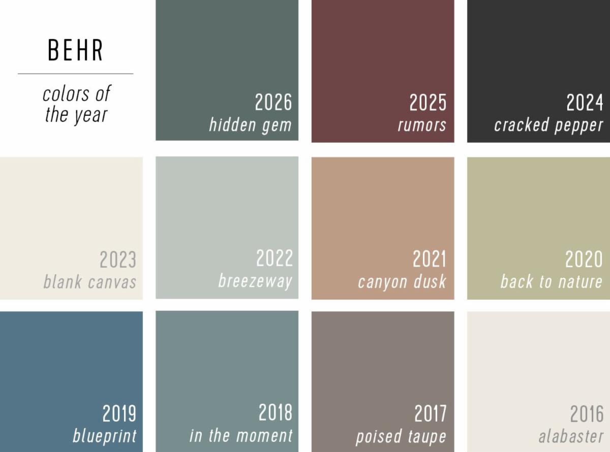
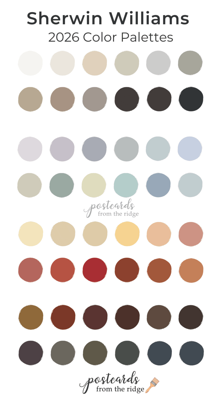
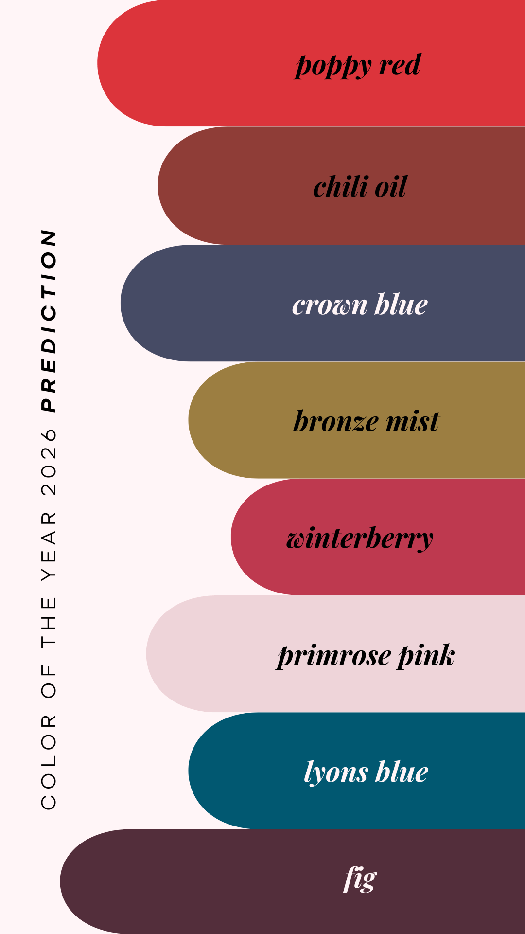
Other companies like Sherwin Williams, Behr, Benjamin Moore and WGSN also choose an annual color of the year. Benjamin Moore chose Silhouette AF-655, a “luxurious burnt umber with delicate notes of charcoal” as its 2026 color. WGSN opted for Transformative Teal, the color “for a period of change and redirection.”
| |
What Pantone Says Cloud Dancer Means
“Cloud Dancer visually represents a space to create, like a blank page ready for you to turn your inspiration into reality,” the spokesperson said, in part. “It gives us the ability to become receptive both to what can be and what’s ahead as Cloud Dancer suggests the inner peace we feel after clearing the noise around us.”
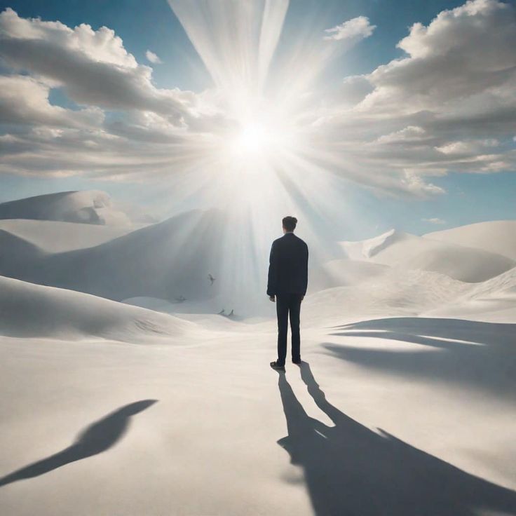
Explaining that the name plays a major role to “conjure up a feeling,” the spokesperson said that Cloud Dancer “reflects a universally shared experience: wherever we are in the world, we all look up to the buoyant clouds for inspiration, wonder, and to spark imagination.” She added, “In the simple act of looking up, we’re connected by the drifting lightness of clouds. That universality is a huge part of why Cloud Dancer was selected as the Pantone Color of the Year 2026."
The company says this white represents slowing down, blocking out “distractions,” and creating space to think, rest, and start over in a noisy, stressful world. Pantone’s vice president has said the color reflects a search for balance between our digital lives (screens, social media, constant alerts) and our basic need for human connection and quiet.
In other words, Pantone wants people to see Cloud Dancer as gentle, pure, and open—like fresh snow or clouds on a peaceful day, not like something harsh or political.
“Skin tones did not factor into this at all,” Vice President Pressman said, noting Pantone has been asked similar questions in the past about other color picks. “With Peach Fuzz and then with Mocha Mousse, people were weighing in and asking if this was about skin tones. And I think we were going, ‘Wow, really?’ Because for us it’s really about, at such a basic level, what are people looking for that color can hope to answer?"
| | |
Why Some People Like the Choice
Even though the backlash is loud, some people genuinely like that Pantone chose a soft white. They feel the color fits the mood of a world that feels stressed and chaotic.
People who like Cloud Dancer often say things like:
- It feels simple and clean in a time when everything feels complicated and messy.
- It is easy to use with other colors in design, fashion, and interiors, because white goes with almost anything.
- A lot of weddings, minimal homes, and “calm” Instagram aesthetics already use soft whites, so this choice makes sense with current trends.
Some planners and designers online were happy because they already use a lot of whites, creams, and neutrals, and Cloud Dancer matches what they do. For them, the color is restful, not “boring,” and they see it as a symbol of quiet hope and a fresh start.
According to Pantone, Cloud Dancer "is not just a colour, it's a mindset" and reflects a collective desire to slow down, reset and find calm after years of visual overload.
| | |
Why Many People Are Angry or Unimpressed
On the other hand, many people reacted very strongly against Pantone’s decision to celebrate a white as the Color of the Year. Their complaints fall into a few main groups: it feels boring, it feels out of touch, and it feels loaded with racial meaning.
“It’s not even a color”
Lots of social media users called Cloud Dancer dull, lifeless, or lazy. Some mocked it by comparing it to mayonnaise or unseasoned chicken, joking that Pantone had picked “nothing” as its big, inspiring color.
-
People joked that Cloud Dancer is “otherwise known as white,” meaning it is just the default background, not a bold choice.
- Some said Pantone missed a chance to choose a rich green or warm earthy color that matched other paint and design trends that felt more hopeful and grounded.
So one part of the backlash is simply about taste: people wanted something richer and more colorful, not another soft, safe neutral.
| | |
“This feels tone‑deaf to the world right now”
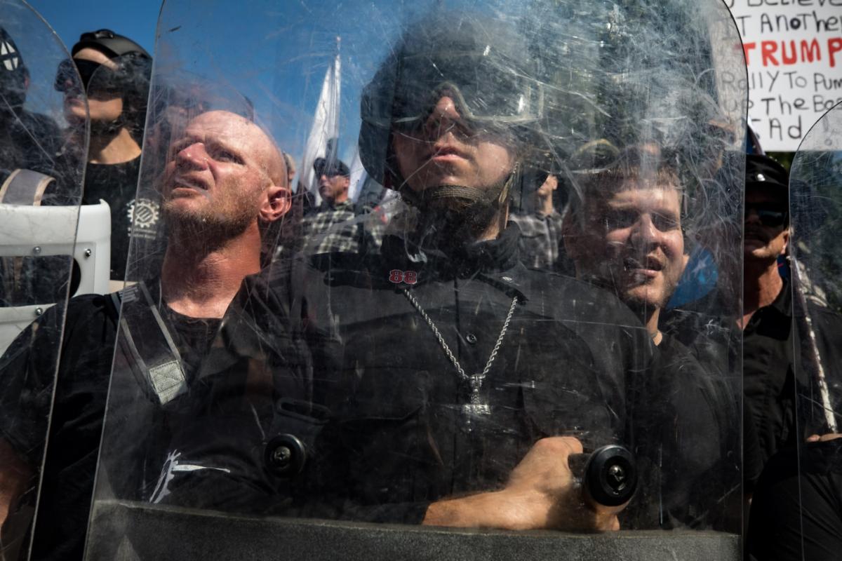
It wasn’t long before the choice was slammed by critics as tone deaf—some have used the term “Pantonedeaf”—and the color was accused of evoking white supremacy in a year many diversity, equity and inclusion efforts were cut and as watchdog organizations warn the ideals of white nationalism are becoming normalized in mainstream politics.
A lot of critics say the problem is not only that Cloud Dancer is plain, but that picking a pure white feels out of step with what is happening in the world.
The last twelve months have been marked by mass upheaval in the U.S. The assassination of right-wing commentator Charlie Kirk shook the country to its core amid the backdrop of rising political violence against notable figures, including the shooting of two Minnesota lawmakers and their spouses, among other attacks. The upheaval has continued across 2025 with mass protests and the recent shooting of two National Guard members, one of whom was killed, while another remains injured.
- 2025 was characterized by political fights over diversity, equity, and inclusion, and some governments cutting DEI programs.
- There are intense debates about race, white nationalism, and how “whiteness” gets treated as a norm or standard in culture and politics.
- At the same time, there are wars, refugee crises, censorship concerns, and a general sense that many people cannot simply “shut out” the world and relax in a quiet white room.
Mathew Boudreaux, Instagram influencer and owner of Mx Domestic Fabric Shop, said the color choice is “hard to separate from the broader cultural context we’re living in.”
Anthony Bruno, an interior designer who closely follows Pantone’s yearly color choice, posted on TikTok to say he does think the color Cloud Dancer is “chic,” but asked if there was “a single person of color in the room” when the choice was made, adding, “to say that the color of the year is white in a time when we are experiencing a rise of white nationalism is just not great.”
Trend forecaster and influencer Mandy Lee said the choice is “beyond tone deaf and disturbing,” and internet personality RaeShanda Lias called it “the color of mediocrity.” Another queried if “Klanrobe White” had already been taken.
Vanity Fair correspondent José Criales-Unzueta wrote , "The whole thing sounds like it was lifted from a late-night show comedy skit. After a year of efforts by the Trump administration and corporations to roll back diversity, equity, and inclusion programs, alongside aggressive immigration crackdowns, it feels bold, and dare I say out of touch, to utter the words 'white is the color of 2026.”
Because of this, critics say that celebrating a white called Cloud Dancer as a kind of pure, calm escape ignores how whiteness is tied to power and privilege in many places. For people struggling with violence, racism, or poverty, the idea of “blocking out distractions” can feel like ignoring other people’s pain.
| | |
“White as a symbol of whiteness”
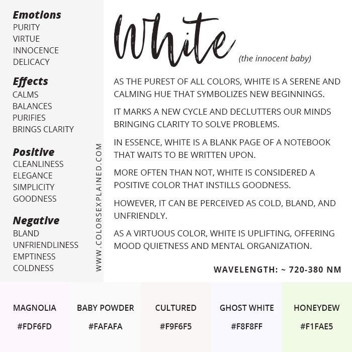
Some writers and designers argue that white is never truly neutral; it always carries meanings. White can suggest cleanliness or peace, but it can also symbolize control, dominance, or “purity” in a way that connects to white supremacy.
One art writer pointed out that Pantone’s language about Cloud Dancer “standing above” other colors makes white sound like the standard that everything else is measured against. Positioning white as aspirational risks racial undertones, landing uncomfortably amid ongoing political and cultural conversations about race and representation
Other critics argued that elevating minimalist and pristine white spaces can feel far removed from the smaller, messier homes most people inhabit.
Pantone declared that skin tones did not play any role in the choice, but critics argue that pretending color is “just color” is itself a political move because it ignores how race and color are linked in the real world.
| | |
The Symbolism of the Color White
White has very strong symbolic meanings in many cultures, and these meanings are not the same everywhere. Understanding this helps explain both Pantone’s choice and the anger against it.
In many Western cultures, white is linked with:
- Purity and innocence: Brides often wear white wedding dresses to symbolize a new beginning.
- Cleanliness and order: Hospitals, clinics, restaurants, and some uniforms use white to suggest safety and sterility.
- Peace: The white flag is a sign of surrender or truce, and a white dove is a common symbol of peace.
These ideas are part of why Pantone can present Cloud Dancer as calming and hopeful.
In other cultures, white is linked to mourning, death, or ghosts. This shows that white can represent sadness, absence and emptiness too, not just cleanliness and goodness.
| |
White as “blankness” and erasing
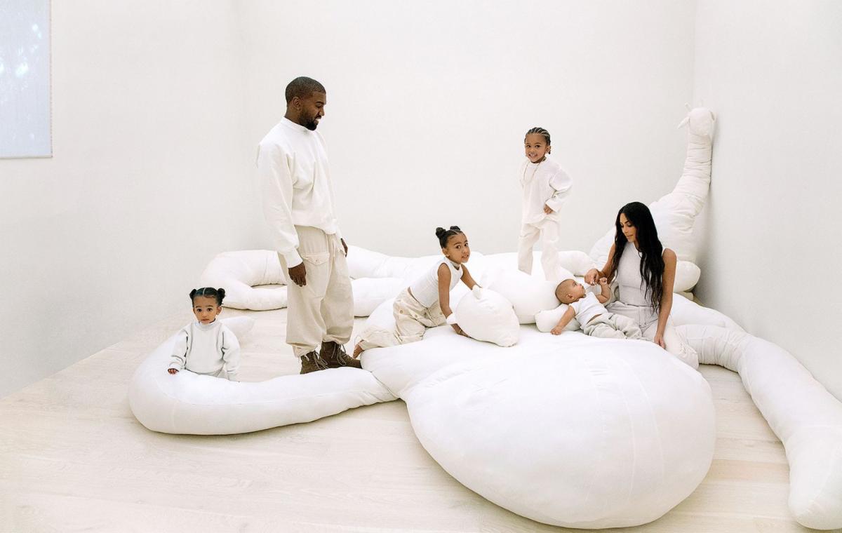
Designers have noted that celebrity homes full of white walls and furniture have come to represent wealth, control, and a kind of careful risk‑avoiding taste. In their view, Cloud Dancer does not just mean calm; it also whispers about status, safety, and staying away from anything that might offend. "White is a signal," Designer Chris Beaumont says, shaped by a decade of minimalist celebrity interiors – most notably Kim Kardashian's stripped-back home – that came to represent "wealth, order and distance from chaos".
He explains that white is "not about inspiration but being careful not to offend", with Cloud Dancer embodying "austerity, moral minimalism and the idea that neutrality signifies virtue".
White is often described as a blank page or empty canvas. That sounds creative, but it can also mean that everything else—color, difference, mess, history—gets wiped out or covered up.
Some critics say:
-
Calling white “blank” can hide the ways white spaces are shaped by money and power, like minimalist houses that signal wealth and distance from everyday mess.
-
Rather than offering calm white risks amplifying "a sense of bleakness", particularly when paired with cool, clinical lighting.
- For anyone who has spent years renting, staring at the same landlord-approved white walls and dreaming of one day adding some actual personality to their home, white might feel like a personal attack.
- What looks serene in a styled shoot can easily feel sterile at home, White can feel stark and unforgiving and you don't want your home to give hospital vibes.
-
When white spaces are praised as “neutral” or “timeless,” it can send the message that other colors, cultures, and ways of living are loud or wrong.
| | |
White, race, and power
There is a suggestion of whiteness as a baseline—the color, if it is indeed a color, to which everyone must compare themselves. And it is certainly a questionable choice at a time when the US has a President who, in 2020, reposted a tweet from a conservative publication that read, “Sorry liberals! How to be Anti-White 101 is permanently cancelled!” In his second term, he made good on that promise, calling for an end to government-funded DEI programs and denouncing a Smithsonian museum whose wall texts included a mention of “White culture.”
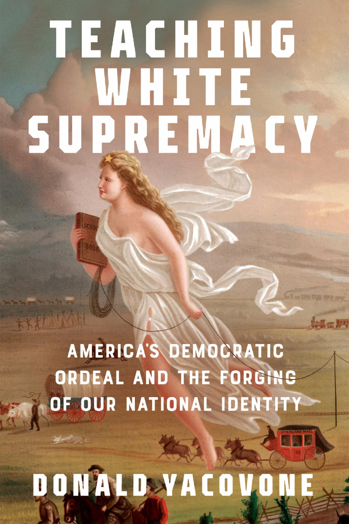
The color white is closely tied to ideas of race. “Whiteness” in social debates does not just mean pale skin; it refers to a system where being white is treated as normal and everything else is “other.”
- Some thinkers say that when white is treated as pure, neutral, or the default, it supports the idea that white people and white culture are the standard.
- In extreme forms, this can be linked to white supremacist beliefs that white people should stay on top or keep control.
Because of this, a big brand choosing a glowing white and praising it as above the chaos can feel very uncomfortable to people who live with racism or see white nationalism growing.
| | |
What “Chromaphobia” Means
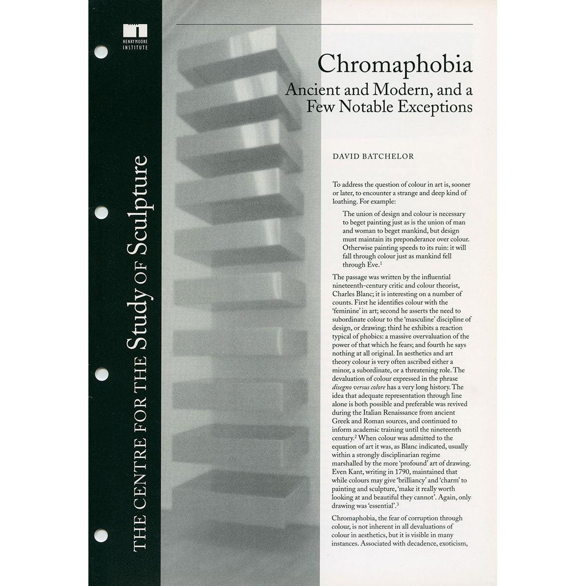
To understand another layer of this debate, it helps to look at “chromaphobia.” The term can mean a medical fear of colors, but it is also used in art and design theory to talk about a dislike or distrust of strong color.
“Chromophobia manifests itself in the many and varied attempts to purge colour from culture, to devalue colour, to diminish its significance, to deny its complexity. More specifically: this purging of colour is usually accomplished in one of two ways. In the first, colour is made out to be the property of some ‘foreign’ body - usually the feminine, the oriental, the primitive, the infantile, the vulgar, the queer or the pathological. In the second, colour is relegated to the realm of the superficial, the supplementary, the inessential or the cosmetic. In one, colour is regarded as alien and therefore dangerous; in the other, it is perceived merely as a secondary quality of experience, and thus unworthy of serious consideration. Colour is dangerous, or it is trivial, or it is both. (It is typical of prejudices to conflate the sinister and the superficial.) Either way, colour is routinely excluded from the higher concerns of the Mind. It is other to the higher values of Western culture. Or perhaps culture is other to the higher values of colour. Or colour is the corruption of culture.” David Batchelor
Chromophobia as a real fear
In psychology and medicine, chromophobia (or chromatophobia) is a strong, sometimes irrational fear of colors. There is even a word “leukophobia” for fear of white, showing that white itself can be scary for some people because of what it represents to them.
| | |
Chromophobia in art and design
Writers and artists also use “chromophobia” in a more poetic way. They use it to describe a cultural habit of distrusting or avoiding bright color, especially in Western art and design.
One art writer has argued that:
- Western thinkers have often treated color as wild, childish, or feminine, while treating black‑and‑white or pale colors as serious and intellectual.
- In this view, strong color gets pushed onto “others”—for example, it is associated with non‑Western cultures, women, children, or “poor taste,” while white or beige is linked to power and “good taste.”
This means when designers choose only whites and greys and call them “modern” and “clean,” they may be showing a kind of soft chromophobia: a preference for safety, control, and sameness over diversity and risk. Here, chromophobia is not about panic attacks; it is about a deeper discomfort with difference and vibrancy.
It is, I believe, no exaggeration to say that, in the West, since Antiquity, colour has been systematically marginalized, reviled, diminished and degraded. Generations of philosophers, artists, art historians and cultural theorists of one sort or another have kept this prejudice alive, warm, fed and groomed. As with all prejudices, its manifest form, its loathing, masks a fear: a fear of contamination and corruption by something that is unknown or appears unknowable.
| | |
How Chromaphobia Connects to the Pantone Debate
Cloud Dancer has become a symbol in a much bigger conversation about color, culture, and power. When people criticize the choice as “Pantonedeaf” or dystopian, they are reacting not only to the shade itself but to what they think it says about our time.
White as safe, color as “too much”
From a chromaphobia point of view, Cloud Dancer fits a pattern:
- Brands and elite tastes keep choosing whites and neutrals, calling them timeless, smart, or calming.
-
Bright or bold colors are seen as risky, loud, or tied to certain groups of people, so they are avoided in “serious” spaces.
For critics, Pantone’s pick looks like another moment where white is presented as the safest, best choice, while the rich variety of colors gets pushed aside. “It seems as if this selection, and the content created around it, was conceived in a vacuum completely removed from our collective social and political present. I’d hope a brand that has this much cultural impact wouldn’t operate with such a glaring blind spot.”
| | |
Blocking out “distractions” vs. facing reality
Pantone’s message about Cloud Dancer talks about turning down external distractions and finding inner peace. But what counts as a “distraction”?
- Some people hear that and think of social media noise and constant news alerts, which truly can be exhausting.
- Others hear it and think of real struggles—wars, racism, economic hardship—that cannot just be turned off with a white wall and a quiet room.
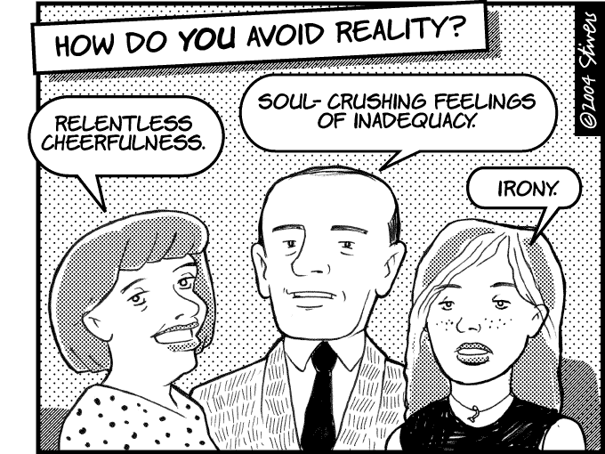
Critics worry that choosing a pure white as the “color of the year” and tying it to blocking out the world encourages people with privilege to drift away from hard truths instead of dealing with them. In that sense, Cloud Dancer can look like a symbol of emotional escape and even moral avoidance.
Might those external influences include the conservative turn in the US and parts of Europe; the wars in Sudan, Ukraine, and Gaza; and the widespread fears of censorship?
Pantone, a taste-making company whose pronouncements about color influence artists, graphic designers, and more, does not say in its release, which essentially implies that Cloud Dancer reigns supreme above all the other hues. Does the company mean for its Color of the Year to become another flashpoint in the ongoing discussion around white supremacy with its 2026 Color of the Year? Perhaps the evasiveness is part of the point here.
| | |
Cloud Dancer white misses the emotional depth many designers are chasing. The current trend has been toward colors that ground, envelop, and evoke mood, like earthy ochres, mineral greens, and smoky blues, rather than an airy white that feels neutral to the point of forgettability.
-
It feels like playing it safe. A white “canvas” doesn’t challenge or inspire; it empties rather than engages. In a year when many brands pick colors meant to nurture, calm, or express personality, white feels like the easiest, but also the least ambitious choice.
-
It lacks warmth and a sense of place. Part of the appeal of the 2026 trend toward “grounded calm” is the tactile and sensual nature of warm neutrals and nature-inspired tones. Cloud Dancer feels cold and detached in comparison.
-
It offers little visual identity. As a “blank slate,” Cloud Dancer doesn’t communicate personality or mood, leaving a space feeling more generic than expressive.
Interior designer James Mellan-Matulewicz says although he was surprised that Pantone's pick this year was "essentially the absence of colour", it is a bit like vanilla ice cream, in that "everyone likes it but it's nobody's favourite".
| |
Pulling It Together
Pantone’s 2026 Color of the Year, Cloud Dancer, sits at the center of a heated argument because color is never just decoration; it always carries meanings. Pantone suggests using Cloud Dancer to create a space for peace, rest, and a fresh start in a chaotic time, like a soft, open space where the mind can breathe.
Many fans agree and enjoy the calm, gentle feel of a soft white that pairs easily with other colors and matches existing minimalist trends. But critics see a different story: a big company lifting up white as the “above it all” neutral at a time of intense fights about race, power, and whose voices get heard, while also repeating a pattern where bright, rich colors get treated as risky or “too much".
The background of white as a symbol of purity, order, wealth, and sometimes emptiness, plus the idea of chromaphobia as a cultural fear or distrust of vivid color, helps explain why one soft shade of white has stirred such strong feelings. In the end, the debate around Cloud Dancer is really a debate about whose idea of calm and beauty gets to lead—and what gets erased when a very pale, seemingly “blank” color is held up as the ideal.
Was Pantone unaware of the uncomfortable undertones tied to celebrating white as an ideal, particularly amid ongoing conversations about representation and accessibility? I doubt it. Pantone says they created the Color of the Year Campaign because "We want[ed] to highlight to our audience how what is taking place in our global culture is expressed and reflected through the language of color."
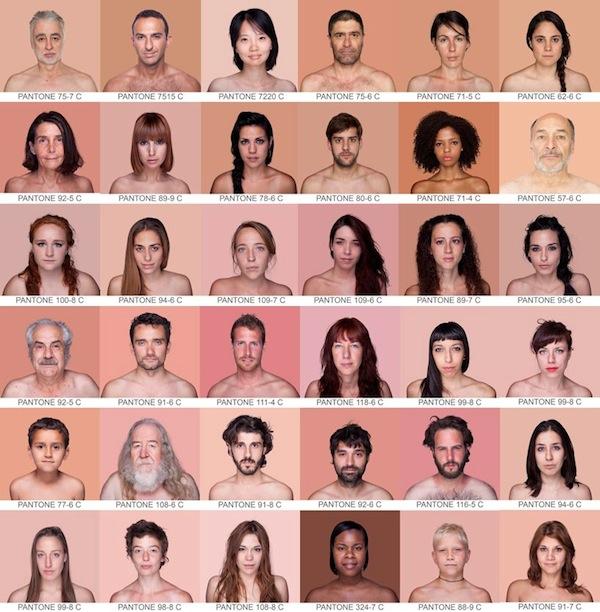
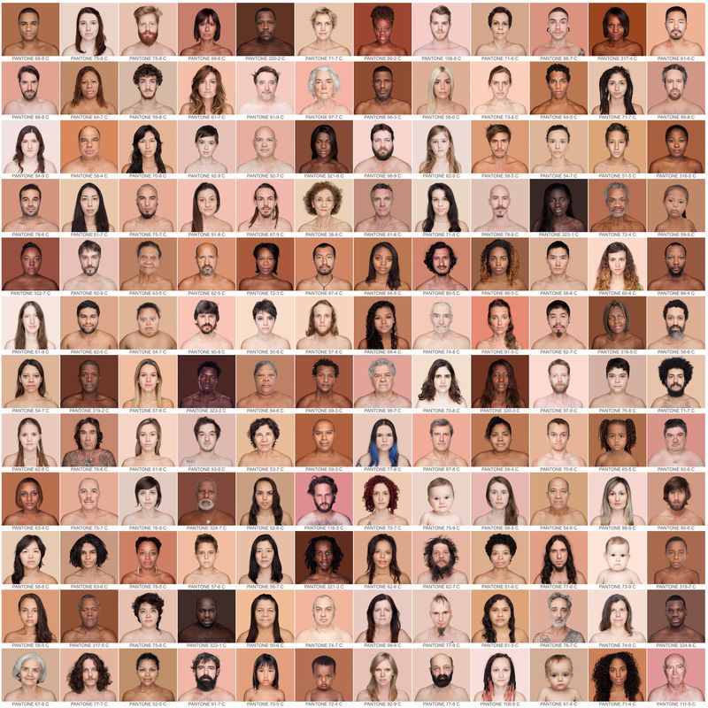
In 2012, Angelica Das, a Brazilian artist began photographing over 4,000 people of every color and matching each subject’s skin tone to hues from the Pantone printing color chart to codify a unique chromatic inventory. In 2018 the project, titled “Humanæ,” traveled the world was featured in National Geographic. Pantone has a long association of using their color charts to encourage us to think more deeply about the meaning of skin tone.
| | |
The real test will be whether "brands engage with that nuance honestly, or simply aestheticise the colour". For those tempted to embrace Cloud Dancer in all its pristine glory, one thing may be essential: a very good stain remover, kept firmly within reach.
Whether you’re an established artist seeking new horizons or a budding creative looking to elevate your work, I hope I have inspired you to consider some new ways to express yourself as an artist. When you paint with passion, you ignite your flames and inspire others to do the same.
Perhaps I can invite you to join my inclusive artistic “circle,” where I generously share all I know to support your creative
development. Don't hesitate to contact me if you want my
mentorship, guidance, and advice in exploring your artistic
path. It makes me happy to share my insights and my
knowledge with you.
| | |
If someone shared this newsletter with you and you'd like
to subscribe, please reach out to me below with your
email address. I promise, no spam, no overloading your
inbox, just the good stuff.
I welcome the opportunity for connection, conversation, cooperation, collaboration, and commissions.
Live heARTfully
| |
P.S. If you didn't get the chance to download your free gift from me: Here is my "Inner Artist Inspiration Package" - a series of illustrated quotes in watercolor based on flower photos taken by family and friends.
| | | This happened in December | | | |
Gold Coast Watercolor Society
Wet Paint
Sugar Sand Nature Center
300 S Military Trail,
Boca Raton, FL 33486-4302
November 19 to January 3
Reception December 6, 2025
2:30 pm to 4:00 pm
| | | | |
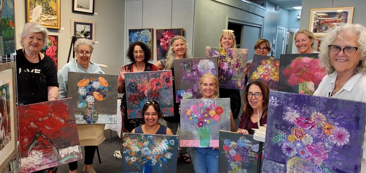
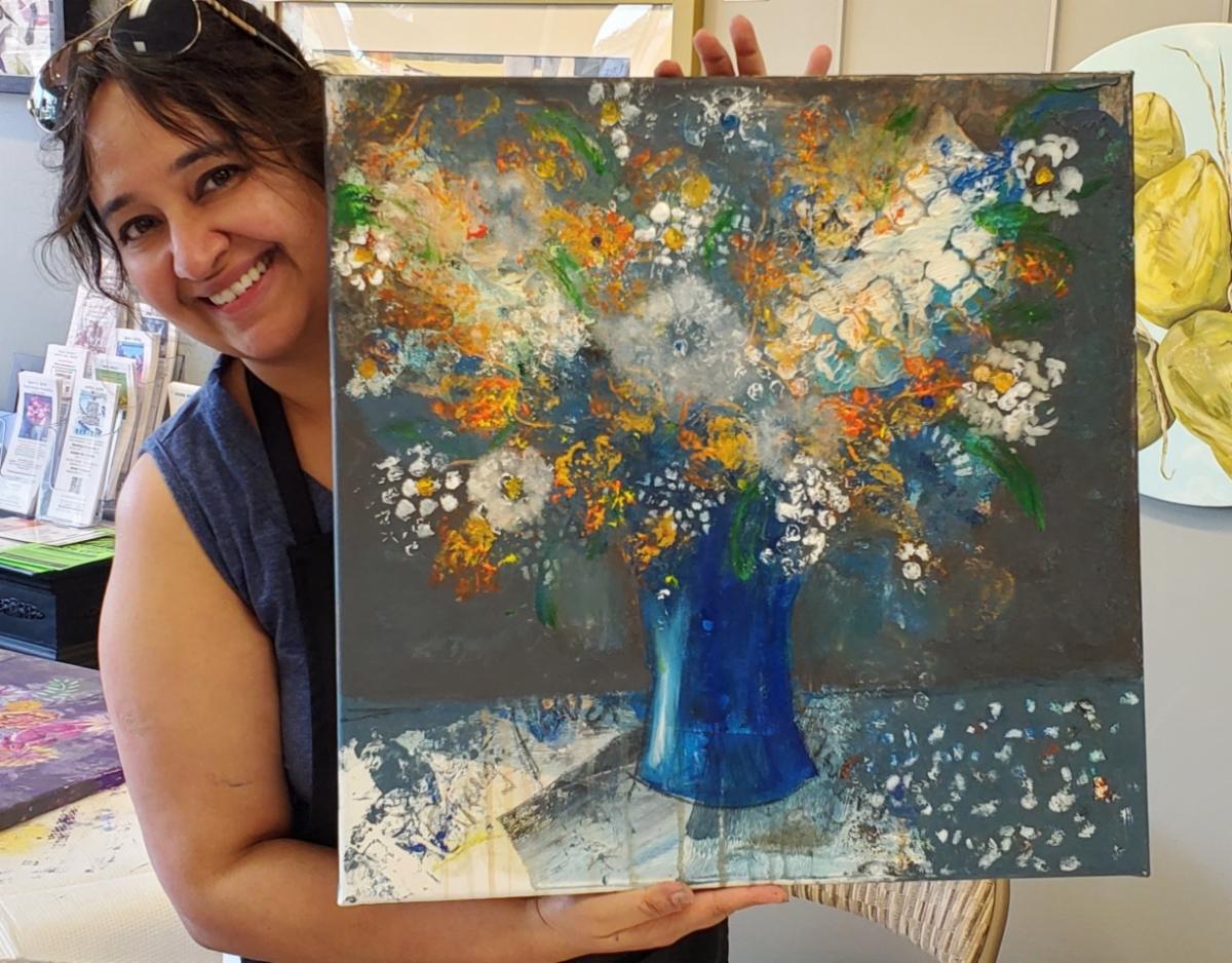
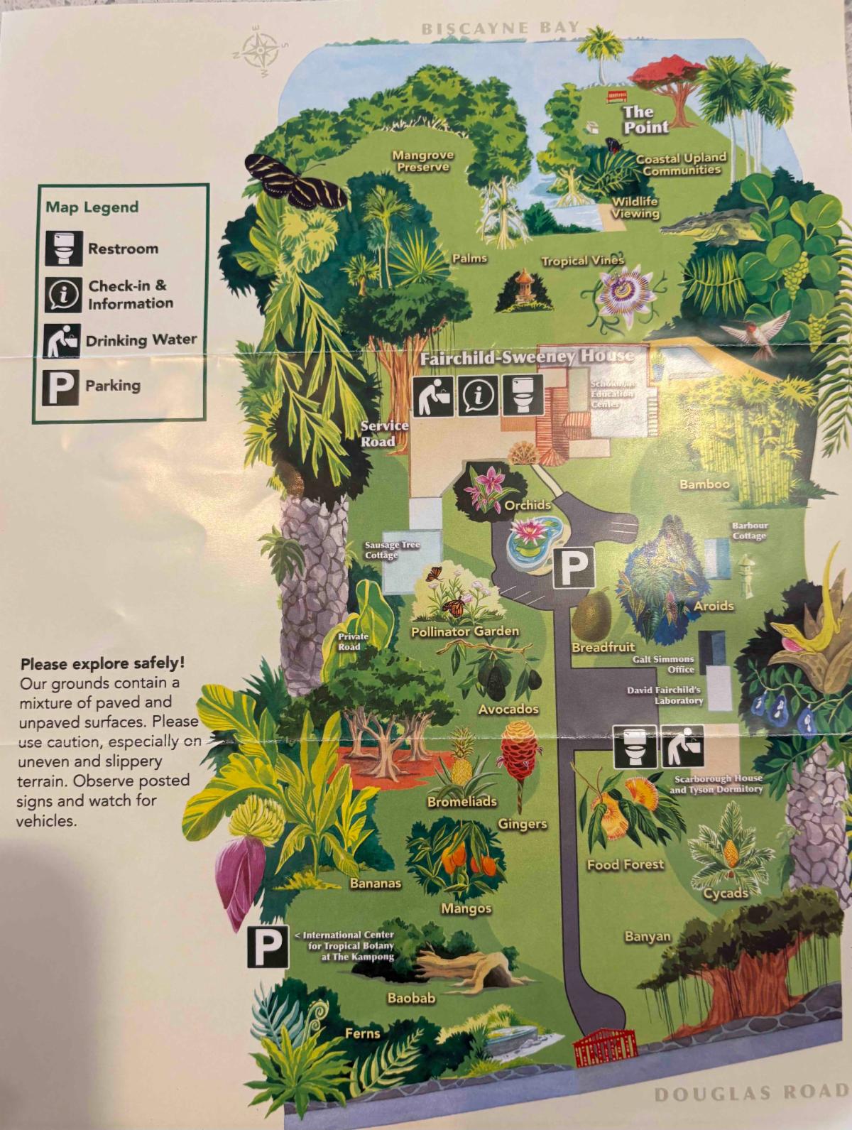
Floral Fantasy at the Kampong
One Day Workshop
The Kampong Botanical Garden
4013 S. Douglas Road
Miami, FL 33133
This is a fantastic location in Coral Gables! If you have never visited the Kampong, take this opportunity to enjoy the vistas of Biscayne Bay, the historic Fairchild/Sweeney home, and the unique gardens. We are going to have a wonderful day creating and enjoying our inspiring and peaceful surroundings.
Saturday,
January 17, 2026
9:30 am to 3:30 pm
$150
| | |
Holiday Special Extended to
January 31, 2026
| |
Private Art Retreats
A personalized experience, full of art and discovery, for those who….
- are traveling alone, or with a couple of friends
- would like a much more flexible, and free experience, and lots of fun, too, tailored exactly to your needs, interests, and experience level
- may want to combine painting with organized discovery trips and tours and really get to know the ‘real’ South Florida
- would like to book in for a shorter or longer time than most workshops
- don’t want to have to bring a mountain of supplies in their luggage
| |
Painting Joy
Created especially for artistic women in the third stage of life who are dissatisfied with their artwork and want to have more fun connecting with themselves and others. In this three-day watercolor workshop, we experiment with visual cues that inspire joy, discover personal symbols that resonate, and provide ways to bring more effervescence into our lives and art.
Please recommend any venues you know that might be interested in hosting this workshop in 2026.
I am also happy to teach this as a private retreat or for a small group in my studio.
I would very much appreciate your help in getting the next booking.
| | | | Private Lessons and Events | | | | Master Classes for High School Students |
Private, highly personalized classes in mastery for artistically-minded US & international students virtually on Zoom or in person at my home.
If you have a student who is a visual thinker, willing to push the boundaries of their own work, and serious about improving their options for college, I want to hear from you! Schedule a time to discuss how I can collaborate with you to build a portfolio that will give your student the greatest chance for success.
| | | | Art Workshops, Critiques & Presentations |
Invite me to present or lead a workshop for your school, club, or guild.
I can customize a program for your event or present my skills programs on composition, color theory, drawing faces, coordinating light/shadow or understanding the cues for depth. I am available for judging, confidence-building critiques and recorded tutorials.
| | | | Improve Your Artist Statement | |
If you would like to delve more deeply into your own inner questions and clarify your thoughts as you create an artist statement for your website, a gallery show, a sponsor, or another project, please reach out, and let’s talk. I have helped many students write compelling statements for AP Art, college applications, and competitions.
Find out More:
| | |
Sketchbook Prompt:
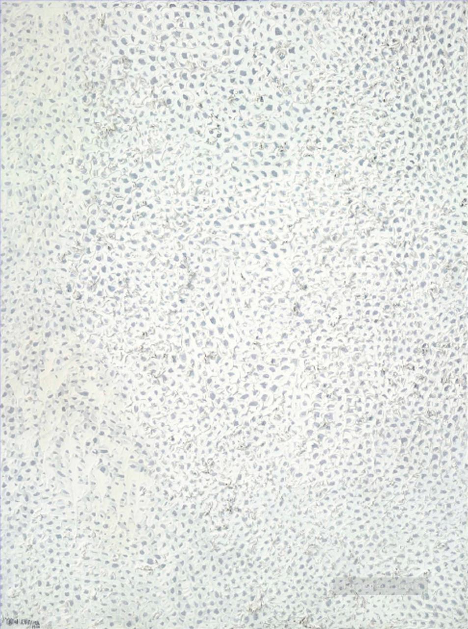
Create an artwork that uses only white on a white background employing texture or slight variations in white tones to define your shapes and lines.
Yayoi Kusama’s White #28 below sold for $7M
| | |
It's time for these artworks to find a forever home. Please contact me if you are interested in adding any of the paintings below to your collection.
I will deliver if you live within a 2-hour drive and if you live further away, I will give you a reasonable price for shipping.
Venmo, CashApp, PayPal and Zelle are welcomed.
| | |
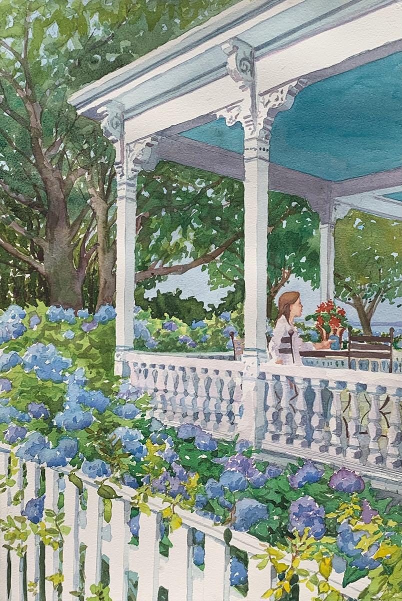
Title: Serenity Now
Media: Watercolor
Size: 21”x28"
Price: $444
Frame: Gold
| | | |
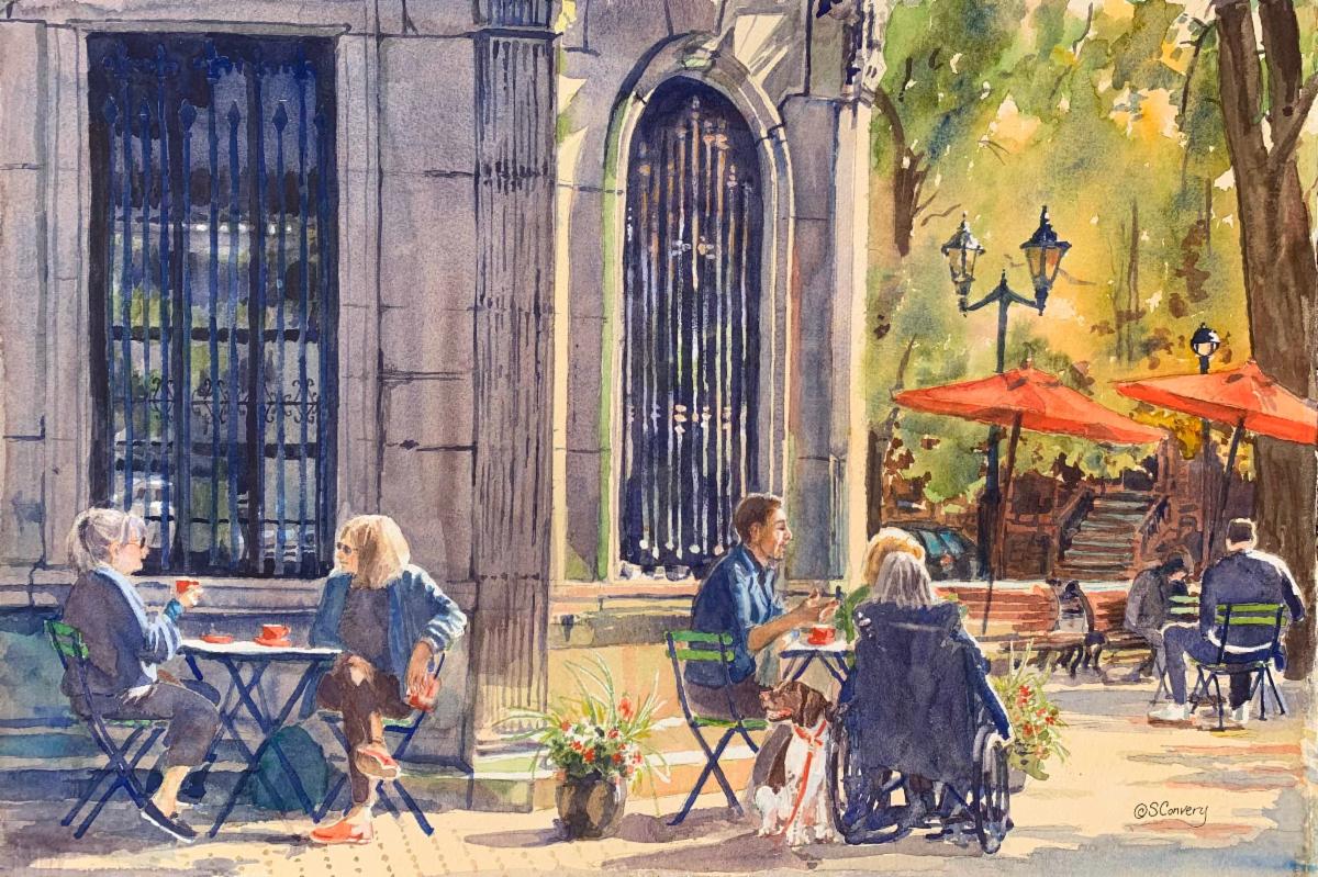
Title: A Brew-tiful Day
Media: Watercolor
Size: 22"x 28"
Frame: Gold
Price:$1111
.
| | | |
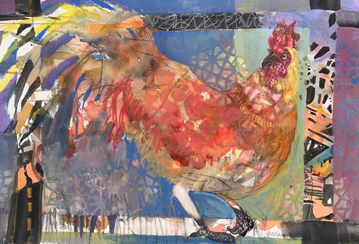
Title: Something to Crow About
Media: Watercolor, Ink, Gouache
Size: 22" x 28"
Price: $444
Frame: Gold
| | | |
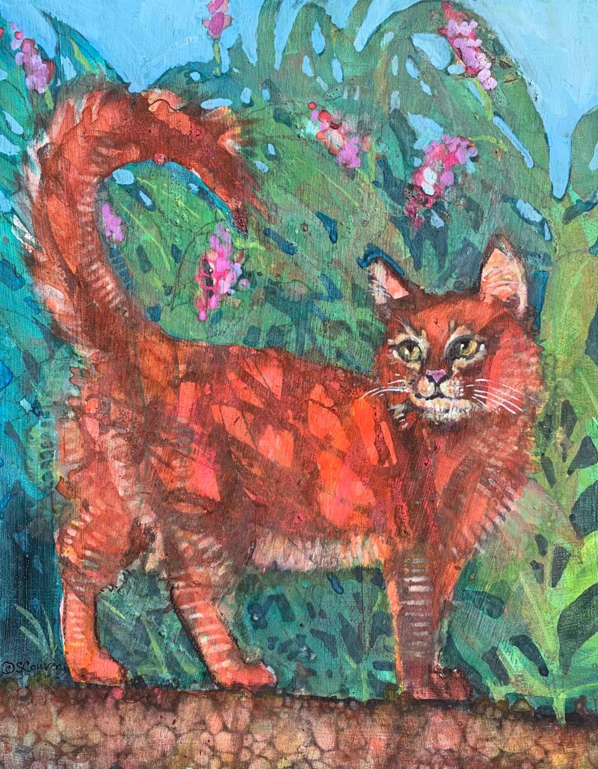
Title: Ginger
Media: Mixed Media
Size: 11" x 14"
Price: $333
Frame: Cradleboard Wood Panel
| | | |
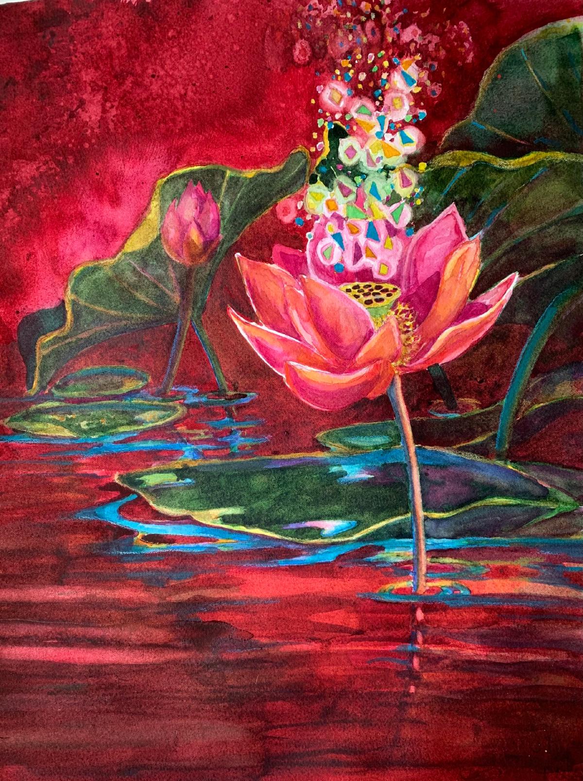
Title: Lotus Mantra
Media: Watercolor
Size: 16" x 20"
Price: $333
Frame: Silver
| | | |
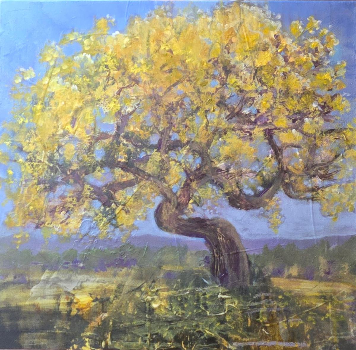
Title: Nothing Gold Can Stay
Media: Acrylic Mixed Media
Size: 20" x 20"
Price: $555
Frame: Gallery Wrap
| | | Want to see past issues of my newsletters? Visit this link on my website. | |
Subscription Information: You are receiving this email because you subscribed to my mailing list, downloaded a resource, purchased one of my products/programs, or opt-ed in some other way.
Thank you for being part of the Cr8V Soul Arts Tribe!
NOTE: Unsubscribing means you won't receive any more emails from me including information about your paid products and programs.
| | | | |