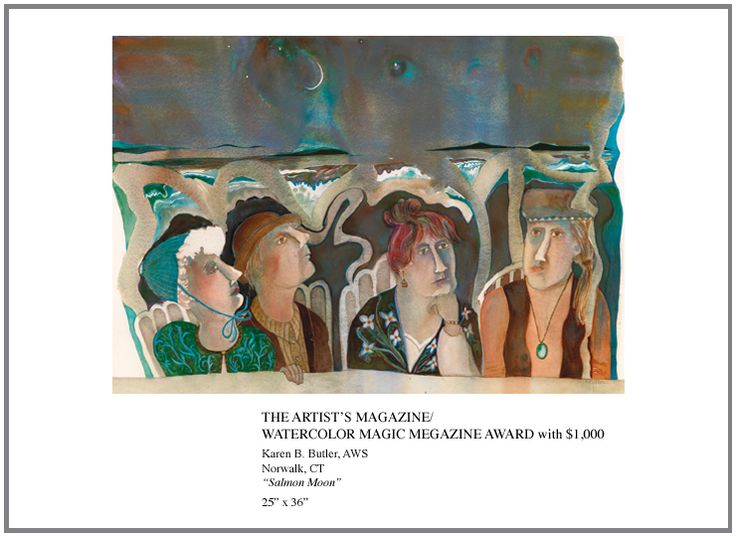
For a Command Performance Painting | | |
As artists we are entertainers, shape makers and symbol collectors
- Edgar Whitney
| | |
Staging an Entry:
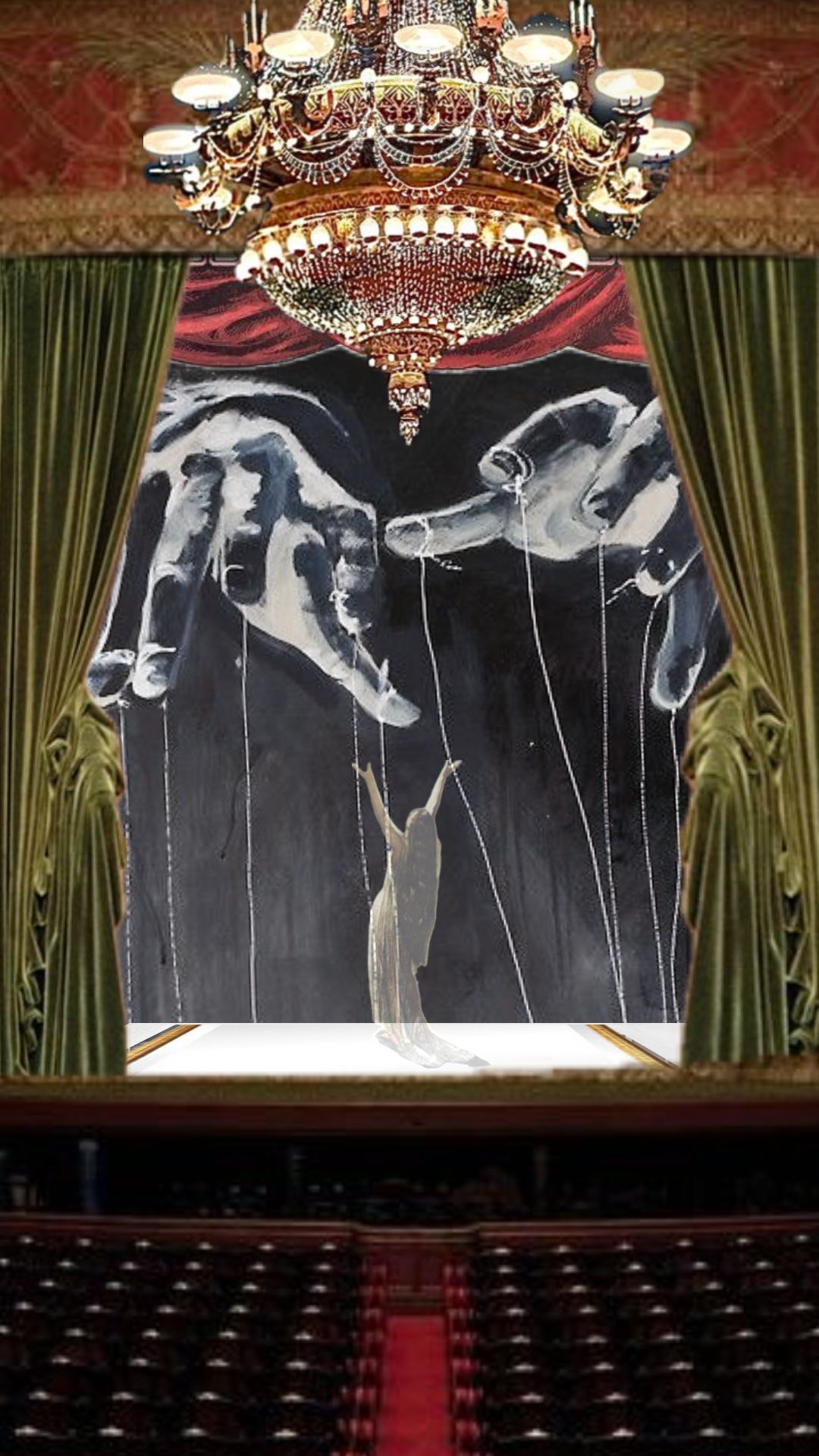
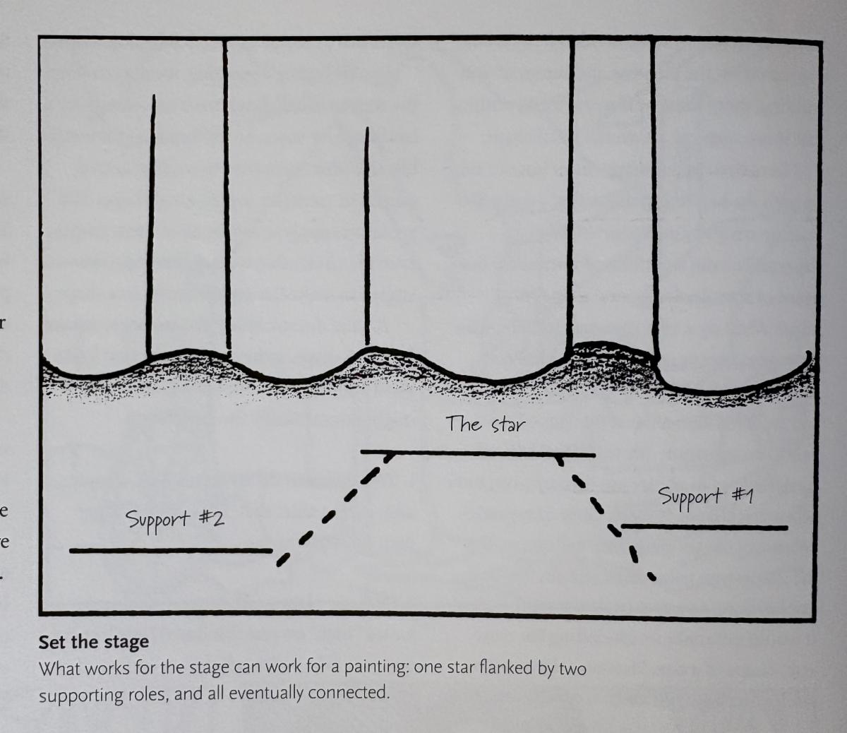
While “Staging an Entry” is a theatrical term, it is a concept we use in painting as well. When beginning a painting, imagine your blank paper or canvas as a stage and that we are planning a production. We need a setting for our story to take place that will set the tone for our command perfomance. We will have a leading actor and two, or more, supporting actors. How shall we arrange them? The lead will not like to have anyone upstaging him/her since he/she is the star. The visual stage we compose will contain our viewers attention and provide substages to lead the viewer through our story.
What works for realism also works for abstraction. Without structure, a painting is like a song composed with no knowledge of music theory, keys or chords or a play with everyone on stage talking and singing at once. You could get lucky in your results once in a while, but consistently successful compositions are designed with careful consideration.
| |
Success:
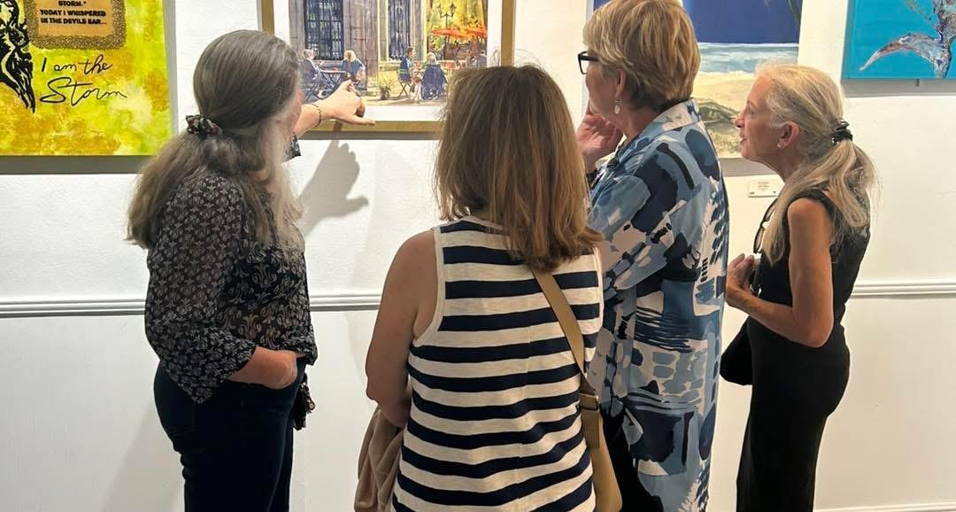
What makes a painting successful? When entering a room full of paintings, it is interesting to observe what your eyes will do. After a single glance around the room, your eyes will usually come to rest on the painting with the brightest colors or the one with the greatest amount of value contrast.
While I have never been to a show where I agreed with all of the judge’s choices, there are common threads that elevate the top paintings in any exhibition into the winner’s circle.
| | |
After speaking with a number of judges and judging some shows myself, I have come up with some criteria for successful exhibition paintings:
-
Content and Meaning - The work must have something to say. It needs to express an idea and tell something about the artist or perhaps about the act of painting.
-
Surprise - The work must feel fresh and new. If you’re painting a common topic such as babies, flowers, birds, sunsets, or bottles - look for a way to surprise the viewer. Formulas and cliches bore knowledgeable viewers and can be dismissed by an experienced judge.
-
Originality - if you are studying, or in love with another artist’s work, look for techniques and ideas to borrow and incorporate into your own work. Do not try to clone their work as your own.
-
Design - Visual impact attracts and holds the viewer’s attention. Make your painting memorable by carefully reviewing and critiquing your own design choices. Distinct values are the first thing a viewer notices and are especially important when a show is being judged from photographs alone. (More on this below)
-
Skill/Technique - Make use of your current skills and technique in support of your content. Childlike, expressionistic, highly detailed and photo-realistic are all valid choices. If you cannot draw well do not try for photo realism instead go for more expressive mark making or project and trace your image.
-
Framing/Matting - Clean and simple is the standard for exhibitions. Many require white or off white single cut mats with unadorned black or gold frames.
| | |
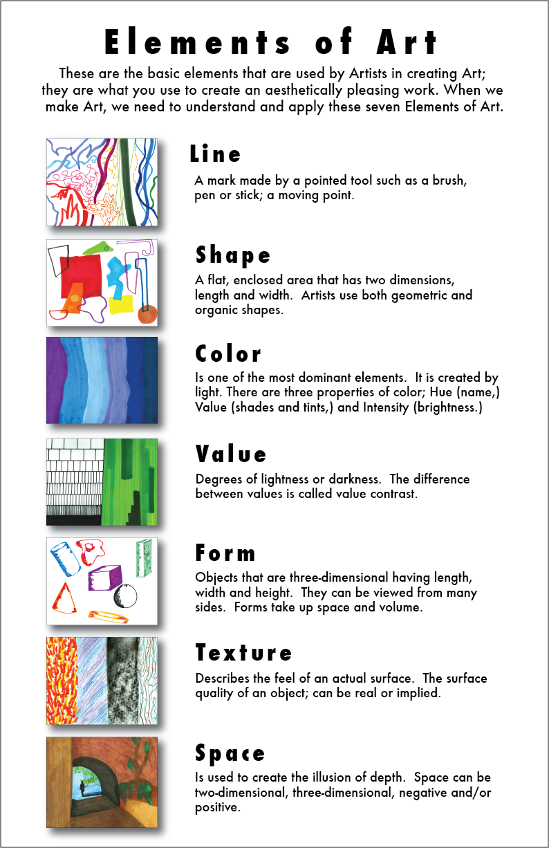
Once you have a story you want to tell then you can design the stage to showcase your idea in a powerful way. The interactions of the elements and principles of design are the underlying structure and means for organizing any work of art. Whether you are aware of it or not, and no matter whether you represent them, realistically or abstractly, these are the ingredients of which drawings and paintings are made:
Below are the commonly agreed on Elements of Art:
| | |
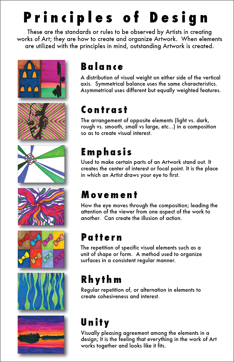
The principles determine the way we organize the elements to evoke a response from our viewers. Evaluate each of the elements using the principles.
Below are the commonly agreed on Principles of Design:
| | |
Contrast/Dominance;
As long as at least four elements dominate in a painting it will have significant character and structure. You do not need to use all of the elements in every work. In fact, too much information is confusing and distracting.
When considering the element of line in a painting ask yourself: Is line a dominant feature of your artwork? How are lines repeated? Which type of line is dominant - curved or straight? How is line used create contrast? How is line used to unify your work?
If there is ever any doubt about who is the star, a simple solution is to add more intense color or greater value contrast to strengthen its dominance.
Each element you use is a player who relates to all of the others. The elements you employ are there to support or provide contrast to your hero or heroine. You don’t need to worry about all of the possible combinations, Instead, choose one or two items from each column to play with and combine in ways that enhance our appreciation for the star.
| | |
Shape:
It’s easy to put too much in a painting. By making your area of interest big, there’s not much room left for the things you don’t like or don’t care about. You will not confuse your viewer with peripheral stuff that detracts from your message.
When designing your next painting remember the 50% rule - make the thing you like; the boat, the barn, the figures, the bird - large enough to occupy at least 50% of your painting.
For example, if it’s the sky that interests you, it should occupy 50% or more of your painting, if it's two figures digging in the sand - 80% might be even better. Just as a good storyteller devotes most of the pages of the story to the hero or heroine, you shold devote most of your painting surface to your major interest.
| | |
A Good Shape:
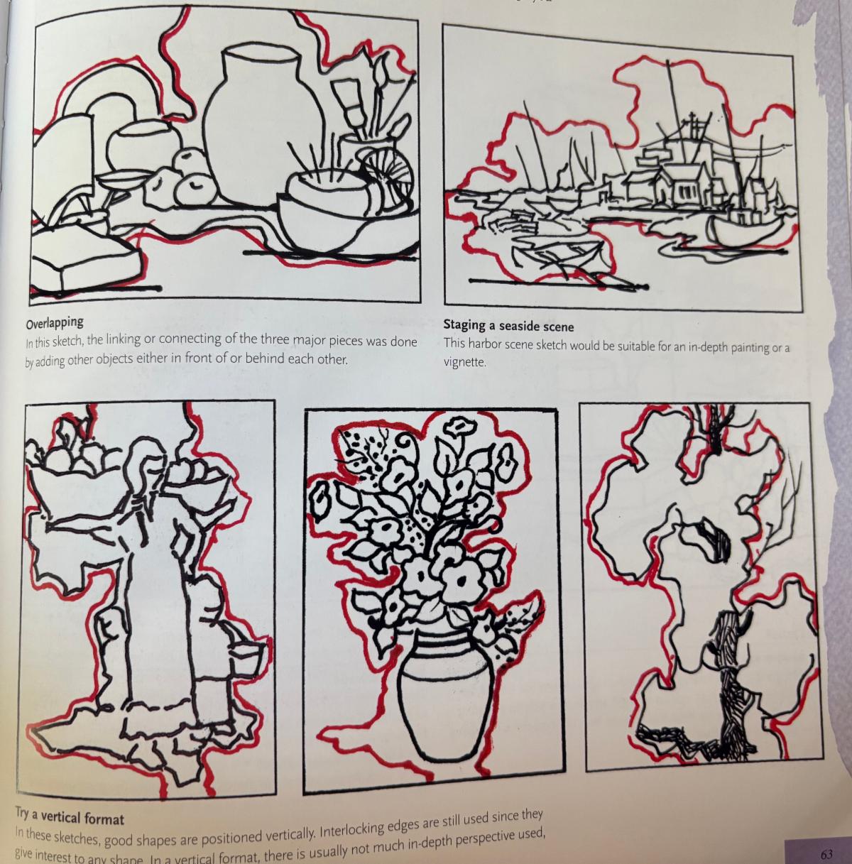
For the purpose of creating our stage we will design a “good” compound shape where our performance will take place.
The shapes you design should not only suggest your subject, they should suggest the mood you wish to convey. For example, shapes with edges that abruptly and frequently change direction convey a feeling of energy, movement and activity. Shapes with edges that gradually and smoothly change direction suggest a feeling of sensuality or calm.
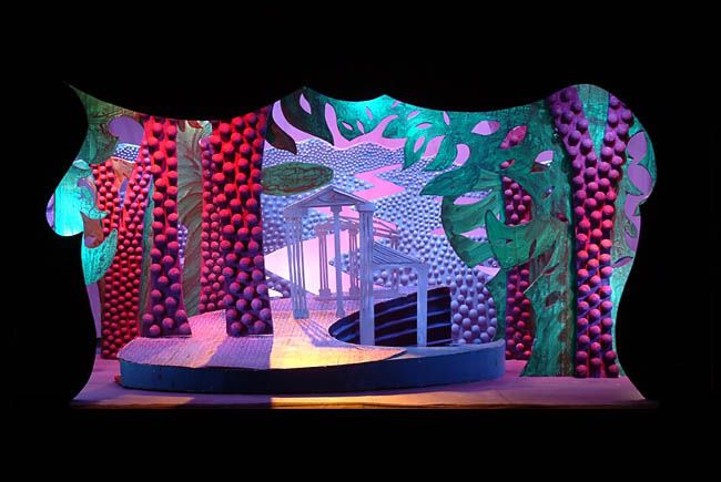
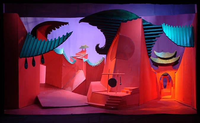
| | This set has sharp corners, diagonal movement and unsettling energy | | |
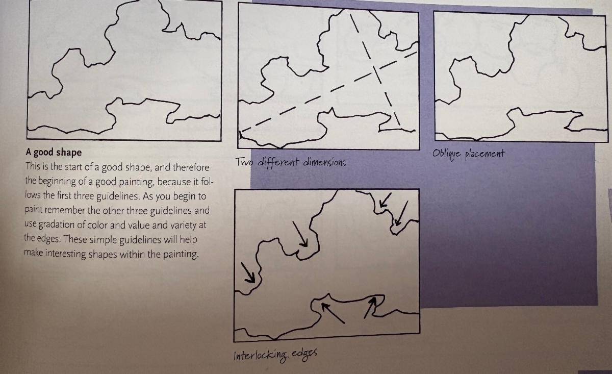
Edgar Whitney, who taught watercolor for many years at the Pratt Institure in NYC came up with these guidelines for a good shape:
-
Two different dimensions - It is taller than it is wide, or vice-versa
-
Think like a sculptor - think of each side as opposing the other. If one is straight the other must contrast and curve or change direction.
-
Oblique Placement - The shape touches three sides of the canvas at different heights. One side being higher and the other lower. (think of these as your stage entry and exit)
-
Interlocking edges - there are varied nooks and crannies along the edges of your compound shape on every side.
-
Gradation of Value - There are at least three value shifts within the larger shape. Value change can create the illusion of three dimensionality
-
Gradation of Color - There are variations of warm and cool within the larger shape.
-
Variation at the Edge - there should be a variety of edges; rough, smooth, soft, sharp to keep the eye moving.
| | |
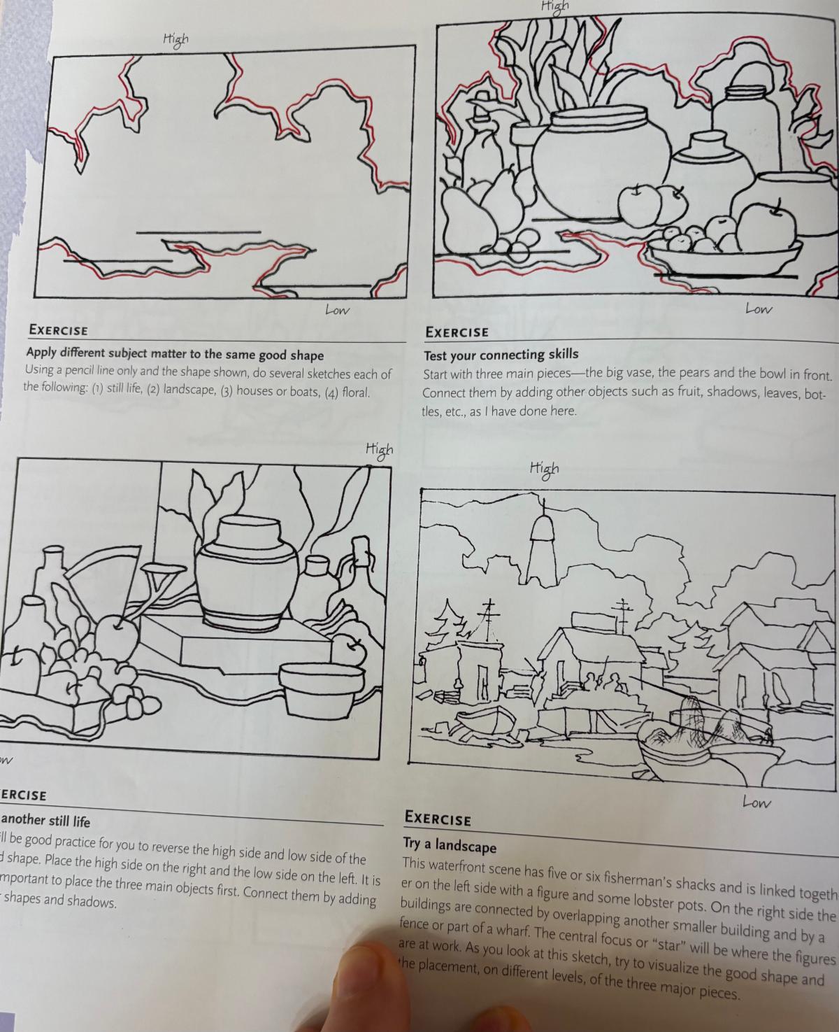
Once you have a good compound shape it can be adapted to any subject matter or format. The shape drawing above is a dynamic arrangement to help build a stage setting. For the artist, this can translate to a landscape painting or a still life.
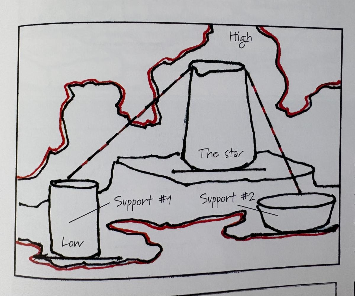
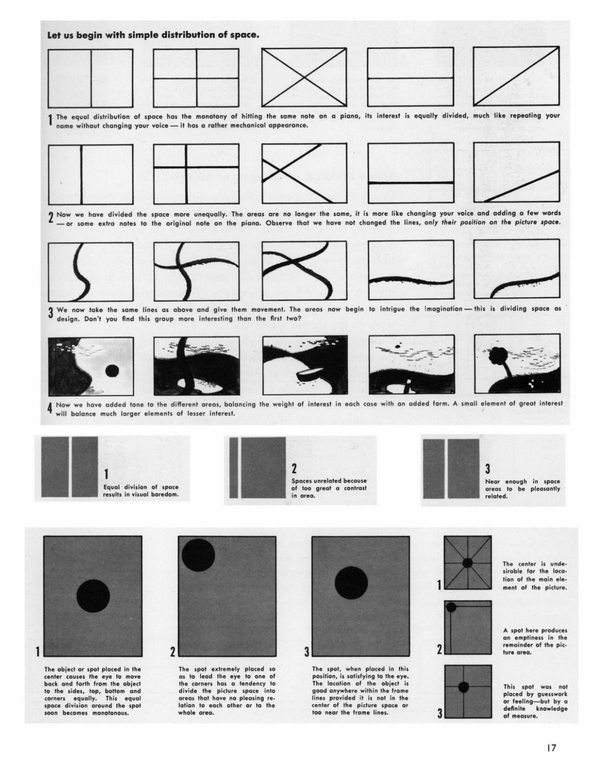
To begin your arrangement, choose three major pieces and place them in the approximate locations shown with the star on center stage, but not in the center of the stage. Then add other objects or scenery to link or connect the three major pieces to make a larger (compound) interesting shape.
Below are some guidelines for placing your players within the set (compound shape) you designed:
| | |
Dynamic Placement:
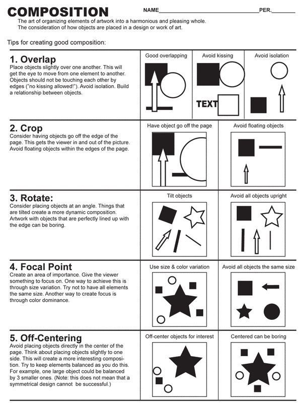
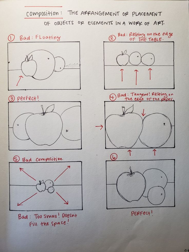
Set the stage then connect shapes in a dynamic offset placement. Avoid placing any object directly above or below the major pieces. Also, extending the composition beyond the picture plane will help establish continuity.
Static and Dynamic are two important terms that must be understood because they are parts of the composition of any painting. Static is immobile or stationary and can serve to anchor some areas of your paintings. Dynamic, meaning active is important in leading the viewer’s eye throughout the composition.
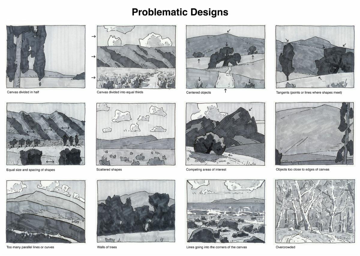
Here are some examples of problematic shape placements:
| | |
Value:
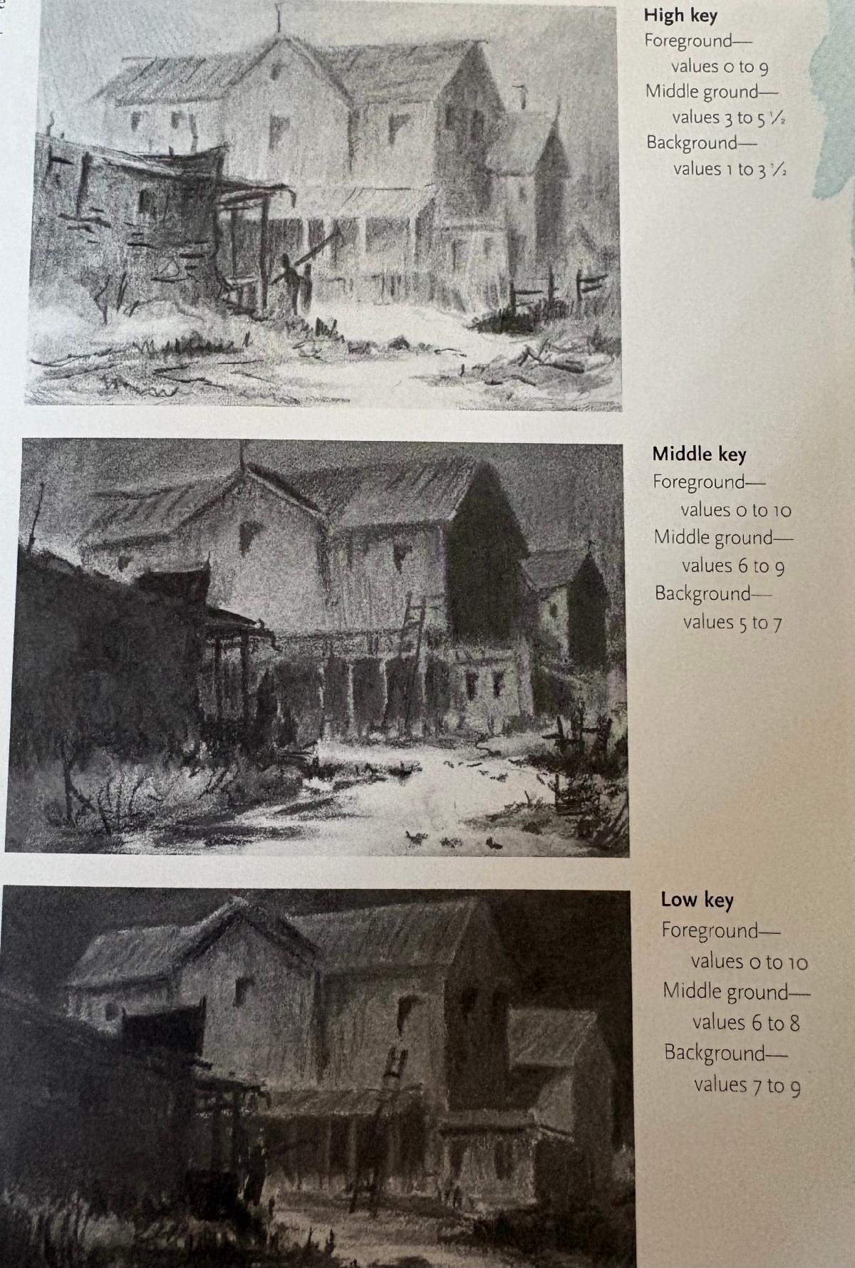
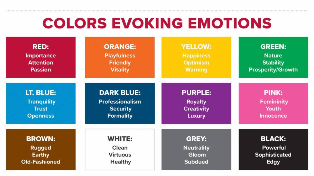
Value and color sets a mood and expresses feeling.
The dominant value generates an emotional response regardless of the subject matter. Think about the content of your painting and then plan for the feeling or response you want your viewers to have.
Sunlight lightens and stimulates our spirit. Twilight calms us and makes us pensive. Darkness has the power to depress us, fill us with fear or anxiety, or create mystery. Be intentional.
| | |
Six Value Schemes:
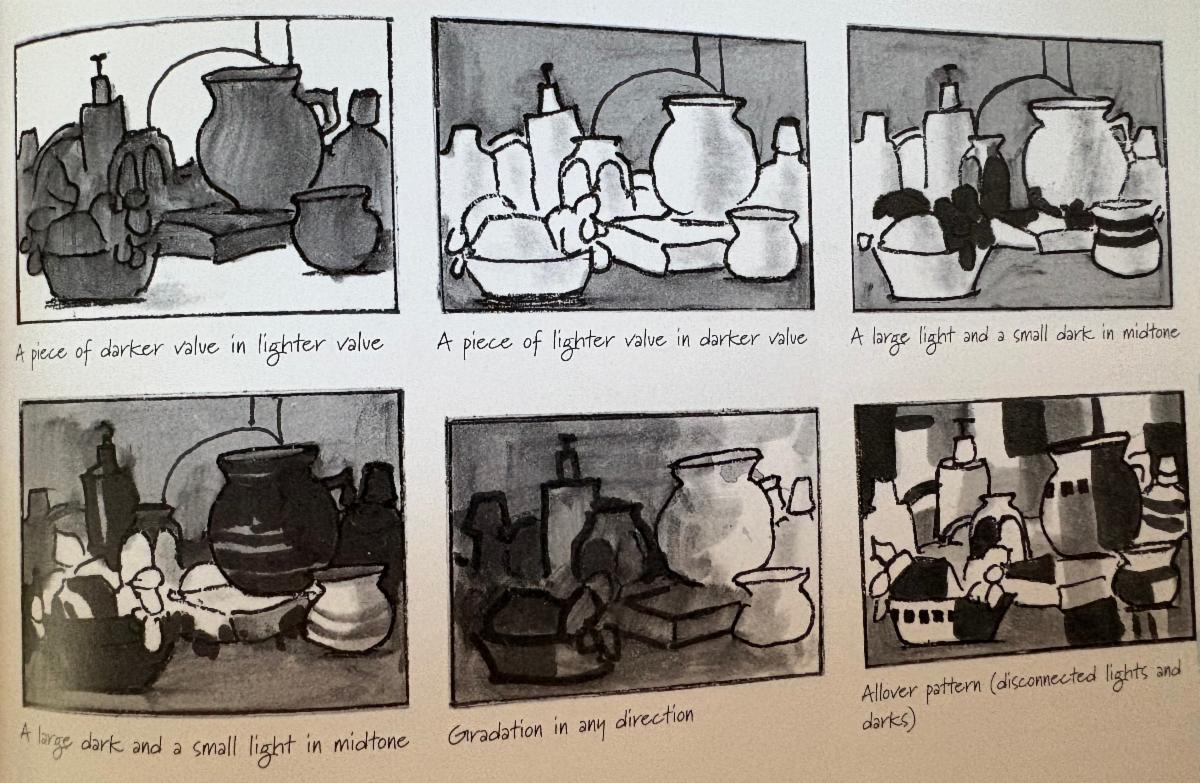
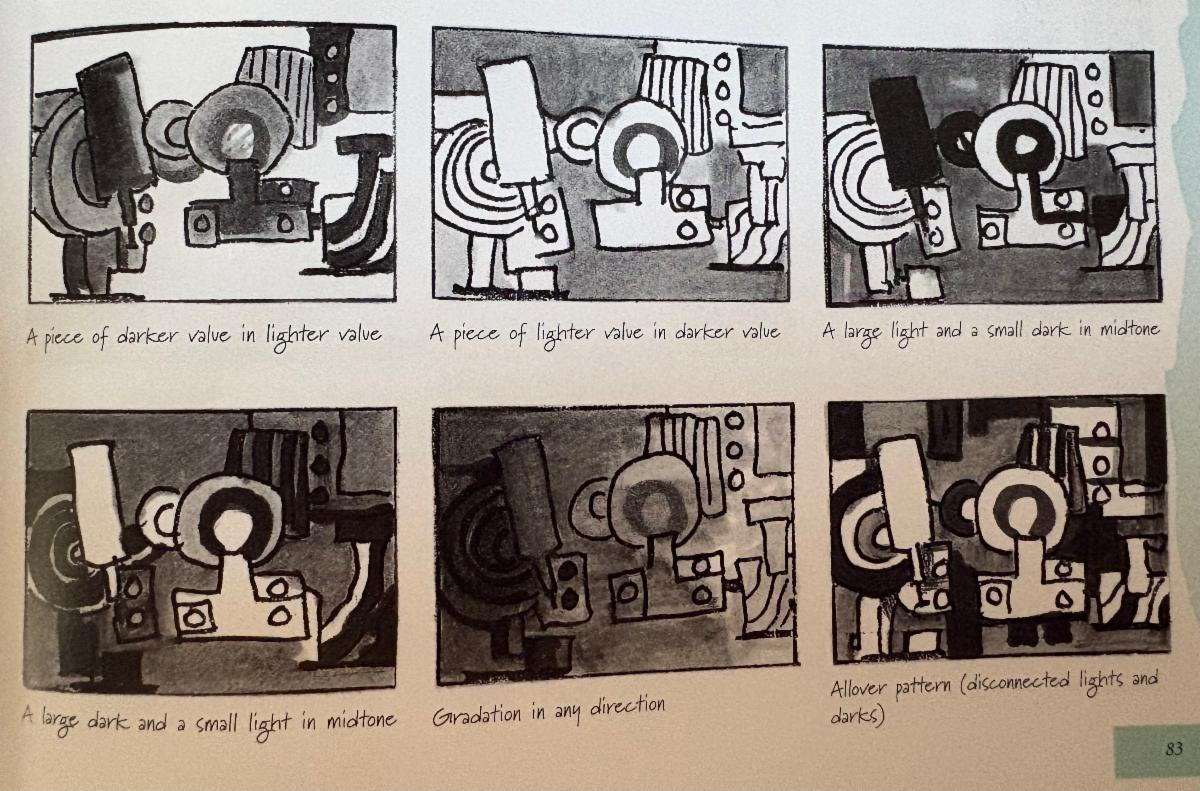
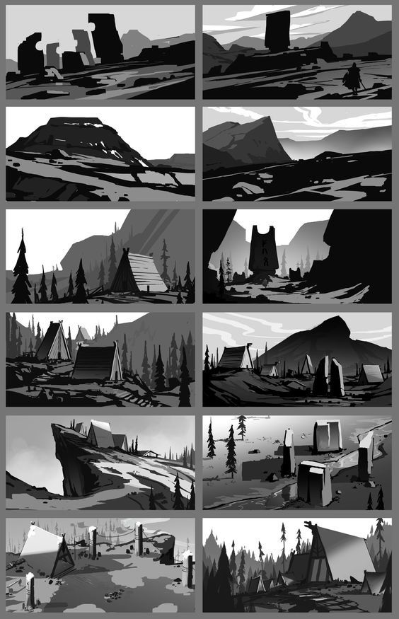
Here are six value schemes which will prevent you from having equal values. Value sketches can be done in only a few minutes and you will be so much more certain as to which works best when you sketch your subject in each of the six value schemes.
- A large dark shape in a lighter setting
- A large lighter shape in a dark setting
- A large light shape with small dark areas in a midtone setting
- A large dark shape with small light areas in a midtone setting
- Gradation of light to dark from right to left or left to right
- Allover pattern (disconnected lights and darks)
For any value scheme, remember that it's easier to begin by first surrounding the light shapes with a light midtone value. Then add darker midtone values and place the darks last.
| | |
Emphasis:
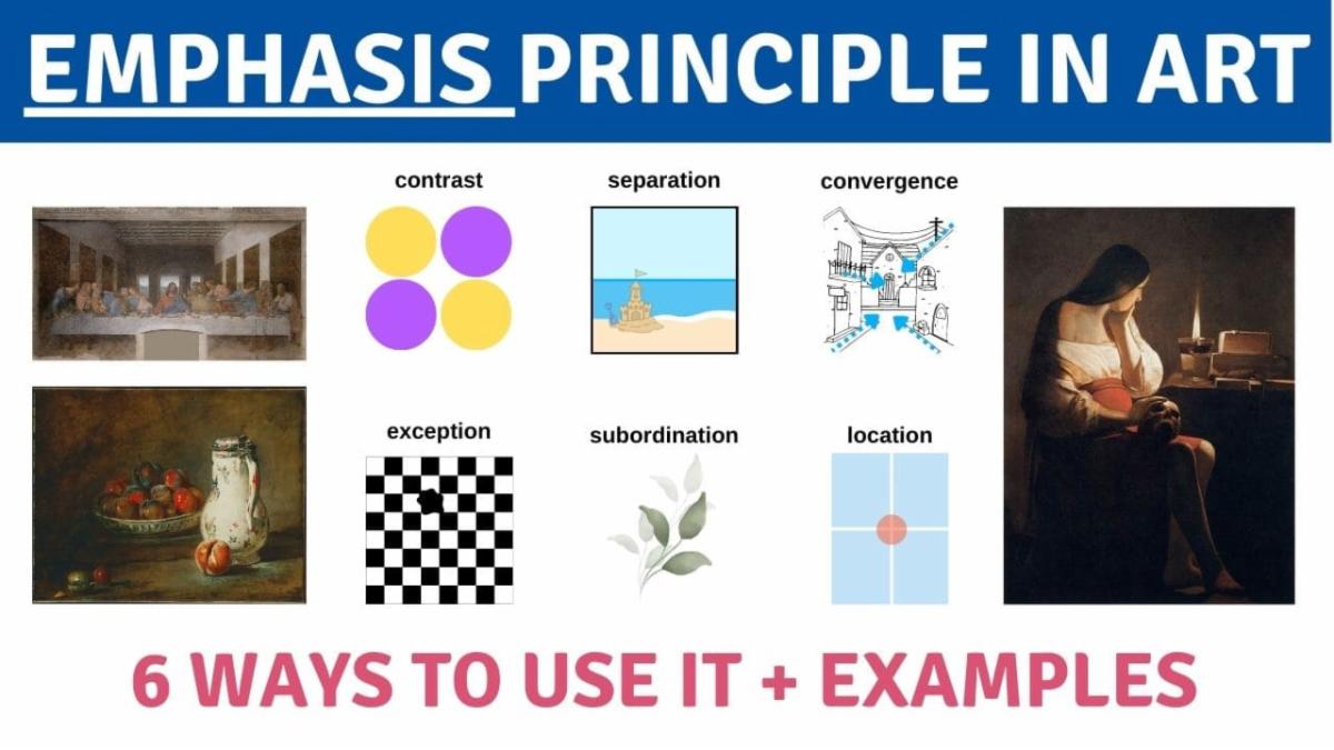
The focal point is the star of your performance. The success of your focal point is vital to the painting’s success. By using the principles and elements of design you can ensure that the focal point is doing its job - attracting attention and delivering your message.
Here are seven ways to create a focal point. Some are widely used and others, such as texture, are more a matter of personal style.
-
Contrast of Value - putting your lightest light next to your darkest dark is the most common way of creating a focal point, because it’s probably the most successful. The eye is immediately attacted to the strongest contrast of lght and dark. Knowing this you should avoid placing intense value contrasts at the edges of your painting.
-
Complementary Colors - Colors that are across from each other on the color wheel are a vibrant way to attract attention.
-
Intense Color - Red often shows up as a focal point. It’s particularly successful in a gray or muted painting.
-
Color Temperature - A warm focal point in a cool painting or vice versa is inviting.
-
Oblique Angles - Diagonal shapes and lines leading into your painting are another way to point to your focal point. Be careful that they don’t point out of your painting.
-
Texture - can be the focal point in a relatively smooth painting.
-
Detail - figures, words or letters will catch the eye in any work.
| | |
Create a Focal Path:
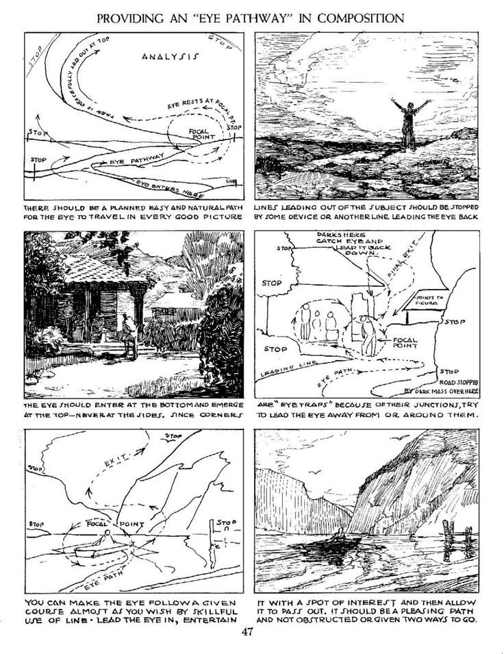
These same contrasts can be used with less emphasis to lead the viewer through the painting to the supporting cast and the secondary stories they have to tell.
| | |
Value Chords:
There are several reasons to choose to paint with a full-bodied range of values. First, light paintings are often considered sketches or look indecisive. Worse still, they are sometimes interpreted as incompetent. While we all have some measure of an inferiority complex… strengthening your expression can banish indecisive paintings and silence the critics.
A value chord is different from a value scheme. A single shape can hold a value chord, or a larger compound shape can be made up of smaller shapes forming a chord.
A value chord in a painting has to do with the relationship of intervals between lights and darks. The light is at one end of the value scale; the dark is at the other . There will be a more beautiful value chord in a painting if there are several midtone values used in between.
This is similar to the harmony created with a chorus of soprano alto, tenor and bass voices. The bass and soprano voices are so far apart - one so high and the other so low - that it would sound thin without the voices in between. Adding the altos and tenors make a more complex, yet beautiful sound.
In painting, think of the soprano as the lightest light value and bass as the darkest dark value. Using these two values alone would result in a thin painting. However, by adding two or three shades of midtone value between the darkest dark and lightest light, you can have painting with a rich, beautiful value chord. This is to the eye what four-part harmony is to the ear. Choosing a value scheme and creating a value chord for your composition will result in a strong finished painting.
| | |
Color:
The warm colors of yellow, orange and red are positive, aggressive and stimulating. They typically appear in the foreground of a painting.
The cool colors of blue, green and violet tend to be negative, retiring and tranquil. These colors usually recede in a painting.
| | |
Steps for Enriching Your Colors;
-
Fill your palette wells. Use plenty of paint.
-
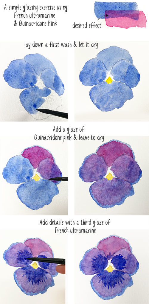
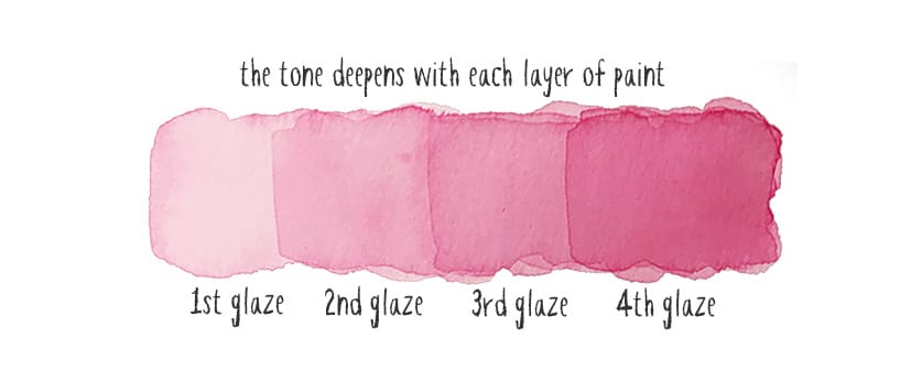
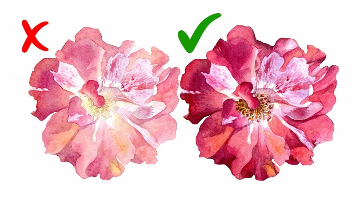
Develop the intensity of your values. Add two or more layers of similar colors to most of your painting. Second verse, same as the first. Many times you will need a third or fourth layer too. Keep your new layers similar to earlier colors and this will keep the colors bright.
-
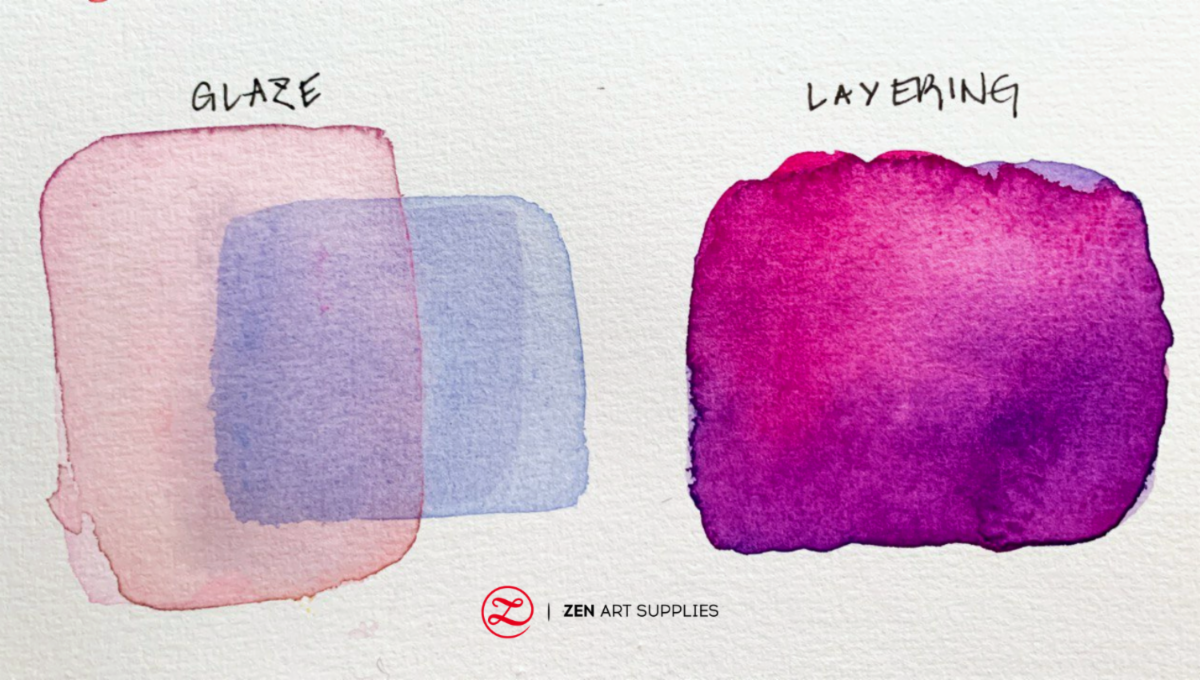
Keep your layers colorful. When you add layers to your paintings you don’t want to create “mud”. Mud is a color usually gray, that has gone dead and lost its spark. Avoiding these dead colors is easy. Paint with your most transparent colors first because these will never make mud. Use them as much as possible in the early stages of your painting. Try to limit your layers to analogous colors and limit layering with complements and heavy granulating colors.
-
Create a color chart to prevent mud. If you want to avoid making mud you really need to make a color chart and find your transparent colors. To do this staple a strip of black paper to a piece of your normal watercolor paper then generously load up your brush and swipe it across the black strip and onto your paper. Label each color with the brand of paint as well as its color name. Transparent colors are the ones that disappear almost completely on the black paper.
-
Go Darker. There is an old joke about watercolor classes that says you can walk by any class and yell in the door “Darker, darker!” and you will have given the right instructions to everyone in the class. Since watercolor dries at least 20% lighter than it appears when it's wet push yourself to make it darker than you think you need. Remember, you can always go darker in the next layer.
| | |
Unity:
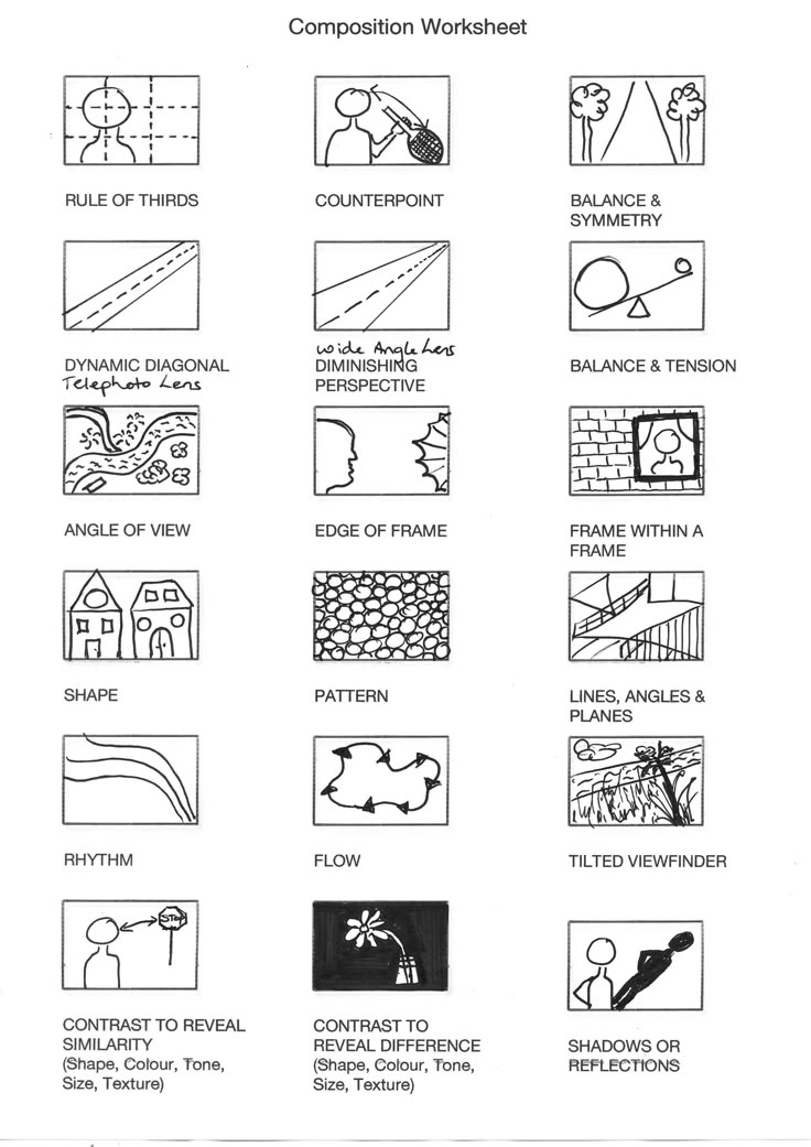
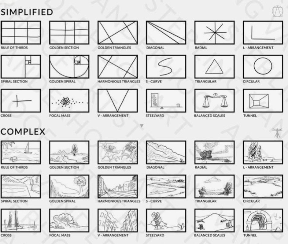
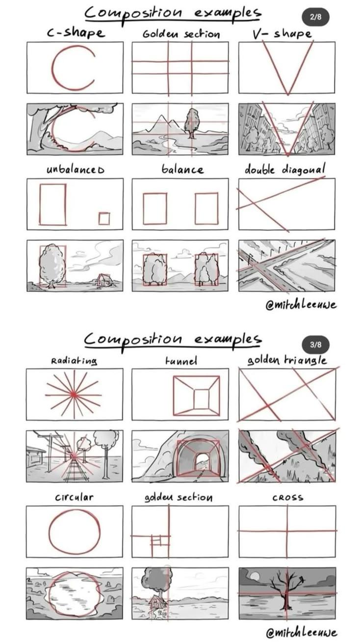
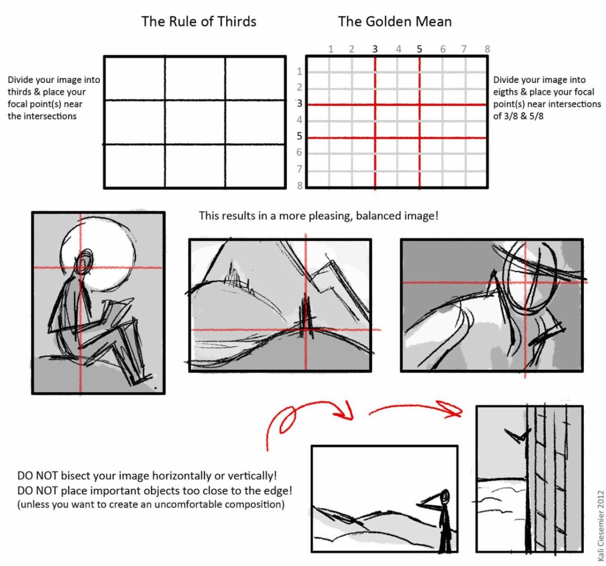
Unity is the most important principle of design. These proven compositional stage sets are a great starting point for placing your characters into a successful relationship. These formats divide your stage into an abstract pattern that will help you to build a great support for your story. Look for one that already resembles your resource photo or preliminary design idea.
| | |
Planning:
Planning is time well spent. Paintings that have a variety of darks, lights and midtones and vibrant colors in unequal amounts are exciting, while those with less variety are not.
Distinct values are the first thing a viewer notices and are especially important when a show is being judged from photographs alone.
You should rehearse at least two different value and color plans for each painting and then decide which one best suits your subject and intention.
| | |
Lighten up:
About two-thirds of the way through every painting I tend to get to the point I refer to as the “ugly teenager” stage. You don’t have to keep the parts you hate or throw the painting away and start over again. Frustrating drawing and painting errors and discouraging flat or muddy portions need not be tolerated and can still be changed despite common watercolor wisdom that says mistakes cannot be fixed.
Painting over the areas you hate with darker paint or opaques are often an arrow to the problem. I find the best solution is to lift the problem out, dry the area and repaint it again - and again, if necessary. Good watercolor paper is very forgiving and your persistence will pay off.
By cleaning up your colors and adjusting your drawing, you are successfully coping with the elements of art and several principles of design. Use corrections to let your colors and shapes dominate and unify the painting and the rest will fall into place.
Soft edged correction;
A scrubber brush has short stiff bristles to loosen and lift paint. Use clean water and blot frequently with a paper towel when correcting with a scrubber brush. Use the bristles sparingly as these repairs can look “dirty”.
Soft and hard edged correction:
Draw your correction on your painting and cover the area you want to keep with a carefully cut stencil (packing tape works great for this but only on heavily sized paper like Arches). Soften the problem area with a damp sponge and clean water around the stencil. Lift one side of the stencil and soften that edge with your sponge to create a contrasting softer edge.
You can also use commercial stencils to add interest to boring areas by lifting out the stencil pattern instead of painting it in.
Changes in large areas:
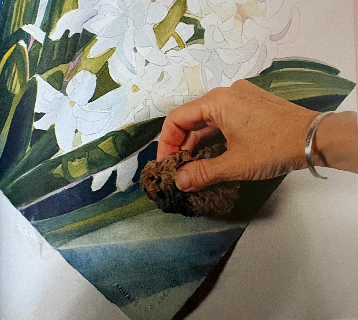
You can gently lift off or even flood away large areas of strong color with your natural sponge and clean water. Do not try to remove all of the paint. Make sure you clip your painting to a support board and tip the board so that the water pours off the edge of the painting and into a sink or wastebasket. If you want a smooth look, blot the paper with tissues and dry with a hair dryer before attempting to repaint.
Stencils with other media:
To lighten acrylics, cut a stencil from tape and use a toothbrush or scrubber brush dipped in alcohol to lighten the area around the stencil. Blot frequently.
Softening textures:
If you find a texture you created to be overwhelming you can soften the area in question with a damp sponge or add one or two layers of a wash in a similar color.
Softening damaged paper:
If removing your masking fluid or tape stencil damaged your paper try rubbing the damaged area with the back of a spoon to burnish the paper back into place.
| | |
Evaluate Every Square Inch:
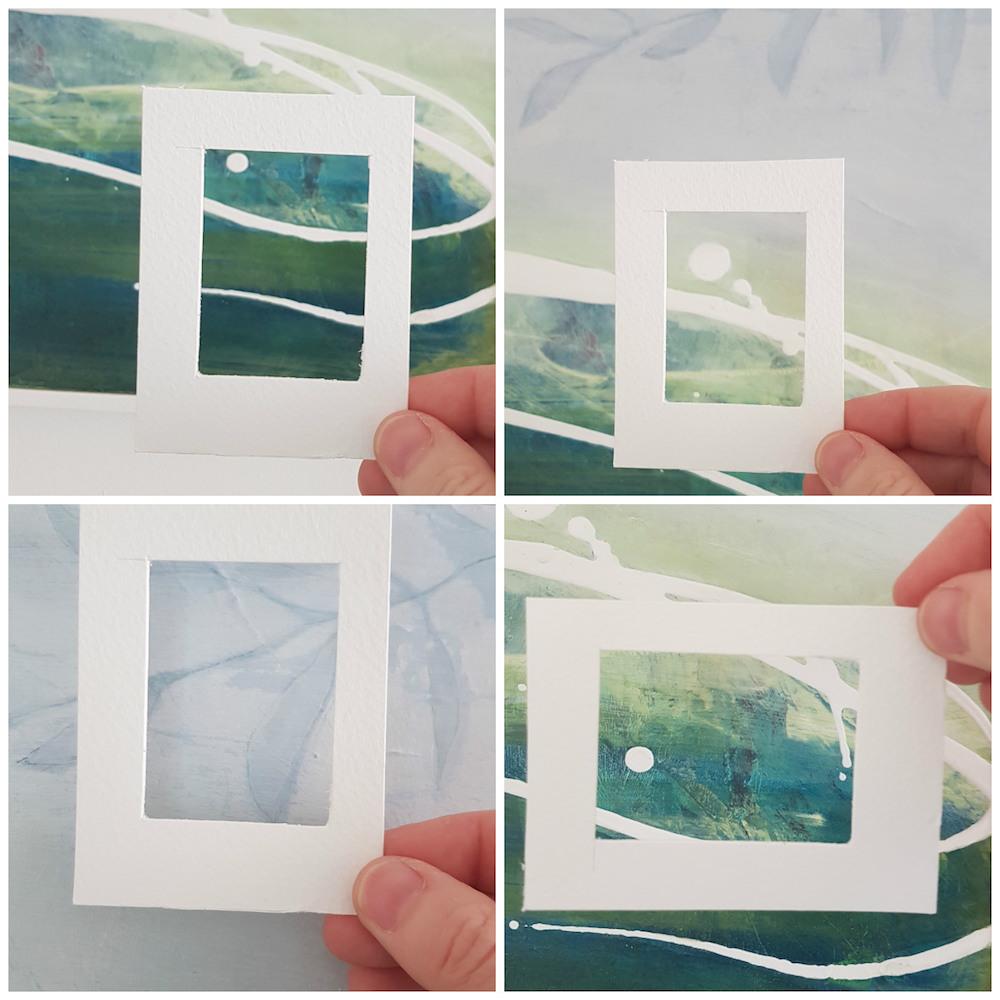
Use a viewfinder to isolate a small section of your painting
To make this painting a command performance you must revise and edit. You are looking for these things:
-
Ugly Areas - Are there any dead colors? Any misguided drawing or brushstrokes? Rough edges that could use smoothing. If so, go back and lighten up, scrub and remove the area before repainting it freshly.
-
Boring Areas - Move your viewfinder across the painting to determine if there’s enough going on in each section to keep your interest. You may want to go back and break up the boring area by adding a few leaves, a stencil pattern, texture, or abstract paint strokes. Do not add anything you cannot draw well.
-
Wimpy Areas - As you move across the painting look to see if every section is dark enough, saturated enough? Go back and add more layers of color - Use similar colors, “Second verse, same as the first”
-
Disjointed light areas - Are there flickering light or white spots around the edges of your shapes? Are they distracting? Do they pull attention away from the focal point? Wash a single color over the whole area to unify it.
-
Check the focal point and path through your painting. Notice how your eye moves through the painting. You want to move the eye around the painting and return it to the center. You don’t want the eye to shoot off the edge of your artwork and on to the next painting in the exhibition. Revise your cues, if needed to block the exits and draw attention where you want it.
-
Are your colors rich? Is your painting dark enough to stand up against other strong paintings in an exhibition? Is it dark enough to photograph well? Add additional layers of the initial colors to enrich it.
-
Look at it in a mirror, upside down, in a black and white photograph and as a thumbnail sized image. Look for tiny improvements you can make to love your painting more.
| | |
Surprise us:
The first step of planning is to take your subject or object and do something to it to show it off. Surprise is when you then do something ELSE with it - something fresh and unexpected. Play delights the viewer and the artist too.
| | |
Master Disaster:
Visual impact is what attracts and holds your viewer’s attention. Carefully review and critique your design choices to make your painting memorable. When you find a problem don’t worry - the final stage of painting is mostly about fixing your work.
To Master Disaster:
-
Lighten or remove whatever you hate about your painting. Stencils execute clean precise corrections. After blotting and scrubbing - repaint in a fresh color.
-
Break up boring spaces - what to do with all that background?. (try borders, abstract lines, texture, lettering)
- Enrich your values and color
-
Unify - organize your colors and values
-
Surprise yourself and your viewers. Content is crucial to meaningful paintings.
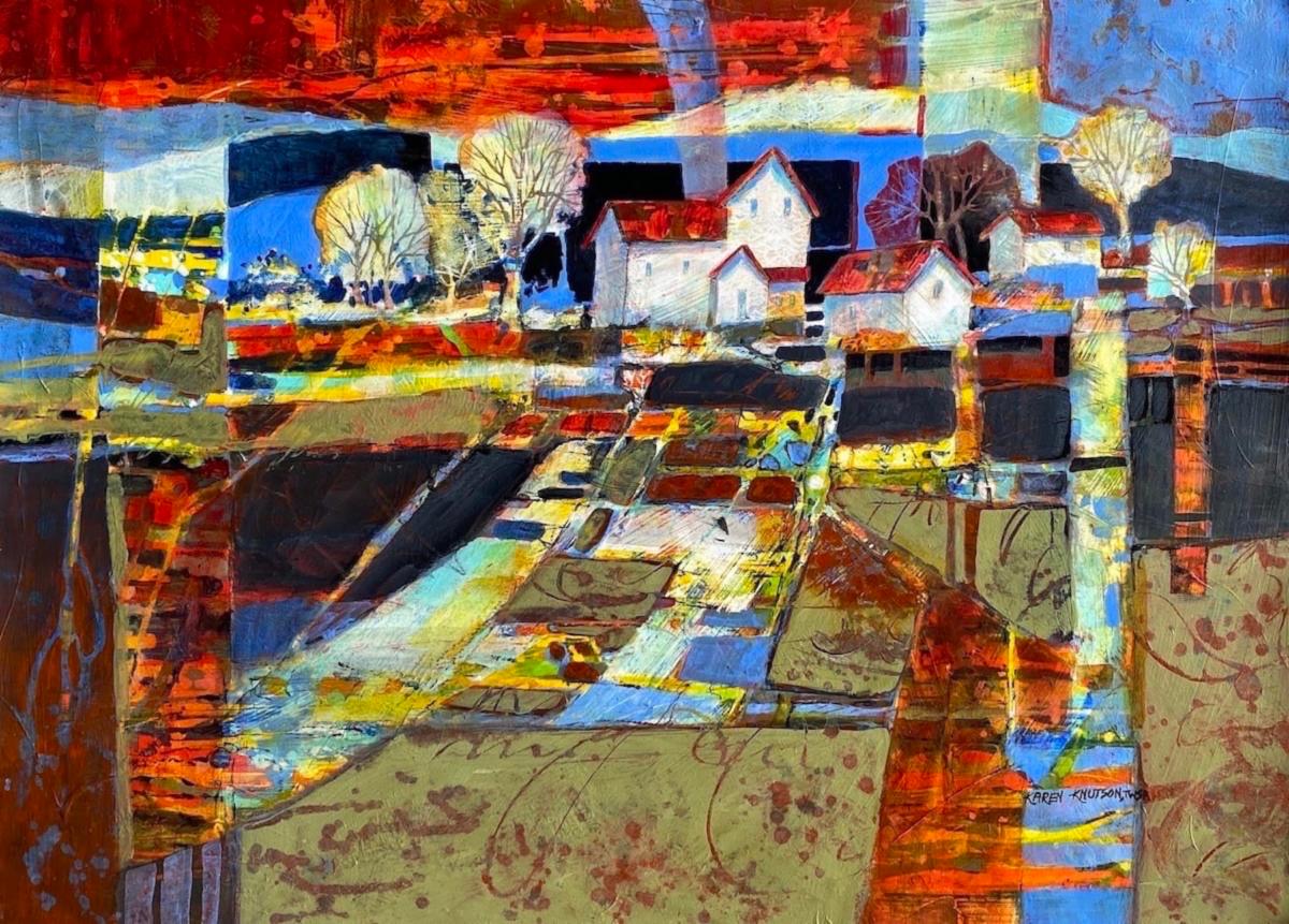
| | Karen Knutson “Family Farm" | | |
While “Staging an Entry” is a theatrical term, it is a concept we use in painting as well. When beginning a painting, treat your blank paper or canvas as a stage where you are planning a production. Create a setting for your story to take place that will set the tone for what to expect. Give careful consideration to how you arrange a leading actor and two, or more, supporting actors. The visual impact you compose will hold your viewers attention and lead the viewer on a journey through your painting.
A command performance demands attention. It is by definition the opposite of “wimpy” or indecisive. Be bold in your shape and color choices and confident in your revisions that you are making the most powerful statement you have within you.
Whether you work in realism or abstraction - without structure, a painting is like a song composed with no knowledge of music theory, keys or chords or a play with everyone on stage talking and singing at once. While you might get lucky in your results once in a while, you will have consistently successful compositions when you understand and apply design principles to your inspiration.
May your next painting be a command performance!
| | David Hockney’s stage set for Turandot | | |
Please write and let me know if imagining your artwork as a stage performance expanded your appreciation of how to give your art more “Oomph". Perhaps you’ll be inspired to try something new next time you pick up your brush.
If you would like to try these compositional techniques with me in person please reach out. If you’d like to learn more about design or you need help with technique to level up to your taste and the type of painting you admire, I welcome the opportunity to share what I’ve learned over the years in private classes, and/or workshops.
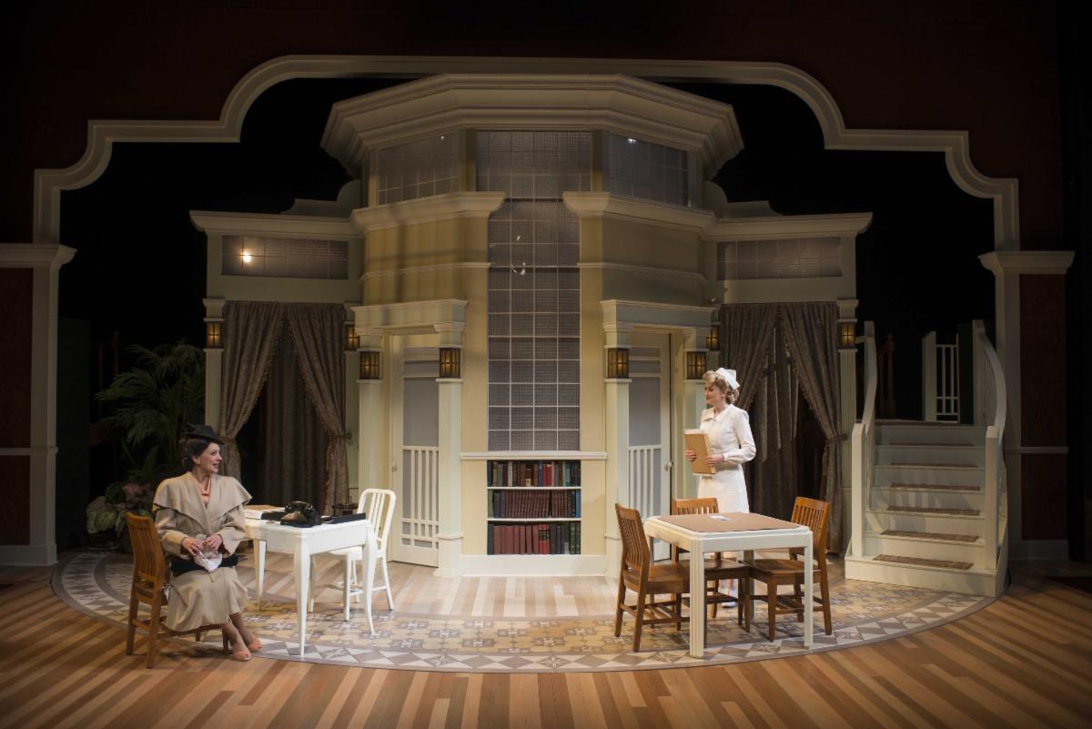
| | Notice how the designer uses furniture shapes and color to tell us the period of this performance | | |
If someone shared this newsletter with you and you'd like to subscribe, please reach out to me below with your email address. I promise, no spam, no overloading your inbox, just the good stuff.
I welcome the opportunity for connection, conversation, cooperation, collaboration, and commissions.
Live heARTfully
| | P.S. If you didn't get the chance to download your free gift from me: Here are annual collections of my newsletters from September 2022 through December 2025. | | | |
Sources:
Taylor, Jo “Watercolor Wisdom”, North Light Books, 2003
Webb Tregay, Susan, “Master Disaster - Five Ways to Rescue Desperate Watercolors”, North Light Books, 2007
Skip Lawrence and Christopher Schink’s Watermedia Focus, Issue 2o, 2000
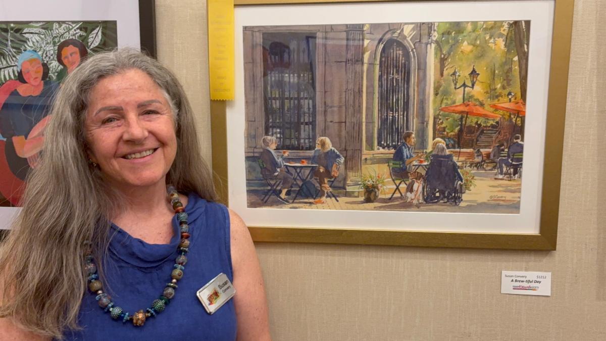
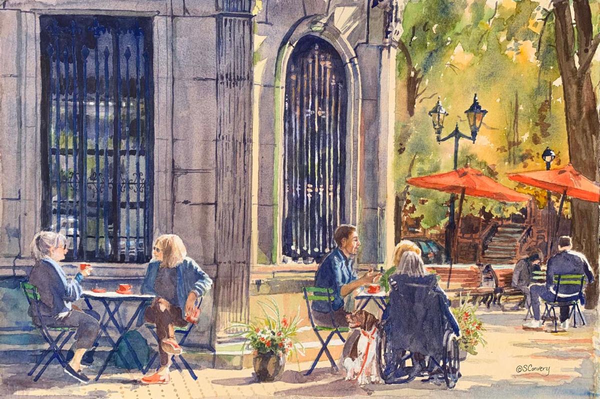
| | My painting “A Brew-tiful Day” received the People’s Choice Award at the Bonnet House Gallery of Art in Fort Lauderdale. | | | | |
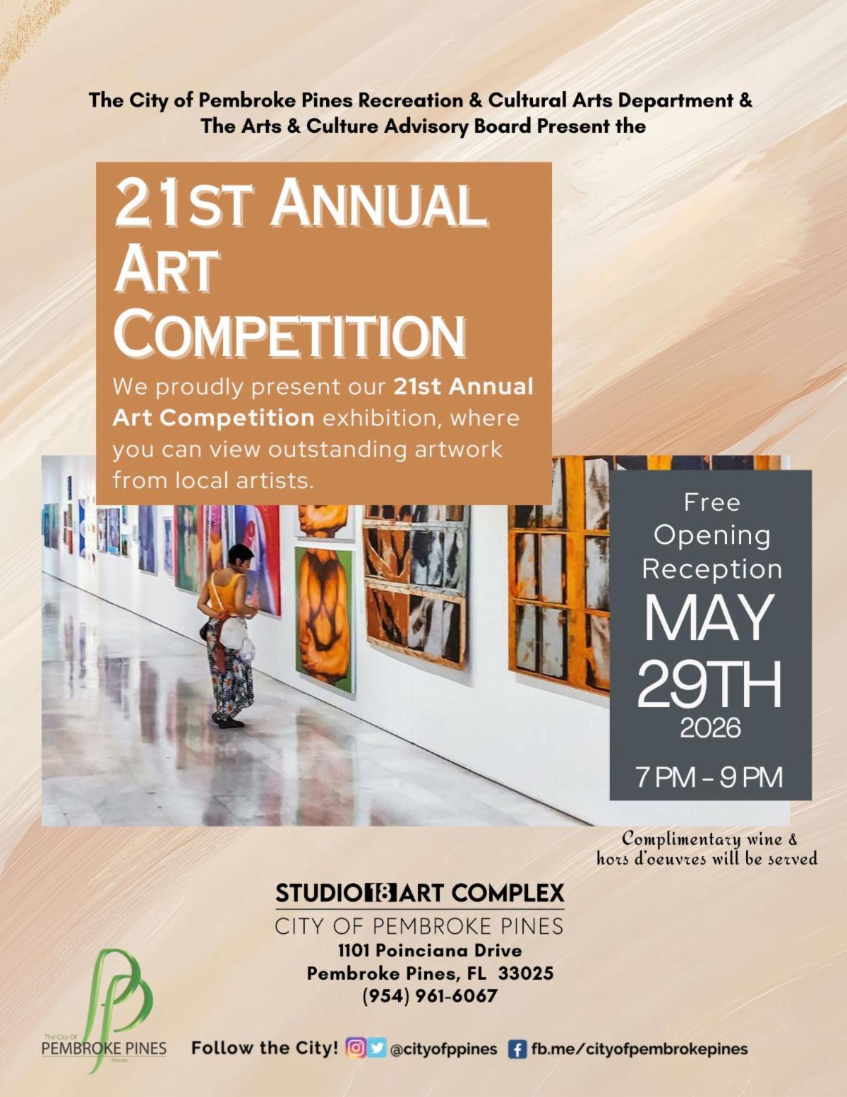
Studio 18
21st Annual Art Competition
1101 Poinciana Drive
Pembroke Pines, FL 33025
(954) 961-6067
Reception May 29 7:00 - 9:00
Show dates May 20 - August 6, 2026
www.ppines.com/studio18
| | |
Private Art Retreats
A personalized experience, full of art and discovery, for those who….
- are traveling alone, or with a couple of friends
- would like a much more flexible, and free experience, and lots of fun, too, tailored exactly to your needs, interests, and experience level
- may want to combine painting with organized discovery trips and tours and really get to know the ‘real’ South Florida
- would like to book in for a shorter or longer time than most workshops
- don’t want to have to bring a mountain of supplies in their luggage
- Prices start at $100 per hour
| |
Painting Joy
Created especially for artistic women in the third stage of life who are dissatisfied with their artwork and want to have more fun connecting with themselves and others. In this three-day watercolor workshop, we experiment with visual cues that inspire joy, discover personal symbols that resonate, and provide ways to bring more effervescence into our lives and art.
Please recommend any venues you know that might be interested in hosting this workshop in 2026 or 2027.
I am also happy to teach this as a private retreat or for a small group in my studio.
I would very much appreciate your help in getting the next booking.
| | | | | |
Private Portfolio Review
One and a half hour consultation to help you direct your energy into improving your paintings and identifying your “next step"
$250
Text Link
| | | Private Lessons and Events | | | | Master Classes for High School Students | |
Private, highly personalized classes in mastery for artistically-minded US & international students virtually on Zoom or in person at my home.
If you have a student who is a visual thinker, willing to push the boundaries of their own work, and serious about improving their options for college, I want to hear from you! Schedule a time to discuss how I can collaborate with you to build a portfolio that will give your student the greatest chance for success.
Packages start at $130 per hour
Find out more
| | | | Art Workshops, Critiques & Presentations |
Invite me to present or lead a workshop for your school, club, or guild.
I can customize a program for your event or present my skills programs on composition, color theory, drawing faces, coordinating light/shadow or understanding the cues for depth. I am available for judging, confidence-building critiques and recorded tutorials.
| | | | Improve Your Artist Statement | |
If you would like to delve more deeply into your own inner questions and clarify your thoughts as you create an artist statement for your website, a gallery show, a sponsor, or another project, please reach out, and let’s talk. I have helped many students write compelling statements for AP Art, college applications, and competitions.
$250
Find out More:
| | |
Sketchbook Prompt:
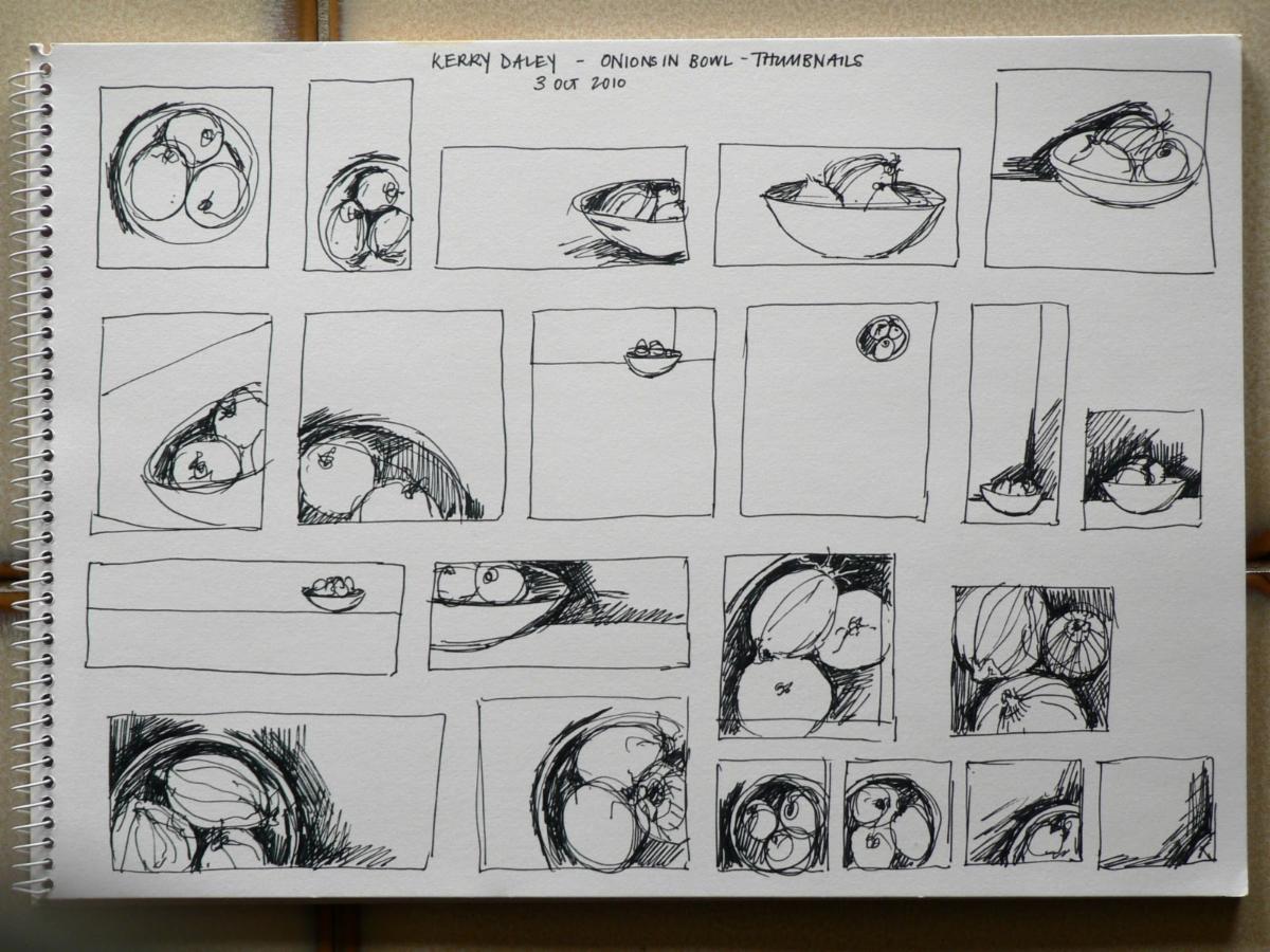
Apply different subject matter to the same good shape: still life, landscape, and abstract
| | |
It's time for these artworks to find a forever home. Please contact me if you are interested in adding any of the paintings below to your collection.
I will deliver if you live within a 2-hour drive and if you live further away, I will give you a reasonable price for shipping.
Venmo, CashApp, PayPal and Zelle are welcomed.
| | |
Title: Croatian Kerfluffle
Media: Watercolor
Size: 31”x 29"
Price: $1111
Frame: Gold
| | | |
Title: Little Blue
Media: Mixed Media
Size: 22"x 17"
Frame: Gold
Price:$222
.
| | | |
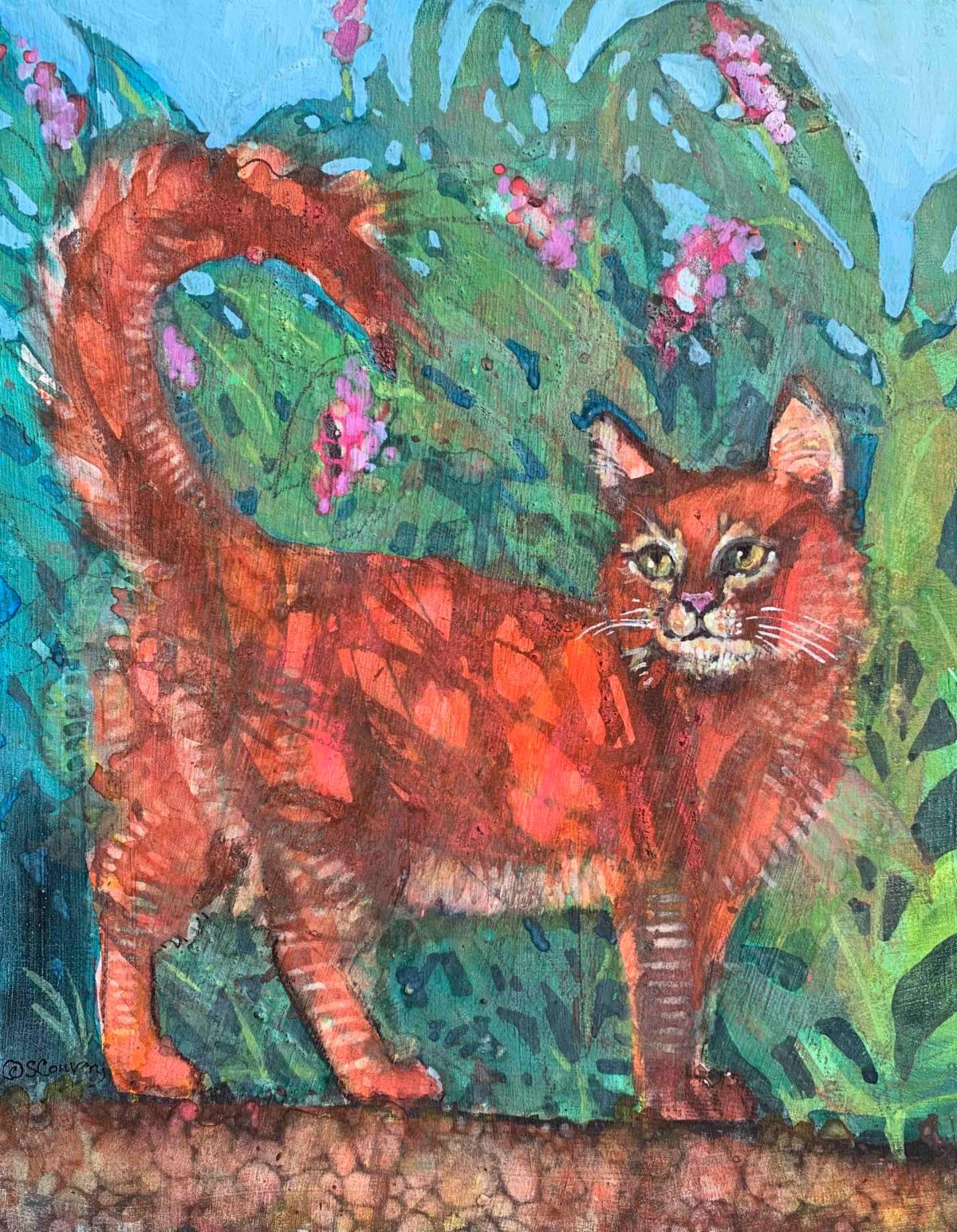
Title: Ginger
Media: Mixed Media
Size: 11" x 14"
Price: $222
Frame: Cradleboard Wood Panel
| | | |
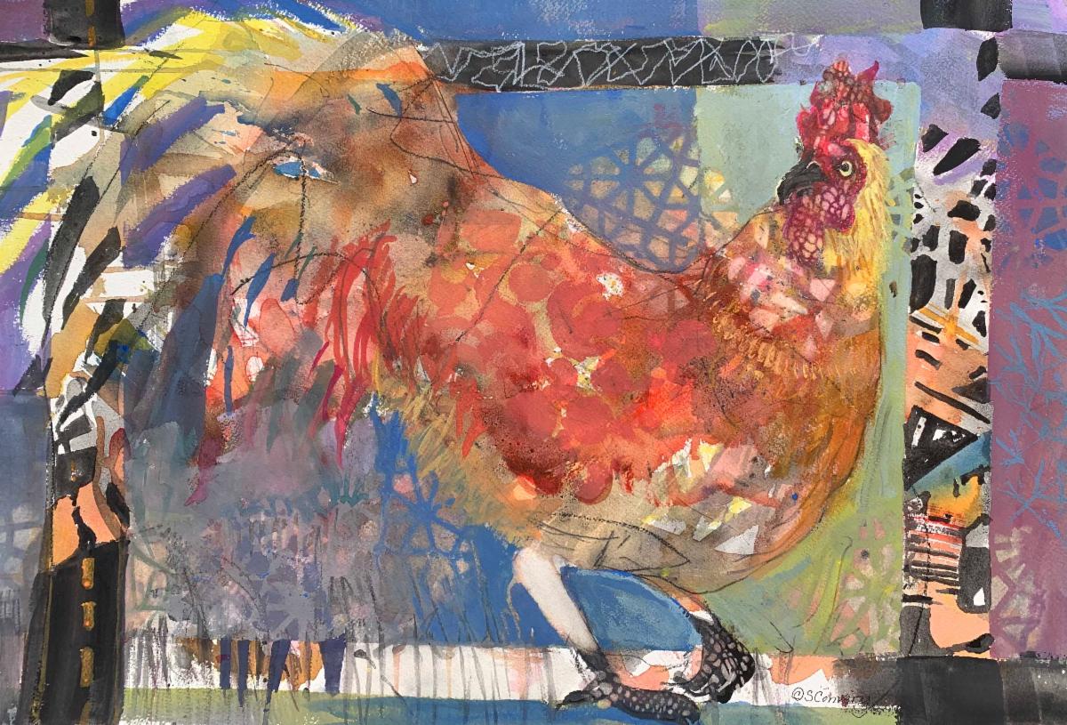
Title: Something to Crow About
Media: Mixed Media
Size: 22" x 28"
Price: $555
Frame: Gold
| | | |
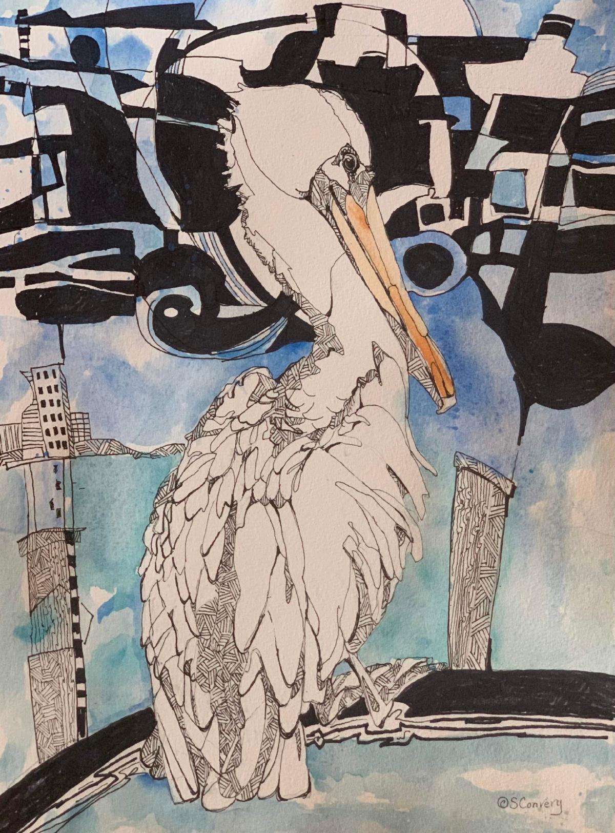
Title: I Wish For Fish
Media: Watercolor & Ink
Size: 16" x 12"
Price: $222
Frame: White
| | | |
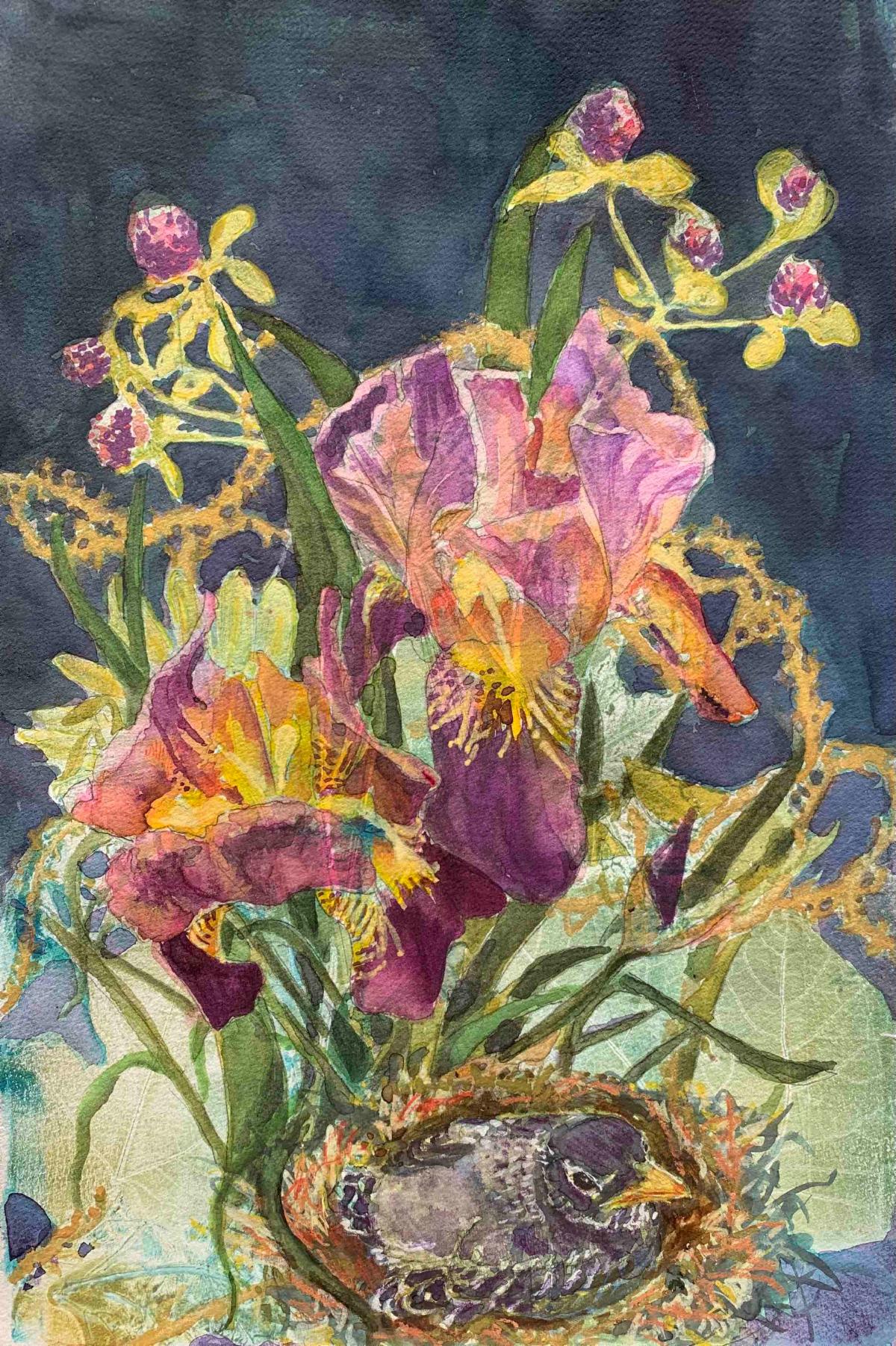
Title: Summer’s Lease
Media: Mixed Media
Size: 16" x 20"
Price: $333
Frame: Gold
| | | Want to see past issues of my newsletters? Visit this link on my website. | |
Subscription Information: You are receiving this email because you subscribed to my mailing list, downloaded a resource, purchased one of my products/programs, or opt-ed in some other way.
Thank you for being part of the Cr8V Soul Arts Tribe!
NOTE: Unsubscribing means you won't receive any more emails from me including information about your paid products and programs.
| | | | |