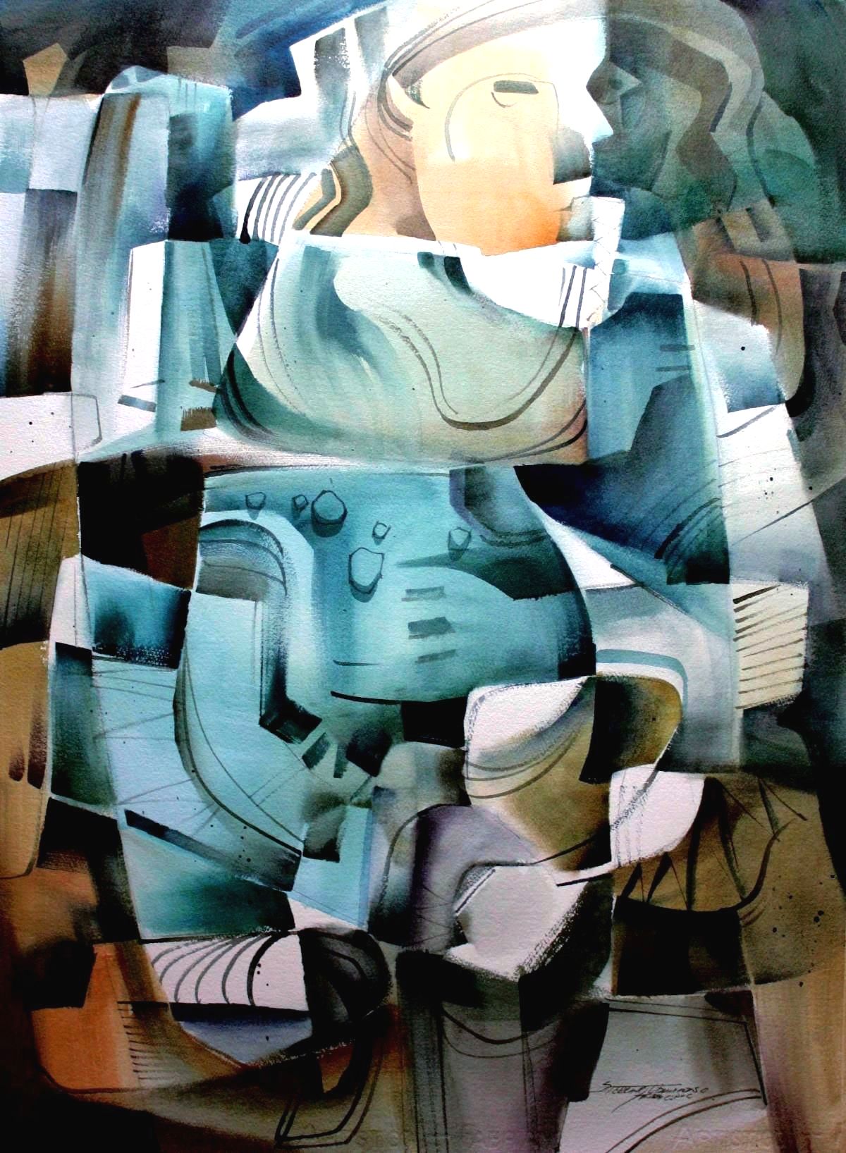
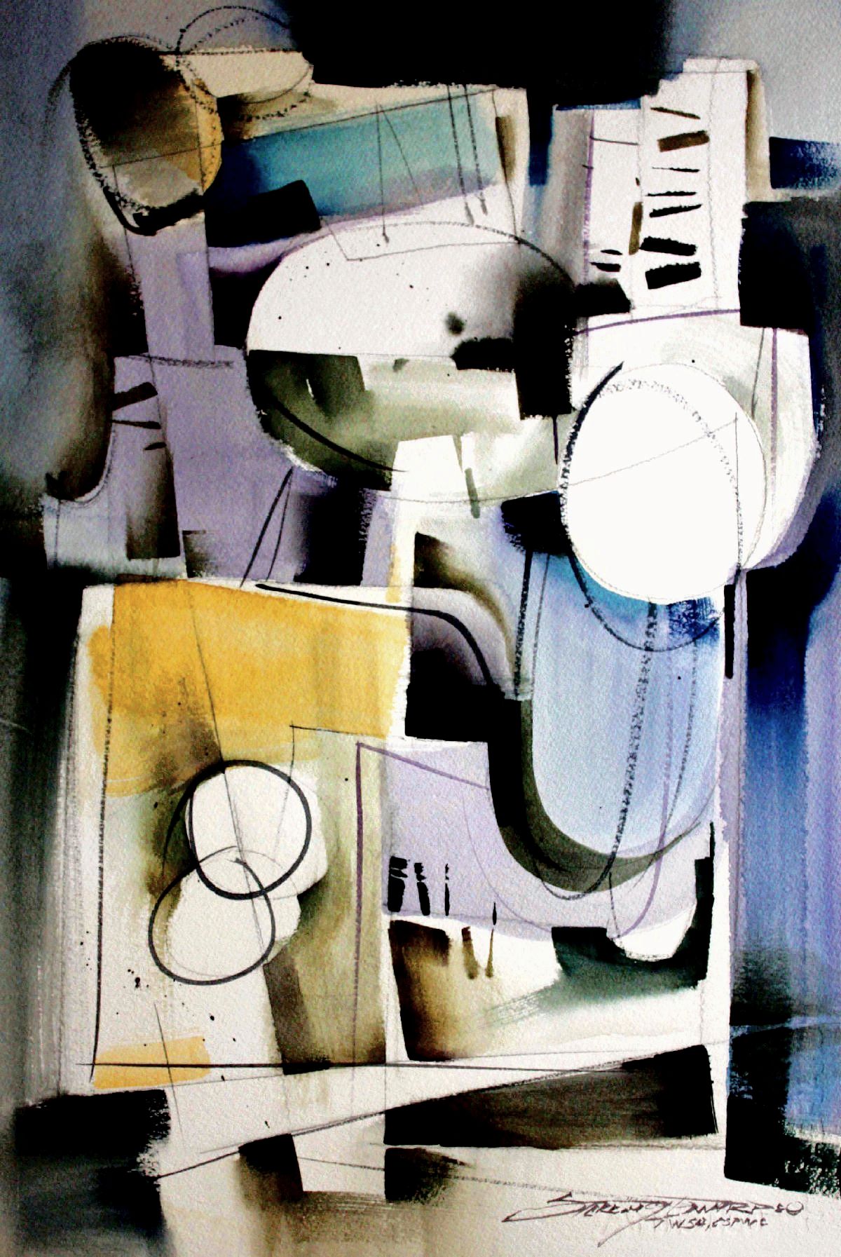
"Perplexity", 22" x 30" watercolor
Push yourself; then push harder
Just how far can you go with your creativity? I'll bet that many of don't really know because you have always painted what is generally considered acceptable art. By that I mean, landscapes, flowers, still life's, beach scenes, and so on. There is nothing wrong in doing that and it is often a reliable source of income. That's what I did for most of my painting career and it proved to be very popular. When you stop and think about it, most of the people that purchase or like our artwork have never had any real education in art. Quite often when you present them with something a little more on the creative side they often do not understand what you have done, and some will even consider it to be weird or strange art. Let's face it, most people that purchase art are home decorators and want something that is generally considered "Safe Art". You know, art that won't subject them to the rolling eyes or cruel comments from those who do not understand anything other than the traditional art that is commonly displayed in homes and offices. The safe art is also perfectly suited to match the colors in the room and is often priced low enough to be purchased without bankrupting the budget. These considerations are all valid points and as artists, we can always find a way to cater to that market. In other words, we are often painting for the market and not for ourselves. We want to be applauded for our skills and hopefully receive universal acceptance. It's only normal; I did that too for many years before I began to push myself in a few different directions. I did not have a clue as to where I was trying to go but I did have the desire to jump out of my box and test the water. To say that it was an evolutionary process is putting it mildly. It was both exciting and scary, fun and stressful, rewarding at times and filled with rejection at others. I often asked myself, "What have I gotten myself into?" Nevertheless, I kept pushing along to see just where this road would lead.
Much of what I painted during this evolution were mild abstractions of things that I was accustomed to painting in a style that I was very familiar with. I would sometimes look at one of my landscapes and figure out a way to do something really different, yet still identifiable as a landscape. I also began looking at the works of Picasso during his Cubism period. I don't claim to be so intellectual as to understand some of his pieces but I found them interesting and so different that I wanted to try my hand at it. I began to see some common threads in his work. He used a lot of obliques (angles) in his designs and carefully balanced them with some curved lines that suggested movement. He also used imaginary connecting shapes that did not seem to represent anything in particular other than random shapes that he used to connect the various recognizable shapes in his paintings. I found it interesting, and a little bit of a brain twister, in the way he would take some of his shapes and bisect them into secondary shapes of different colors or textures. Then he would offset them against each other even though they were all part of a larger common shape. These are just some of the peculiarities that intrigued me and inspired me to give this a try. Why not? I have all of the tools and materials at my disposal and I have the time. Most of all; I needed to see if this is something that I could do and enjoy, not to mention possibly exciting.
The painting above, "Perplexity", is one of my more successful watercolor Picasso style abstracts. It's totally imaginary and began as a crazy drawing on a piece of 300lb cold pressed watercolor paper. As I introduced a shape I would look for ways to bisect it and create secondary shapes within the larger shape. Many of the shapes in the painting were not something that was recognizable but allowed the viewer's imagination to try and interpret. I probably spent more time drawing and designing this painting than I had done in years. Typically I only draw the larger shapes before I begin a painting because I paint mostly with large brushes. In this painting, however; I became totally absorbed in the design process and couldn't lay my pencil down. I can honestly say that it was the most creative I had felt in years and it was a great feeling. I probably spent two days and two erasers before I was ready to introduce some color. Since I was painting something that really doesn't exists I had total artistic license to use whatever colors I wanted. I have always been attracted to paintings that have blues and browns, so I decided to go with that color scheme. This allowed a balance of warm and cool colors and areas of white unpainted paper to form the foundation of my painting. Towards the end of the painting I started mixing some black using Payne's Gray and Brilliant Orange. The black really set the colors off and created a dramatic statement. It also made a bold statement when I was ready to do my calligraphic designs that added a little more movement to some of the shapes. In my typical style, most of the painting was created using negative shapes that were occasionally accented with a few positive shapes. Aside from the crazy design, I was painting in the same style that I have been doing for the past forty years.
It was finished. I was both mentally and physically exhausted but I felt great. This was the first time I had ever pushed myself this far with a design concept and I couldn't wait to start my next piece. I decided that the next time I'll push myself even harder. Why not?
Note:
For at least the next few newsletter editorials I have decided to feature a painting in my top center space that I can write about as an example of a specific style or thought process.
We now have a NEW Companion Website:
For several years we have received numerous requests that we offer prints of some of my paintings. To accommodate these requests we have designed a new website that is a companion to our current site.
This new site allows us to offer a large selection of prints of my paintings and even some prints of my photography. Yes, unknown to most, I'm also a photographer. There are also two galleries that feature original watercolors and original acrylic abstracts on paper that are available.
Another great feature of this new site is that you can choose from a variety of sizes and surfaces that you would like for your prints. We hope that you will check it out and be as excited about it as we are.
Gift Certificates
We have received several request for Gift Certificates recently so Diane and I have decided to offer Gift Certificates for $75.00 or $100.00 that can be redeemed for Videos, Live Classes, Art Supplies, and Paintings. The Gift Certificates can be purchased on our website; www.sterlingedwards.com under Art Supplies.
(Not redeemable for live, on location workshops)