Improved User Interface
Over the last few months we have been working on improving the design of our application. From the colours and font, to the menu navigation and data visualizations, we have revamped the whole look and feel.
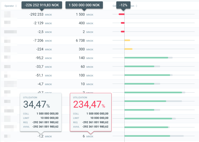
There are now new ways to better visualize the collateral utilization of cleared positions.
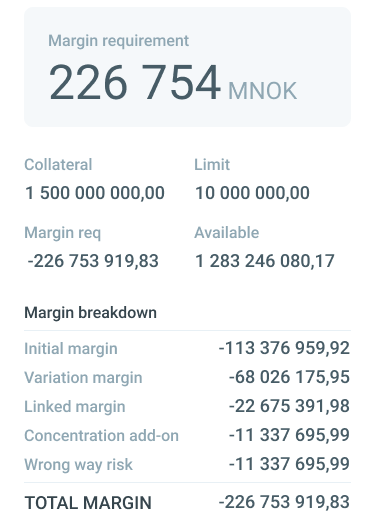
We have a detailed breakdown of utilization, and a mobile version (both below).