|
Art Talk Contents:
Dolores Mitchell Retrospective at the Chico Art Center, June 9-July 17.
Reception for the artist: Friday June 26, 5-7pm.
My use of color and of 3 painting mediums (oil, watercolor, pastel)
In this Art Talk I discuss insights that came to me while revisiting the fifty paintings in my Retrospective.
The Catalog that accompanies the show
I'll explain how making the catalog with the help of my daughter Ann Mitchell gave me a better understanding of my art. One copy will be available to examine within the exhibit and ten will be for sale in the gift shop.
How to create your own "catalog" of your art or life experiences. The new Chico Art Center Computer lab offers book making equipment and classes that will let you document your art and/or family experiences.
| | |
Dolores Mitchell: How teaching art history and making art have reinforced each other in my life.
There are 50 paintings in my Retrospective--seven from my UCLA years in the l960s and the majority from after my retirement in 2,000 from teaching art history at CSUC. I received my BA at UCLA in Studio Arts in l964, but I lacked a compelling direction to pursue as a painter and turned to graduate study in art history as a fascinating discipline with viable career potentials.
| | |
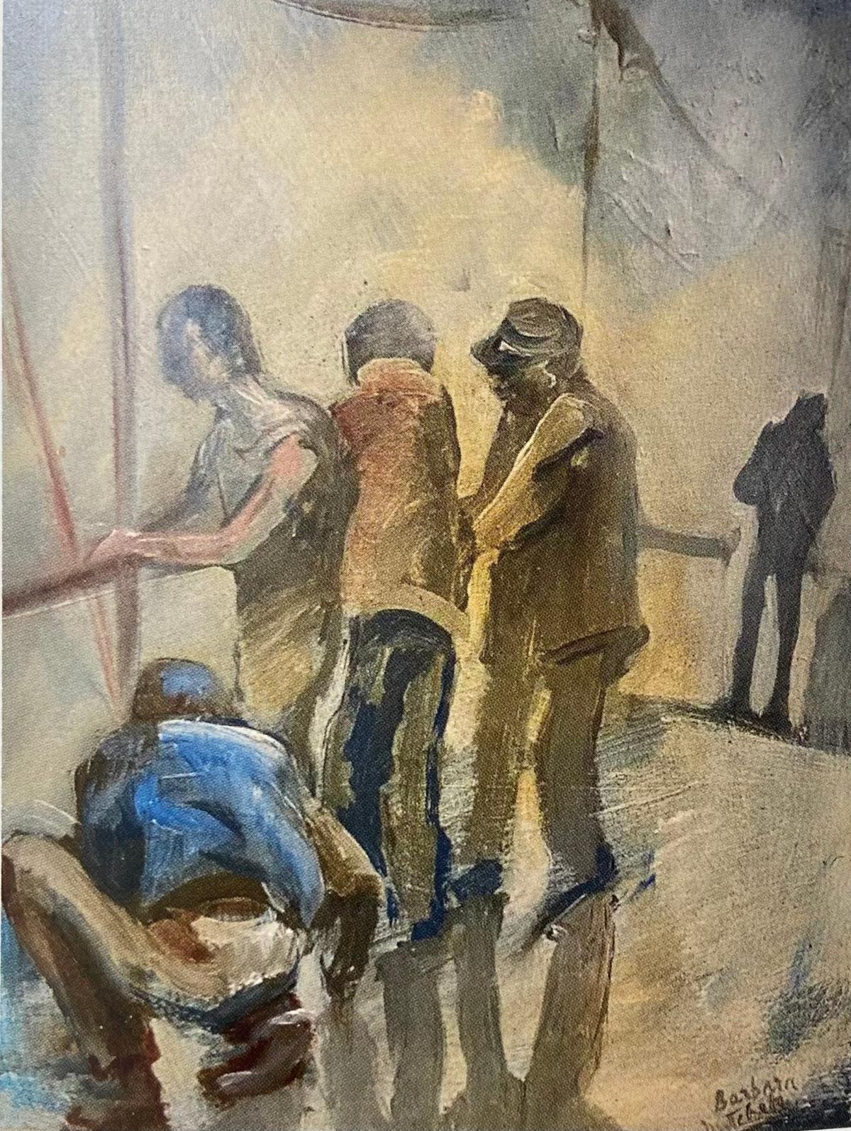
Oil sketch done on location on the Santa Monica Pier, c. l963
While teaching art history I hadn't enough time or energy to paint. However, I continued to draw and analyze paintings in museums so I could explain to students how masterful artists had constructed their compositions. When I began painting again, I had achieved insights that I'd lacked in my youthful years. For me, painting and art history have complemented each other and teaching students has resulted in teaching myself as well.
| | |
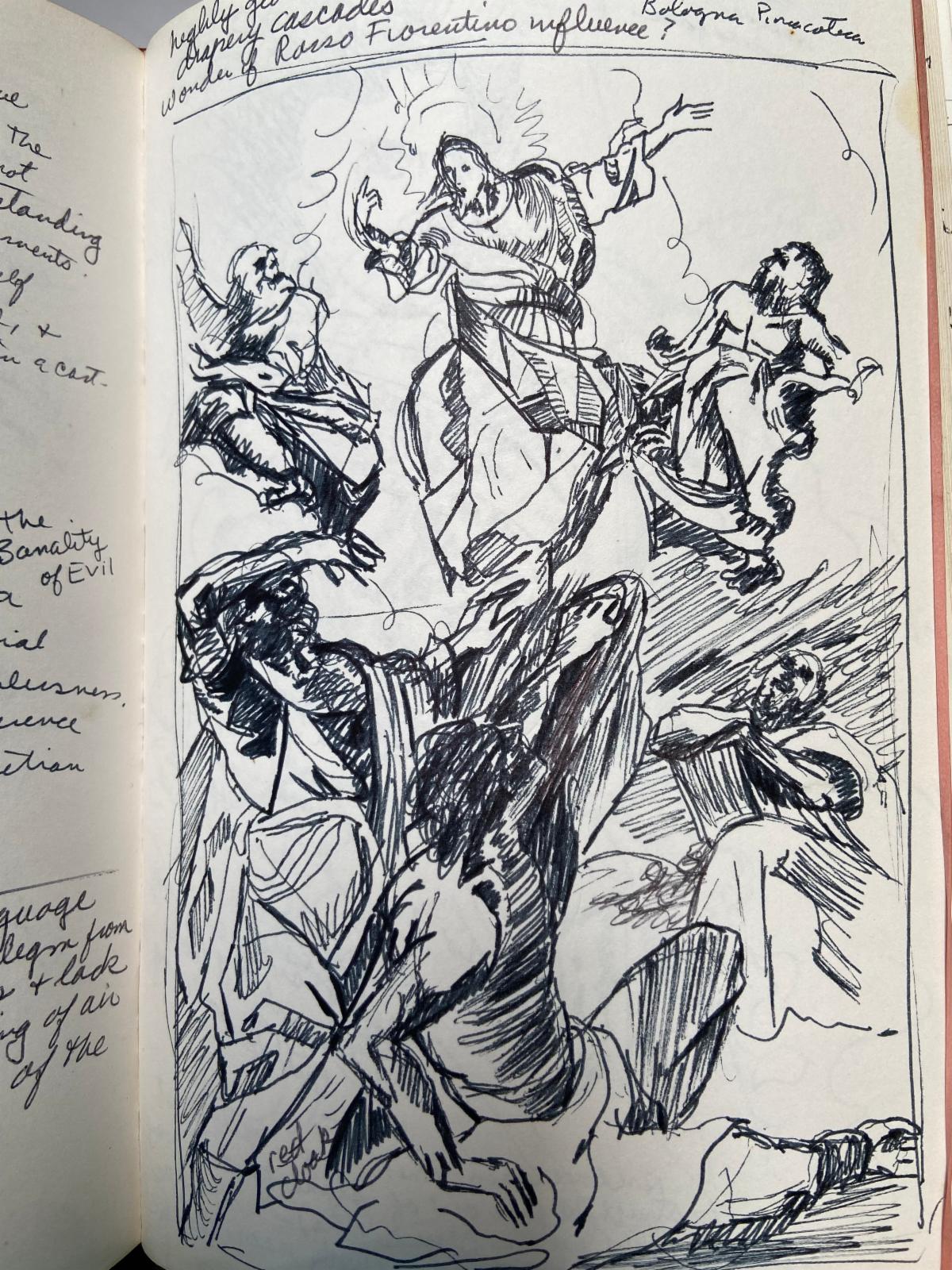
My sketch of a Mannerist painting in a museum in Bologna.
After retiring, I began to practice plein air painting in which I depicted what I saw as faithfully as I could. Gradually, I began adding memories and personal feelings to eyesight information. A huge incentive to paint seriously came in 2004 when, together with Maria Phillips and Giovanna Jackson, I co-founded Avenue 9 Gallery and had a yearly featured-artist exhibition.
In this Art Talk, I'll share some thoughts that came to me as I assembled this Retrospective, such as the importance of color and mediums in my art. Applying art historian skills, I'll analyze my paintings as if giving a gallery tour .
| | |
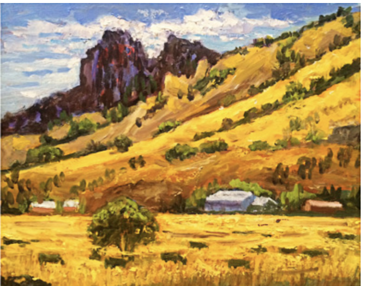
Dolores Mitchell, "Sutter Buttes in August" oil,. 2006
I've used all the yellows in my paint box--Naples Yellow, Indian Yellow, Yellow Ochre, Lemon Yellow and Cadmium Yellow Medium--to suggest the searing heat of August in the Sutter Buttes.
| | | |
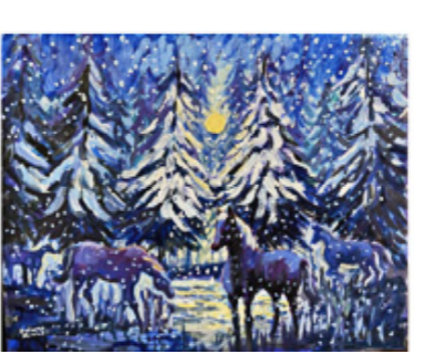
Vivaldi's Four Seasons: Winter
Inspired by the shivery sounds of Vivaldi's Winter, I've imagined Prussian Blue and Ultramarine horses wandering through a forest during a snowstorm.
| | |
Detail: Sutter Buttes in August
I've often asked students to imagine the effect of changing something in a painting, such as adding a creek full of blue water to this painting.
| |  | |
Detail: Vivaldi's "Four Seasons-Winter"
What if I had painted Chestnut colored horses rather than blue ones?
| | | |
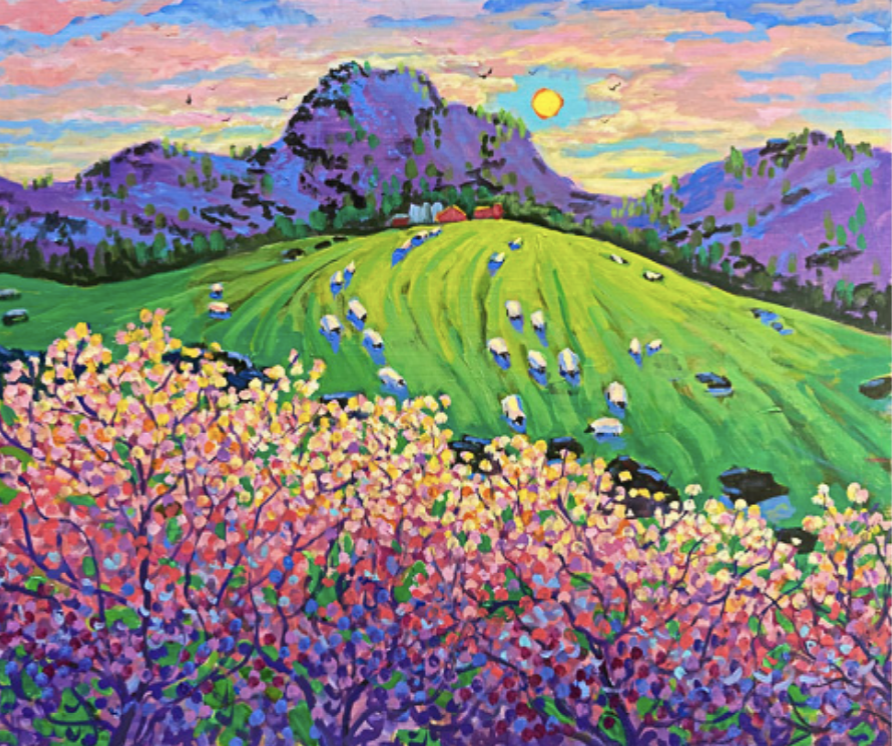
Sutter Buttes in Spring, Oil
Is the first thing you notice about this painting the contrasts between pink and green? Look longer and you'll see colors that range from purples on the lowest portions of the trees, reds, oranges and pinks in the mid-section, and pale pinks and yellows for the sunlit treetops. Shades of green change from Chartreuse at the top of the canvas to Emerald Green at the bottom.
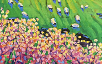
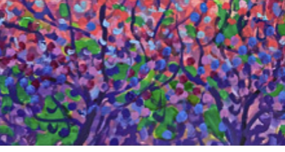
| | | This detail brings out how sunlit blossoms are intensified through juxtaposition with black lava rocks. | | | To darken the lowest patches of Emerald Green I used Prussian Blue rather than black so they would glow like stained glass rather than look dull. | | | |
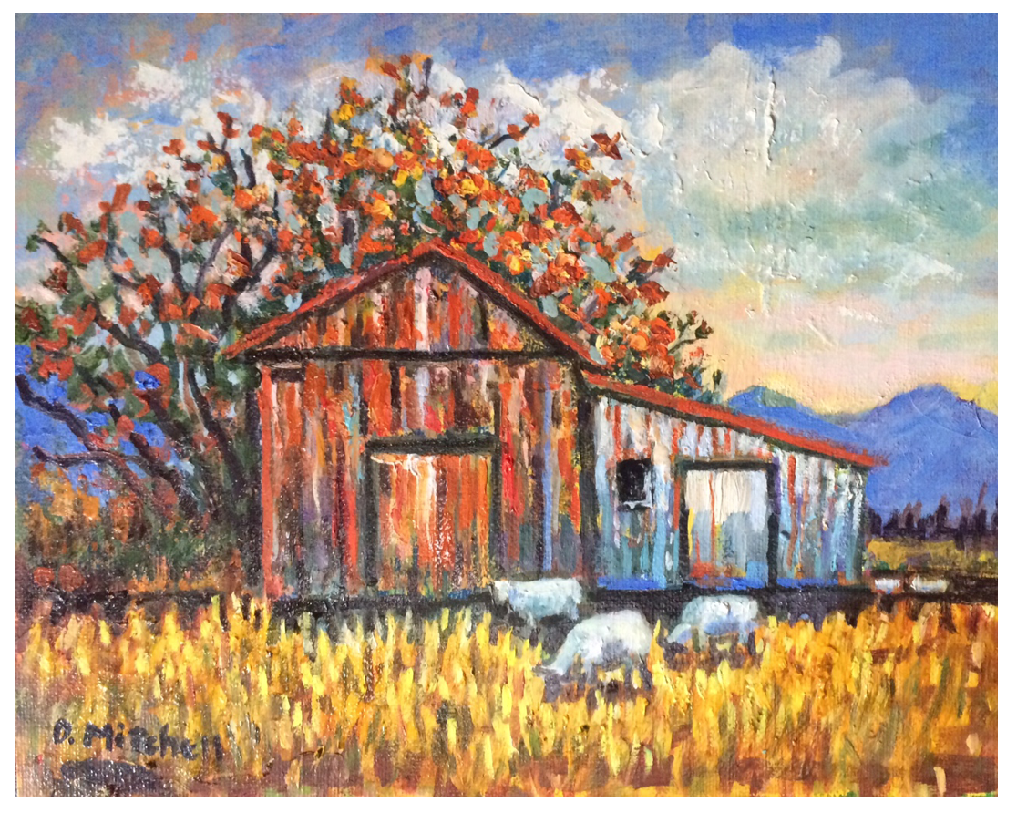
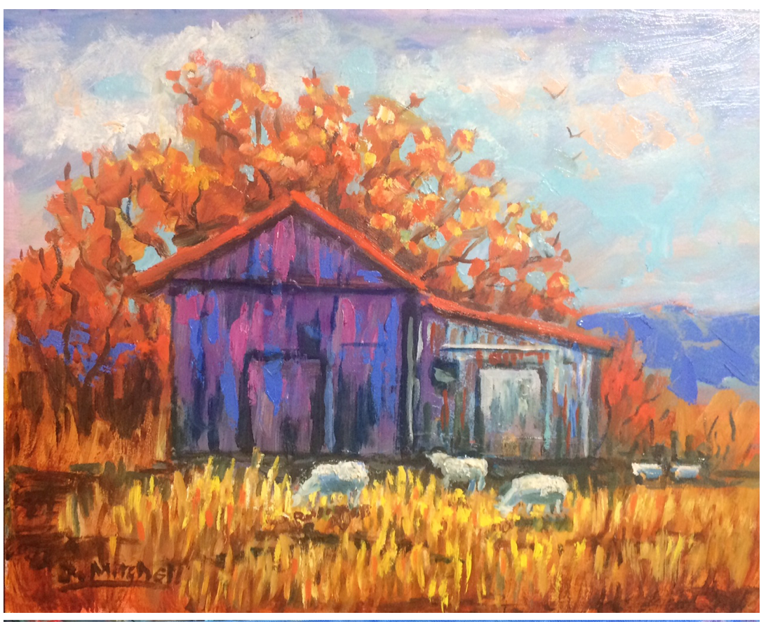
Sutter Buttes: Barn & Sheep
at Noon,
I based this painting on a sketch of a shed near the Sutter Buttes. To animate the composition I've painted three sheep in the foreground and two in the distance. Warm advancing colors of yellow, orange and red fill the foreground and cool receding blues make up the background.
| | | |
Sutter Buttes: Barn & Sheep
in Late Afternoon.
I next tried a 'what would happen if' experiment by sandwiching a cool, recessive blue and purple shed between warm orange trees and yellow grass. How is a sense of space affected by my color choices? Do the two paintings of the same barn communicate different moods and times of day?
| | | |
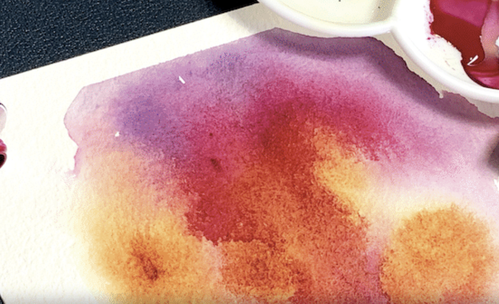
My retrospective lets viewers compare the effects on my paintings of 3 different mediums that I have used: watercolors, pastels, and oils. Each medium uses the same pigments but with additions of gum Arabic, or small amounts of binder, or oil.
| | |
Watercolor (above) produces luminous, transparent, ethereal effects on paper surfaces. Corrections are difficult and inexpert mixing can produce
"mud". I love the medium, but using it results in a high proportion of "throwaways" to "keepers." Available in either pans or tubes, watercolors are made up of finely ground pigments suspended in a binder such as gum Arabic and distilled water.. A wet brush is the usual vehicle for thinning and applying watercolor to paper.
| | |
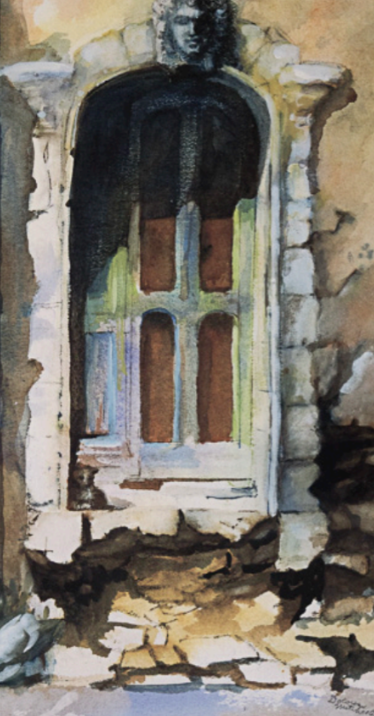
Mysterious Doorway, watercolor
It was the missing stairs that drew me to this ruined doorway in Provence. The door itself was intact, but reaching it meant scrambling over rubble around the steps. Yet the entrance hadn’t been boarded up. Was someone still living in the house? As I sketched, my imagination spun stores of a recuse who despite the obstacles was spry enough reach the door and enter the inner sanctuary.
| |
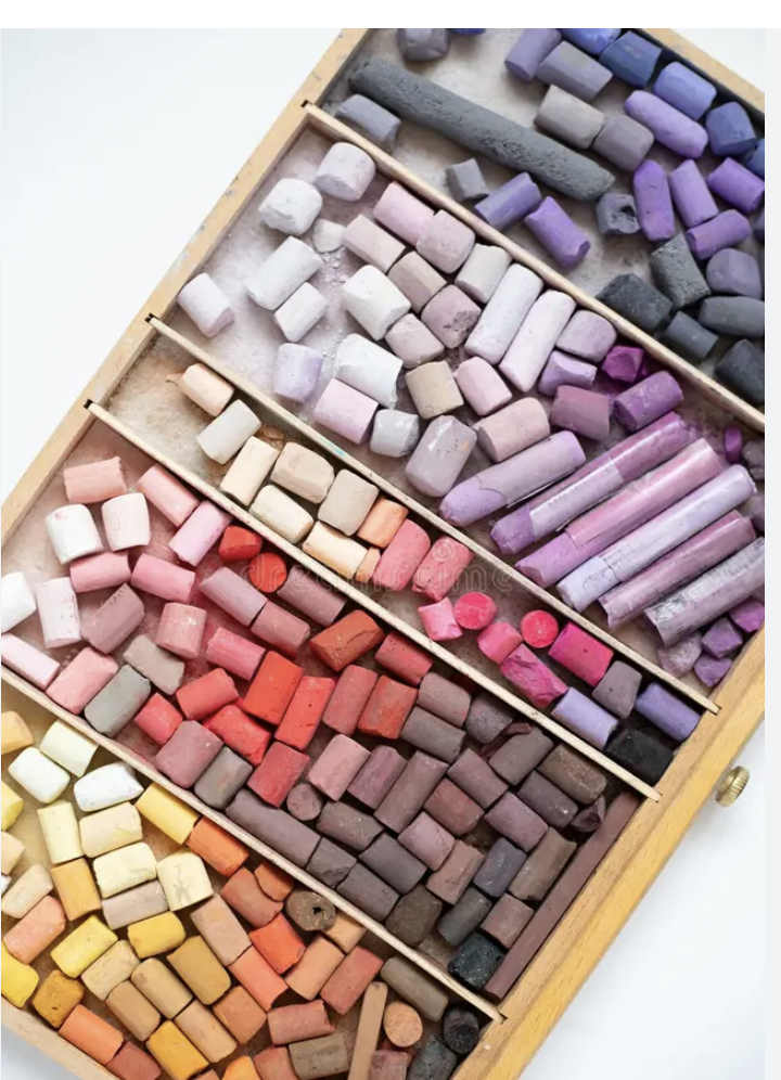
A box of pastels, a medium loved by Degas.
Pastel is the most saturated of the three mediums. It consist of pure ground pigments plus a small amount of white filler like calcium carbonate or kaolin. A textured paper is needed to grip the pigments. An artist holds a stick of pastel between his or her thumb and fingers like a pen, making it as personal in its application as handwriting.
| | |
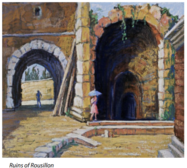
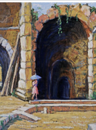
These ancient ruins in the town of Rousillon in Provence were almost deserted when I settled down at noon on my folding stool to paint them. The crumbly textures and natural earth tones of my pastels closely matched the weathered bricks and stone that surrounded me. What might the challenges be to depict this subject at sunset?
| | | |
Oil painting being manufactured
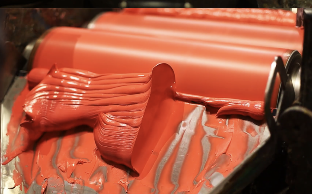
Ground pigments mixed with liinseed or walnut oil are typical oil paint ingredients. Student Grade oils contain more 'fillers' than expensive, highly saturated Artist Grade oils. Turpentine and mineral spirits can make oils spread easily, but they can also be applied thickly right out of the tubes--much like troweling plaster onto a wall. I paint my oils on both canvas and masonite surfaces.
| | Oils have been my preferred medium since I was 12 and learned 'Old Master" techniques of layering and glazing from a shoemaker who had practiced as an artist in Italy before moving to Chicago. The medium allows for maximum control because its extended drying times permits changes and overpainting. I use sable brushes and palette knives to achieve all manner of textures with this medium. | | | |
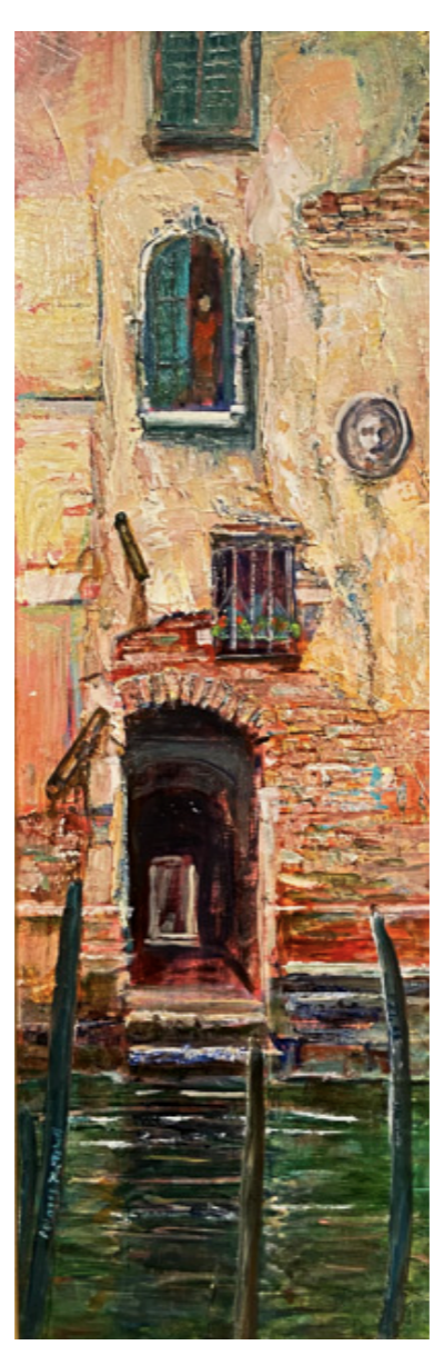
View from a Venetian Canal, oil
Like an actress who hides a plain face under thick makeup, this Venetian building once concealed the bricks that supported it under layers of stucco and limestone. Decades of weathering had destroyed portions of the outer layers and I relished using ochre, sienna and umber oils to paint bricks made of the same types of earth.
| | |
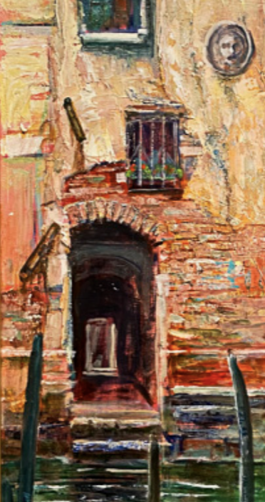
Detail of View from a Venetian Canal
What clues help you understand the configuration of this passageway?
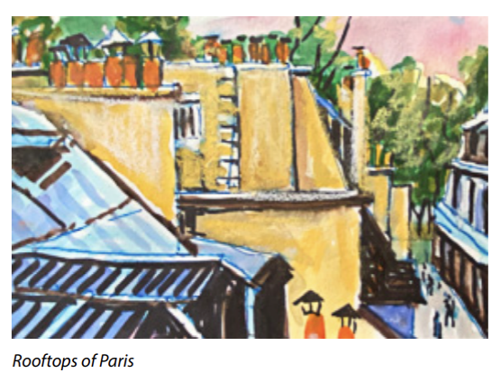
| | | If you were to run your hand over the surface of this watercolor, you wouldn't feel any textures--all is illusion, yet, from a distance, you can make out jagged contours, cavities, and projections. How is this achieved? | | | Compare this detail of The Ruins of Rousillon, a pastel, with the details of Mysterious Doorway, a watercolor. Which seems more tangible and which more ambiguous--and why? | | | A blue shape occupies the lower left corner. What might it be? | | | I often use watercolor pens to sketch people and places as I travel. They have a more graphic feelng than watercolors brushed onto paper. | | |
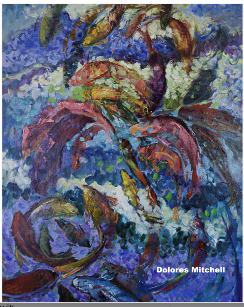
This is the cover of the informal catalog that accompanies my retrospective. Visitors can examine a copy in the gallery and ten copies are available for purchase in the gift shop. It contains 40 more artworks than are in the show. It can be purchased directly from the printer, MagCloud, for $13.50 plus $6.50 shipping or for $20 from the CAC Gift Shop which includes a 30% donation to CAC.
I hope my catalog will encourage people to create their own documentation of their art and lives by using the new Chico Art Center computer lab facilities.
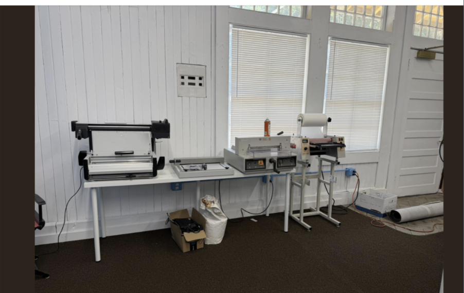
| | Daniel Donnelly says: "On May 6th, eighteen CSU Chico Graphic Design students visited the Chico Art Center's new Digital Arts Lab, and though it was still in development, we had the book binding equipment ready for the students to bind a softcover book with a cover they'd designed earlier in the week." | | |
Donnelly continues: "The students learned how to use the softcover spine crimper, cover laminator, the glue-binder, and our trimming machine."
The June 22 issue of Art Talk will include a more extensive discussion of the Computer Lab facilities as well as details on classes that will equip artists to promote their art.
------------------------------------------------------------------------------------------------------
| | Call for Students, Friends, Colleagues of Janet Turner to contribute to an article I am writing about her for the September issue of Upgraded Living. Send information to: dmitchell@csuchico.edu | | |
James Snidle Fine Arts and Appraisal
Pop Up of Fine Arts & Estate Sale
By appointment: June 9th, 10th, & 11th (Tues-Thurs)
Public Reception: June 12th, Friday and 13th Saturday
at 514 Orange Street, Chico
| |
Chico Art Center is at 5th Street and Orange by the train tracks. Open 11:30-4pm. 530-895-8726
Art Talk" is a forum for the entire local art community including nearby towns. "Entire" means all ages and all levels of art-making from beginners to pros. Early submissions are welcome and I can chat with you by email or phone to help you get started: dmitchell@csuchico.edu. I also write 6 or so art articles a year for Upgraded Living and invite artists to contact me about that possibility.
You can make "Art Talk" a more useful free communication outlet by forwarding this copy to friends who can click below to subscribe.
https://docs.google.com/forms/d/e/1FAIpQLSf6d_A3vX1euAAXTzNHZepclpGCOFPirkUibW2b-m_62L4dSw/viewform
| | | | |