Ever wonder what a massive economic shock does to price levels? The answer is not always clear. Depending on the nature of the crisis, there can be a wide variety of impacts on both the supply of and demand for different categories of goods and services. Fortunately, the Consumer Price Index (CPI) data, available from the Bureau of Labor Statistics website, provides all the answers you could ever want. Price levels are extremely important to policymakers, including lawmakers as well as the Fed, because they can provide clues as to the underlying strength of economy. When price levels are growing very slowly or falling, policymakers can afford to implement fiscal and monetary policies that boost economic growth without worrying about an undesirable spike in prices. On the other hand, when price levels are growing at an outsized rate (the Fed's target inflation rate is 2%), policymakers might want to think twice about adding too much fuel to the fire.
In the following discussion, we are using the BLS's September, 2020 index weightings for the CPI.
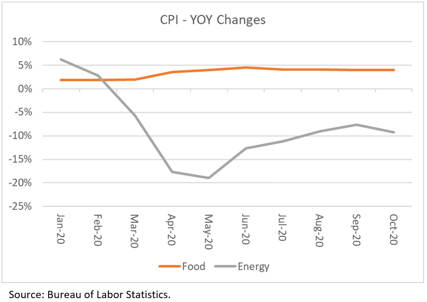
The first thing to point out is that economists usually exclude the impact of changes in food and energy prices when evaluating overall price-level changes. They do this because these categories can be highly volatile. The first chart below shows that prices for food and energy have indeed been highly volatile during the course of 2020, with huge drops in energy prices offset by outsized gains in food prices. The second chart shows that if we remove the effects of both food and energy, the "core" CPI is clearly much less volatile than the headline CPI.

Let's look a little closer at the core CPI and try to figure out which prices are going up and which prices are dragging the overall index down. Let's start with the physical goods side first (as opposed to services). Goods prices represent about 37% of the CPI. If we exclude food and energy, goods represent only about 20% of total CPI. Within goods prices, one category clearly stands out as having an outsized impact on the overall level of goods prices in recent months. And although this category only accounted for about 2.8% of total CPI (or 7.5% of goods prices), the large increases in used auto prices have been enough to make a big difference. In the table below we show the YOY changes in used auto prices along with the changes in good prices if we exclude 1) food, energy and used autos; and 2) just food and energy. It's easy to see that the YOY change in core goods prices would have remained negative over the past few months if we remove the inflationary impact of used autos prices. Why are used auto prices up? There are several reasons: 1) new auto production declined to a halt during COVID; 2) people are nervous about riding public transportation during a pandemic so they have opted to buy a car instead; 3) super low interest rates have lowered the cost of ownership, and 4) stimulus checks may have been used for down payments.

Now let's turn to services. It turns out there are several categories of services prices that are running much hotter than overall CPI. The largest and most influential by far is shelter, which carries a weighting of 33% of total CPI. Though price increases for shelter have slowed meaningfully over the past year, the cost to put a roof over one's head is still climbing at a 2% pace YOY. Other categories seeing big YOY changes are medical care services, recreational services, tuition, other school fees and childcare, and telephone services. Together, these five categories represent half of total CPI, or 62% of CPI if we exclude food & energy.

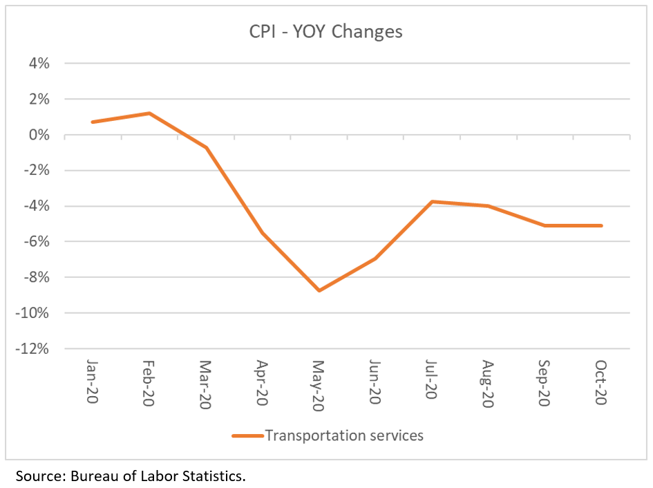
Is there anything on the services side that is offsetting the big gains in these prices? There is one category muting the increases. Prices for transportation services, which account for about 5% of total CPI, have been dropping at sizeable rates due to the unwillingness to fly, take a cruise or use public transportation. This is obviously one category that is likely to see a big rebound in prices if and when vaccines are successfully distributed and administered.
What does this data tell us? Well, the big takeaway, in my view, is that low- to moderate-income folks continue to get squeezed by job/income losses combined with outsized increases in the prices of necessities (also called "non-discretionary" expenditures). Food price inflation has been running right around 4% since the start of the coronavirus outbreak, while shelter, medical care, and child care are all seeing above average price increases as well. These increases are a big reason why Congress must get another round of fiscal stimulus passed. There is a lot of suffering out there, and the extent of the carnage is masked by the BLS's methodology for calculating consumer price changes. Sure, prices for clothing, cruises and airline flights are going down, but that makes no difference to people that are struggling to put food on the table. And though outside the scope of this Market Commentary, the weightings that the BLS is using to calculate CPI far underestimate the proportion of lower-income paychecks that are needed to pay for non-discretionary goods and services.
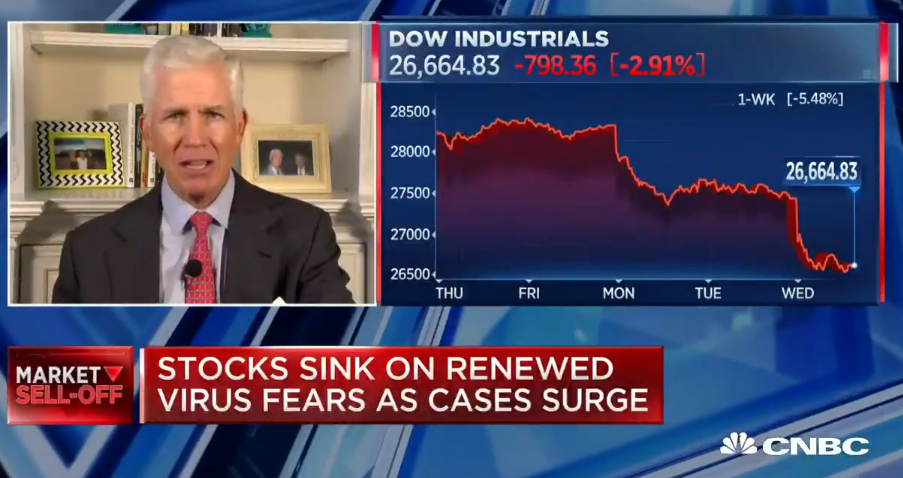
The markets are likely to encounter continued volatility until Congress gets its act together. If another round of assistance is not passed, there will be a lot of needless suffering this winter on top of the big spikes in COVID infections, hospitalizations and deaths. Humanitarian crises are not a good backdrop for economic growth and risk assets. The sooner policymakers understand this, the better off we'll all be. A double dip recession is not in anyone's interest.
Peace,