|
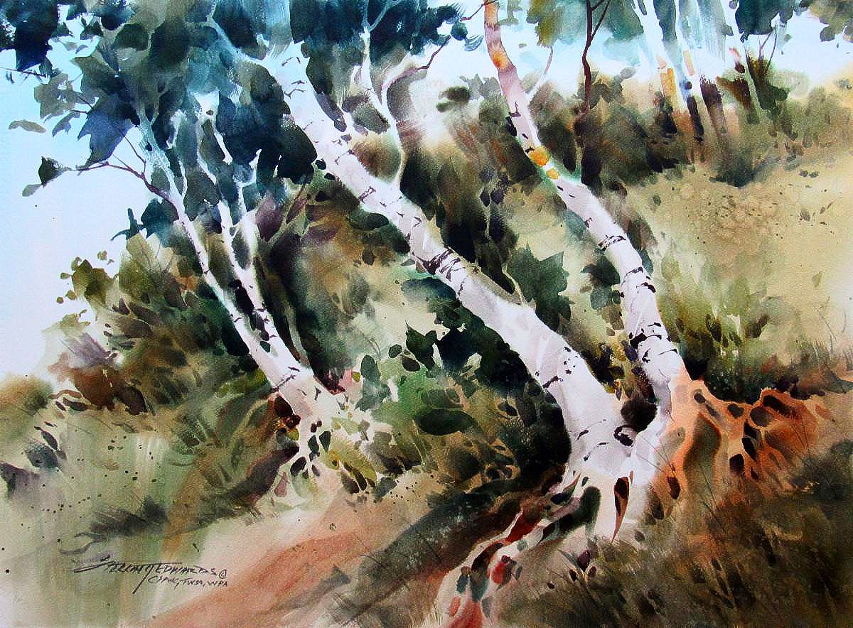
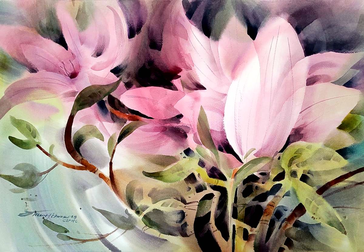
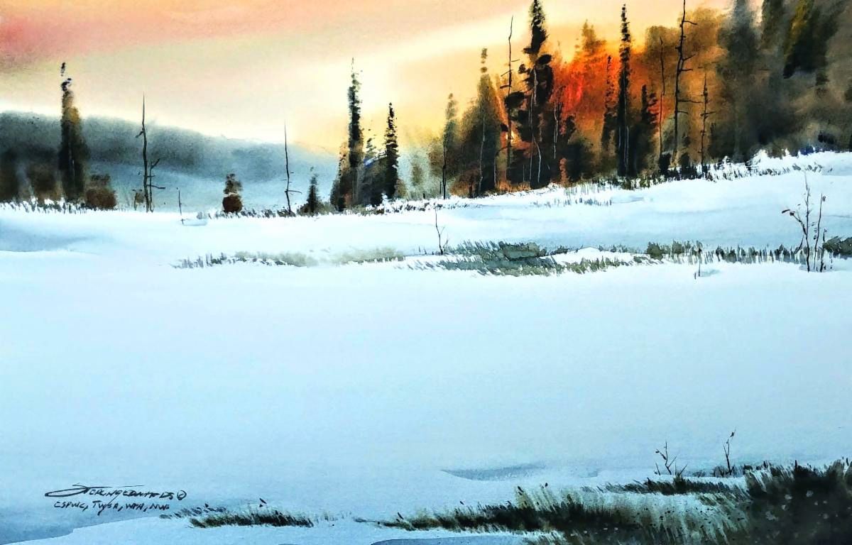
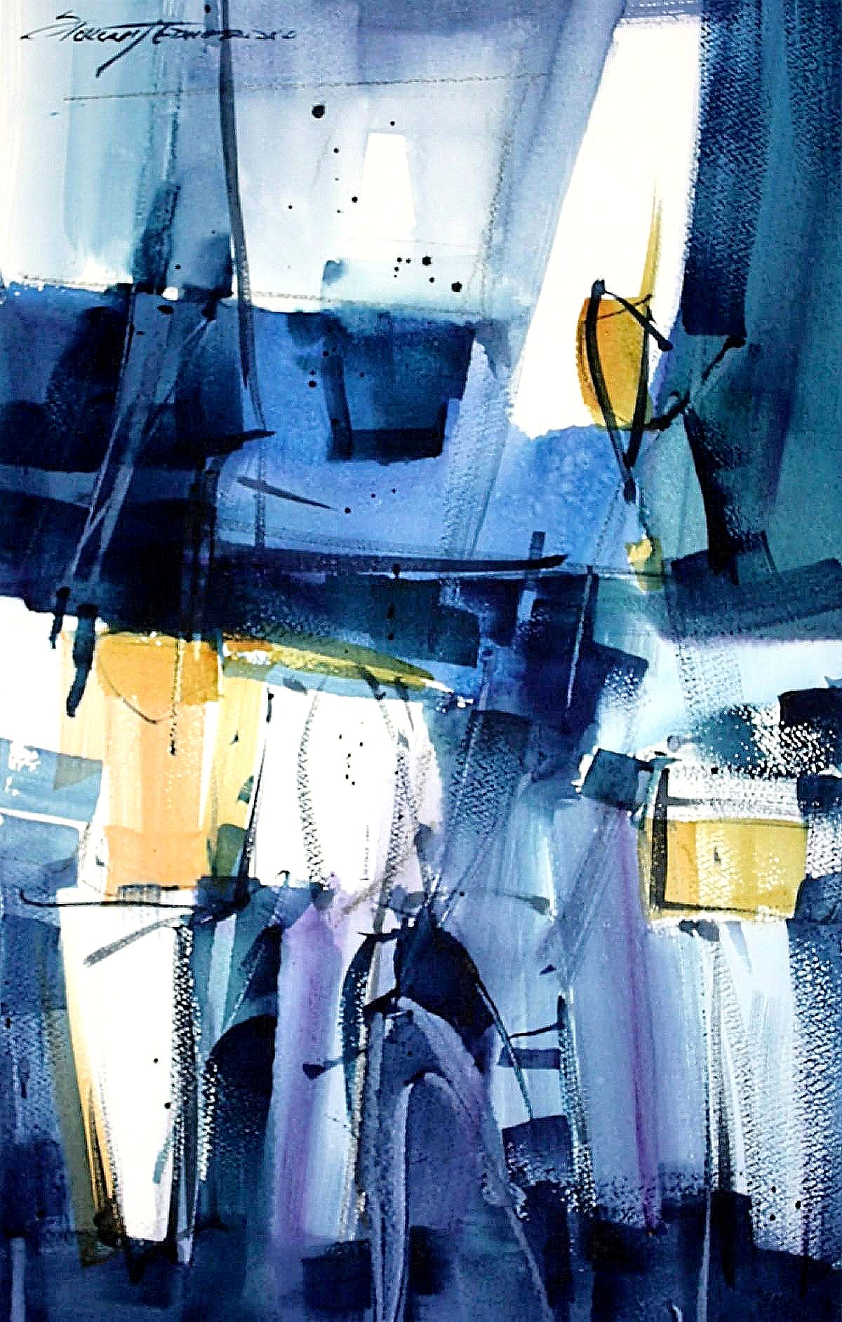
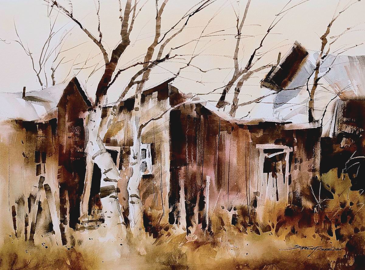
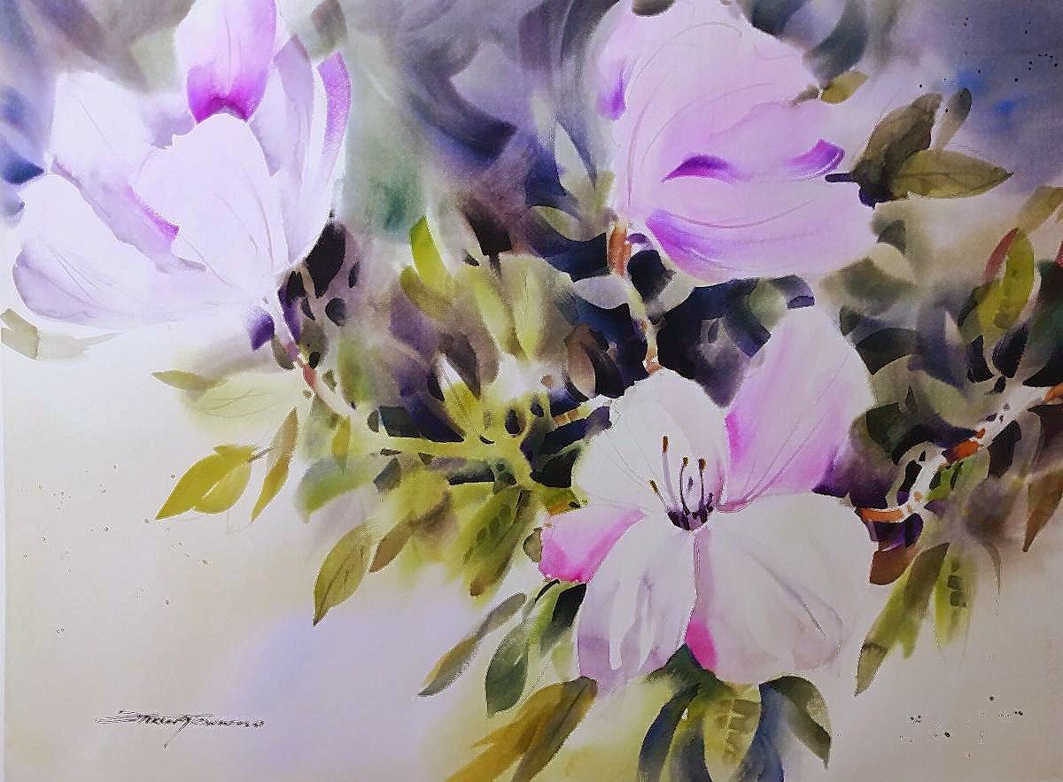
22" x 30" Watercolor.
Is your painting finished? Develop a check list.
Have you ever painted something and wondered whether or not it is finished? Let me rephrase that, have you ever painted something and not asked yourself is it time to sign it and move on to the next painting? I ask myself that every time I paint something. Like most of you, there is always that fear of overworking our painting looming in the back of our mind. It's a natural concern and fear, which is not necessarily a bad thing. Fear is what usually keeps us out of trouble or stops us from doing something reckless. It's also what keeps us from pushing a beautiful painting too far. So the question arises, "What is too far?" How do we determine beforehand if we should keep working on a piece or sign it and move on?
Anyone who has ever studied with me knows that I frequently refer to what I consider the basic elements of a good painting. It doesn't matter what the subject of the painting is or what style or medium you are using; there are certain tried and true elements that go into each painting. If done well, the painting stands a good chance of being successful. It's a well known fact that not every piece we create will be a winner. But we can increase our odds of being successful if we each develop a standard of expectations of what we hope to achieve in our paintings. I may from time to time deviate a little from this list, but overall, I use it as my guide. I constantly evaluate my work as I am painting to assure myself that I am sticking to my basics. The following is the list of elements that I use as I am working on a painting. Once I have achieved all of my basic elements to my satisfaction I generally consider the painting to be finished. Here are what I consider the most important and essential elements.
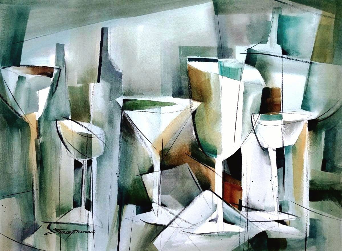
COMPOSITION: Does the painting have a strong composition that allows the eye to move throughout the painting as well as pull the eye to my center of interest? Is the center of interest off center enough that the overall image does not look too symmetrical? Notice that I listed Composition first because I believe it is the most important element on my list. Without a strong composition the painting can almost look awkward and off balance. In fact, when I jury art competitions, composition is the first thing that I notice when looking at a painting. A bad composition stands out immediately and can often disqualify a painting from being accepted in a show; at least the show that I jury.
SHAPES: Are the shapes interesting and do they frequently overlap? Anytime that I can find an opportunity to vary the sizes of the shapes, and overlap two or more shapes I get more depth and dimension in the painting. Since I am a studio painter I work from photographs that I have taken. Rarely do I paint something that did not require me to move things around a little to overlap and even resize some of the shapes. Once you begin your painting it is all about the painting, not the reference photograph. It is only the inspiration that prompted you to paint this piece. You as the artist, can rearrange and manipulate the shapes any way the suits the painting. "Artistic License" is a wonderful thing that we always have at our disposal if we choose to take advantage of it.
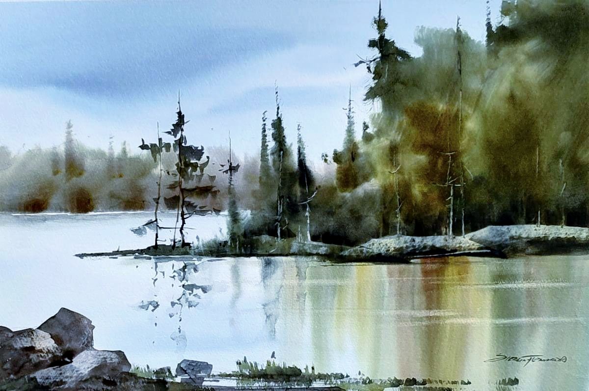
VALUES: Does the painting have a sense of drama? In other words, would this painting stand out if it were hanging in a gallery surround by dozens of other paintings by accomplished artists? The values (light and dark shades) are an excellent way to make a painting more dynamic and noticeable. I will sometimes even add black to certain areas of the painting to create this effect. I also usually leave some of the white unpainted paper in or near my center of interest. This creates a strong sense of light and if it is in close proximity to my darker values it creates the drama that I feel is very important in getting a painting noticed.
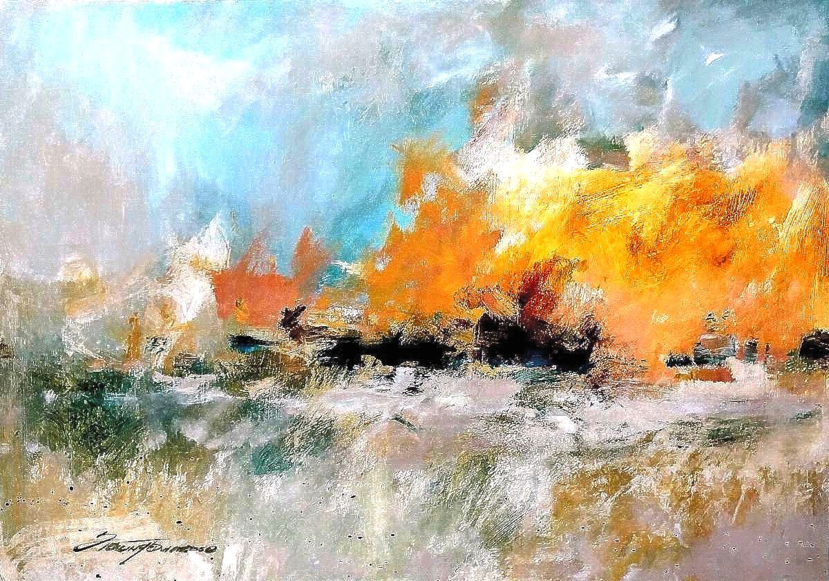
COLORS: Let's be honest here. Colors are ALWAYS a personal choice, not an absolute. Are the colors in the painting adequate to not only depict what you are painting but also keep the viewer entertained? This sometimes requires that I embellish my painting with additional colors that may not always be true to the subject I am painting. For example; if I were painting a red apple, I could also put some blue or violet on the shadow side of the apple and infuse a little yellow on the highlighted side. This is not something that we would expect to see when looking at an apple in real life but in a painting, it can create more of an interesting and artistic statement that might intrigue the viewer.
TEXTURES: When I refer to textures I am usually thinking of a balance of hard and soft edges, dry brush, and splatter. I want this to look like a painting which also includes expressive and noticeable brushwork. For years I have talked with art collectors that tell me that they love to see how the artist moved the brush as they created a painting. Always remember, most people art not artists and they are fascinated by those of us who are. So I will quite often intentionally exaggerate the brushstrokes to make the painting even more artistic and painterly.
This is my check list that I use when deciding if a painting is finished. Of all the elements on my the list I consider the composition and variations in values to be the most important. They can literally make or break a painting. Since we all have our own way of mixing colors and moving brushes I recommend that each artist develop their own check list that suits their style of painting. This check list has worked well for me and really keeps me focused on what I consider the basic backbones of my paintings. It can vary from artist to artist depending on their style of painting. But regardless of your style it will also create a sense of unity with your paintings, especially if you are exhibiting a collection of multiple paintings. The viewers will see a common thread amongst your paintings and identify you with that particular style.
Having a simple check list and sticking to it is a great way to measure your paintings and stay focused on what really makes our paintings work.
If you have a suggestion for a future editorial please email us at;
sterling@sterlingedwards.com
|