|
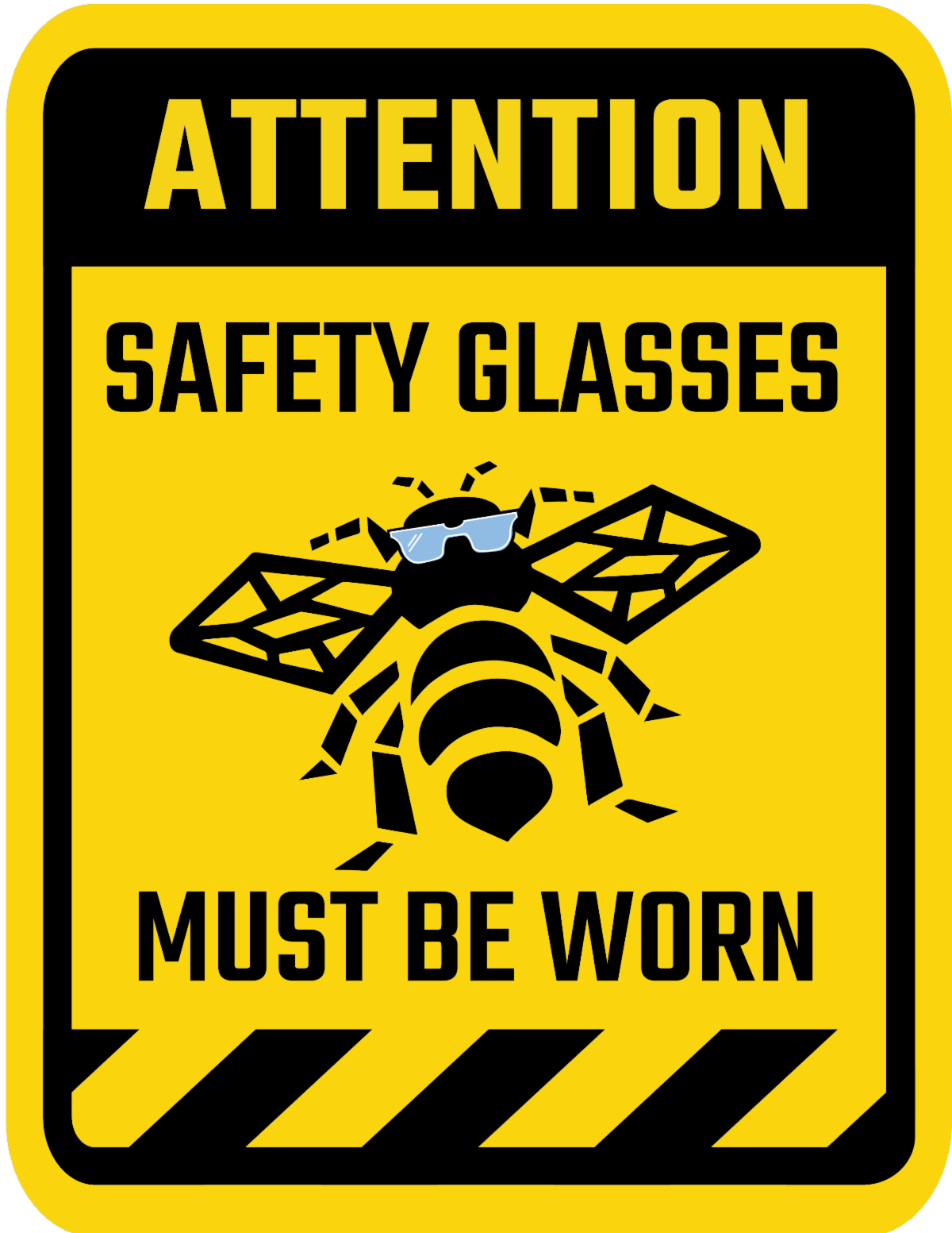
Make safety your top priority by following these guidelines.
Keep them visible
Signs must be large enough that a person with normal vision, including corrected vision, can read the safety sign at a safe viewing distance from the hazard. Limit one message per sign and avoid crowding multiple signs together.
Make sure they are accurate.
Remove signs for hazards that no longer exist.
Be specific
When needed, add text to signs to supplement safety instructions.
Replace and change signage frequently.
The more often the signage is seen with the same message in the same place, the less visible they become.
Choose your color wisely. Use...
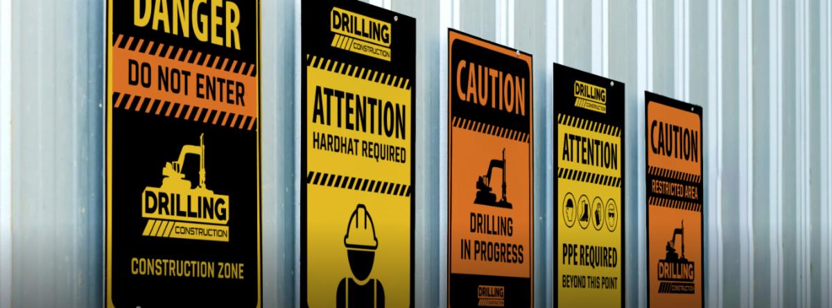
Yellow or Orange for Caution
Red for Danger
Green for First Aid or Emergency Escape
Blue for Mandatory Rules
Use simple, easy-to-see fonts
Studies show that sans-serif fonts like Helvetica and Verdana are the most readable. The signal word letter height should be at least 50 percent greater than the height of a capital H in the message panel wording.
|