Better choices about what's essential in life and art | | “Good design is as little design as possible. Less, but better - because it concentrates on the essential aspects, and the products are not burdened with non-essentials. Back to purity, back to simplicity ” -Dieter Rams | | |
This month’s newsletter revisits one I wrote in July 2022.
,
Life is complicated.
I’ve been feeling overwhelmed recently and you probably feel the same. Too much change, too much divisiveness, too much information, too much pain, too many choices, too many decisions, and too much detail. The abundance current is flowing like a firehose, breaking down the old, revealing what’s been hidden underneath and I feel out of breath from swimming to keep up with it all.
I need to breathe. I need time to pause and reflect.
One of the advantages of being older and wiser is having more tools for problem-solving. When it feels like everything matters and everything is urgent the tool I use is to create a space where I check in with myself and realign with what really matters to me.
I have done years of work clarifying my personal values, my purpose, and what it feels like to be fulfilled and satisfied. Good health, freedom, deep connections, learning, reflection, joy, creation, and teaching are most important to me. Knowing what is essential helps me to identify my priorities and pass on those problems that are not mine to solve.
| | |
The story below helps me differentiate among everything I am called to do.
There once was a philosophy professor who was giving a lecture. In front of him, he had a big glass jar, a pile of rocks, a bag of small pebbles, a tub of sand, and a bottle of water.
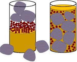
He started by filling up the jar with the big rocks and when they reached the rim of the jar, he held it up to the students and asked them if the jar was full. They all agreed, there was no more room to put the rocks in, it was full.
“Is it full?” he asked.
He then picked up the bag of small pebbles and poured these into the jar. He shook the jar so that the pebbles filled the space around the big rocks. “Is the jar full now?” he asked. The group of students all looked at each other and agreed that the jar was now completely full.
“Is it really full?” he asked.
The professor then picked up the tub of sand. He poured the sand in between the pebbles and the rocks and once again he held up the jar to his class and asked if it was full. Once again, the students agreed that the jar was full.
“Are you sure it’s full?” he asked.
He finally picked up a bottle of water and tipped the water into the jar until it soaked up in all the remaining space in the sand. The students laughed.
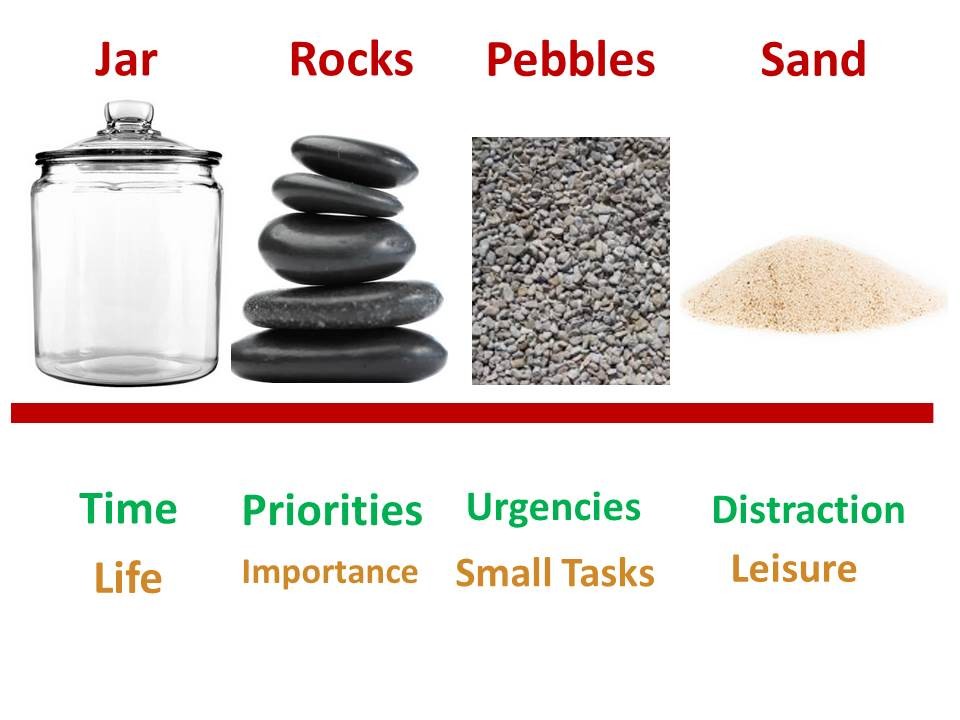
The professor went on to explain that the jar of rocks, pebbles, sand, and water represent everything that is in one's life.
The rocks represent the most important things that have real value – your health, your family, your partner. Those things that if everything else (the pebbles and the sand) was lost and only they remained, your life would still have meaning.
The pebbles represent the things in your life that matter, but that you could live without. The pebbles are things that give your life meaning (such as your job, house, hobbies, and friendships), but they are not critical for you to have a meaningful life. These things often come and go, and are not permanent or essential to your overall well-being.
If you fill the jar in the opposite order there would be no room for the rocks. No room for what’s essential to you.
Written by Siddhi Latey (Weloquent)
| | |
This lens of essentialism will improve your artwork as well as your life.
Our paintings often try to say too much, with too much information. When we don’t really know what it is that we want to say, we have no idea what belongs on the canvas and what belongs in the discard pile.
It's easy to overwhelm your viewer with all the information in your scene and all the marks and shapes you fell in love with.
A poet uses only the most essential words to communicate. Your painting can be an entire novel or, like a poem, elegantly capture a single perfect moment.
Whether you are a realist or an abstract artist what’s essential to your art is distillation - expressing your idea in the simplest way possible using shape, composition, and color.
This system of essential questions can help you to evaluate your artwork as it evolves from concept to completion.
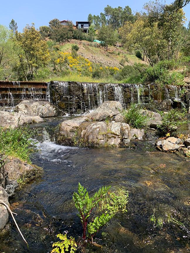
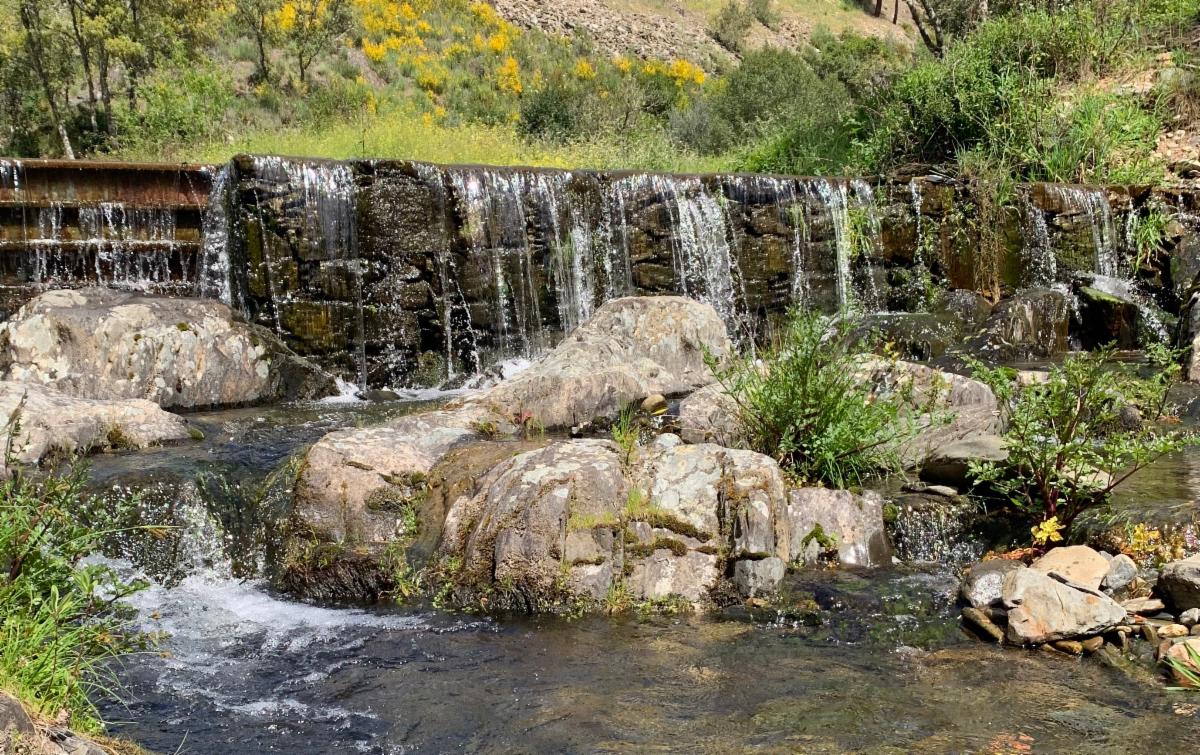
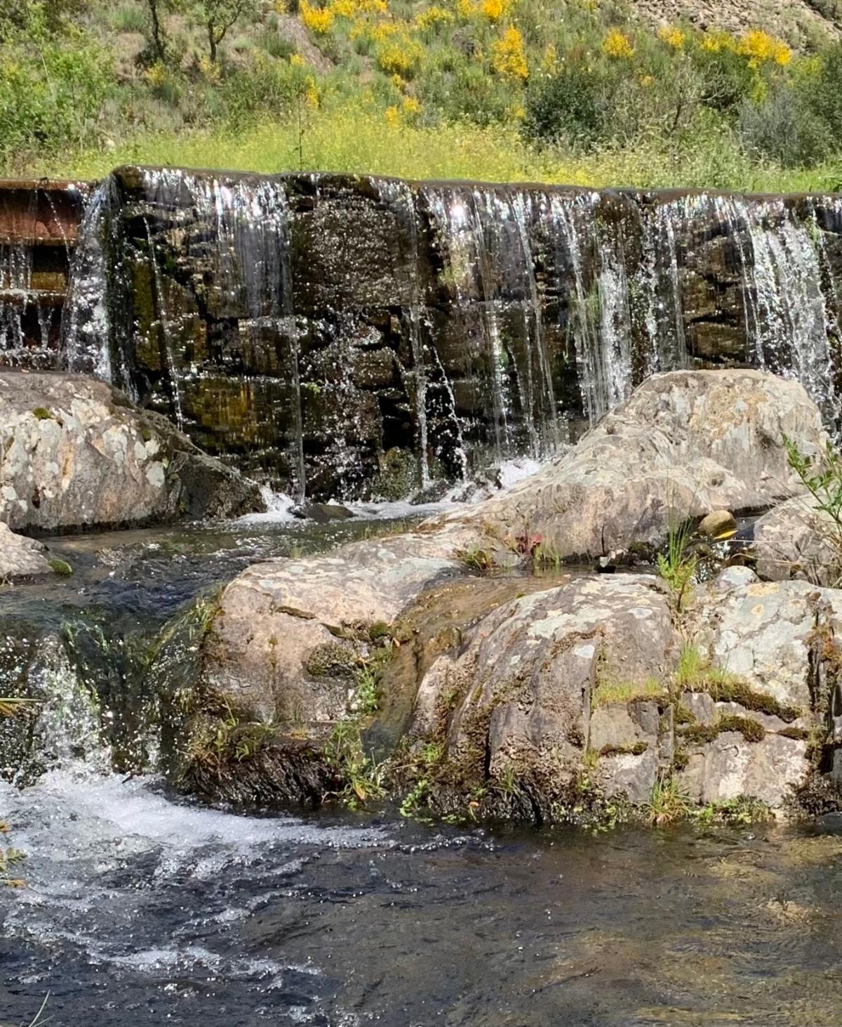
| I'm going to use this photo as an example of how to zero in on the essence of an artwork and how to apply the essential questions. Select one of your own source images and walk through the process along with me. | |
Essence:
What matters most in this artwork? Can you express your idea with less?
Is there one corner that you love more than anything, a mark or line that moves in a particular way? Could you format (crop) the image to contain just that one thing and eliminate the rest?
There is always a choice, and we can simply leave out what is not needed to tell the essence of our story.
Ask yourself if you can tell the story using just 20% of the information in your resource image?
How much of the other 80% of the detail could be sublimated into a larger value zone?
Is there a clear path of priority through your artwork? Pick and choose what stays and goes so you amplify the essential and delete or diminish the rest.
| | |
What attracts me the most in the original photo we started with is the waterfall.
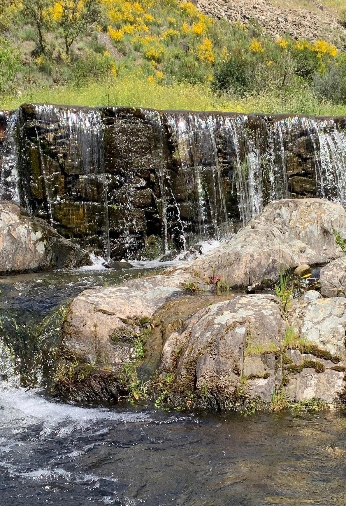
Here are two possible formats that capture the essence of this waterfall.
I think the vertical image has a more interesting pathway and interlocking asymmetrical dark shape than the horizontal one above.
| | | |
Rocks/Value:
Squint at your image… Is the simplest, essential form of the image apparent?
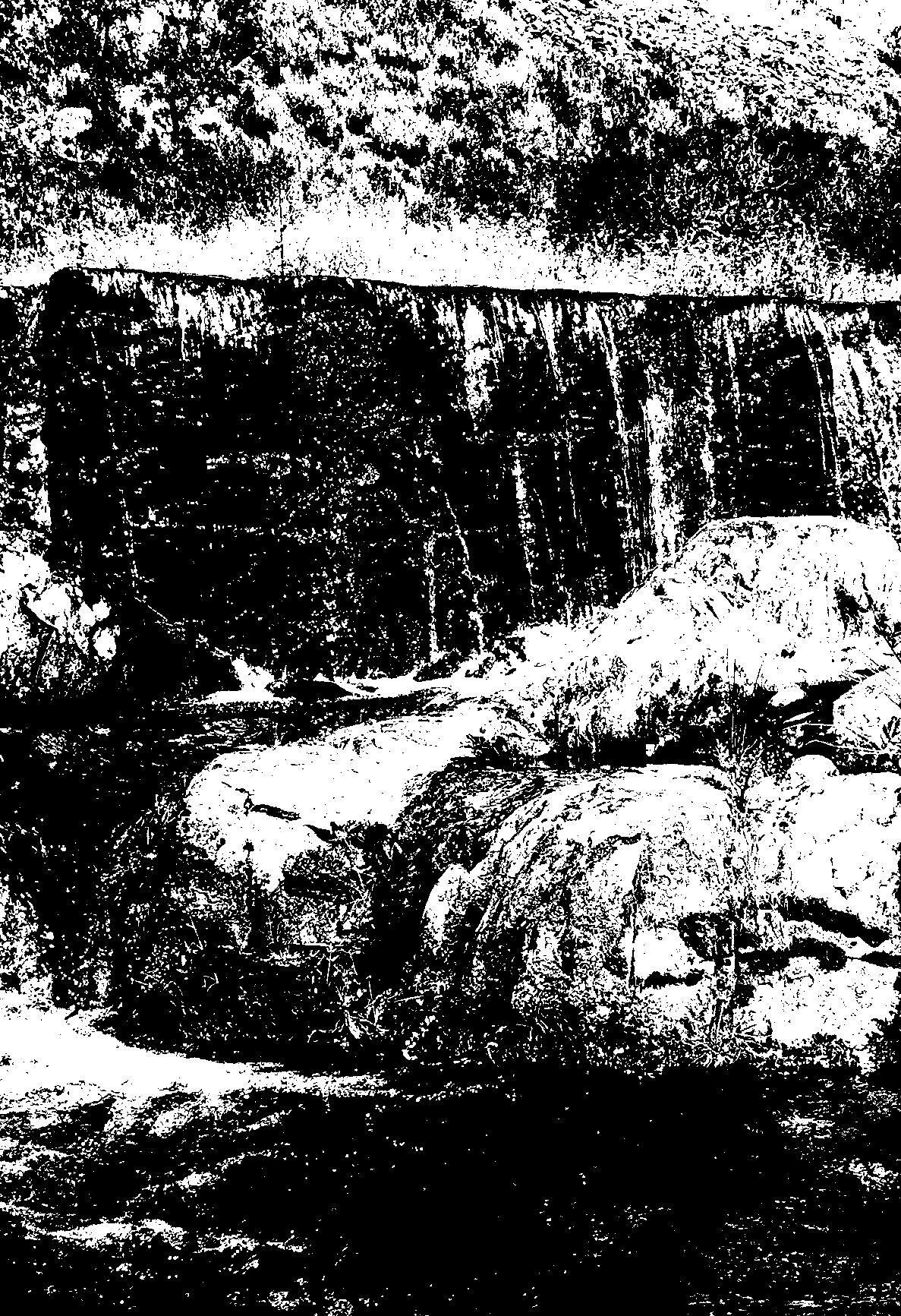
When you reduce your image to two values (black and white) is the essence clear?
Is the strongest contrast of light/dark at your most important event?
What happens when you add more values? Value zones can be used to contain and compress detail. When you set the endpoints of your value scale closer together, emotion is enhanced.
How are you using value to separate one shape from another?
How are you using value to join your shapes?
Below is a clear 2-value pattern (Notan) that conveys the essence of the image.
| | I rely on the Notanizer App to evaluate my photos before using them as resources for a painting. Follow this link for a tutorial. | | |
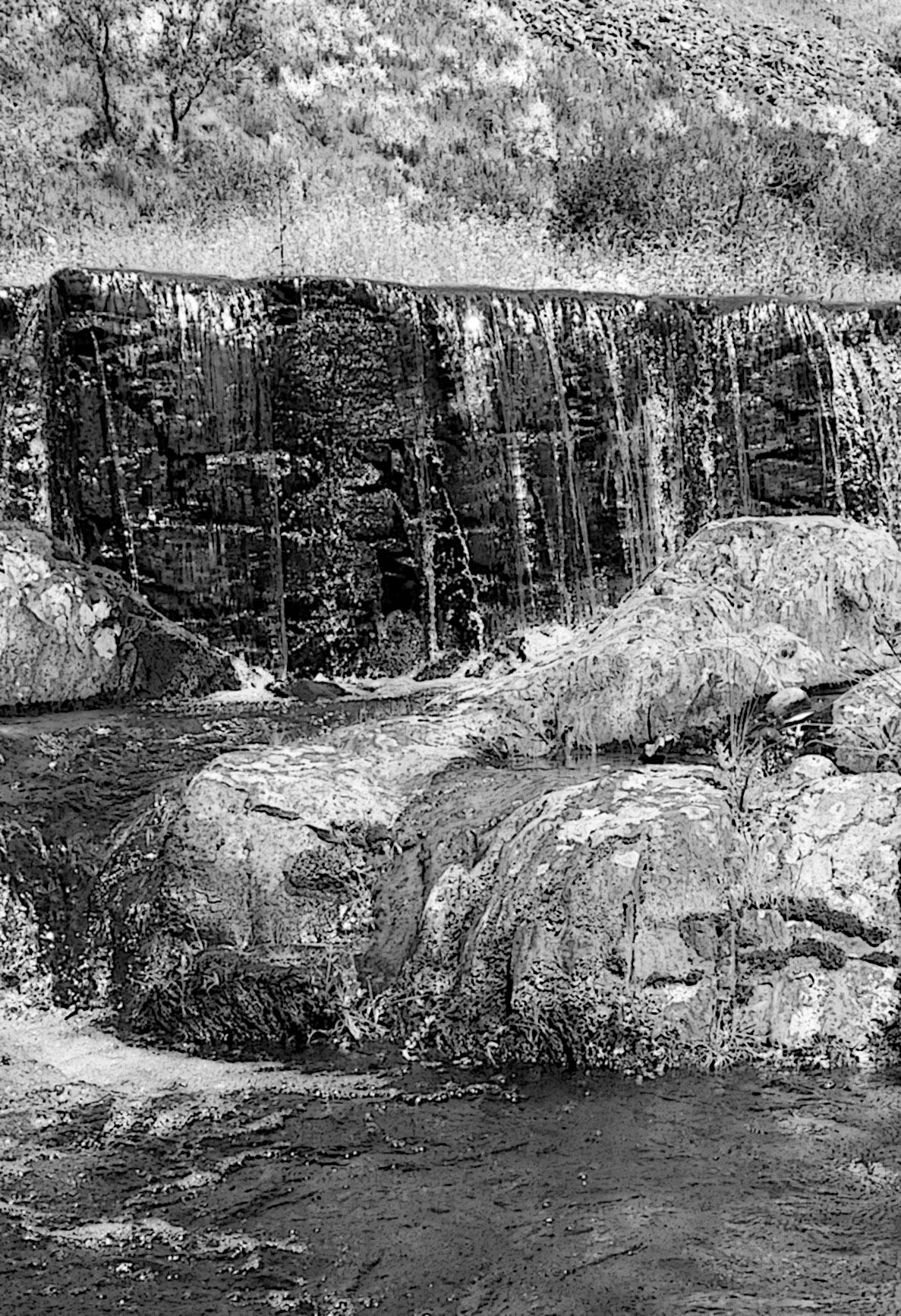
Below is how the image might look with more values. These additional values are being used to separate my large shapes into smaller zones.
Value Zones:
As I add the details back in, I associate the details with a larger value zone. Each value zone has a limited range of values in it.
My most significant value drop is at the focal point, and my focal point is in the correct rule of thirds location. If I want to draw even more attention there, I can exaggerate the effect of the waterfall hitting the river.
| | |
Rocks/Shape:
What are the main structural forms in your image?
Asymmetrical shapes are more appealing. Can you adjust yours to be less symmetrical?
In this photograph, the background and the waterfall itself are almost rectangular. These two shapes contrast as the background is light and the waterfall is dark. The stones in the river take interesting bites out of the darkest shape, so the shapes become less symmetrical as they advance towards the viewer. I see four basic shapes - the background, the waterfall, the large stone in front, and the river that arcs around it. Each of these shapes has its own value zone, and the river is close enough in value to the waterfall that those two shapes visually join together. The white highlights are not forming a larger shape, but visually they associate, so we know they tell us about the movement of the water without breaking apart the larger shapes.
Could you say what you need with fewer shapes? Are there smaller shapes to combine into a larger mass that interlocks with two or three sides of the canvas?
Have you considered the negative space as a shape?
| | |
Sand/Color:
Consider the color grouping you will employ for harmony & mood?
Will your painting be based on a particular color or color arrangement that contributes to its essence?
Which color interaction will have priority in each of the following three contrasts?
Choose one for each contrast of:
- Hue - similar/dissimilar
- Value - low/med/high
- Saturation - low/medium/high
Hue is the name of the color, usually one of twelve around the color wheel. Saturation is the strength of the hue. Saturation is reduced by adding black, white, or a complement to a hue. Value is the range of light/dark in your colors.
| |
Pebbles/Play (Variation):
Play is the pebbles in your container of composition. Play doesn't just help us explore what is essential; it is essential in and of itself. Play creates the poetry in your work.
Variation and difference keep the composition interesting and alive. Map the pathway of priority through the artwork as you vary (play with) the interval, length, height, angle, weight, color, and value of your shapes and marks.
| | |
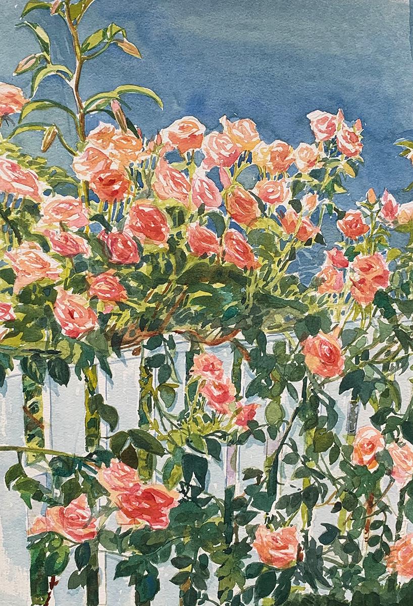
Example 1:
In the rose painting below my color harmony is split complementary - Red-Orange, Yellow-Green, Blue-Green
Choose one for each contrast of:
-
Hue - similar/dissimilar
-
Value - low/med/high
-
Saturation - low/medium/high
Notice the variations in height, angle, weight, color, and value of the roses.
Is the essence clear?
| | |
Example 2:
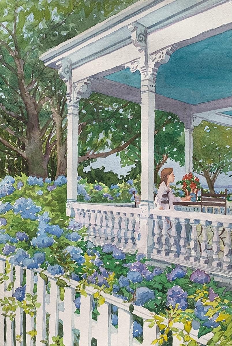
In this painting, my color harmony is Analogous - Green, Blue, and Violet. warm colors are extremely limited and neutralized.
Choose one for each contrast of:
-
Hue - similar/dissimilar
-
Value - low/med/high
-
Saturation - low/medium/high
Notice the variations in height, angle, weight, color, and value of the architecture and the hydrangeas.
Is the essence clear? Can you tell what inspired me here?
| | |
Example 3:
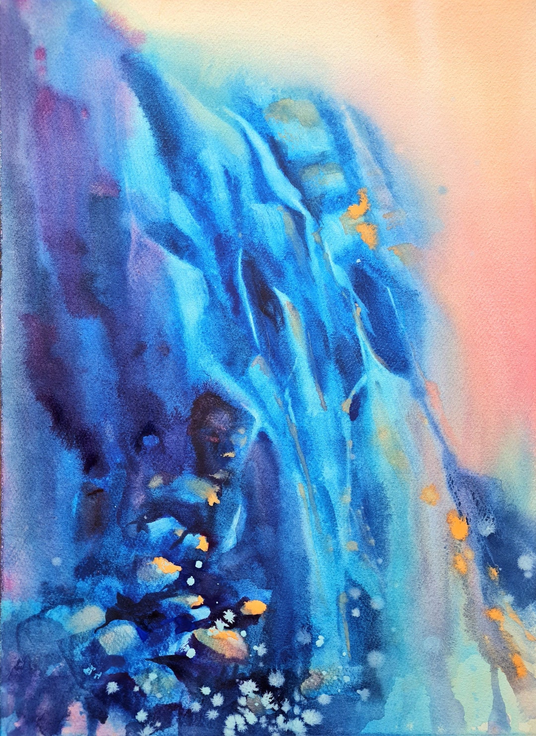
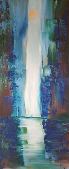
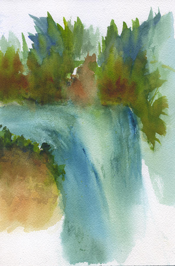
Waterfall abstraction
In this painting, the artist's color harmony is Analogous - using cool colors and very little contrast. This painting feels poetic in its minimalism.
Choose one for each contrast of:
-
Hue - similar/dissimilar
-
Value - low/med/high
-
Saturation - low/medium/high
Notice the variations in height, angle, weight, color, and value of the water.
Is the essence clear? Can you tell what inspired this artist? Is it poetic?
| | |
Finished:
One of the hardest and most essential questions is how to tell when your painting is finished.
It seems like there is always more you could do and more you could add. Your painting is not just about regurgitating the facts but about returning to what inspired you to create it.
Reflect on your original intent when you chose the essence of this artwork. How did you live up to your vision for your artwork? Is there unity? Poetry? Perhaps you did not attain your entire vision for the piece. But if you captured the essence of your inspiration, you have more than enough.
At some point, you need to declare the artwork the best you can do at this time.
If the essence of the piece truly inspires you, remember you can return to the point of inspiration and create a series of variations on your theme.
Done is better than perfect. I often return to old artworks years later, pop them out of their frames and revise them with what I learned.
| | |
In situations of overwhelm in art and in life, less is more.
There is relief in amplifying the essential and leaving the rest. Picking and choosing what belongs and what does not is essential.
Understanding the difference between the things that feel urgent and those that are truly important not only reduces overwhelm but is critical self-care.
Efficiently completing urgent but unimportant tasks keeps me from being effective in the areas that matter most to me. Reflecting on what is essential helps me to reorder my priorities and be effective as a human, an artist, and a teacher.
In art as in life, having a system returns our effort many times over. Figure out your priority list. Reduce or omit what holds you back. Walk away from dead ends. Amplify yourself and your work by concentrating on and creating more of what matters to you.
| | |
Whether you’re an established artist seeking new horizons or a budding creative looking to elevate your work, I hope I have inspired you to amplify your impact as an artist. When you paint with passion, you ignite your flames and inspire others to do the same.
Perhaps I can invite you to join my artistic “circle,” where I
can generously share all I know to support your creative
development. Don't hesitate to contact me if you want my
mentorship, guidance, and advice in exploring your artistic
path. It makes me happy to share my insights and my
knowledge with you.
| | |
If someone shared this newsletter with you and you'd like
to subscribe, please reach out to me below with your
email address. I promise, no spam, no overloading your
inbox, just the good stuff.
I welcome the opportunity for connection, conversation, cooperation, collaboration, and commissions.
Live heARTfully
| |
P.S. If you didn't get the chance to download your free gift from me: Here is my "Inner Artist Inspiration Package" - a series of illustrated quotes in watercolor based on flower photos taken by family and friends.
| | | |
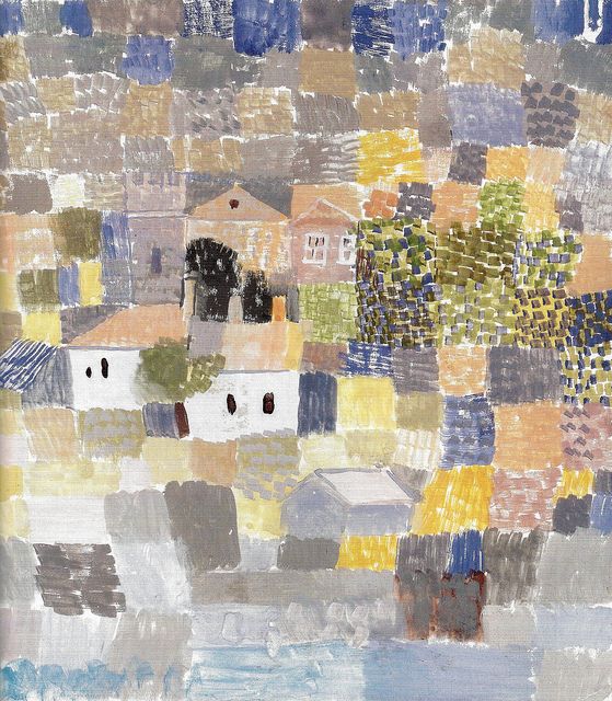
The beholder’s eye, which moves like an animal grazing, follows paths prepared for it in the picture - Paul Klee
| | | |
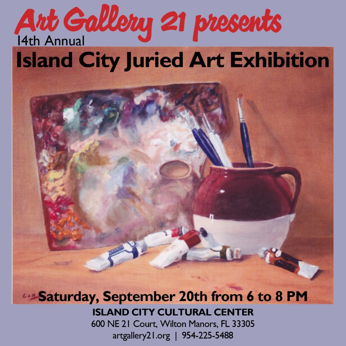
Art Gallery 21
Island City Annual Juried Art Exhibit
Island City Cultural Center
600 NE 21 Court
Wilton Manors, FL 33305
Call or Text 954-225-5488
www.artgallery21.org
| | | | |
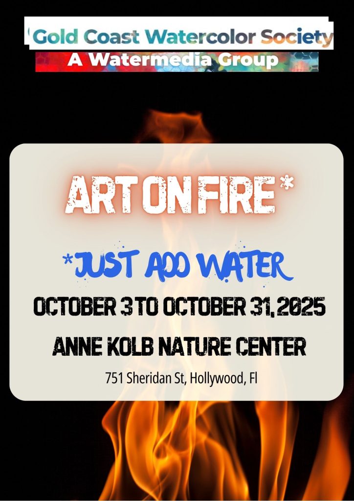
Gold Coast Watercolor Society
Art on Fire - Just Add Water
Ann Kolb Nature Center
751 Sheridan St
Hollywood, FL
October 3 to October 31
| | | | |
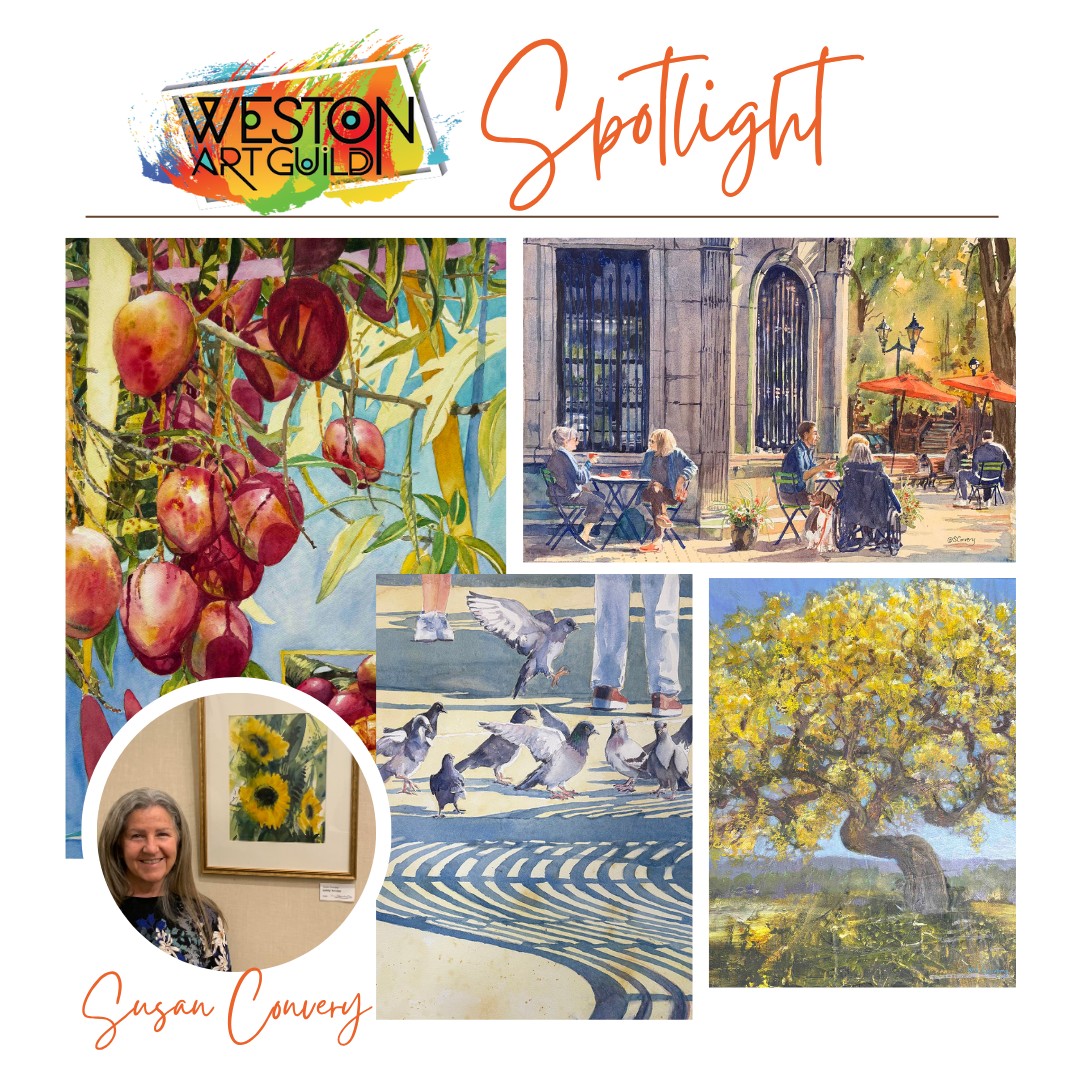
Weston Art Guild
17th Annual Juried Show
Weston Branch Library
4205 Bonaventure Blvd
Weston, FL 33332
Meet the Artists Reception: Monday, October 13, from 6:00–7:30 PM
| | | | |
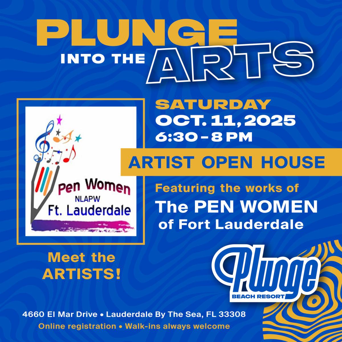
National League of American Pen Women
Plunge into the Arts III
Plunge Beach Resort
4660 El Mar Drive
Lauderdale by the Sea, FL
Meet the Artists Reception: Saturday, October 11, from 6:30–8:00 PM
| | | |
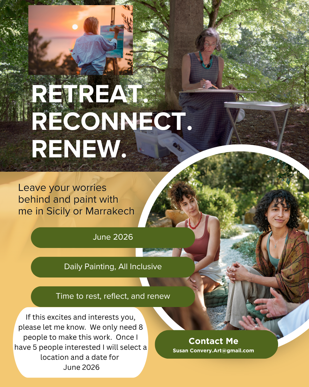
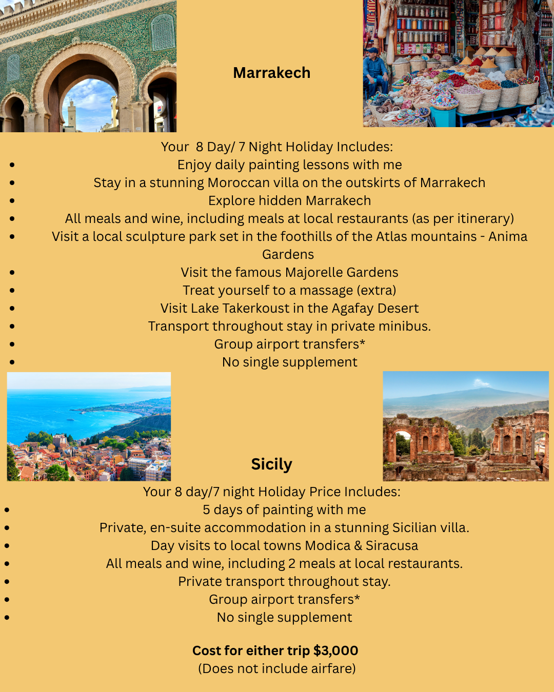
Would you like to join me for a painting retreat in June 2026?
I was contacted by a company that hosts painting retreats in Europe to see if I could gather a group of at least eight people for an all-inclusive holiday in either Sicily or Marrakech. Once I have five people interested, I will select the location and date. Please call me and I will share all the details with you.
| |
Private Art Retreats
A personalized experience, full of art and discovery, for those who….
- are traveling alone, or with a couple of friends
- would like a much more flexible, and free experience, and lots of fun, too, tailored exactly to your needs, interests, and experience level
- may want to combine painting with organized discovery trips and tours and really get to know the ‘real’ South Florida
- would like to book in for a shorter or longer time than most workshops
- don’t want to have to bring a mountain of supplies in their luggage
| |
Painting Joy
Created especially for artistic women in the third stage of life who are dissatisfied with their artwork and want to have more fun connecting with themselves and others. In this three-day watercolor workshop, we experiment with visual cues that inspire joy, discover personal symbols that resonate, and provide ways to bring more effervescence into our lives and art.
Please recommend any venues you know that might be interested in hosting this workshop in 2026.
I am also happy to teach this as a private retreat or for a small group in my studio.
I would very much appreciate your help in getting the next booking.
| | | | Private Lessons and Events | | | | Master Classes for High School Students |
Private, highly personalized classes in mastery for artistically-minded US & international students virtually on Zoom or in person at my home.
If you have a student who is a visual thinker, willing to push the boundaries of their own work, and serious about improving their options for college, I want to hear from you! Schedule a time to discuss how I can collaborate with you to build a portfolio that will give your student the greatest chance for success.
| | | | Art Workshops, Critiques & Presentations |
Invite me to present or lead a workshop for your school, club, or guild.
I can customize a program for your event or present my skills programs on composition, color theory, drawing faces, coordinating light/shadow or understanding the cues for depth. I am available for judging, confidence-building critiques and recorded tutorials.
| | | | Improve Your Artist Statement | |
If you would like to delve more deeply into your own inner questions and clarify your thoughts as you create an artist statement for your website, a gallery show, a sponsor, or another project, please reach out, and let’s talk. I have helped many students write compelling statements for AP Art, college applications, and competitions.
Find out More:
| | |
Sketchbook Prompt:
Select a famous realist painting and make it abstract.
What happens when you remove the details and reduce a beautiful artwork down to simplified unrecognizable shapes and color blocks? Does the painting still “work”?
| | |
It's time for these artworks to find a forever home. Please contact me if you are interested in adding any of the paintings below to your collection.
I will deliver if you live within a 2-hour drive and if you live further away, I will give you a reasonable price for shipping.
Venmo, CashApp, PayPal and Zelle are welcomed.
| | |
Title: Serenity Now
Media: Watercolor
Size: 21”x28"
Price: $444
Frame: Gold
| | | |
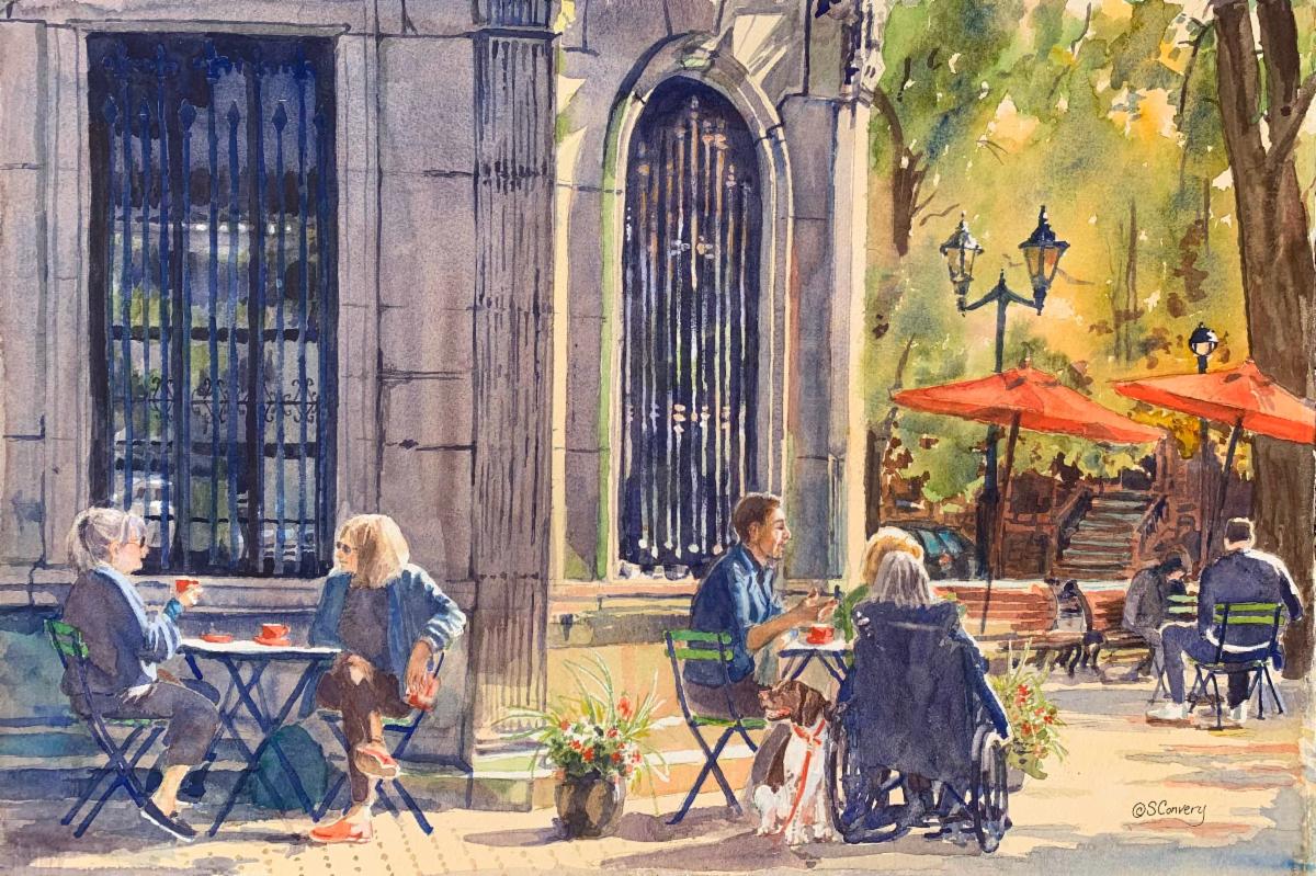
Title: A Brew-tiful Day
Media: Watercolor
Size: 22"x 28"
Frame: Gold
Price:$1111
.
| | | |
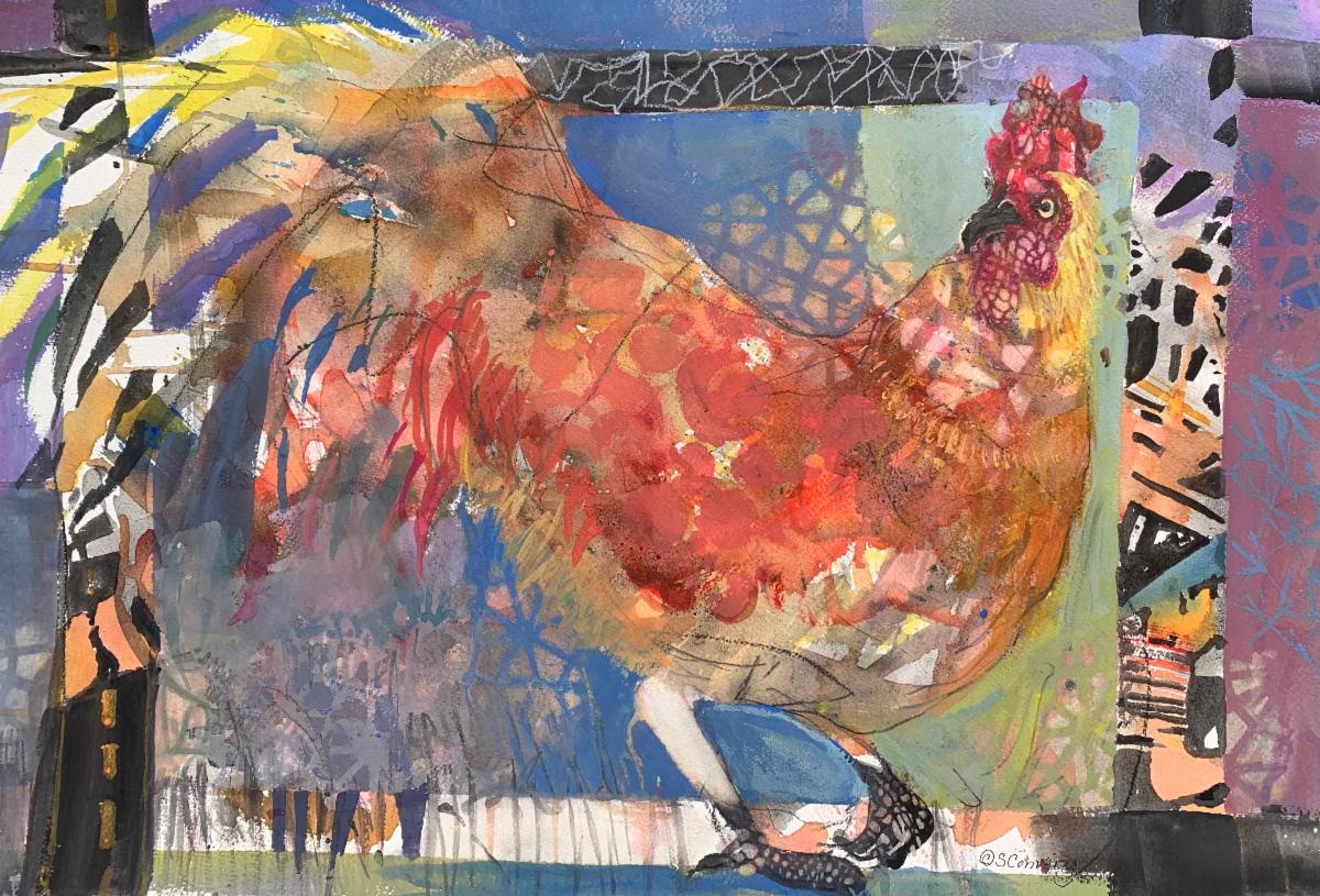
Title: Something to Crow About
Media: Watercolor, Ink, Gouache
Size: 22" x 28"
Price: $444
Frame: Gold
| | | |
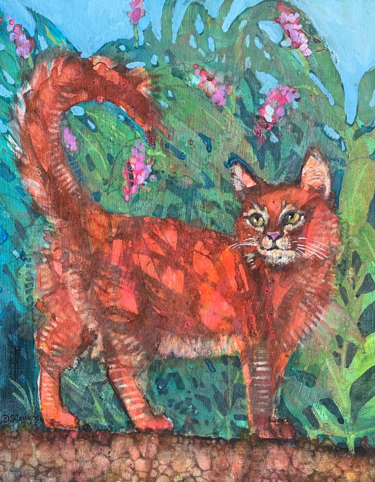
Title: Ginger
Media: Mixed Media
Size: 11" x 14"
Price: $333
Frame: Cradleboard Wood Panel
| | | |
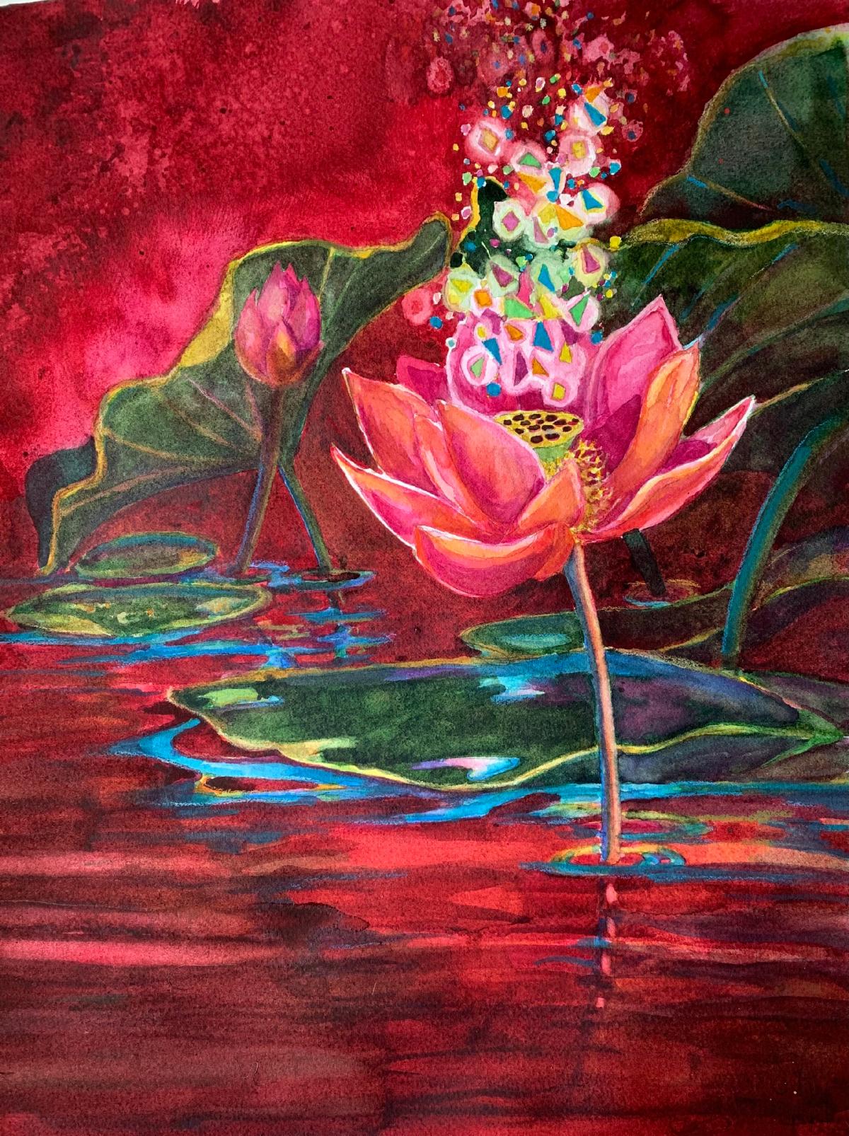
Title: Lotus Mantra
Media: Watercolor
Size: 16" x 20"
Price: $333
Frame: Silver
| | | |
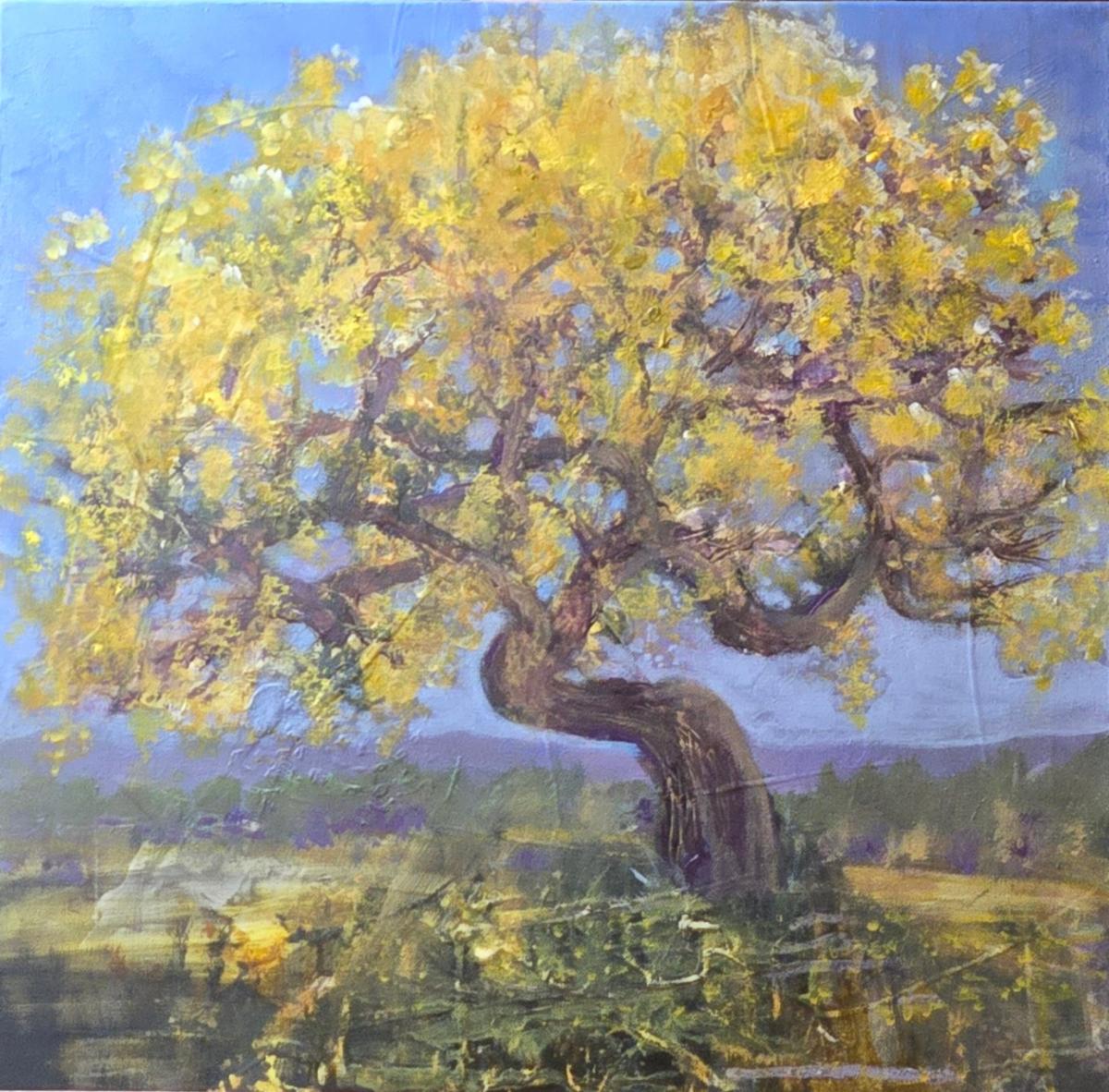
Title: Nothing Gold Can Stay
Media: Acrylic Mixed M
Size: 20" x 20"
Price: $555
Frame: Gallery Wrap
| | | Want to see past issues of my newsletters? Visit this link on my website. | |
Subscription Information: You are receiving this email because you subscribed to my mailing list, downloaded a resource, purchased one of my products/programs, or opt-ed in some other way.
Thank you for being part of the Cr8V Soul Arts Tribe!
NOTE: Unsubscribing means you won't receive any more emails from me including information about your paid products and programs.
| | | | |