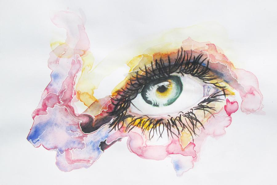
Step by Step Watercolor Portrait | |
| |
“The countenance is the portrait of the mind and the eyes are its informers”
Marcus Tullius Cicero
| | |
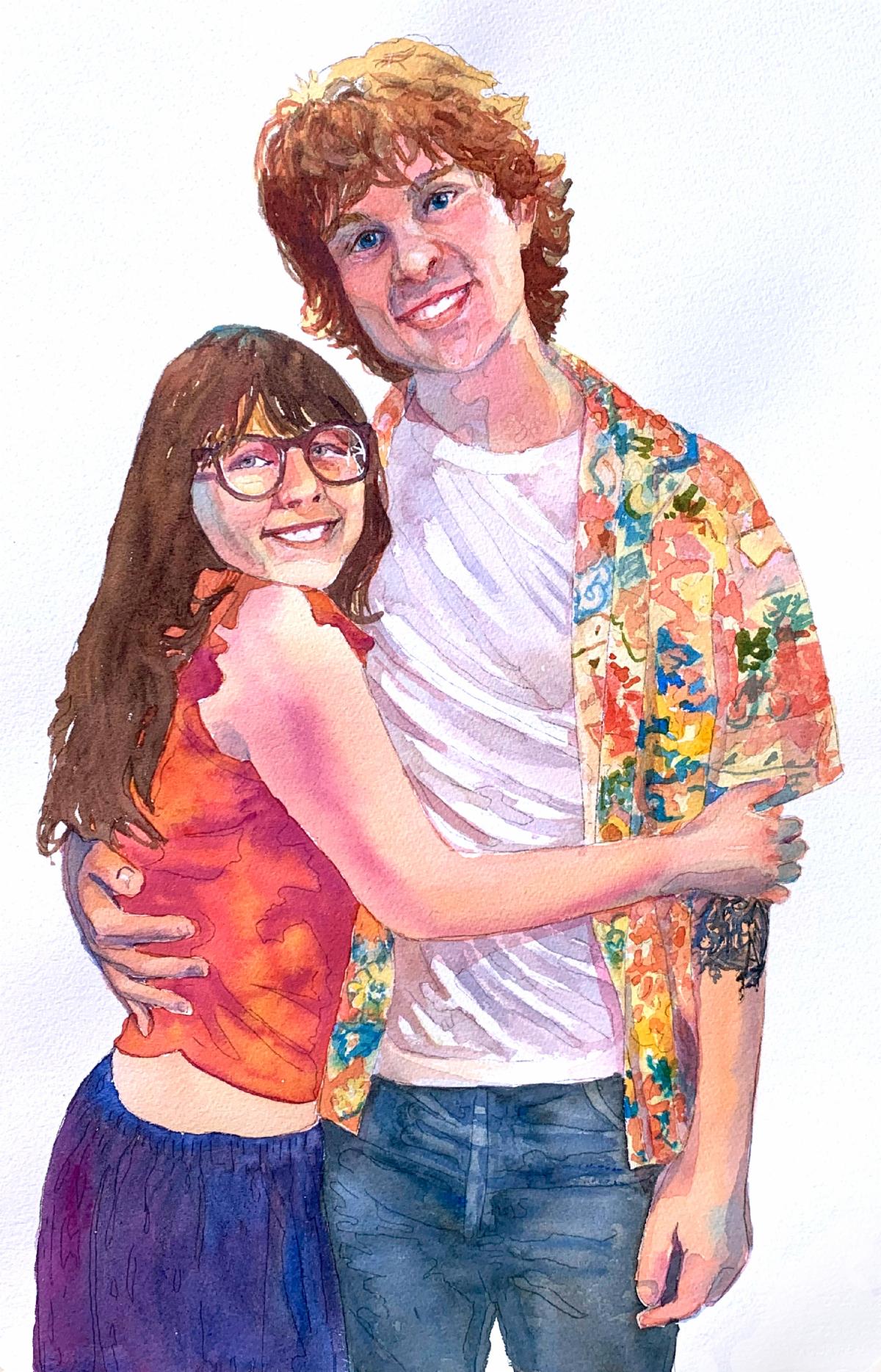
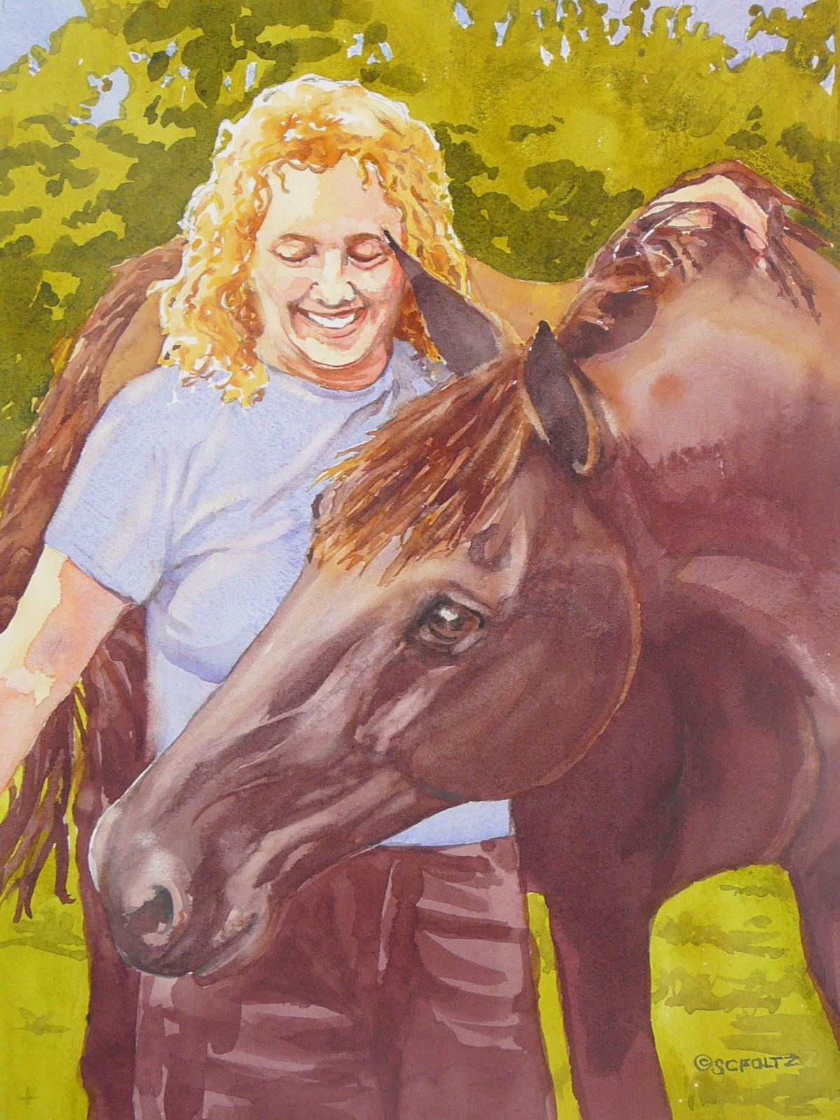
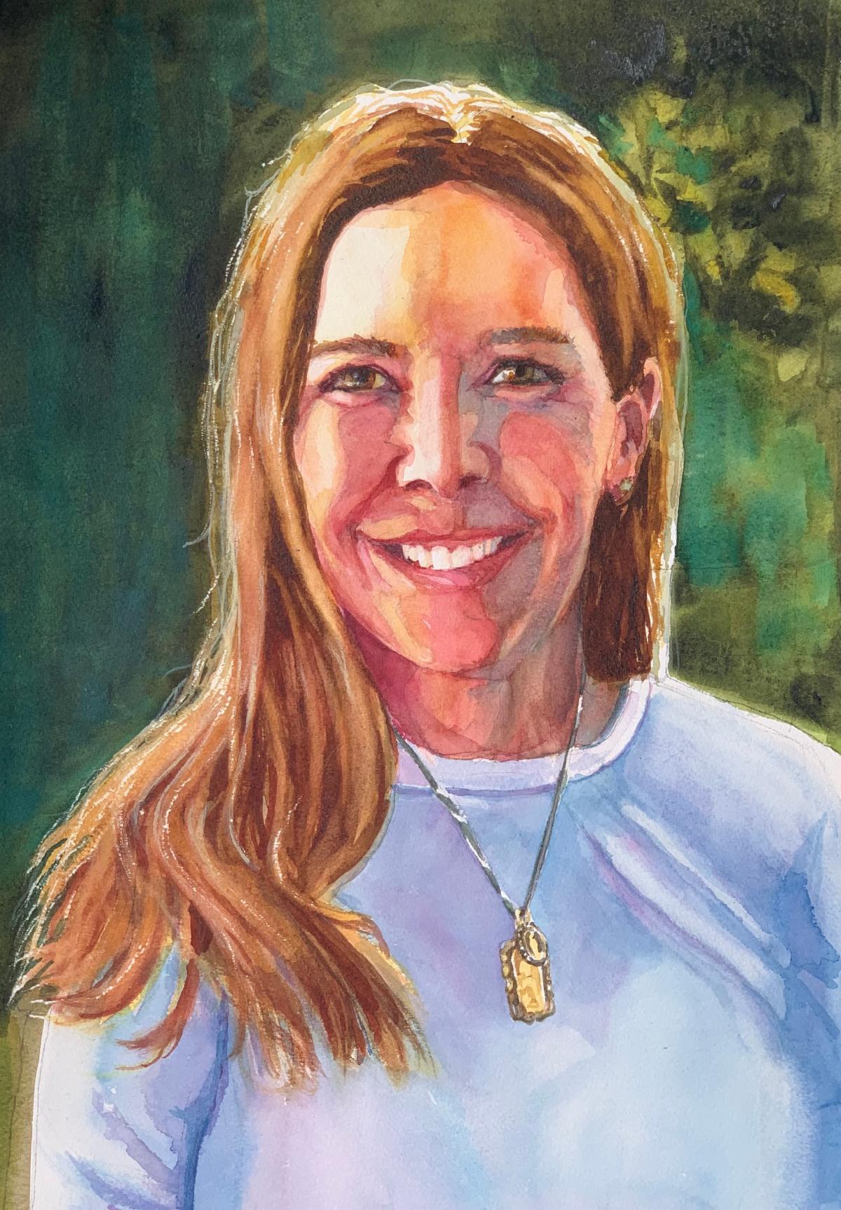
When my kids were young one of the things I did to supplement my income was painting watercolor portraits on commission. I created many portraits of adults, children and animals in watercolor and had a lot of fun doing it. If you’re curious, you can see some of them here: https://www.susanconvery.com/portraits.
While watercolor is not an exact science, each painting is an exciting new adventure and I think the spontaneity of this medium is perfect for capturing a likeness.
There are many myths about watercolor, such as “you have to get it right the first time” and "you can’t make corrections or paint people with watercolor". I disagree. I made a lot of mistakes, which I prefer to call experiments, and I created a system that allows me the freedom to play with paint and color while capturing the personality and likeness of my subject.
| |
A few months ago one of my students requested step-by-step instructions for painting a portrait. It seems to me that many of you would also appreciate the same recipe for making informal portraits of beloved family members and friends.
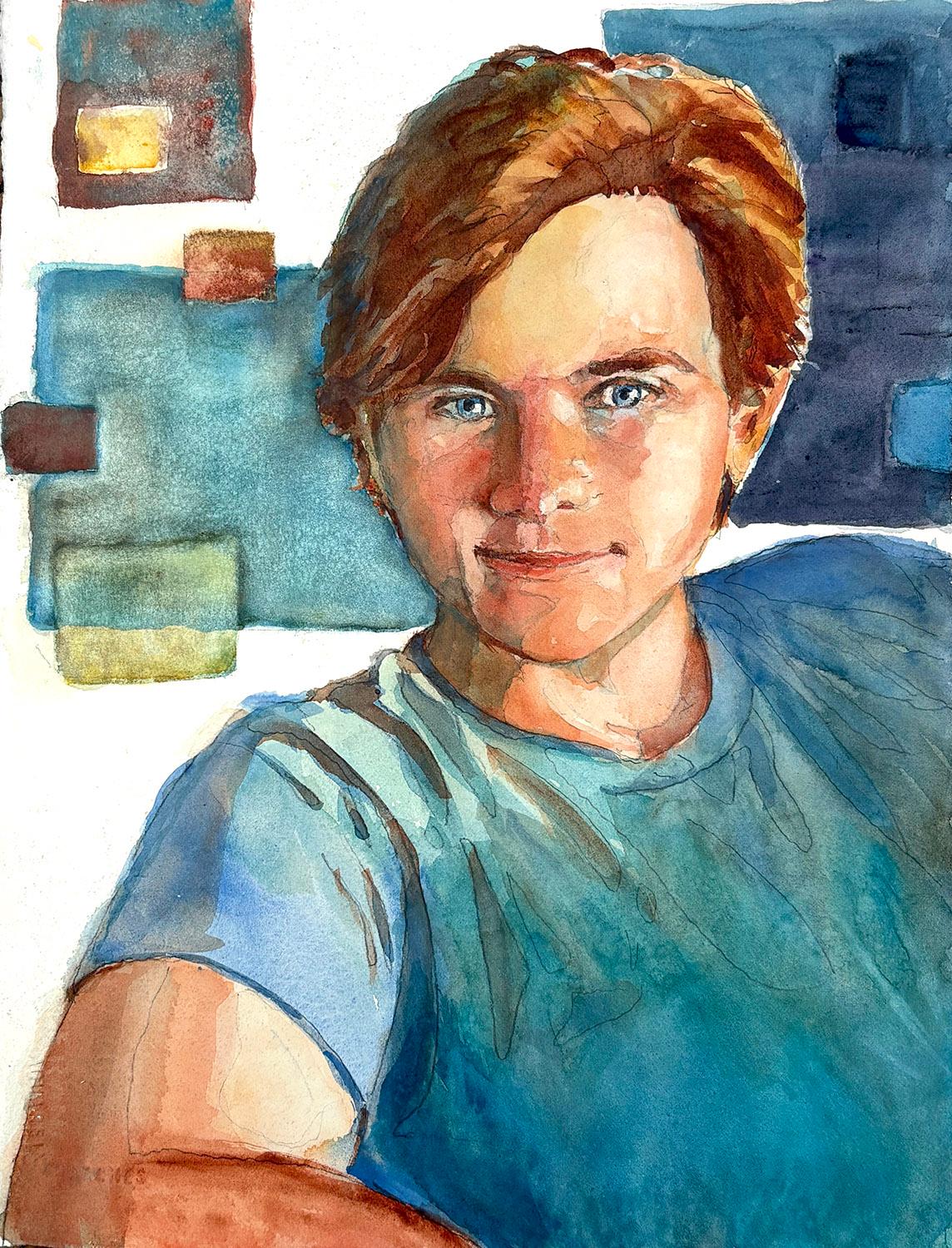
Although the instructions below are a recipe for creating a watercolor portrait, you could easily substitute oil paint, pastel or other media and achieve similar results. For this demonstration I will be creating a portrait of my very handsome, youngest son, Jack.
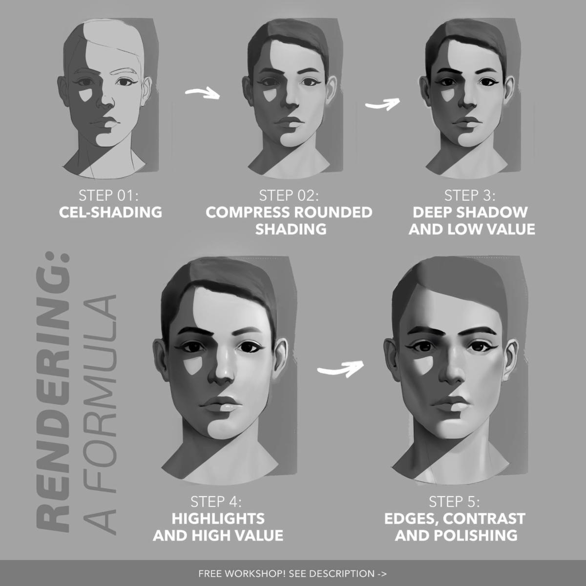
If you don’t have much experience drawing people, this recipe includes a short-cut to support your drawing skills by allowing you to trace your photograph. It will also help you understand how to see and work in layered values from light to dark. I find this method makes it much easier to create the illusion of three dimensional form.
| | |
Materials You Will Need:
Notanizer App: Apple Store or Google Play
Light Box
Tracing Paper
Mechanical Pencil
Frisket
Painting Board
Stiff Bristle Lifting brush
Round Sable or Sablette Brushes
Palette
Water container
Watercolor paints
Paper Towels
Tape
140 lb Watercolor Paper (best quality)
Resource Photograph 8 ½” x 11”
| | |
Choosing a resource Photograph:
A poor resource photograph will never produce a good painting. If you are a beginner or amateur portrait painter do not burden yourself with difficult lighting, corrections or enhancements. Flash photography, dark settings, multiple light sources are better left as photographs. Set yourself up for success by taking the time to select a photograph that will easily adapt to paint.
The following list should be non-negotiable when selecting a suitable resource photograph:
Natural Daylight - single source (no flash!!)
Features clearly visible
Relaxed Expression
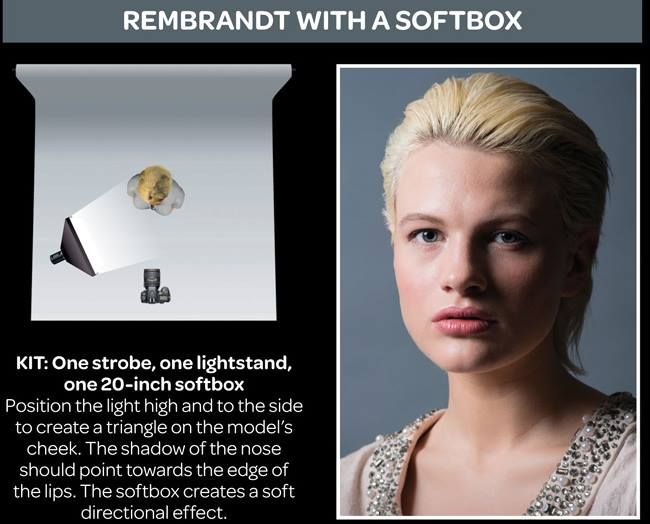
¾ Lighting.
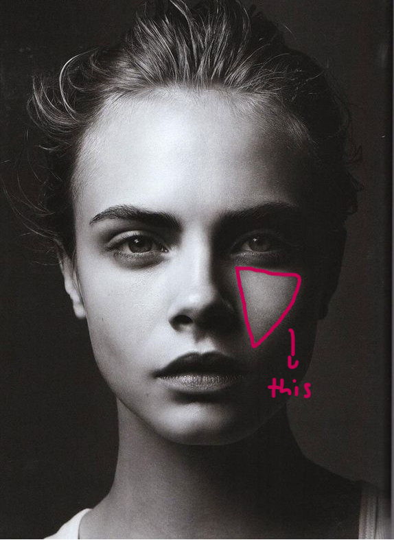
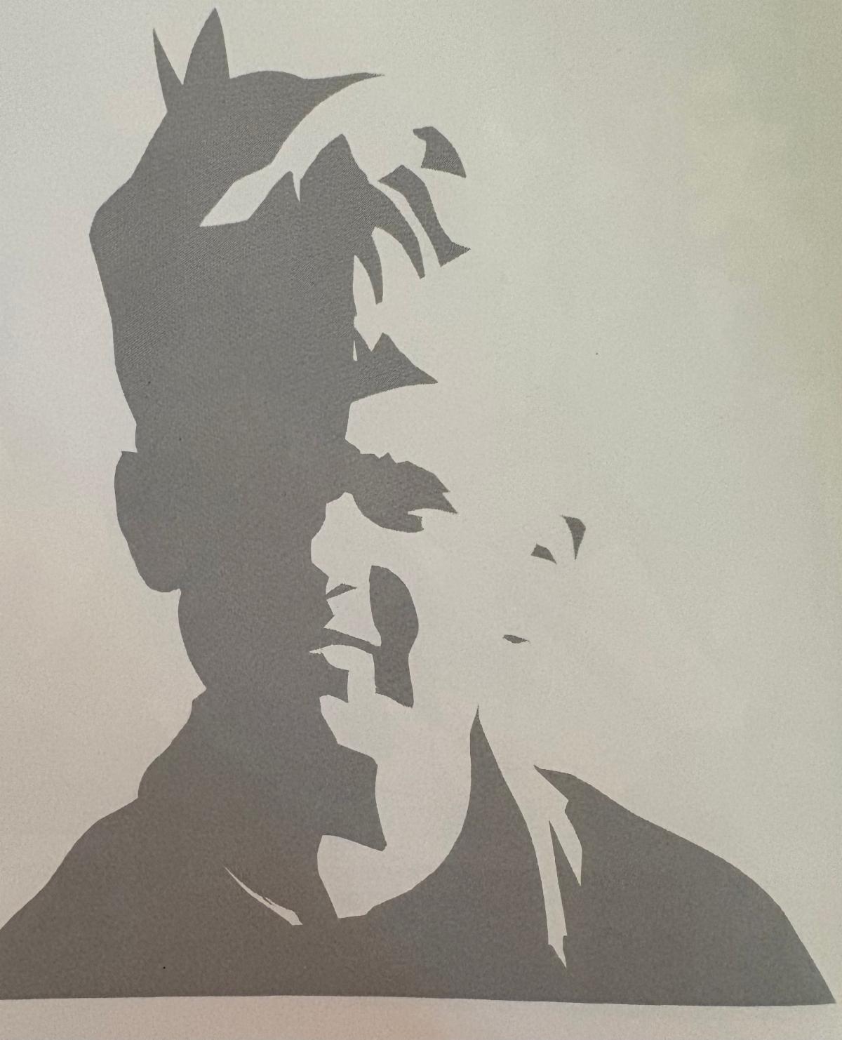
The most flattering portrait lighting comes from slightly above and off to the side so 3/4 of the face is in sunlight and 1/4 of the face is in shadow. This is often referred to as “Rembrandt” lighting and can be recognized by a characteristic triangle of light on the shadowed side of the face. The shadow side of the face should be at least 40% darker than the sunlit side of the face. A face lit this way has defined light and shadow shapes that will allow you to recognize the subject using only two values. It will make capturing the likeness much, much easier.
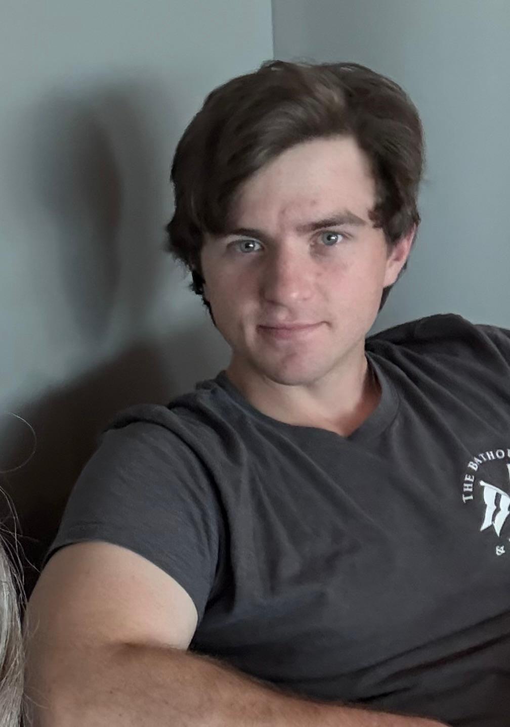
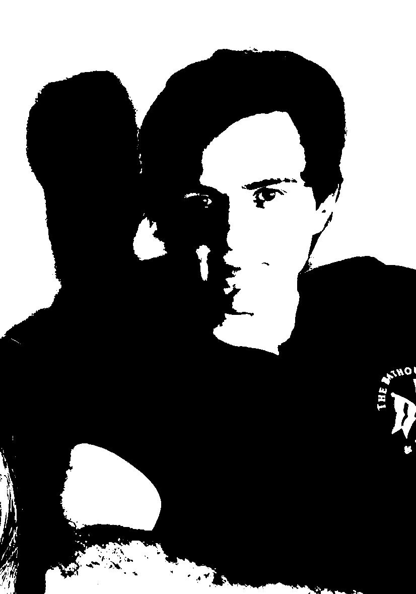
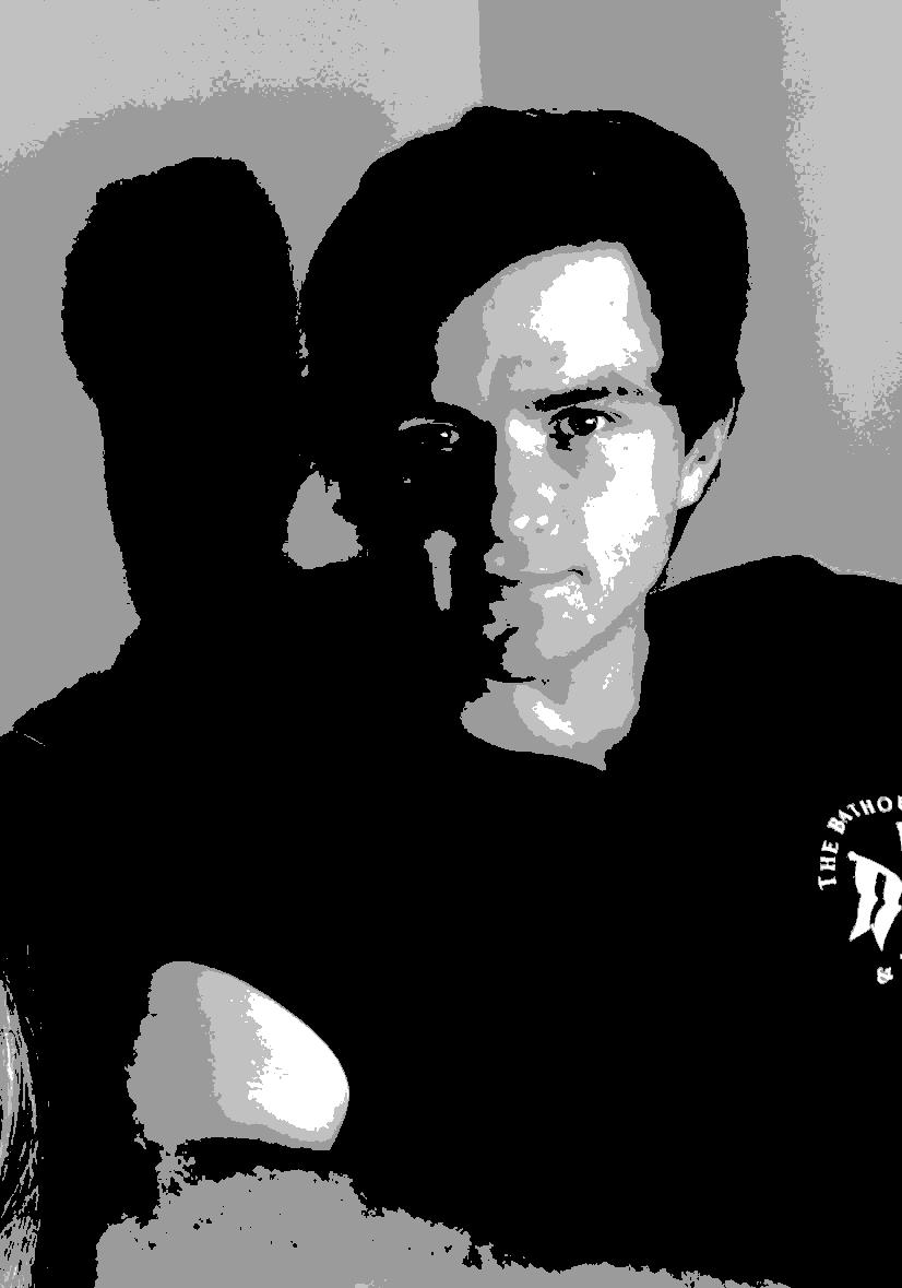
| | Here is the resource image for my portrait. Below is the two value Notan of the photograph. You can see the Notan captures the whole likeness in just black and white. | | |
This two value system is called Notan, a Japanese concept which focuses on the balance of light and dark elements in art. It allows users to convert images into various tonal values, aiding in composition and design. I rely on this system for evaluating my compositions. The app I use is called Notanizer and in addition to creating a Notan, it will also separate my color photographs into a black and white four value study. If my image is well composed as a Notan and has 4 clear values it will make a successful watercolor painting.
Many artists often overlook the importance of value because they are distracted by the more obvious appeal of color. As a consequence their paintings lack an exciting underlying pattern of lights and darks. Develop the habit of considering the values you want to use before you even start to think about color.
| | | | |
Notice how you can recognize the entire face using only two values
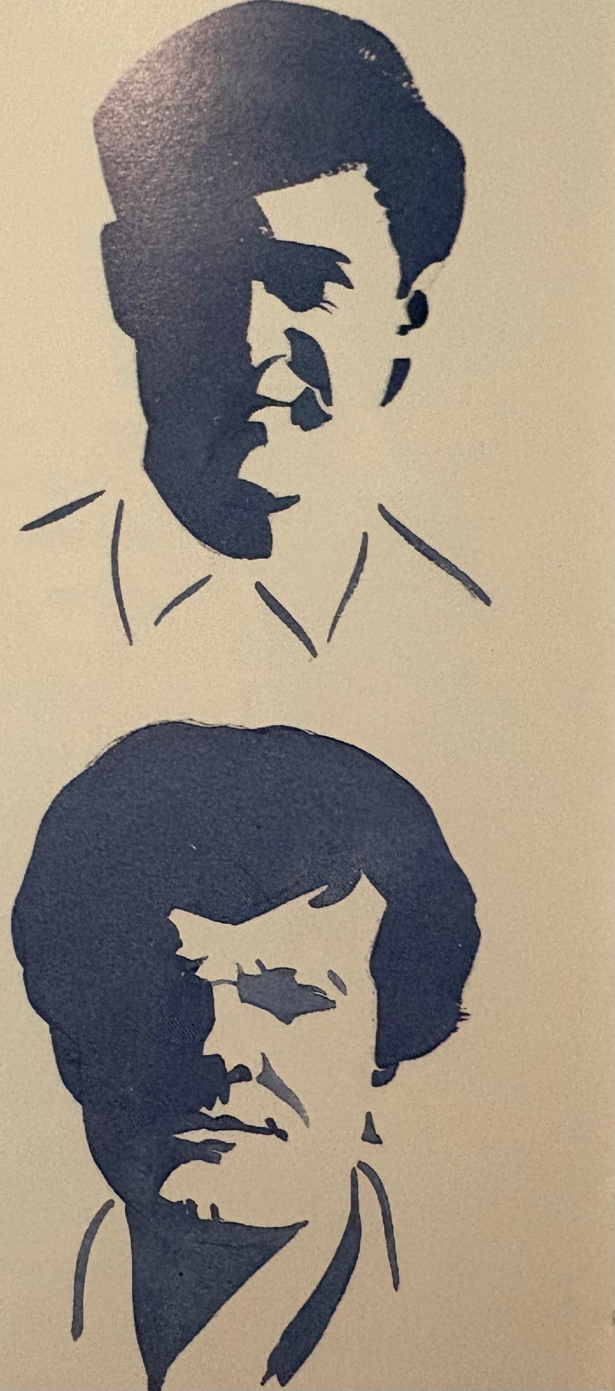
You can use this type of characteristic shadow to sketch in the faces for a crowd of people in your backgrounds.
| | |
Once you have selected 4 or 5 good images of your subject turn them into Notans and 4 Value Studies. Consider the following questions as you choose which one you will select to make the strongest painting:
What do I want to say about this person?
Which characteristics do I want to emphasize or express?
Looking at your subject
Where are warm and cool areas?
Where are the shadows? Cast shadows?
What exciting colors do I see?
Where can I add exciting color?
Where is the reflected light?
Can I introduce reflected light I do not see?
Which edges should be hard?
Which edges should be soft?
Where can I “lose” an edge?
Are the values clearly and simply stated?
Is there a 40% difference between the sunlit and shaded areas?
Are cast shadows even darker?
Composition -
Is there a center of interest?,
What will I remove from the resource photo?
What will I add to it?
Once you have selected a resource photograph , print the image on 8 ½” x 11” paper in color, as a Notan, a 4 Value sketch and if you have Adobe Photoshop print it with the “Posterize” filter.
| | With just 4 values you can already see the four value layers you will need to create a three dimensional likeness of your subject. | | Here is the Adobe Posterized version of the photograph. It makes it clear to me that the shirt should be blueish to match his eyes. The colored areas are broken into islands of color that will make it much easier for me to switch the colors on my brush as I go. | | |
Theme:
Write down a theme for your painting - the characteristics of the person you’re portraying ie. bright, approachable, warm, friendly. This will help you to refine the shapes and colors you will use to support your theme.
For my portrait I wrote down, strong, direct, intelligent, confident.
Sketch:
If you are already good at drawing faces and features you can skip my advice on tracing. Or you can check out my October 2024 newsletter on drawing the head using the Loomis method.
When I capture a likeness I rely on tracing a photograph to ensure I don’t make the eyes crooked or the arms too long or short. I’ve ruined too many paintings to consider drawing by hand to be worth my time and effort. I enjoy painting much more than drawing and I want to get there as quickly as possible.
If drawing is not your strength, tracing is a way you can train your observational skills and quickly improve your results. I suggest that you trace your four value Notan if you are not familiar with creating maplike islands of color and value change from your photograph. If you outline only the features it will be very difficult for you to model the value and color changes in the face.
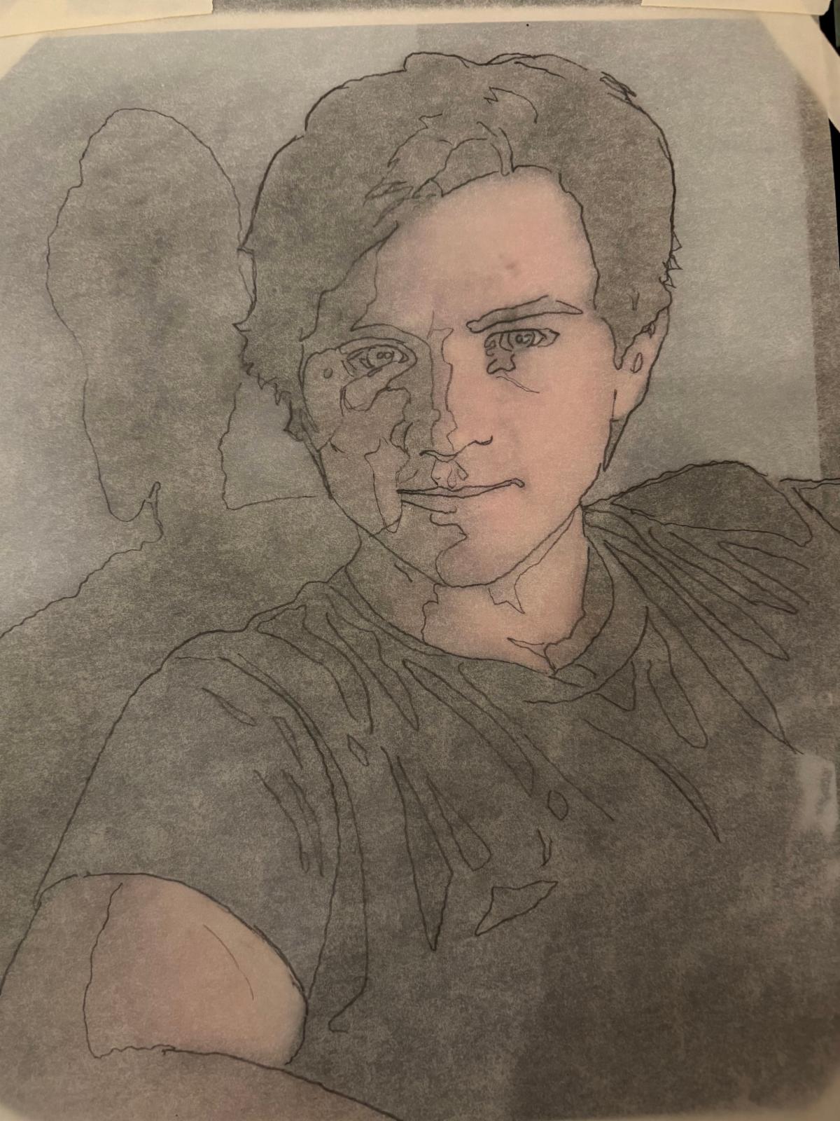
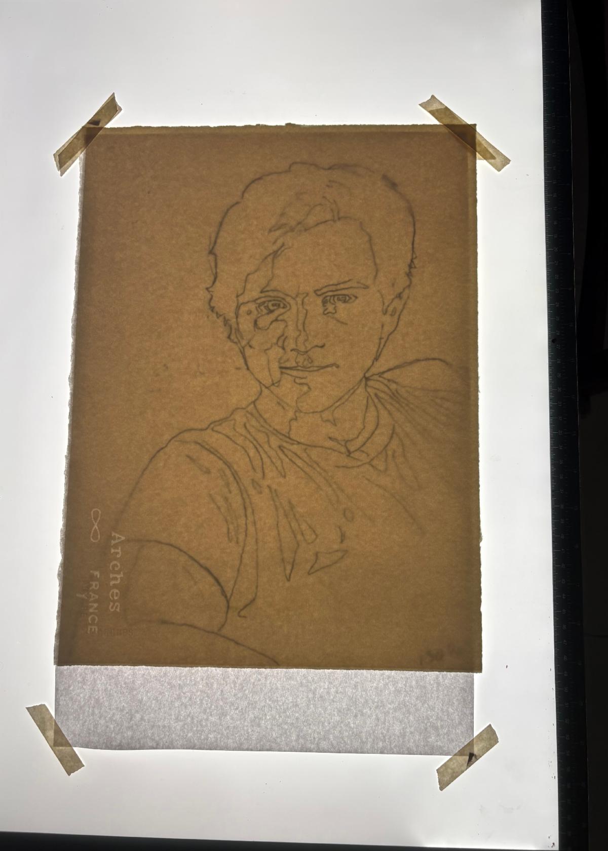
| | Notice how I created islands for each of the value and color changes as I traced the photograph. | | |
Place your 8 ½” x 11” photograph on the light box and tape it down. Lay an 8 ½” x 11” sheet of tracing paper on top and tape that in place. Put your lightbox on full brightness and trace your image with a mechanical pencil making careful notes of where the value changes occur, where shadows fall and what you can and cannot see in the image.
Check your work by laying the tracing over your four value sketch, your color image and the Notan image to see if you missed anything. It’s easy to erase pencil lines on tracing paper so correct as needed.
Look carefully at your tracing and ask yourself the follow questions about your portrait:
Does my composition convey what I want to say about my subject?
Is my composition unified?
Is there a dominant form, shape, contrast?
Are there entertaining contrasts?
Does my background support my ideas?
| | I decided to get rid of the background shadow. | | |
Stop and Think:
Once you have a good tracing, photocopy your tracing onto copy paper and paint a “stop and think” color sketch to see how your overall color scheme and composition works. Ask yourself if the dominant colors and shapes support your theme.
This is the time to revise your background if it is not supporting your theme. A few minutes of corrections spent here can save you hours of frustration later. Give yourself enough information to provide direction but not so defined you can’t change it as you go.
| | |
Color:
Now you are ready to think about color!
Note how the color shifts in your resource photo. Studying the photograph, observe all the colors in the light and shadow areas. If you have the Adobe Photoshop posterized version of your photograph, notice the way the colors shift as they change value. This version will be a great help to you in planning when and where to transition your colors.
Notice how the light affects your colors - all horizontal surfaces are cooler than the vertical ones in full sun.
Select which colors you want to emphasize and which you’d like to exaggerate for excitement. Limit yourself to just a few colors, don’t go for the whole rainbow. On a scrap of watercolor paper paint and label the array of colors you will be using for this portrait.
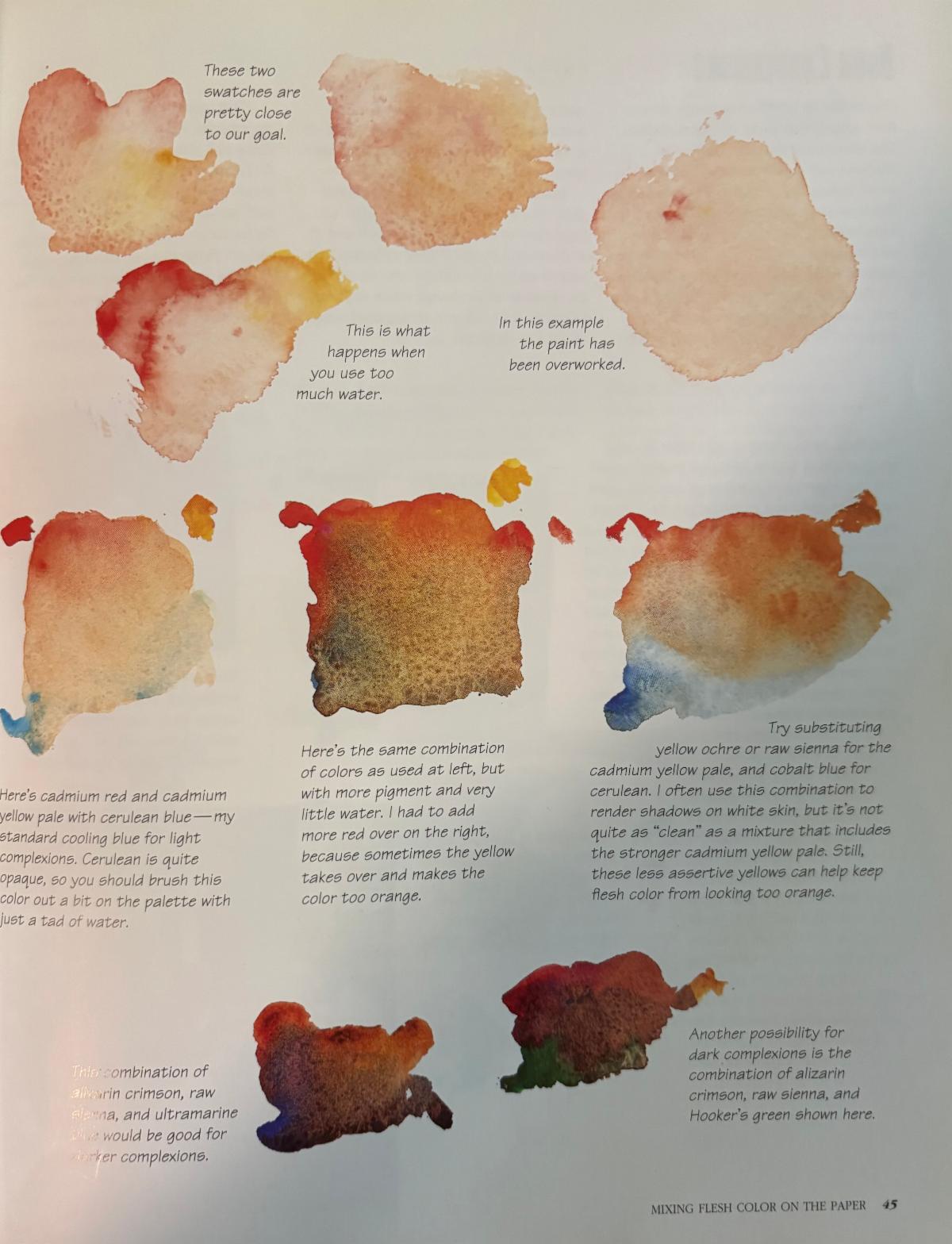
There are many color combinations that make good flesh tones and there are thousands of varieties in human skin so I can’t give you a good one-size fits all for every skin tone.
In my painting I used a combination of Cadmium Red, New Gamboge and Turquoise for most of my skin tones. As my values got darker I added Quinacridone Burnt Orange, Cobalt Blue, Moonglow and Alizarin Red.
| | |
Enlarging:
Once you are satisfied with your preliminary sketch it's time to enlarge your drawing to the size of the watercolor paper you will be using.
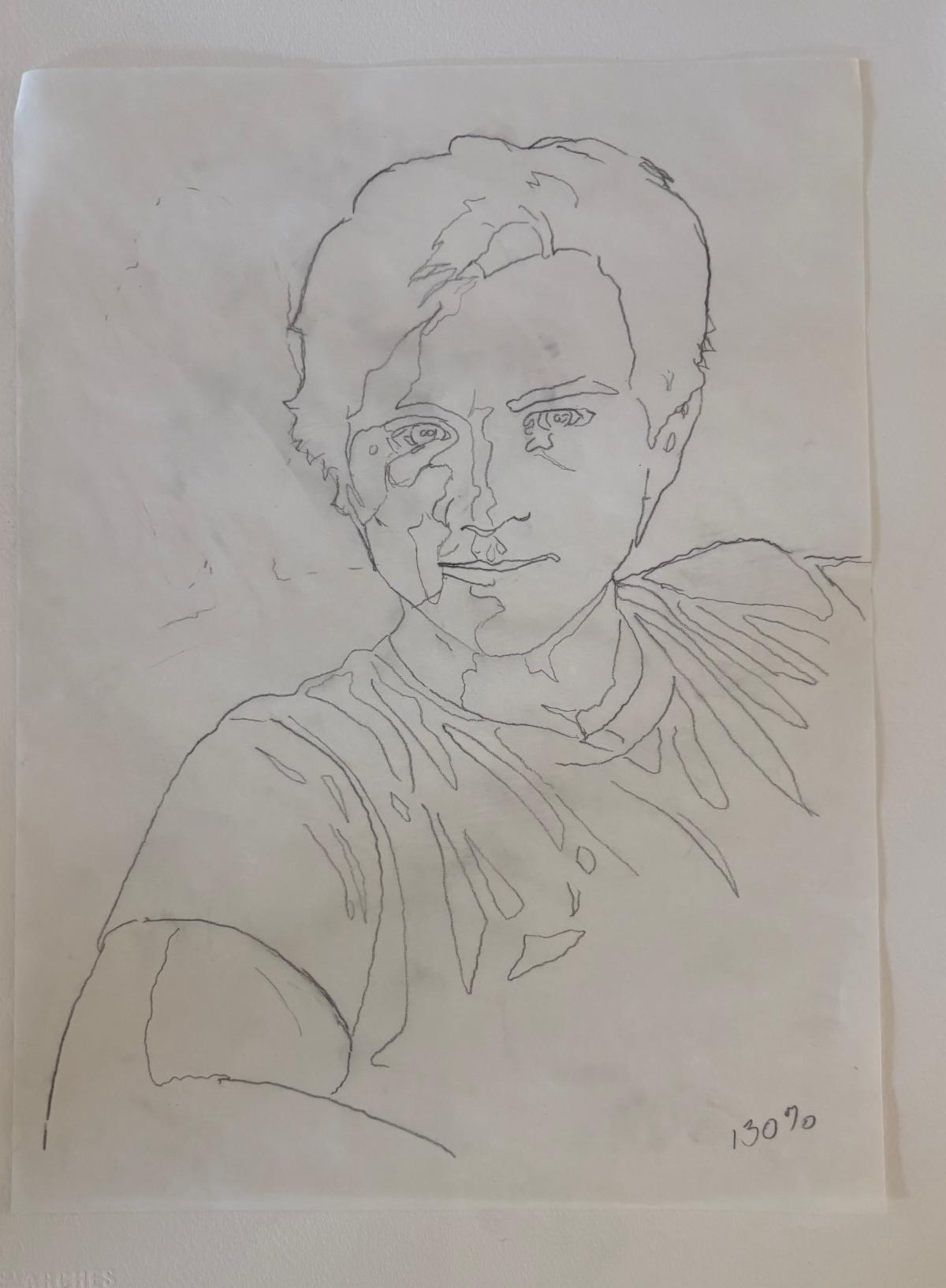
Take your 8 ½” x 11” tracing paper with the map of value and color changes to FedEx or a local print shop. Enlarge it to fit on 11” x 17” paper (130%) and you will have an image the perfect size for ¼ sheet of standard watercolor paper. If you want a larger size use a proportional scale and ask at the desk for help blowing up your image to the size you need.
Use the lightbox to trace your enlarged image onto the watercolor paper. Tape the tracing under your watercolor paper and turn the light up as bright as it goes. Use a mechanical pencil to copy slowly and carefully but don’t make your pencil marks so dark you will not be able to erase them later.
Correct your drawing by observing the original photograph to note what you might have left out or need as guidelines later on.
| | |
Applying Paint:
Step 1 - Preserve white areas using frisket. In my painting I preserved only the catchlight in the eyes.
Tape or clip the watercolor paper to a board, then slant the board 30 degrees. You can prop it on a roll of paper towels or a box. Gather your painting supplies, paints, palette, paper towels, clean water, brushes, etc.
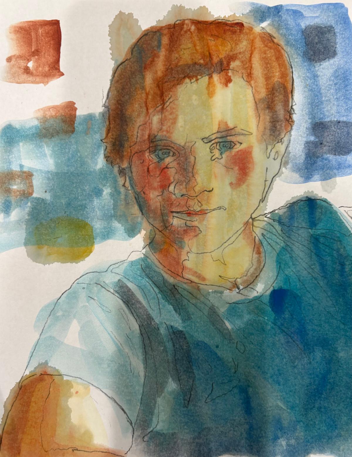
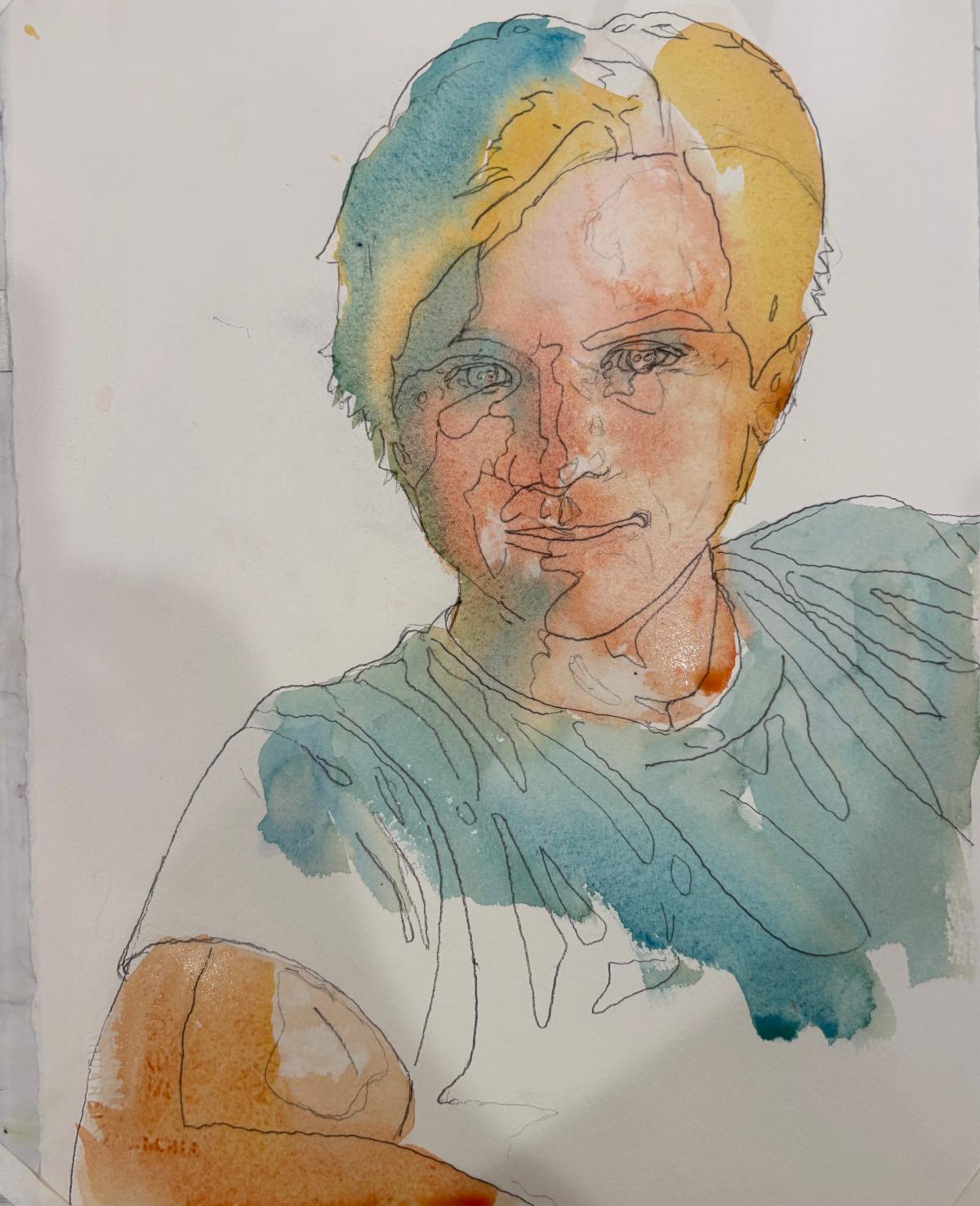
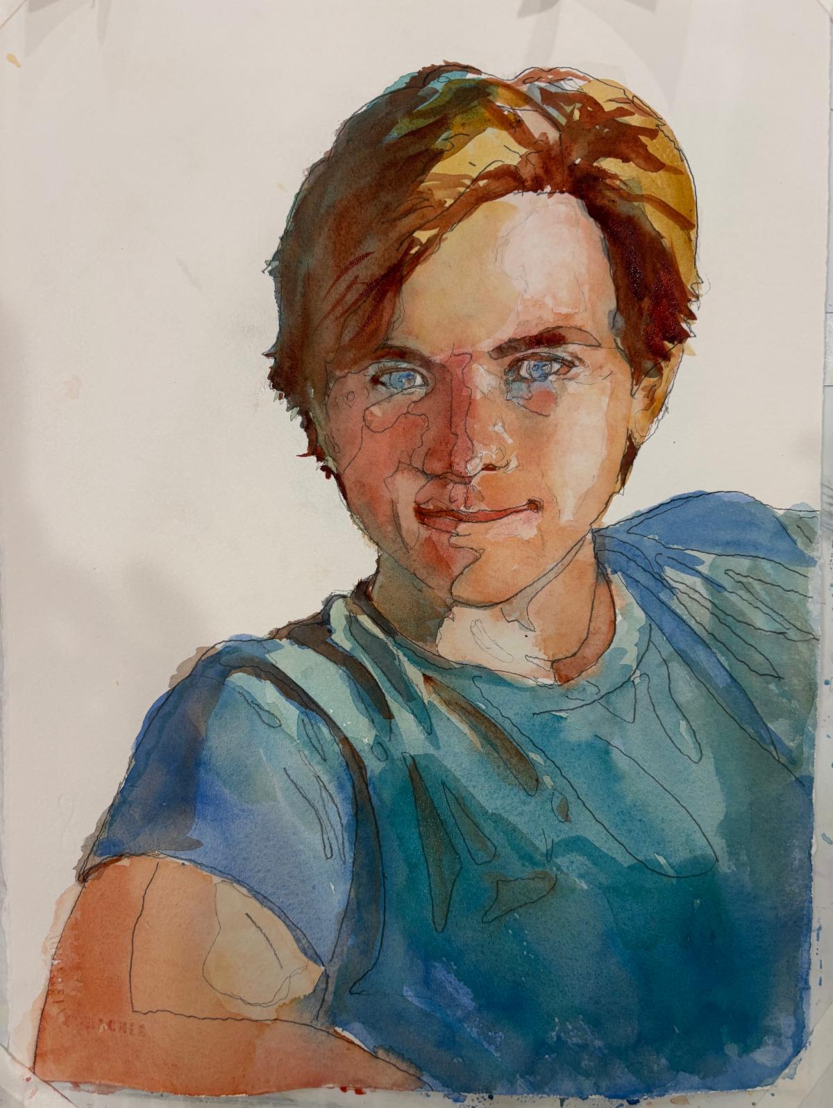
| | This is my first pass with the color. You can see there are some problems here with the backwash on his forehead but it’s still early in the process so I know I can fix it later. | | |
Step 2 - Light values
Moisten the area of the paper you will be painting with clean, clear water. Mix up a large puddle of the colors you will be using. Try to keep your colors clear and luminous. Use a scrap piece of watercolor paper to test your colors before adding to the paper.
Don’t cover the entire wet area with pigment - drop a small amount in the middle and let the water carry the color. If a small amount of hair color flows into the flesh color don’t worry. We want soft edges and the lightest values.
Blot if the paint starts to run wild and tip the board if you need the water to flow in a different direction. The colors you place now while the paint is wet will dry 20% lighter than what you see when wet, so be brave.
You can always add a second layer to add oomph to your values but be aware each additional layer takes away from the freshness of the painting.
Let dry.
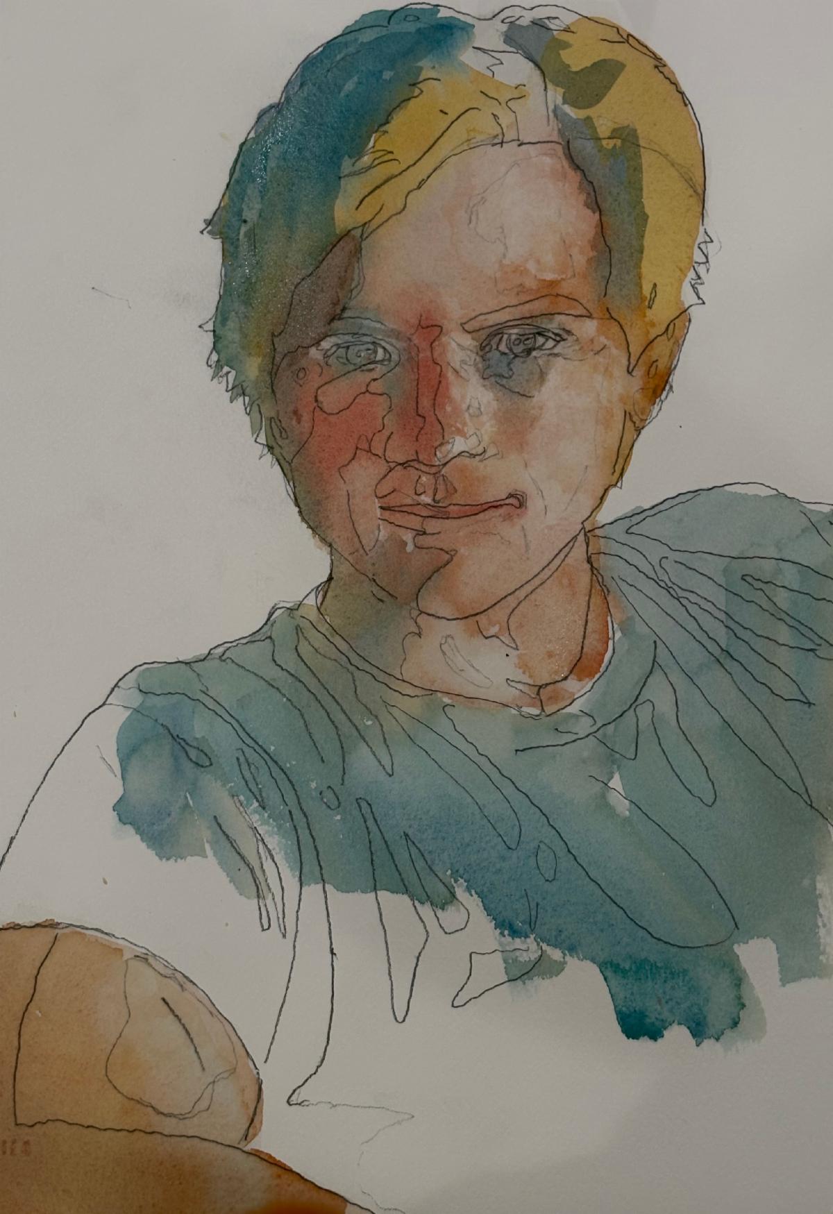
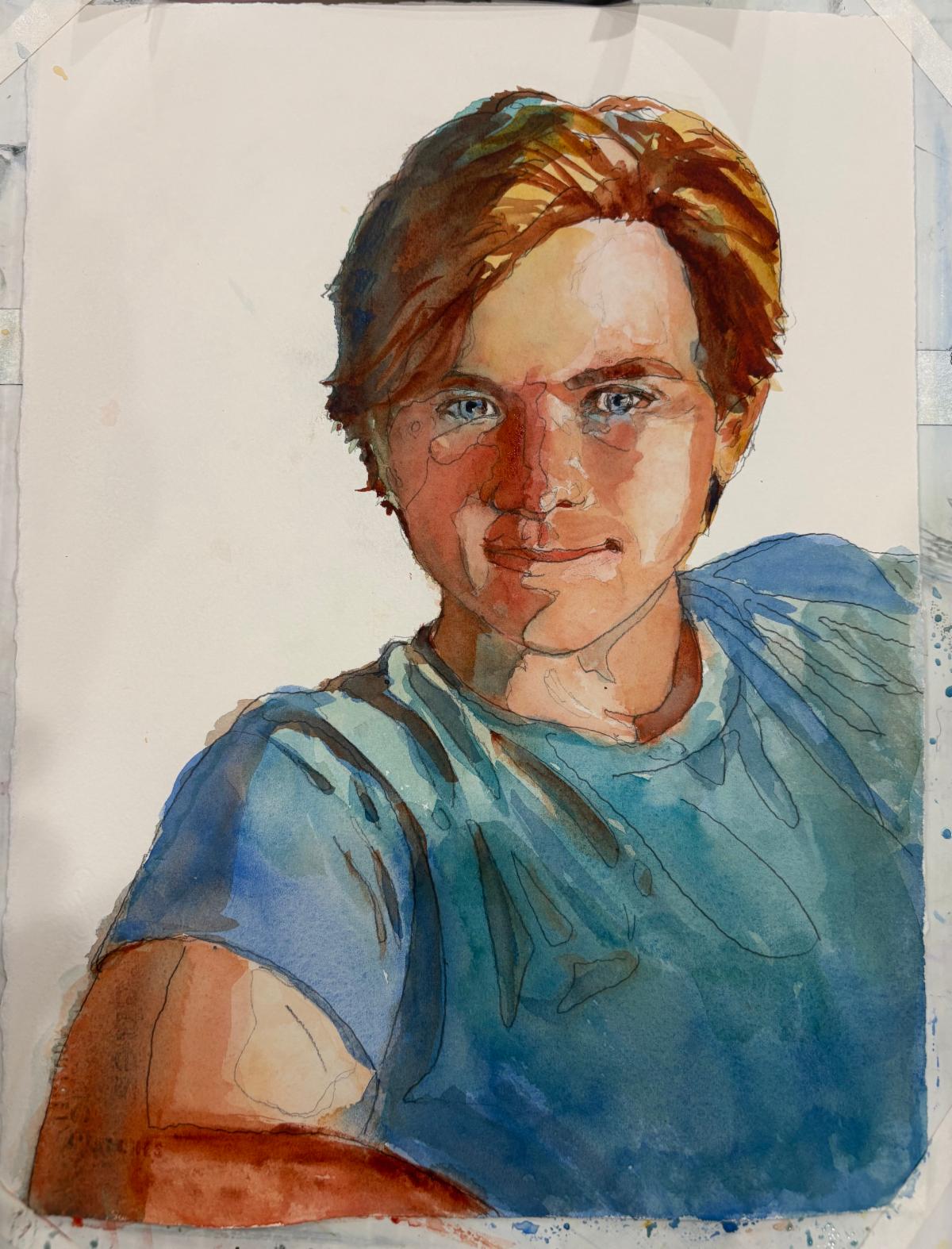
| | I’m adding strength to the shadows here. | | |
Step 2 - Shadows
Get fresh clean water, wash your palette & brushes. Mix up a large puddle of the colors you will be using. Use a scrap piece of watercolor paper to test your colors before adding to the paper.
Shadows are 40% darker than your light value. If using Cadmium Red be aware this color will dry at least 20% lighter and duller than when you first apply it. Cadmium Red is an opaque color which will lie on the surface and not disturb the color underneath it so it is great for brightening and it’s easy to remove if you overdo. Be brave and add more color than you think you’ll need.
Carefully observe the Notan of your photograph. You should have the outlines of the shadow shapes marked on your drawing. With a wet brush, start at the hair and move down the face quickly shifting color and moving across the nose to the second eye, down the side of the nose and into the upper lip and the chin and under the neck. Before the paint dries, clean your brush and bring color into the smaller shapes on the opposite cheek and ear. Survey how the color is drying and add more red if needed.
Use a moist brush to soften areas of transition.
Even if you’re not satisfied with your shadow side do not try to fix it now. When the paint is only half dry fussing can create an unlovely blob. Let everything dry first - corrections can come later on.
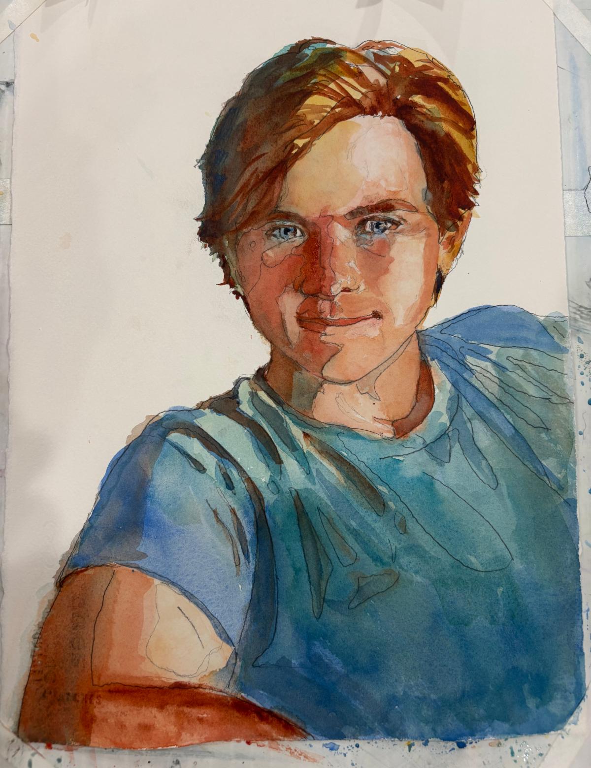
| | Here you can see the shadow shape from my four value sketch taking form on the left side of the face | | |
Step 3 - Blush Zone
Get fresh clean water, wash your palette & brushes. Mix up a large puddle of the colors you will be using.
Everyone looks healthy when they are blushing. A blush appears when you are attracted to someone, or you have a “glow of health” when you’ve just finished exercising. The blush spreads from ear to ear across the cheeks, the tip of the nose and the lips. In portrait painting we exaggerate this blush to make our subjects even more attractive. By painting the forehead yellow we warm the skin and describe the effect of our yellow sun. A cool blue shift on the jawline and under the bottom lip strengthens the dimensionality of the face.
| | |
Start on the sunny side of the face and begin modeling the features with a light to mid value flesh color mix. Think of your brushstrokes as giving volume to the surfaces. These form shadows will usually have soft edges and smooth transitions. You may want to begin with a brush loaded with pigment then add water as the stroke advances. It should be lighter than the shadow side of the face but darker than the lightest areas.
Now we can begin adjusting the colors - adding more red into the blush zone, yellow for the forehead, exaggerating the hair and the cooler shadow side.
Begin painting the clothing at this point since we will be incorporating the reflected light from the clothing in the next step.
Let Dry.
| | |
Step 4 - Shadow Side
Get fresh clean water, wash your palette & brushes. Mix up a large puddle of the colors you will be using.
Cast shadows have hard crisp edges. Form shadows describe the surface shape of an object and they have soft edges. Let’s begin modeling the form of the features on the shadow side, adding color for reflected light wherever possible.
Add modeling to the clothing and look for opportunities to “lose” edges in the dark shadows.
Let Dry.
| | |
Step 5 - Final Darks and Detail
Start with the eyes and eyebrows getting them to look back out at us. Be aware that each person has one eye that dominates the other. You can capture this effect by making the dominant eye clearer and more detailed than the other one. Making the black center of the pupils slightly larger indicates interest and alertness in the subject - too much and they will look drugged.
Darks - Fleshtone darks should be warm. When adding a complementary color, float it in the still wet dark to let it blend and merge on the paper - do not stroke or stir - you will create mud.
Add color for reflected light whereever you can
Make the edge of the cast shadow farthest from the object that cast it cooler.
| |
Step 6 - Evaluation and Corrections:
Take your painting back to the light box and place your enlarged tracing underneath to check for where you might have gone “off the map”.
Remove the frisket and erase your pencil lines. I use a battery powered eraser for this but if you’re worried about damaging the paper stick with a kneaded eraser.
| |
Place your painting on an easel and step back from it.
Ask yourself the following questions:
Values:
Are the values clearly and simply stated?
Are the value relationships correct?
Is there a 40% difference between the sunlit and shaded areas?
Are cast shadows even darker?
Place your four value study next to your painting and look for any areas you might have missed.
Colors:
Are the areas facing the sun warm in color?
Are the areas facing away from the sun cooler but still warm?
Are the dark crevices warm in color?
Is there reflected light on the shadow side?
Are my colors clear and luminous?
Did I use clean water, brushes and a clean palette?
Brilliant Darks
Did I use staining colors for my darks?
Did I use colors from the same side of the color wheel? (remember complements neutralize each other and become dull)
Edges:
Do objects in focus have crisp edges?
Do hard, angular objects have sharp edges?
Do round, soft or distant objects have soft, indistinct edges?
Are there “lost” edges between areas of equal value?
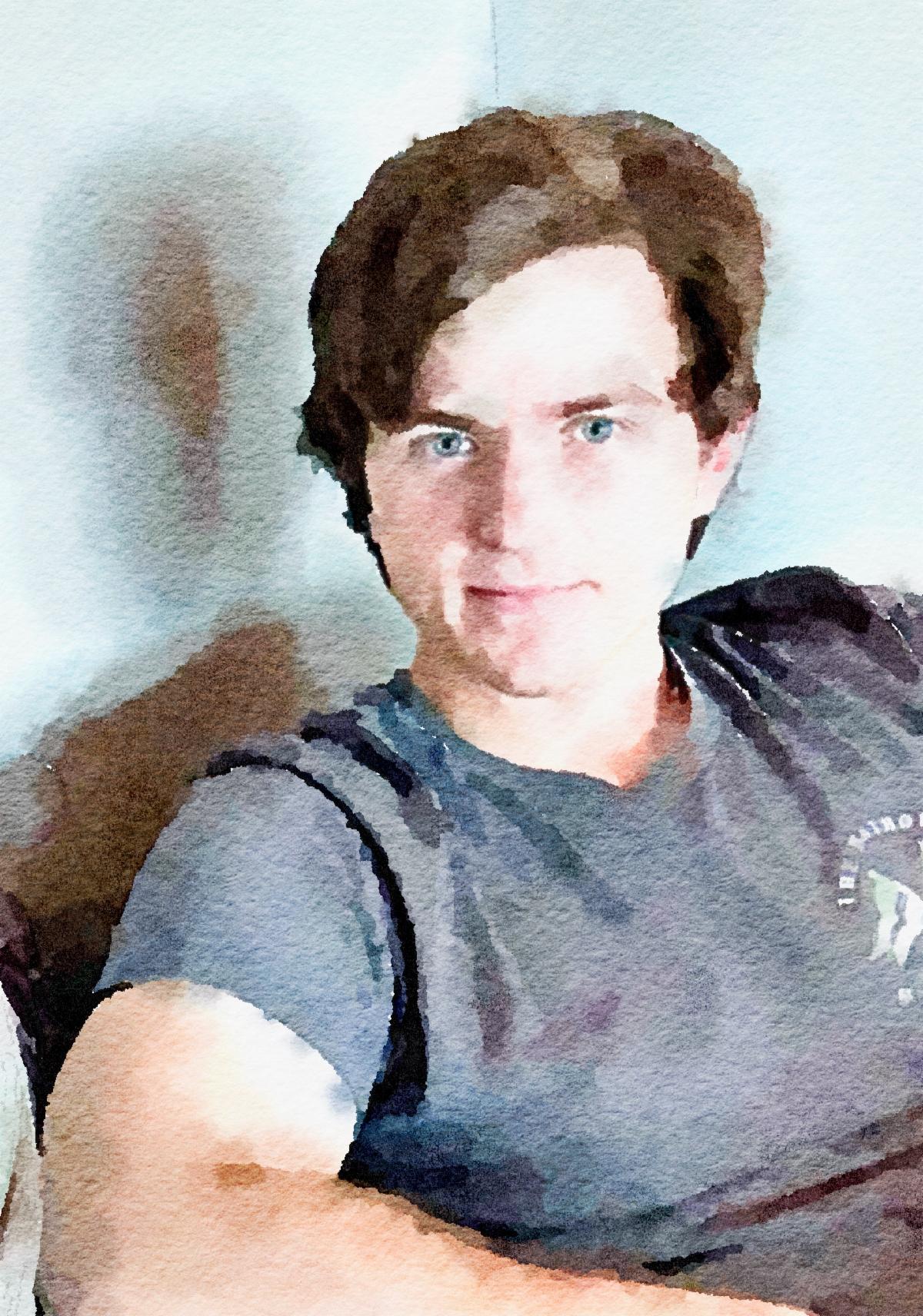
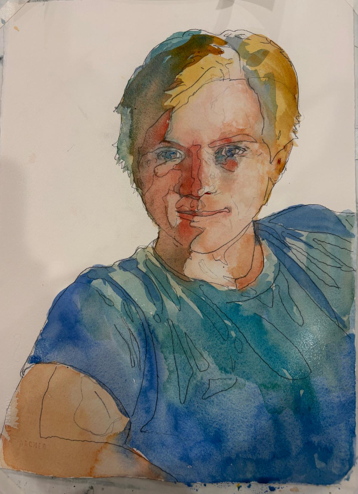
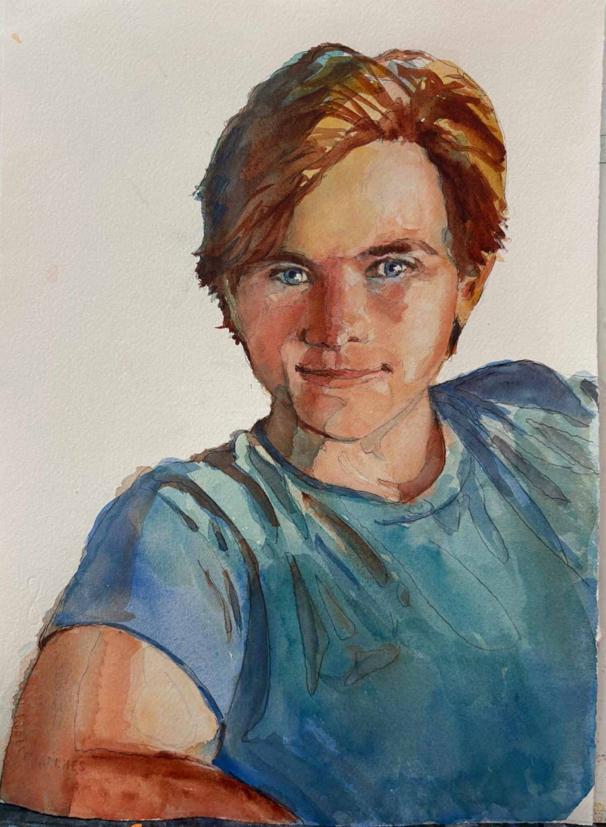
| | Here’s the final version of the portrait next to the resource photograph | | |
Use a slightly moistened, stiff bristle brush to soften any edges that look too harsh. Correct color as needed. I found I needed to add a lot more cadmium red and turquoise.
One final tip: If for any reason you’re not happy with your final painting once it’s dry, try painting a layer of clear, clean water over the entire face. This tends to soften all the edges and unify the head.
If this doesn’t work to your satisfaction try mixing a very light value puddle of cobalt blue with a touch of alizarin crimson. Be sure this is a clean mixture with no other pigments added. Then paint this mixture over the entire shadow side, using light brushstrokes so as not to disturb the pigment underneath. This will help subdue too severe contrasts and further unify the shadow side.
| | |
I hope this recipe will help you to create a successful portrait of a beloved friend or family member. Please share your successes and failures with me. Great recipes are always improved by the comments that follow after experimentation.
If you’d like more support in becoming a more successful portrait artist I am always available to coach you in leveling up your skills. I’m also available if you’d like to commission a portrait of a special person or pet.
If you’d like individualized coaching and support in building the skills you desire, I’m here to help and I look forward to working with you.
| | |
If someone shared this newsletter with you and you'd like to subscribe, please reach out to me below with your email address. I promise, no spam, no overloading your inbox, just the good stuff.
I welcome the opportunity for connection, conversation, cooperation, collaboration, and commissions.
Live heARTfully
| | P.S. If you didn't get the chance to download your free gift from me: Here are annual collections of my newsletters from September 2022 through December 2025. | | | |
Sources:
Kunz, Jan “Painting Watercolor Portraits that Glow” NorthLight Books, 1989
Reid, Charles “The Natural Way to Paint” Watson-Guptill, 1994
Reid, Charles “Portrait Painting in Watercolor” Watson-Guptill, 1973
Gurney, James “Color and Light - A Guide for the Realist Painter” Andrews McMeel Publishing, 2010
| | | |
Florida Watercolor Society
Annual Convention & Trade Show
Bradenton Area Convention Center
1 Haben Blvd
Palmetto, FL
Dates Thursday - Saturday
October 1 - 3, 2026
PLEASE REGISTER HERE
| | | | |
Gallery 21
Annual Juried Show
Island City Cultural Center
600 NE 21st Court
Wilton Manors, FL 33305
(954) 225- 5488
Awards Ceremony
Saturday September 19, 2026 6-8pm
Show dates September 12 - October 17, 2026
www.artgallery21.org
| | | | |
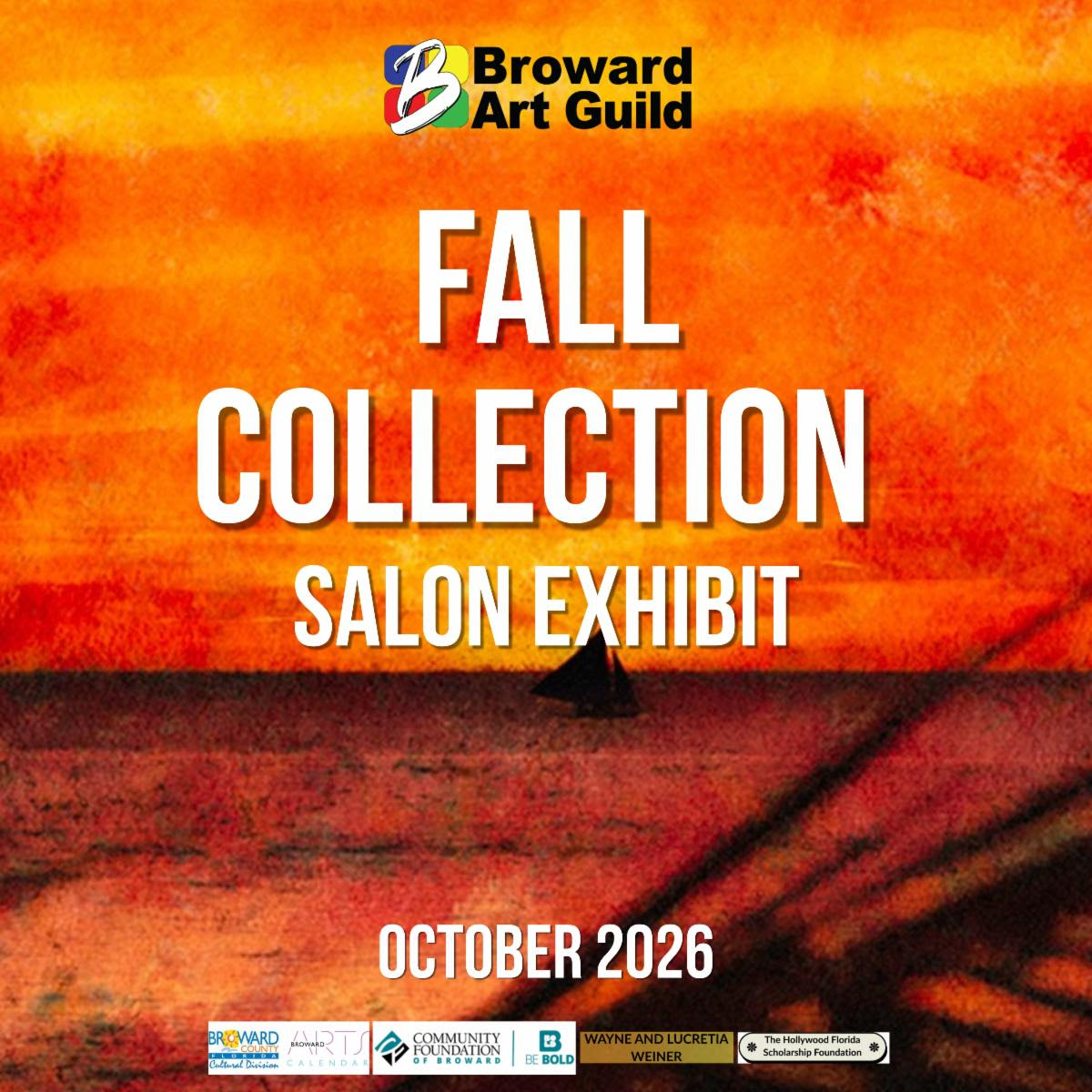
Broward Art Guild
Fall Collection Salon Exhibit
2052 E. Oakland Park Blvd
Fort Lauderdale, FL 33026
(954) 537-3370
Awards Ceremony
Saturday October 3, 2026 6-8pm
Show dates September 30 - October 23, 2026
www.browardartguild.org
| | | | |
National Leage of American Pen Woment - Ft Lauderdale Branch
Railways and Reveries
Sunrise Civic Center Gallery
10610 W Oakland Park Blvd
Sunrise, FL
Reception September 30, 6:00 - 8:00
Show dates October 2 - November 14, 2026
penwomenftl@gmail.com
| | | |
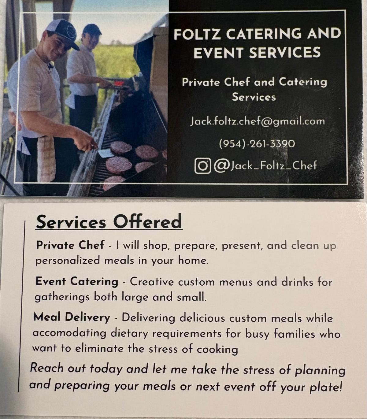
If you live in the Fort Lauderdale area, consider hiring my very talented son, Jack Foltz, the subject of this portrait, as a private chef for your next party or family event. Those of you who have tasted Jack’s cooking know what a treasure he is.
| |
Private Art Retreats
A personalized experience, full of art and discovery, for those who….
- are traveling alone, or with a couple of friends
- would like a much more flexible, and free experience, and lots of fun, too, tailored exactly to your needs, interests, and experience level
- may want to combine painting with organized discovery trips and tours and really get to know the ‘real’ South Florida
- would like to book in for a shorter or longer time than most workshops
- don’t want to have to bring a mountain of supplies in their luggage
- Prices start at $100 per hour
| |
Painting Joy
Created especially for artistic women in the third stage of life who are dissatisfied with their artwork and want to have more fun connecting with themselves and others. In this three-day watercolor workshop, we experiment with visual cues that inspire joy, discover personal symbols that resonate, and provide ways to bring more effervescence into our lives and art.
Please recommend any venues you know that might be interested in hosting this workshop in 2027.
I am also happy to teach this as a private retreat or for a small group in my studio.
I would very much appreciate your help in getting the next booking.
| | | | | |
Private Portfolio Review
One and a half hour consultation to help you direct your energy into improving your paintings and identifying your “next step"
$250
Text Link
| | | Private Lessons and Events | | | | Master Classes for High School Students | |
Private, highly personalized classes in mastery for artistically-minded US & international students virtually on Zoom or in person at my home.
If you have a student who is a visual thinker, willing to push the boundaries of their own work, and serious about improving their options for college, I want to hear from you! Schedule a time to discuss how I can collaborate with you to build a portfolio that will give your student the greatest chance for success.
Packages start at $130 per hour
Find out more
| | | | Art Workshops, Critiques & Presentations |
Invite me to present or lead a workshop for your school, club, or guild.
I can customize a program for your event or present my skills programs on composition, color theory, drawing faces, coordinating light/shadow or understanding the cues for depth. I am available for judging, confidence-building critiques and recorded tutorials.
| | | | Improve Your Artist Statement | |
If you would like to delve more deeply into your own inner questions and clarify your thoughts as you create an artist statement for your website, a gallery show, a sponsor, or another project, please reach out, and let’s talk. I have helped many students write compelling statements for AP Art, college applications, and competitions.
$250
Find out More:
| | |
Sketchbook Prompt:
Fill a page in your sketchbook with eyes, another with different types of noses, another with different types of ears, and one more with mouths. Practice different expressions, nationalities, and ages
| | |
It's time for these artworks to find a forever home. Please contact me if you are interested in adding any of the paintings below to your collection.
I will deliver if you live within a 2-hour drive and if you live further away, I will give you a reasonable price for shipping.
Venmo, CashApp, PayPal and Zelle are welcomed.
| | |
I have seven new watercolor paintings to introduce to you!
In honor of June’s newsletter I am including a statement for each piece.
| | |
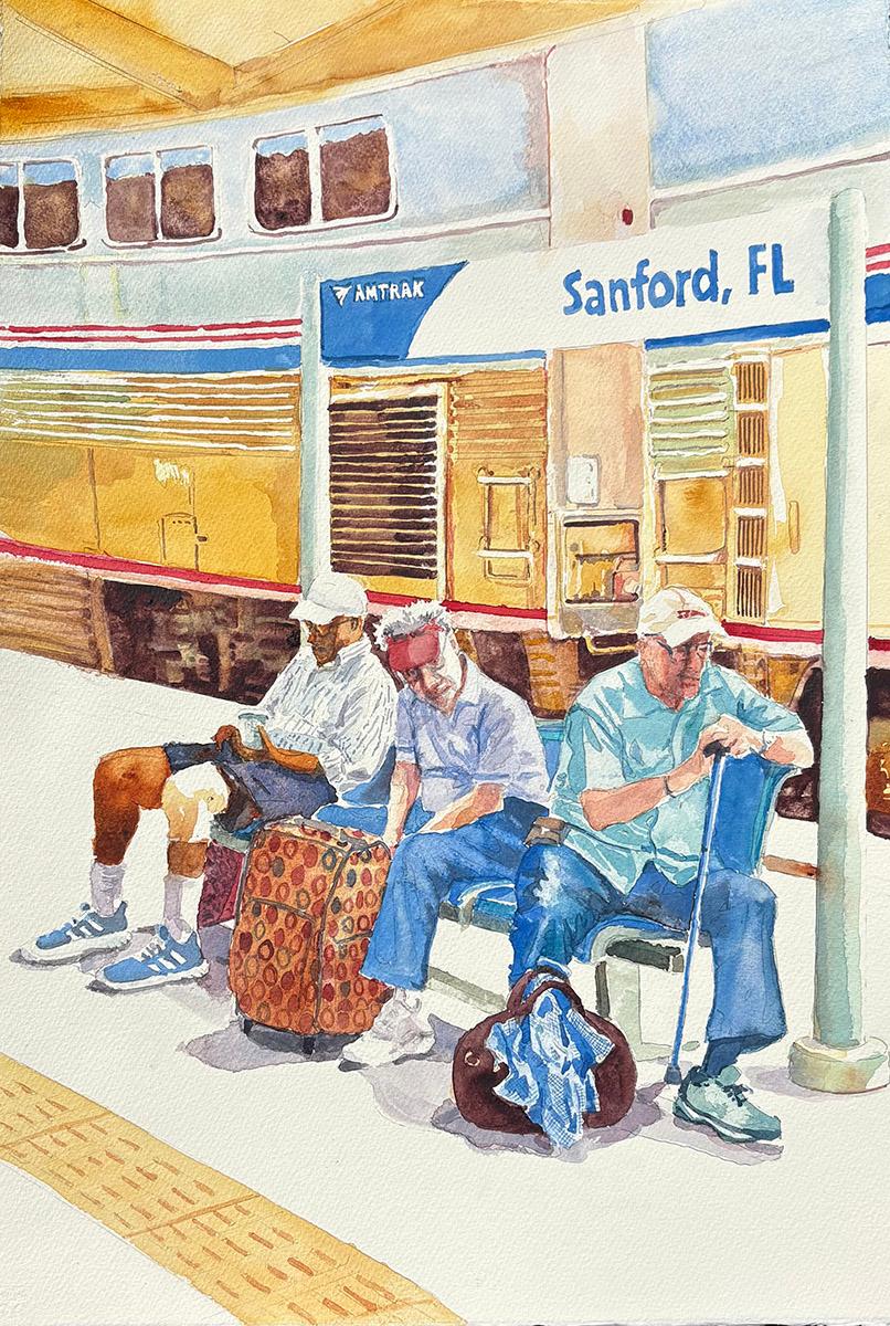
Title: Waiting
Media: Watercolor
Size: 27”x 20"
Price: $777
Frame: Gold
Statement:
While waiting to board the auto train a few years ago I was amused by these three figures. I love the contrast of the speed of the perspective of the train with their solid bored expessions fixed in place by the sign and its poles. They are linked together by color into a really interesting shape and the light falling on them is perfect for watercolor.
| | | |
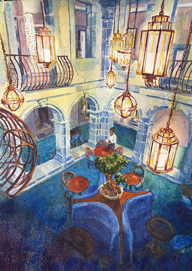
Title: Seixo Convent
Media: Watercolor
Size: 35"x 27"
Frame: Gold
Price:$1212
Statement:
While visiting Portugal last winter I stayed in a lovely convent that’s been converted into a luxury hotel. The cold stone walls of the inner courtyard contrasted beautifully with the warmth of these fabulous hanging lanterns. I love how the circular shape of the tables and banquette bubble up into the lamps and balconies in a joyous way.
.
| | | |
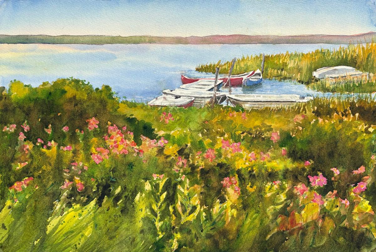
Title: Safe Harbor
Media: Watercolor
Size: 20" x 27"
Price: $777
Frame: Gold
Statement:
This little cove on Martha’s Vineyard in June reminds me of gentle summer days spent messing around in little boats. Beach roses are a signal that the long cold winter is truly ended and summer has arrived.
| | | |
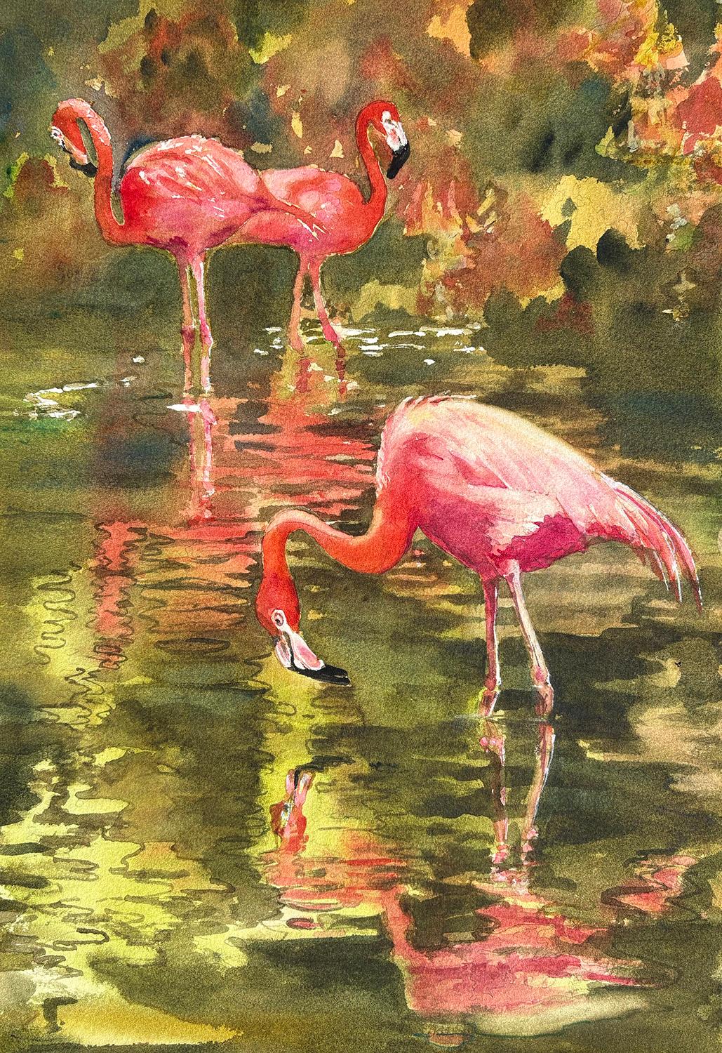
Title: Pink Narcissus
Media: Watercolor
Size: 27" x 20"
Price: $777
Frame: Gold
Statement:
I was intrigued by the contrast of the pink flamingos with the muddy green water and it’s reflections. In this painting I kept the background very abstract to show off the elegant forms of the flamingos.
| | | |
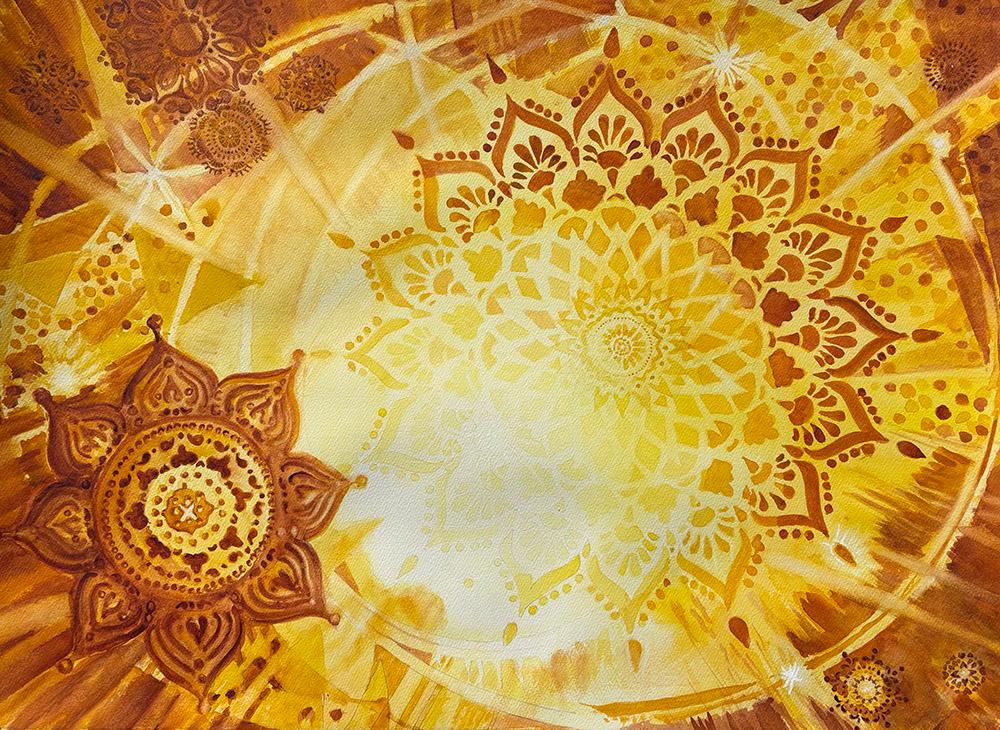
Title: Music of the Spheres
Media: Watercolor
Size: 25" x 33"
Price: $1212
Frame: Gold
Statement:
This painting started as an exercise in what happens to light as it encounters objects. I wanted to play with how bright light makes the edges of objects fade away and lose color. It was fun to work abstractly this way. The swirling mandalas compose a feeling of crescendos and quieter passages as in a symphony..
| | | |
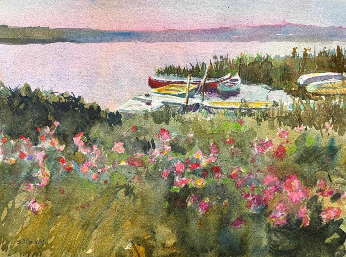
Title: Such is Summer
Media: Watercolor
Size: 15" x 19"
Price: $444
Frame: Gold
Statement:
This painting was my practice sheet for “Safe Harbor”. I generally test out my color and composition before working on a large sheet of paper, but I really like this composition and in some ways I think it is moodier and more successful than the larger final painting.
| | | |
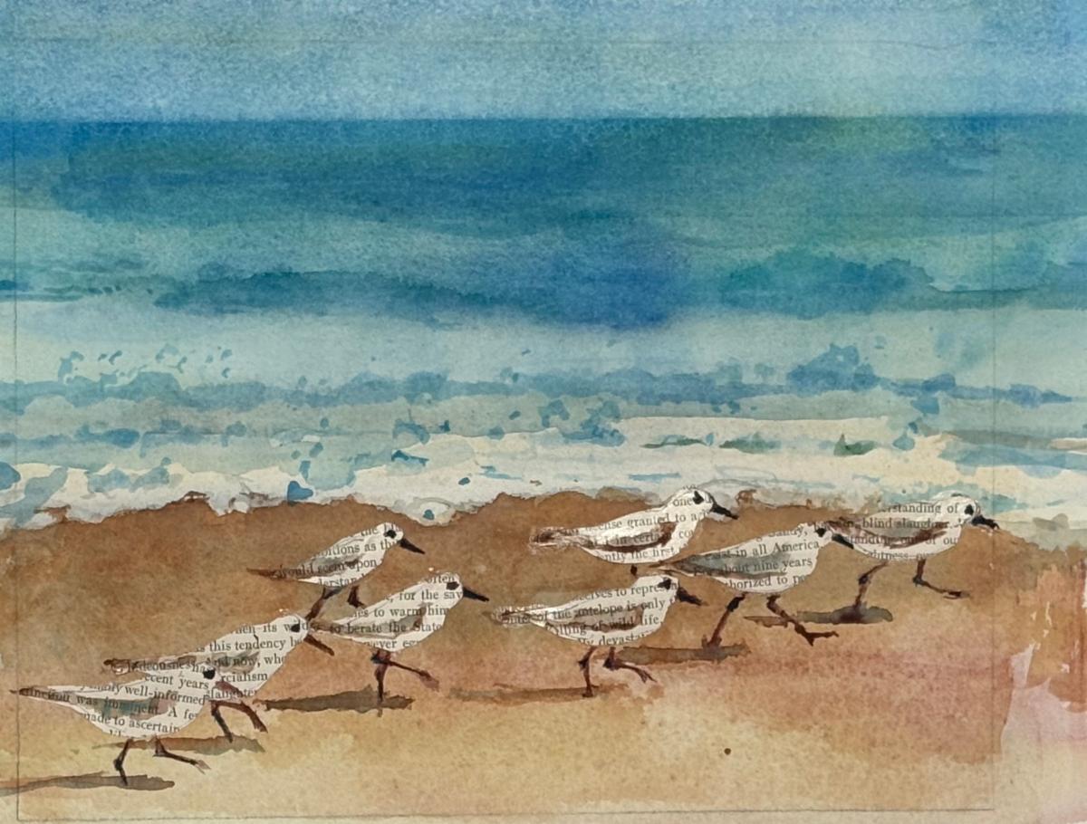
Title:Wordy Birds
Media: Watercolor + Collage
Size: 8" x 10"
Price: $333
Frame: Gold
Statement:
I’ve been creating some loose watercolor landscapes as a warm up before painting. This one looked like it needed some birds in the foreground. I had fun cutting out little bird shapes from a 1930’s magazine and then making them look like sandpipers.
| | | Want to see past issues of my newsletters? Visit this link on my website. | |
Subscription Information: You are receiving this email because you subscribed to my mailing list, downloaded a resource, purchased one of my products/programs, or opt-ed in some other way.
Thank you for being part of the Cr8V Soul Arts Tribe!
NOTE: Unsubscribing means you won't receive any more emails from me including information about your paid products and programs.
| | | | |