“Absolute green is the most anesthetizing color possible… similar to a fat cow, full of good health, lying down, rooted, capable only of ruminating and contemplating the world through its stupid, inexpressive eyes”. - Wassily Kandinsky | |
|
Regardless of where you were born, you are invited to wear green on St. Patrick’s Day. New York’s St. Patrick’s Day Parade traces its lineage back to March 17, 1762, 14 years before the declaration of Independence. Every year, while the White House dyes the waters of its fountain green, hundreds of thousands of honorary Irish men and women gather to celebrate by drinking Guinness, wearing green and trying out their Irish accents. Ireland's lush landscapes earned it the nickname "The Emerald Isle," and St. Patrick’s teachings associating the holy trinity with the shamrock solidified green as the natural choice for Ireland’s national identity.
The color green conjures comforting images of the countryside and environmentally friendly politics. Despite its association with envy, it is generally seen as a peaceful color and is often associated with luxury or money. The ancient Egyptian hieroglyph for green was the papyrus stalk, a plant the Egyptians held in high regard. In Latin the word for green is viridis which is related to a large group of words that suggest growth and even life itself; virere, to be green or vigorous; vis, strength; vir, man.
| |
|
In the West, green is mainly linked with the rituals of spring. Green also became the badge of youth and young love. The Middle Ages already used the expression “to be green,” which means inexperienced.
For Muslims, for whom “Paradise” is nearly synonymous with gardens, green became a favorite color in the twelfth century. In the Koran, the robes worn in paradise and the silk couches scattered amidst the trees are the color of leaves. For this reason, green is a feature of most Muslim flags.
In antiquity, green pigment was available to artists through natural green earth and minerals such as malachite. As early as 2500 BCE, Egyptian artists used malachite, a basic copper carbonate, to color pottery and create wall paintings, symbolizing regeneration and rebirth. The ancient Greeks created green by exposing copper to acetic acid and scraping off the formed green crust. The Renaissance saw an increased use of plant-based green pigments, though these were often unstable and prone to fading.
While a spectrum of greens can be mixed with various blue and yellow pigments, a single pigment green was sought as a starting point for mixing other greens or neutralizing intense reds. Below, I have collected some stories about the beautiful green pigments we see in our own and other artists’ palettes.
| |
|
Terre Verte:
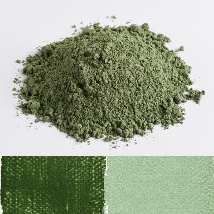
Also known as green earth or Verona green, contains naturally occurring silica clay and pigmented green earths of varying hues and mineral makeups. They are usually made of glauconite and deladonite but can include many other minerals such as malachite. They have been used since prehistoric times. These pigments are all permanent and stable, transparent, and work perfectly in all mediums.
| |
These green pigments crop up in significant quantities, most famously in Cyprus and Verona, and come in various colors from deep forest to an almost crocodile-like shade and even a rather beautiful sea mist. Most Terre Verte and green earth pigments are delicate with a low tinting strength that makes them unassertive in mixtures, but they are characterful pigments in their own right. They can be used to neutralise red and orange pigments, or in underpaintings for portraits (a technique known as verdaccio, which can help create life-like flesh tones).
| |
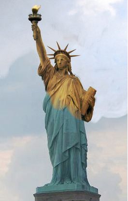
Gustave Eiffel "The Statue of Liberty”, 1886 - Original copper color and verdigris patina | |
|
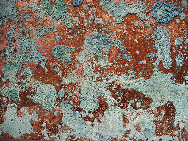
Verdigris is a naturally occurring copper carbonate that forms on copper and its alloy bronze when exposed to oxygen, water, carbon dioxide or sulfur. This green patina forms on old copper pipes and roofs, and gives the Statue of Liberty the blue-green color of the misty sea she often faces. It took 30 years for the elements to transform Gustave Eiffel’s second most famous structure from rosy copper to full green.
Verdigris paint was made when leaves of copper were placed in a pot with lye and vinegar or sour wine. The pots were then sealed and left for two weeks, after which the sheets were dried and the green patina was scraped off, powdered and formed into cakes with more sour wine.
| |
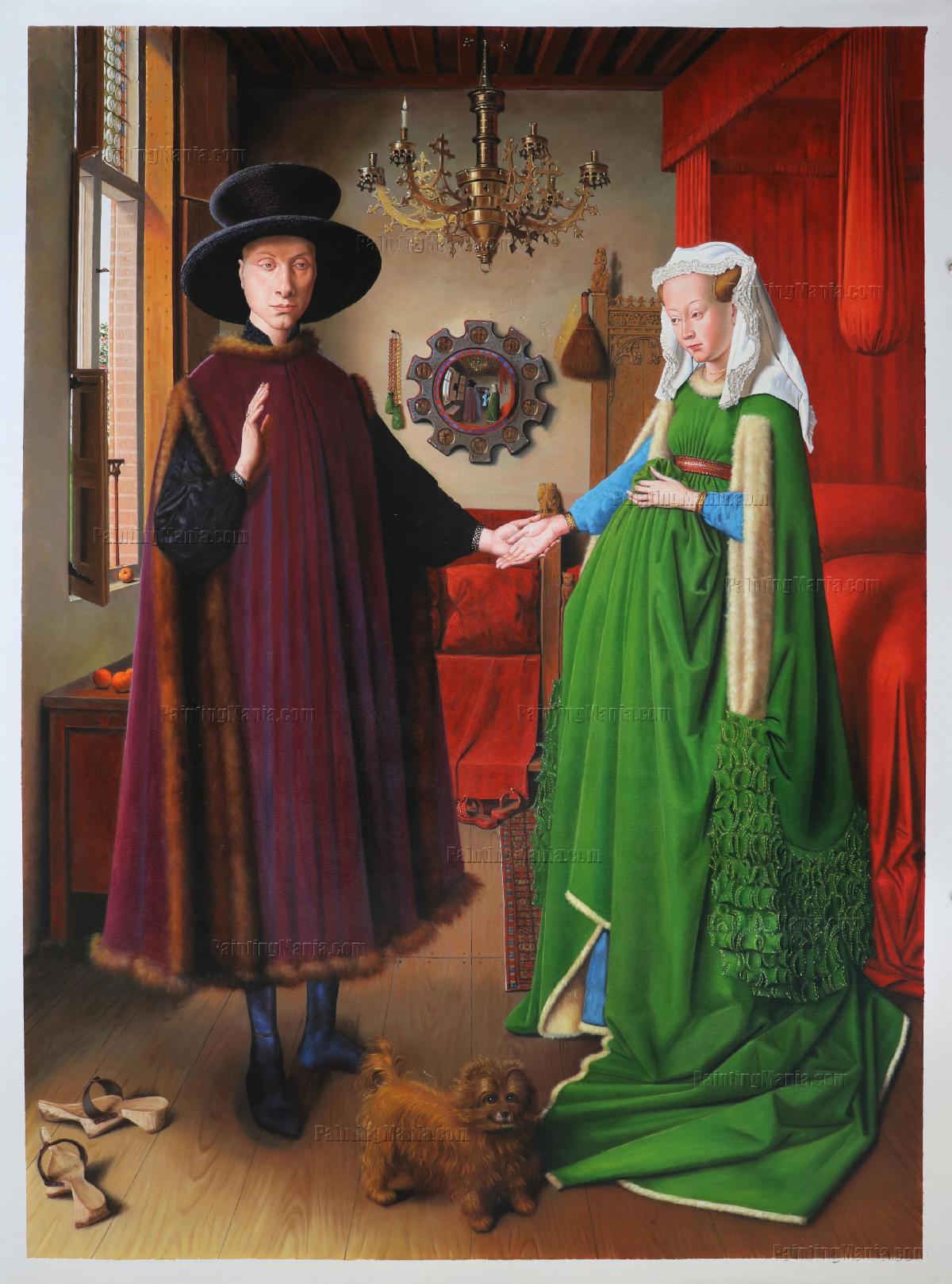
Jan Van Eyck “The Arnofini Portrait”, 1434 | |
|
Green is traditionally worn in the spring and by the forest spirits. Fertile young women like the one in Jan van Eyck’s Arnolfini Portrait (c. 1435) favored green dresses.
In this portrait, a couple stand, bodies tilted toward the viewer. She wears a bottle-green gown with preposterously long sleeves. He has fishy eyes and looks a little like Vladimir Putin. Is the woman’s left hand, loosely clasping her full skirts over the curve of her belly, the protective gesture of an expectant mother or simply an indication of fashionable indolence? Is this a newly married couple or an allegory of abuse? What is the meaning of the little dog? The gargoyles? The discarded clogs?
One thing is for sure; the dress is incontrovertible evidence of the couple’s wealth. The trailing bag-sleeves were so decadent that Scottish peasants were forbidden to wear them in the 1430s; the woolen cloth was further lined with the creamy fur of up to 2,000 squirrels. The sap-green color also indicated money. A deep-dyed and even green was a difficult color to achieve. Generally it requires two dye baths, first in woad (yellow) and then in weld (blue), a practice that was illegal for most of this period because of a medieval taboo on mixing colors.
The green dress in the Arnolfini portrait proves that verdigris could be used to spectacular effect, but it was fickle. The acids used to make it often attacked the surface on which it was used, nibbling through medieval illumination of paper and parchment like a caterpillar munching through leaves. It also tended to discolor and to turn black when combined with other pigments. Because there were so few alternatives, artists had little choice but to persevere, sandwiching their troublesome green between layers of varnish as a precaution and hoping for the best.
| |
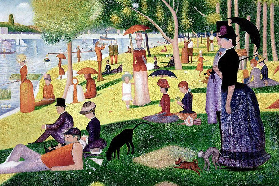
Georges Seurat “A Sunday Afternoon on the Island of La Grande Jatte”, 1886 | |
|
The foreground in Georges Seurat’s Sunday Afternoon on the Island of La Grande Jatte appears withered in patches because of misbehaving green pigments. Copper derived Verdigris remained one of the most widely used green pigments until the 19th Century, when Emerald Green, Cobalt Green, and Viridian were discovered.
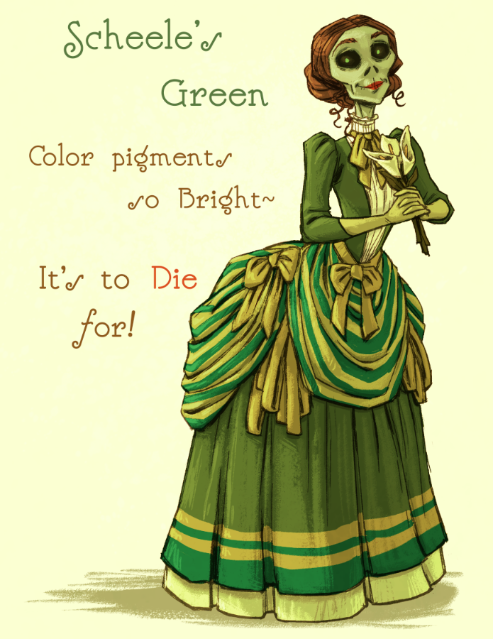
The particular difficulties craftsmen and consumers had with green probably contributed to the color’s symbolic link with capriciousness, poison and even evil. The association with poison at least, had some merit after the development and explosive popularity of copper arsenite pigments in the nineteenth century. Scheele’s Green and its close cousin -variously called Vert Paul Veronese, Emerald Green, Schwingfurt Green and Brunswick Green - were responsible for many deaths, as unsuspecting consumers papered their homes, clothed their offspring, and wrapped their baked goods in an exciting new shade that continued lethal doses of arsenic.
| |
|
Scheele’s Green:
In 1775 Carl Wilhelm Scheele, a Swedish scientist, was studying the element arsenic when he came across the compound copper arsenite, a green that he immediately recognized as having commercial potential in an industry starved for green pigments and dyes.
By 1858 it was estimated that there were around 100 square miles of wallpaper dyed with copper arsenite greens in British homes, hotels, hospitals and railway waiting rooms. And by 1863 the London Times estimated that between 500 and 700 tons of Scheele’s green were being made each year in Britain alone to satisfy the ballooning demand.
By 1871 the poisonous effects of the color were becoming apparent. A six-inch-square sample of wallpaper was found to contain enough arsenic to poison two adults. G.Owen Rees, a doctor at Guy’s Hospital in London, became suspicious after some calico bed curtains poisoned a patient. In 1877 he tested some muslin of a beautiful pale green and found it contained over 60 grains of an arsenic compound in every square yard! Imagine the air at a dance with all the ladies swirling around in their poisonous green dresses.
No laws were ever passed banning this color; instead, the producers opted to scale back production and supply it in minimal quantities.
| |
|
Emerald Green (Vert Paul Veronese, Schwingfurt Green and Brunswick Green or Paris Green):
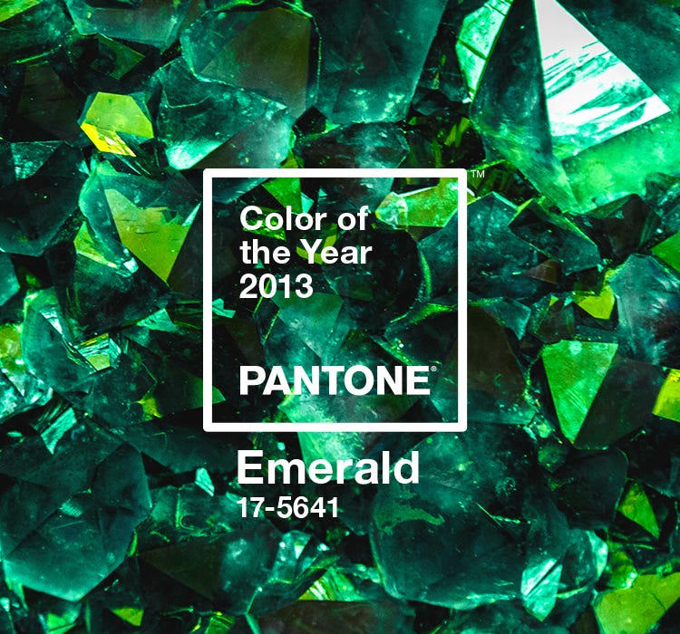
Emerald Green paint’s vivid original color was derived from copper acetoarsenite. A newer, less toxic chemical version of Emerald Green was Pantone’s color of the year in 2013. Emerald green is associated with elegance and mirrors the value of the gemstone named after it. Emeralds are a rare and fragile member of the beryl family, stained green with small deposits of chromium or vanadium.
| |
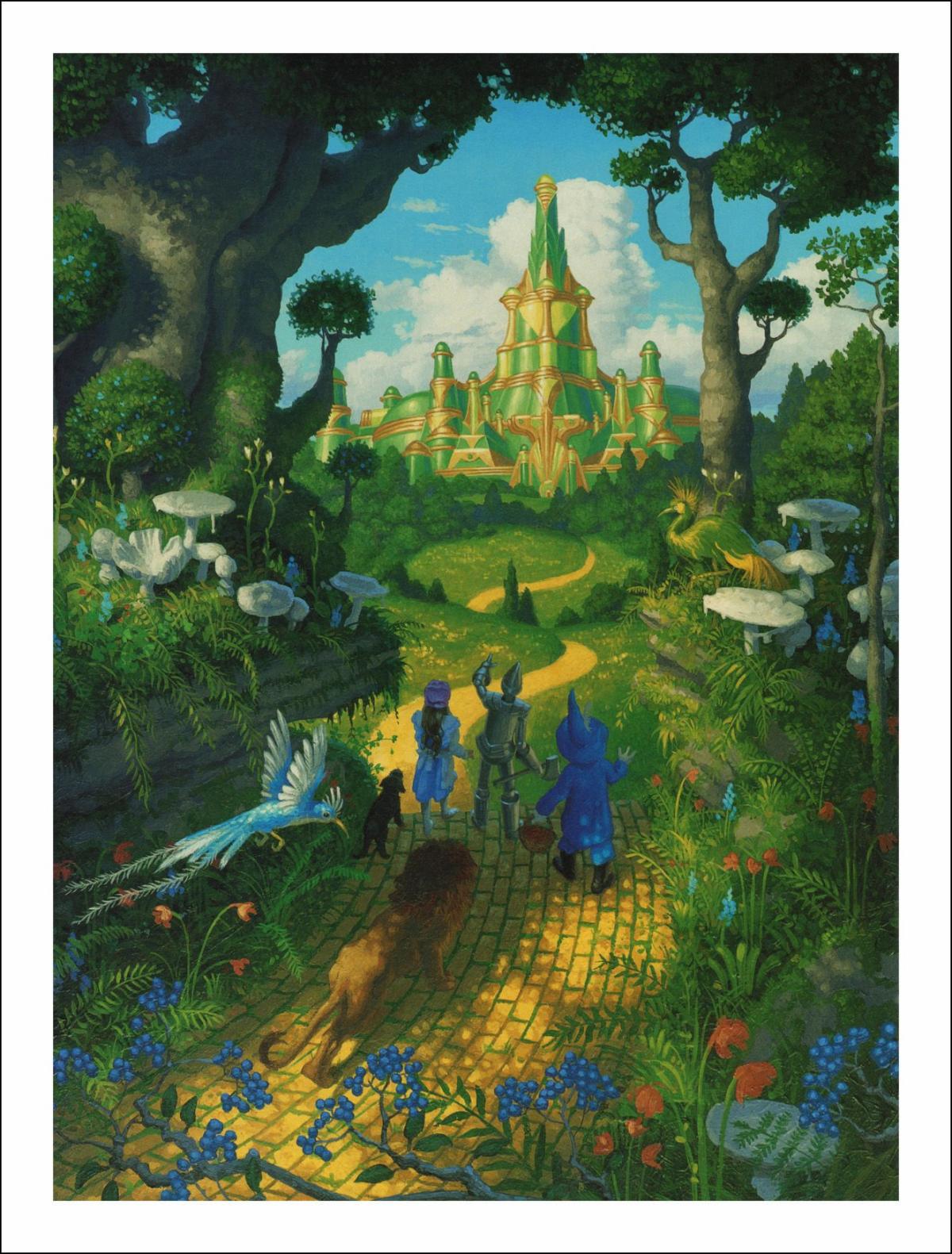
When L. Frank Baum wrote The Wonderful Wizard of Oz in 1900, he used this precious stone as the name and building material for the city his heroine and her misfit friends were trying to reach. The Emerald City, at least at the beginning of the book, is a metaphor for the magical fulfillment of dream; it lures the characters in because they all want something from it | |
|
Cobalt Green:
First introduced as an artist pigment at the beginning of the 19th century, it was not very popular among artists then, and it is often overlooked in favour of brighter and less expensive green pigments.
The first Cobalt Green pigment, a compound of zinc and cobalt oxides, was formulated in 1780 by Swedish chemist Sven Rinman. However, zinc oxide was manufactured on a small scale, so the pigment wasn’t introduced in commercial artists’ paints until the 1830s. As far as chemical stability was concerned, Cobalt Green ticked every box: It is extremely lightfast, permanent, and suitable for both oil and water-based binding mediums. These characteristics were extremely valuable at a time when new pigments were being developed and introduced very quickly, many of them chemically unreliable.
Cobalt Green didn’t capture the imagination of many artists. It was costly, gritty, dull, lacking in tinting power, and was described by 19th-century purveyor of pigments George Field as ‘chemically good, but artistically bad.’ It probably didn’t help that Cobalt Green had to compete with two other pigments introduced around the same time; the inexpensive and vibrant Emerald Green and the jewel-like Viridian. These pigments were used extensively by painters in the late 19th century, including the Impressionists and Post-Impressionists.
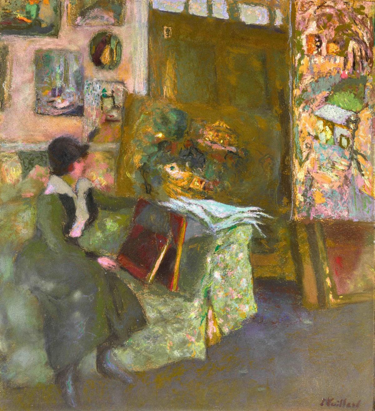
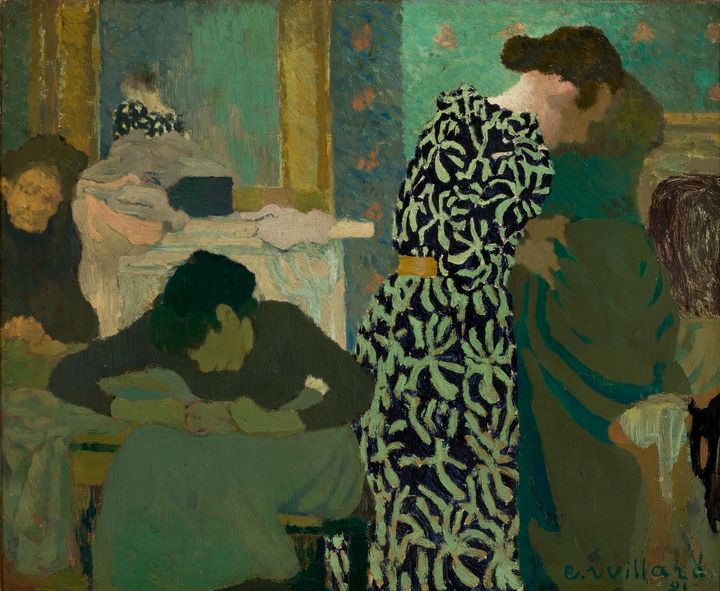
| Edouard Vuillard, “Model on a Green Sofa” Painted with Cobalt Green | |
However, Cobalt Green occasionally appears in pigment analysis of paintings from the time. French painter Éduoard Vuillard (1868-1940), was known to have used the pigment in several of his paintings.
While it may not have enjoyed much artistic success, Cobalt Green has recently been recognised in other fields. In the last two decades research has identified the pigment’s potential in computer technology. Cobalt Green can be magnetised at room temperature and can be used to create high-speed, energy-efficient computers that otherwise only function at sub-zero temperatures. It’s a fascinating reminder that the uses of pigments extend beyond the artist palette.
| |
|
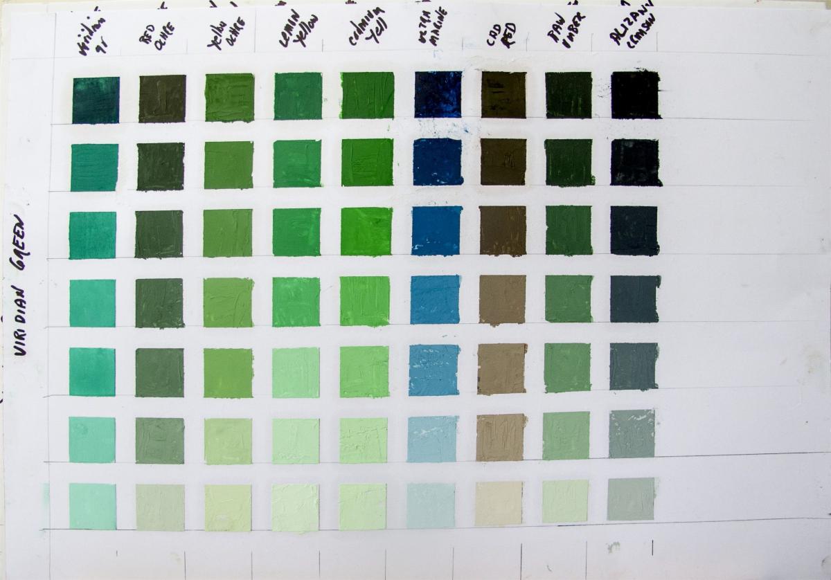
Viridian:
The color's name derives from the Latin "viridis," meaning "green, blooming, vigorous". It’s a vibrant bluish-green pigment created in 1836 by French colourmaker Pannetier. It was noted for its lively character and caught the interest of artists, particularly the Impressionists and Post-Impressionists, due to its intense color, excellent lightfastness, and suitability for glazing techniques.
The initial Pannetier version of viridian pigment was expensive, unstable, and prone to fading when exposed to light. In 1859, French chemist Guignet patented a method for manufacturing viridian, also known as "Guignet's green". This development made the pigment more affordable and stable, significantly increasing its popularity. Guignet's process involved heating a mixture of potassium dichromate and hydrated chromium oxide.
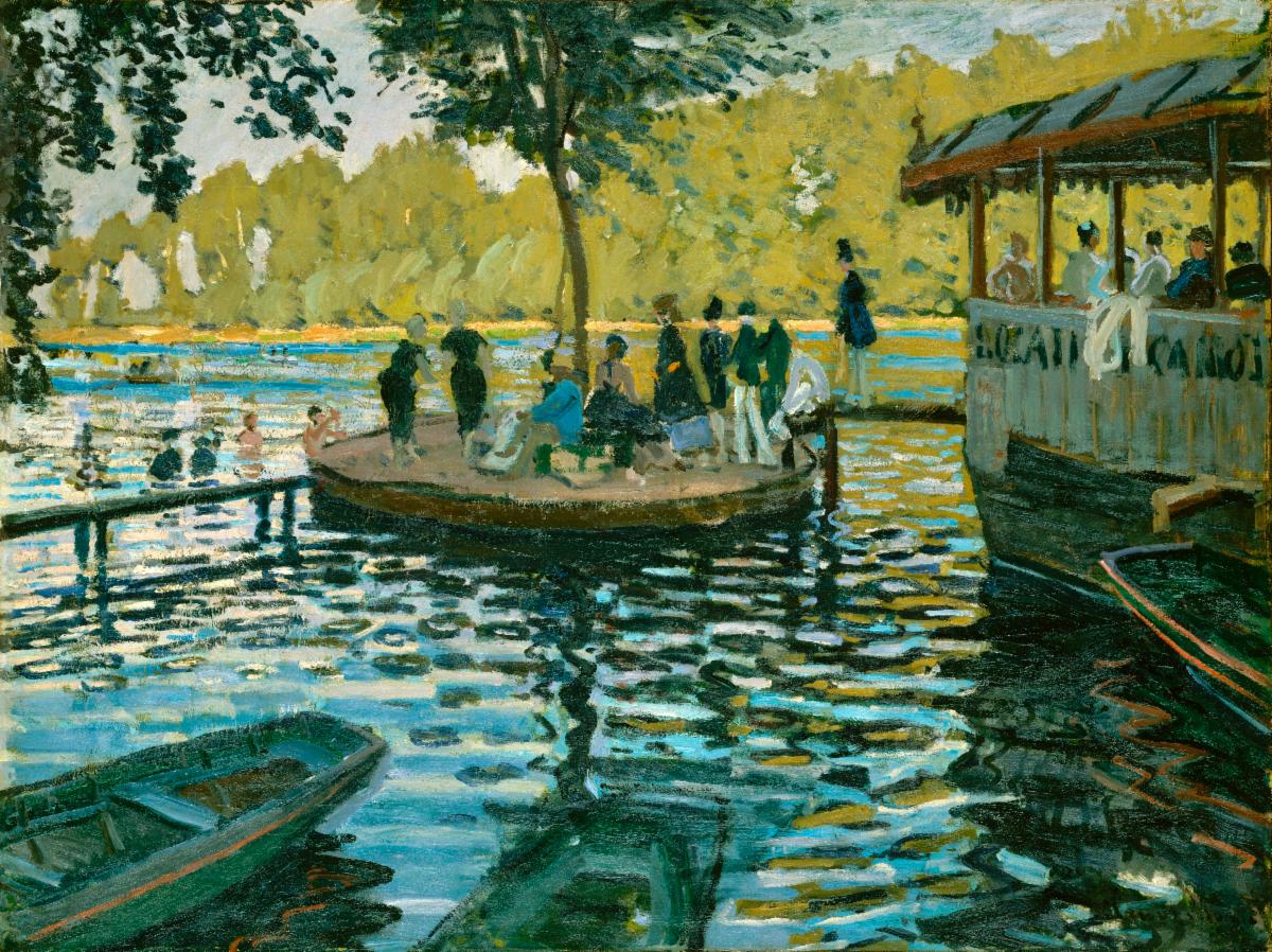
Because copper acetoarsenite Emerald Green tended to go black when mixed with sulfide pigments, like Cadmium Yellow and Ultramarine Blue, Viridian's stability, lightfastness, and intensity of colour made it popular with artists. When combined with yellow, orange, or red, Viridian gives life to an impressive range of natural greens. This makes Viridian a versatile staple for many artists to this day.
| |
Claude Monet, "La Grenouillère”, 1869 painted with Viridian Green | |
|
Recently, Viridian has been playing an essential role in the authentication of masterpieces. Analyses of artworks by Van Gogh, Kandinsky, and Klee have revealed that Viridian produced around the turn of the twentieth century contains a by-product not found in modern pigment manufacturing. Examination of Viridian has therefore been added to the battery of tests used to date, and to authenticate important works of art.
| |
|
Phthalo green
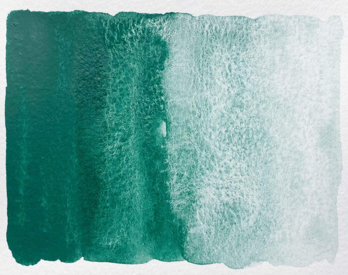
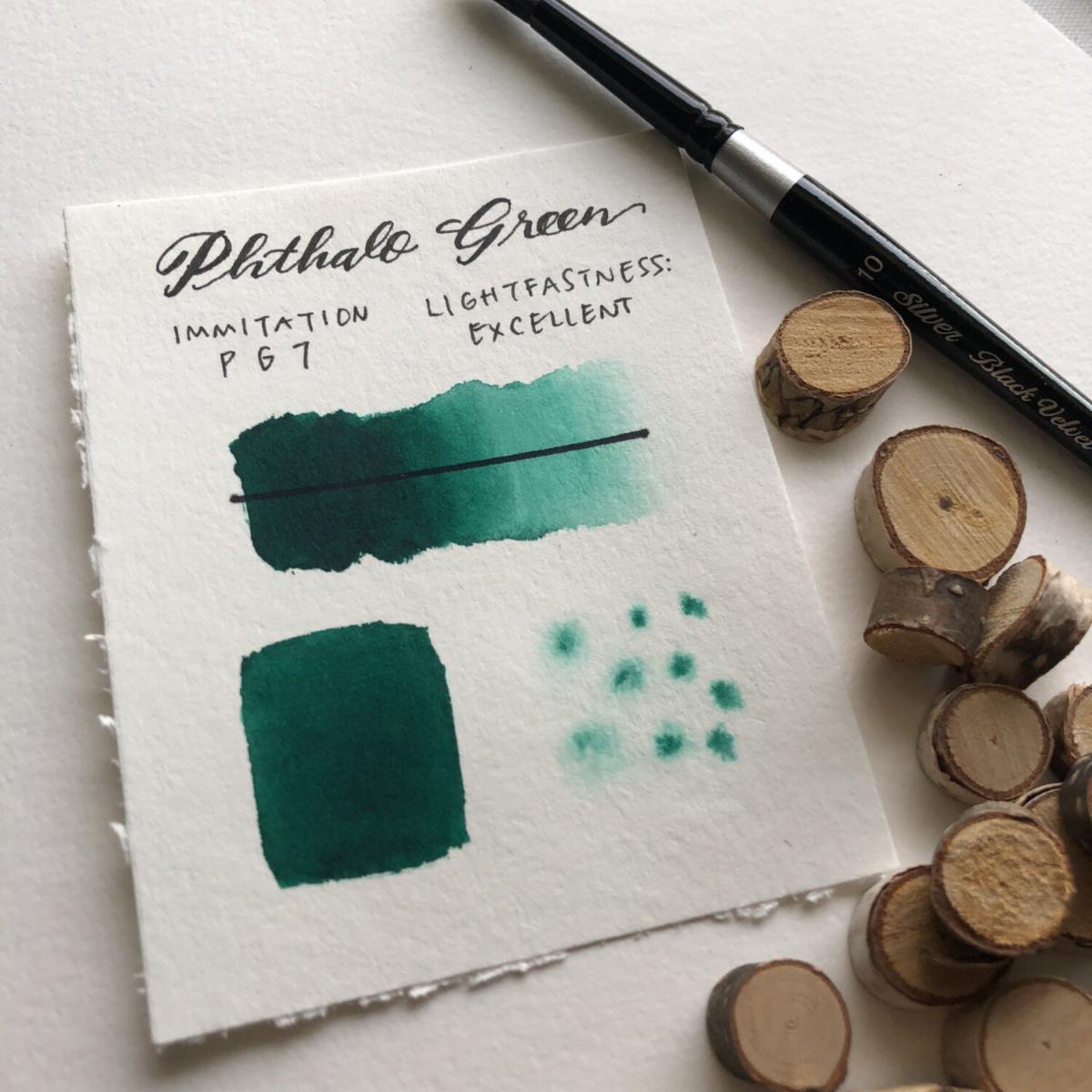
Introduced in 1938, Pthalo Green is a synthetic organic compound from the group of phthalocyanine dyestuffs. It is a soft green powder which is insoluble in water and poses no health hazards. Before its introduction, the only greens capable of equal brilliance were the original emerald greens which were opaque, more limited in their mixtures, harmful and much less permanent.
Though virtually all paint producers include a pure phthalo green in some form, it is also the basis of many popular mixed greens in colour ranges. Examples include: Permanent green, Cadmium green, Emerald green, Chrome green, Hooker’s green, Sap green. This green can produce many helpful colour mixtures, from transparent, subtle natural colours to strong, opaque and brilliant ones. For this reason it has become the most popular green in use by artists today.
| |
|
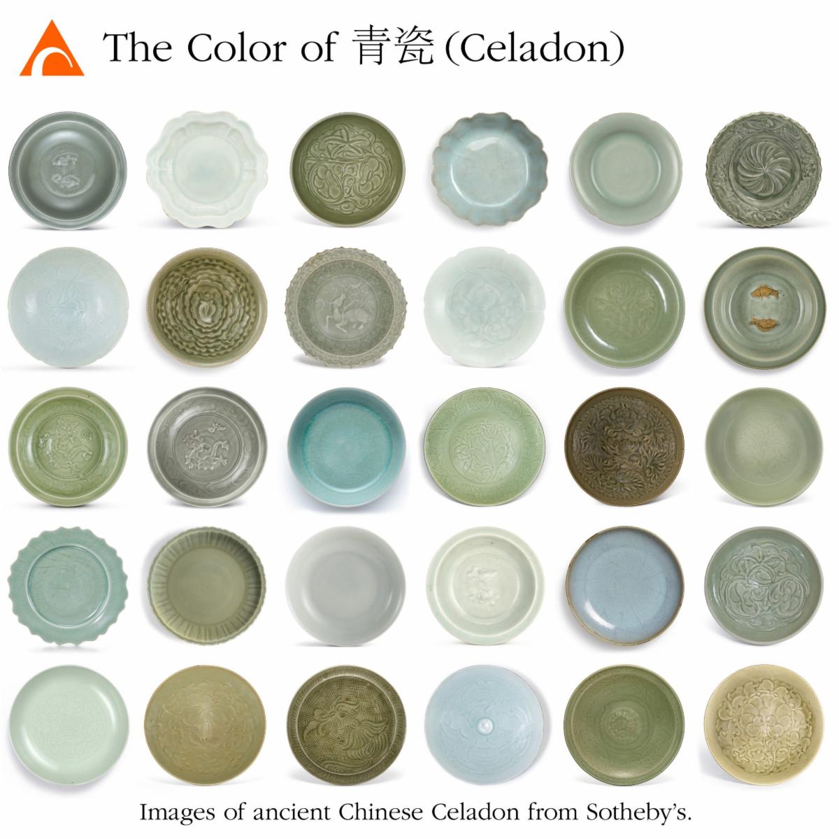
Celadon:
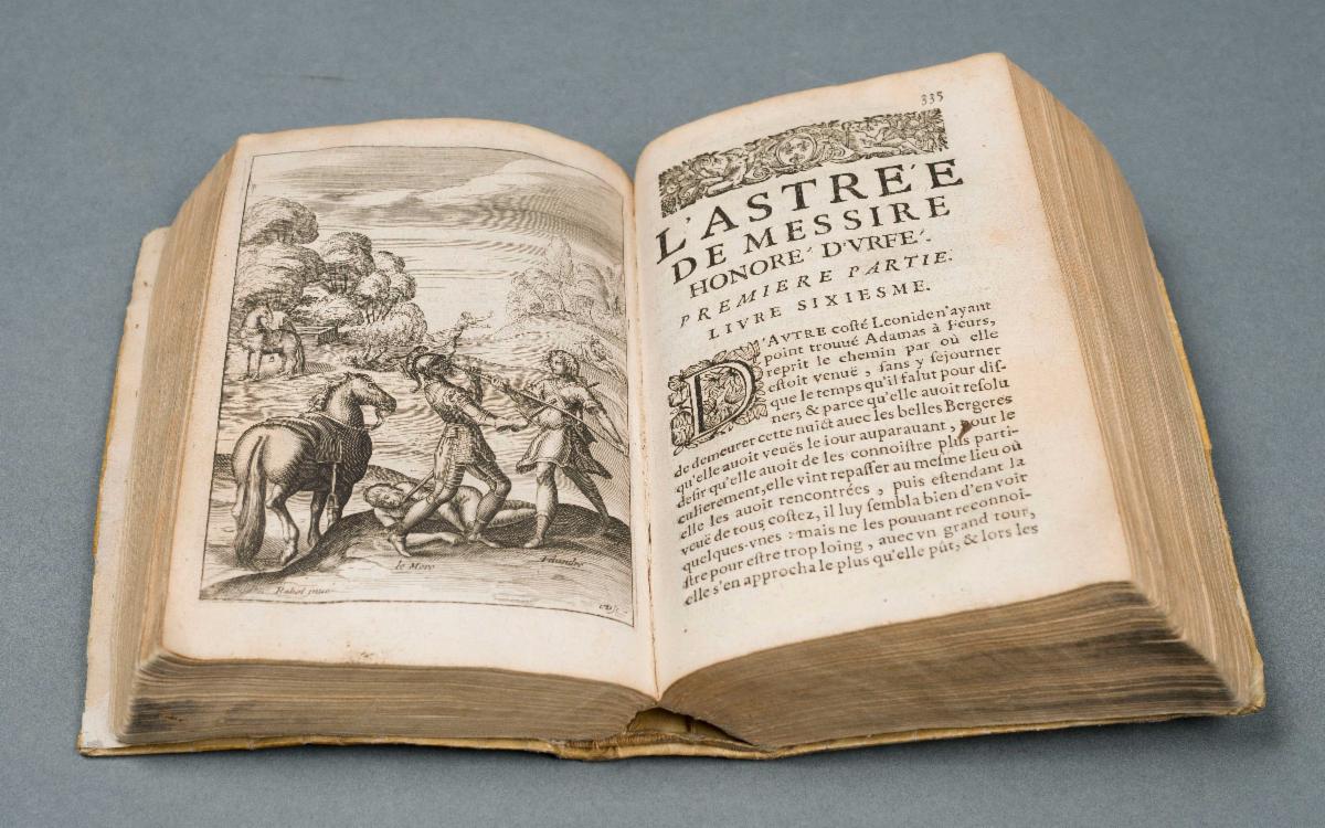
Honore d’Urfe was imprisoned for his political beliefs, lived much of his life as an exile and married his brother’s beautiful widow to keep her fortune in the d’Urfe family. He authored the nostalgic meandering 5,399 page and 60 book pastoral comedy “L’Astree” between 1607 and 1627. The story recounts the futile quest of Celadon, a lovelorn shepherd, to win back his lover Astree. It was widely translated, circulated throughout Europe and spawned a fashion for dressing in sylvan green a la Celadon.
| |
|
So firmly linked was Celadon with this particular woodland-fog color that the word celadon was soon used to refer to a similarly hued ceramics imported from the east.
The Chinese had been making celadon objects for centuries before d’Urfe’s hero emerged. Usually grayish green - although the colors can vary enormously, these ceramics are characterized by iron in the clay and iron oxide, manganese oxide and quartz in the glaze. Many have thin networks of fissures in the glazes as fine as the network of veins in a leaf, which is produced intentionally to make the surface resemble jade. Although the method originated in China, similar ceramics were created on the Korean Peninsula between AD 918 and 1392.
Europeans at the far end of the trade routes were too distant from the source to understand celadon’s myriad classifications. Patterns and colors, which, to a trained observer, would have communicated purpose, place, and time of origin, meant nothing to seventeenth-century Europeans. For them, the beautiful, sea-mist ceramics that had traveled so far conjured up only the hapless Celadon in his shabby green coat.
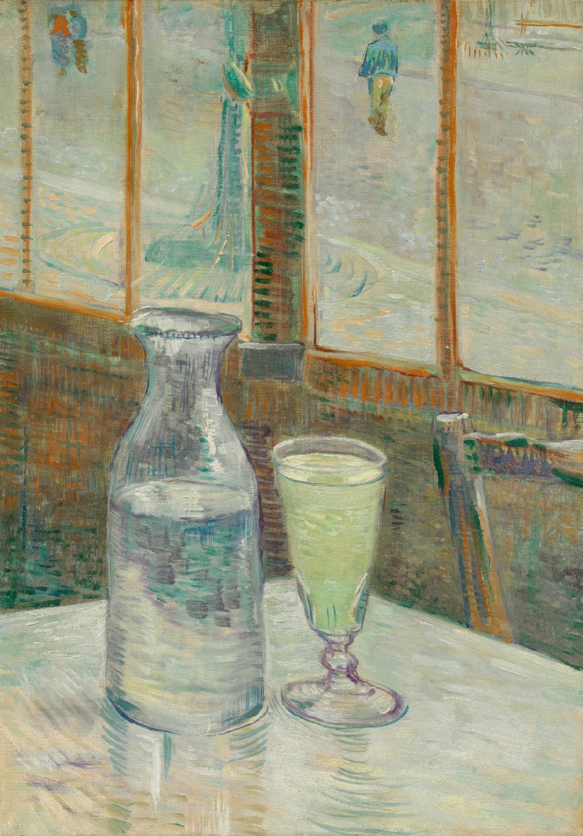
| Vincent Van Gogh, Absinthe | |
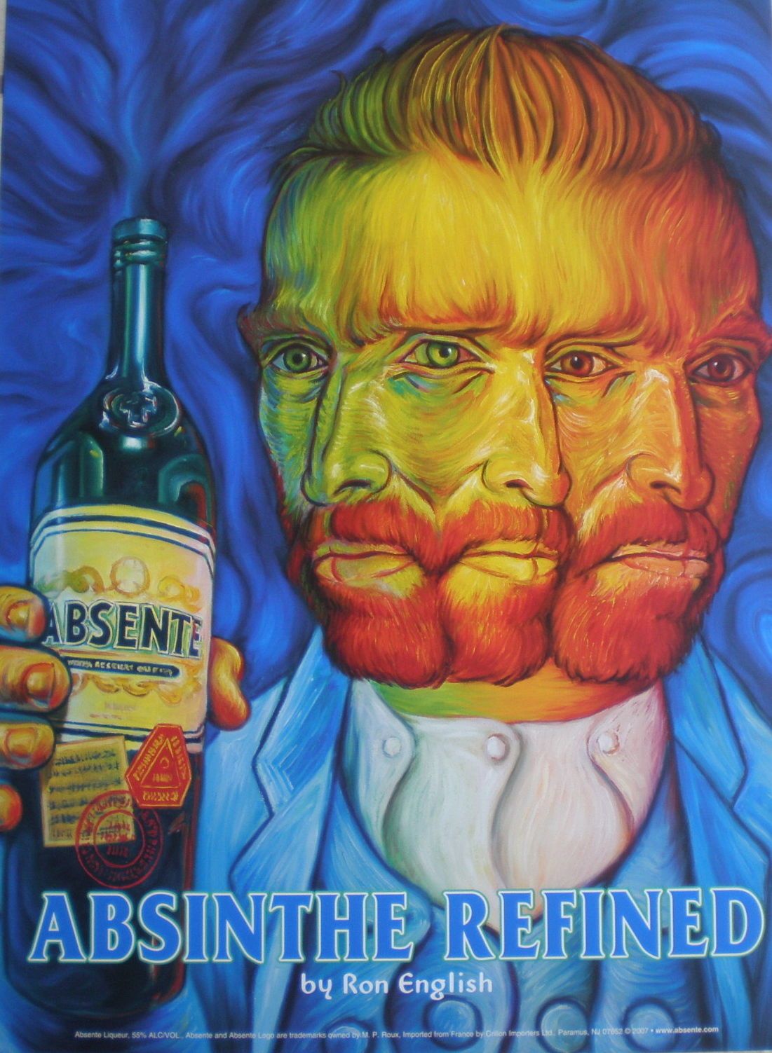
Absinthe:
A concoction made of plants and aromatics, including wormwood, aniseed, fennel and wild marjoram, which were first bruised and then soaked in alcohol and distilled, creating a bitter, pear-colored liqueur. Like today’s Aperol spritz, Absinthe was a popular pre-dinner aperitif. Ancient Greeks and Romans used similar recipes as an insect repellent and antiseptic. The modern version was also intended for medicinal use. French soldiers serving in Africa were given it to help ward off malaria.
| |
A measure would be placed in a glass, and then diluted with ice-cold water poured through a sugar cube, turning the whole thing a pale milky green. At first Absinthe was associated with dissolute bohemians and artists like Vincent van Gogh, Paul Gauguin, Oscar Wilde and Edgar Allan Poe, however, its appeal soon spread.
By the 1870s, as grain alcohol began to be added as a cheaper base, a glass cost no more than 10 centimes, considerably less than wine. In the latter half of the nineteenth century, whole districts of Paris were said to smell faintly herbal between 5 and 6 pm, a time known as l’heure vert (The Green Hour).
In France, consumption increased from 0.04 quarts per person in 1875 to 0.6 quarts by 1913. Absinthe accounted for 90 percent of French aperitif consumption. French doctors began to suspect that it was a poisonous drug. “Absinthomania” began to be seen as a medical complaint quite distinct from mere alcoholism. People were reporting hallucinations and permanent insanity.
Subsequent tests have shown that much of the supposed proof of Absinthe’s inherently deleterious effects was nonsense. Wormwood does not cause hallucinations and madness. Although the spirit does contain thujone, which is poisonous in large quantities, the amount a person would need to consume means that they would die of alcohol poisoning long before thujone overdose became a possibility.
The real problem with Absinthe is that it is very alcoholic, varying between 55 and 75 percent, and in the late nineteenth and early twentieth centuries Europe was experiencing widespread social upheaval of the kind that led many to become alcoholics. Absinthe was banned in most countries for almost 100 years and modern versions no longer contain thujone or wormwood.
| |
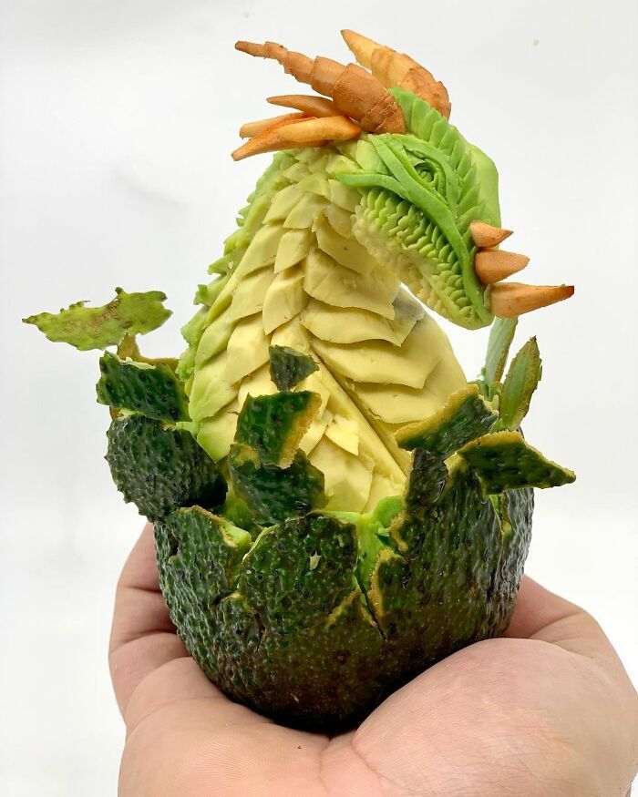
Avocado:
This color green’s association with politics and nature began in the 1970s with the inauguration of Earth Day and the establishment of green parties in France and Germany. Concern for the world environment translated into a palette of earthy colors; harvest gold, burnt orange and avocado.
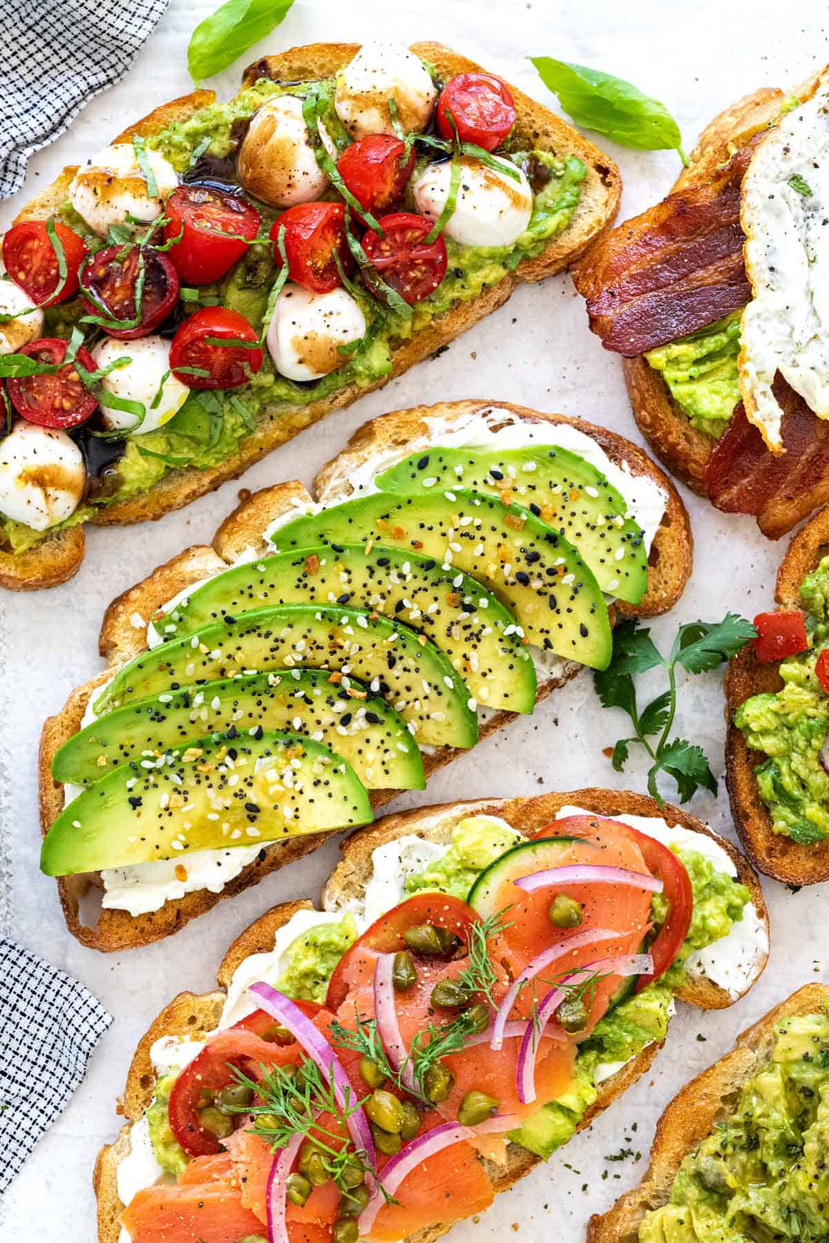
This shade, which appears so dated now, was ubiquitous in advertising, clothing, kitchen appliances, baths, furniture, and even cars. Avocado maintains its popularity as the poster child for a new luxury consumption due to its natural healthfulness. Lovingly slathered on pieces of toast everywhere from Southern California to New South Wales, it has become the centerpiece of the eat-clean aspirational lifestyle brand. Avocado imports have skyrocketed. In 2014, four billion avocados were consumed in America, about four times the number eaten a scant 15 years before.
| |
From toxic beginnings to modern, safe alternatives, green pigments enable artists to capture the essence of nature and express a wide range of emotions and ideas. Green symbolizes wealth, health, status, fear, lies, jealousy, new beginnings, growth, and environmental care. Green is the color of Mother Earth. It takes up more space in the spectrum visible to the human eye and is the dominant color in the natural world.
The color green strikes a balance between the head and the heart. Those who lead with their emotions are subtly reminded to think logically when they see green. On the other hand, unfeeling individuals may become more sentimental when they cross paths with this viridescent shade. The color green encourages us to have a healthy relationship with our feelings.
Please join me in celebrating the splendor of Spring, the magical cycles of nature and the beauty of this great green world. Let’s invite this vibrant green energy to circulate throughout our lives and artwork.
| |
Whether you’re an established artist seeking new horizons or a budding creative looking to elevate your work, I hope I have given you some inspiration on how the color green can inspire your art. When you paint your passion you ignite your flames and inspire others to do the same.
Perhaps I can invite you to join my artistic “family,” where I can support your creative development. Don't hesitate to contact me if you want my mentorship, guidance, and advice in exploring your artistic path. It makes me happy to share my insights and my knowledge with you.
| |
If someone shared this newsletter with you and you'd like to subscribe, please reach out to me below with your email address. I promise, no spam, no overloading your inbox, just the good stuff.
I welcome the opportunity for connection, conversation, cooperation, collaboration, and commissions.
With Light and Delight
| |
P.S. If you didn't get the chance to download your free gift from me: Here is my "Inner Artist Inspiration Package" - a series of illustrated quotes in watercolor based on flower photos taken by family and friends.
| | |
This Happened in February | | |
|
Gold Coast Watercolor Society
Demo Daze
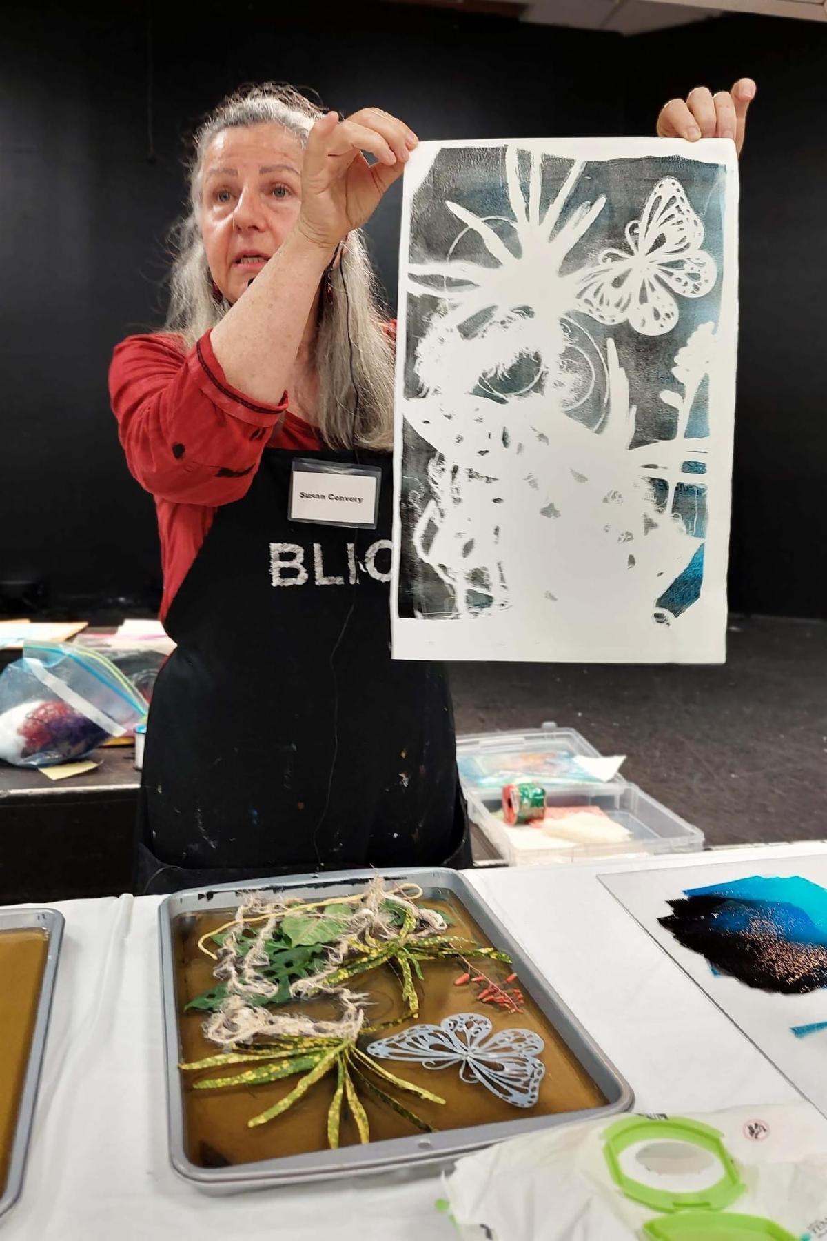
Gelatin Plate Printing
Tuesday, February 18, 2025
Helping our members grow, become better artists, and learn new ideas and techniques, all while introducing you to a wonderful supportive community!
I led a group in creating monoprints with homemade gelatin plates that inspired some beautiful artwork.
Gold Coast Watercolor Society Website
| | |
National League of American Pen Women - Fort Lauderdale Branch
ALL MEDIA & FINE ARTS JURIED EXHIBITION
February 3 to March 4, 2025
Herb Skolnick Community Center
800 SW 36 Ave.
Pompano Beach, FL 33069
Judge: Laura Atria
NLAPW-Fort Lauderdale
| |
|
This is Coming Up in March | | |
|
Gold Coast Watercolor Show
Wet Paint
Main Library
Gallery 6
100 S Andrews Ave.
Fort Lauderdale, FL
March 1 - March 29, 2025
Reception Saturday, March 8, 3-5 pm
| | | |
|
Weston Art Guild
Plunge into the Arts
Plunge Beach Resort
4660 El Mar Drive
Lauderdale-by-the-Sea, FL
March 1 - April 3, 025
.
Reception Friday, March 14, 2025 6 to 7:30 pm
Reception Tickets
| | | |
|
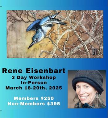
Rene Reisenbart Workshop
Gold Coast Watercolor Society
March 18 - 20, 2025
ArtServe Auditorium
1350 East Sunrise Blvd
Fort Lauderdale
Register Here
| | |
This is Coming Up in April | |
|
|
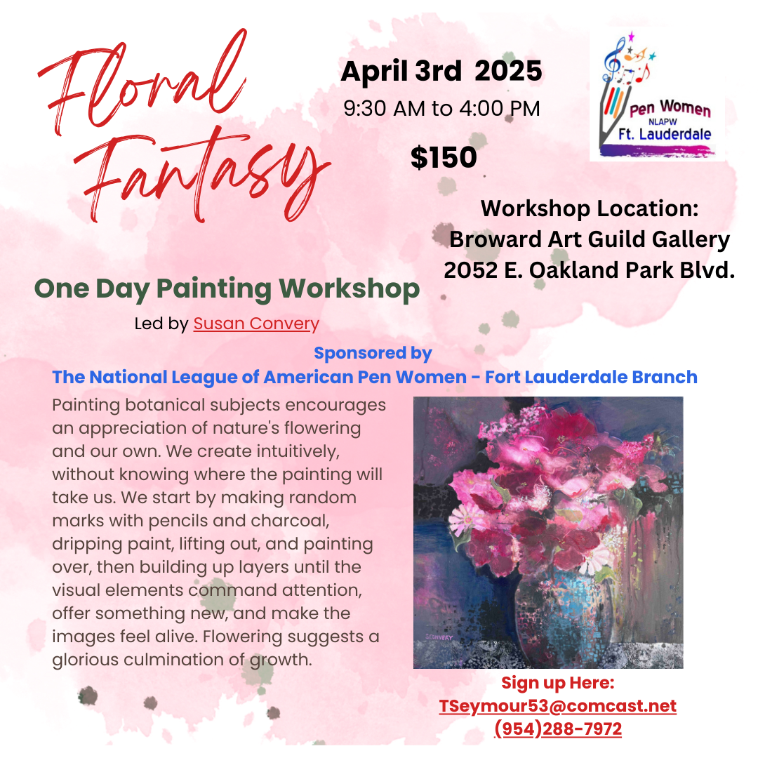
Floral Fantasy Workshop
sponsored by
National League of American Pen Women - Fort Lauderdale Branch
Join me to learn a fun new process for creating acrylic paintings of imaginary flowers. This workshop is limited to 12 participants and it will sell out, so grab your spot now.
Thursday, April 3, 2025
9:30 am to 4:00 pm
Broward Art Guild
2052 Oakland Park Blvd
Fort Lauderdale, FL
Sign Up Here
| | | |
Private Art Retreats
A personalized experience, full of art and discovery, for those who….
- are traveling alone, or with a couple of friends
- would like a much more flexible, and free experience, and lots of fun, too, tailored exactly to your needs, interests, and experience level
- may want to combine painting with organized discovery trips and tours and really get to know the ‘real’ South Florida
- would like to book in for a shorter or longer time than most workshops
- don’t want to have to bring a mountain of supplies in their luggage
| |
Painting Joy
Created especially for artistic women in the third stage of life who are dissatisfied with their artwork and want to have more fun connecting with themselves and others. In this three-day watercolor workshop, we experiment with visual cues that inspire joy, discover personal symbols that resonate, and provide ways to bring more effervescence into our lives and art.
Please recommend any venues you know that might be interested in hosting this workshop in 2025.
I am also happy to teach this as a private retreat or for a small group in my studio.
I would very much appreciate your help in getting the next booking.
| | | |
Private Lessons and Events | | |
|
Master Classes for High School Students |
Private, highly personalized classes in mastery for artistically-minded US & international students virtually on Zoom or in person at my home.
If you have a student who is a visual thinker, willing to push the boundaries of their own work, and serious about improving their options for college, I want to hear from you! Schedule a time to discuss how I can collaborate with you to build a portfolio that will give your student the greatest chance for success.
| | |
|
Art Workshops, Critiques & Presentations |
Invite me to present or lead a workshop for your school, club, or guild.
I can customize a program for your event or present my skills programs on composition, color theory, drawing faces, coordinating light/shadow or understanding the cues for depth. I am available for judging, confidence-building critiques and recorded tutorials.
| | |
|
Improve Your Artist Statement | |
If you would like to delve more deeply into your own inner questions and clarify your thoughts as you create an artist statement for your website, a gallery show, a sponsor, or another project, please reach out, and let’s talk. I have helped many students write compelling statements for AP Art, college applications, and competitions.
Find out More:
| |
|
Sketchbook Prompt:
Create a drawing or painting that is more than 75% green.
| |
Please contact me if you are interested in adding any of the paintings below to your collection.
I will deliver if you live within a 2-hour drive and if you live further away, I will give you a reasonable price for shipping.
Venmo, CashApp, PayPal and Zelle are welcomed.
| |
|
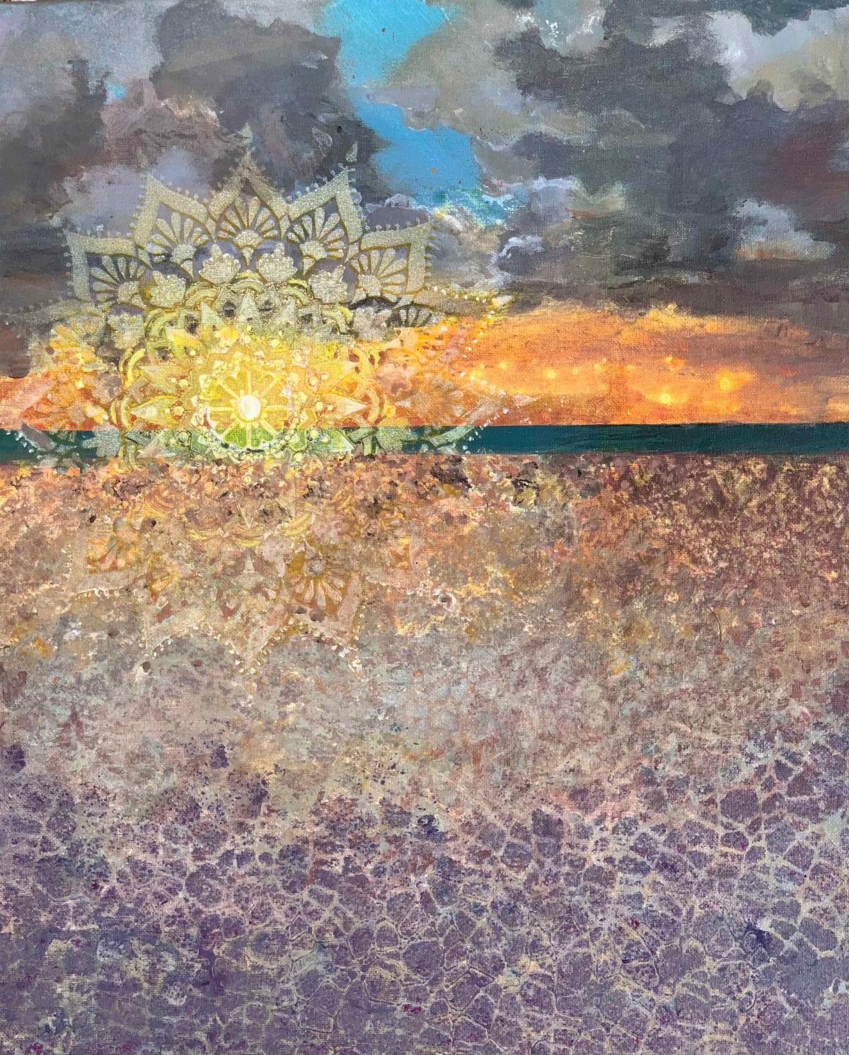
Title: A New Dawn, A New Day
Media: Acrylic
Size: 16" x 20"
Price: $444
Frame: Float Frame
| |
|
|
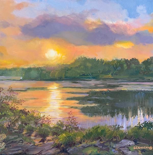
Title: SunGlow
Media: Oil on Canvas
Size: 20"x 20"
Frame: Gallery Wrap
Price:$666
.
| |
|
|
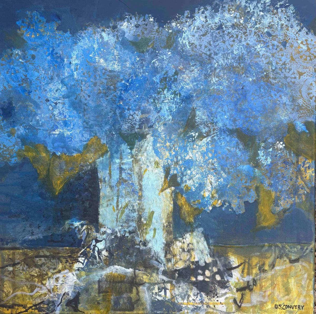
Title: Hydrangea Haze
Media: Acrylic Mixed Media
Size: 20" x 20"
Price: $555
Frame: Wood Float Frame
| |
|
|
Title: From My Heart To Yours
Media: Acrylic Mixed Media
Size: 20" x 20"
Price: $555
Frame: Wood Float Frame
| |
|
|
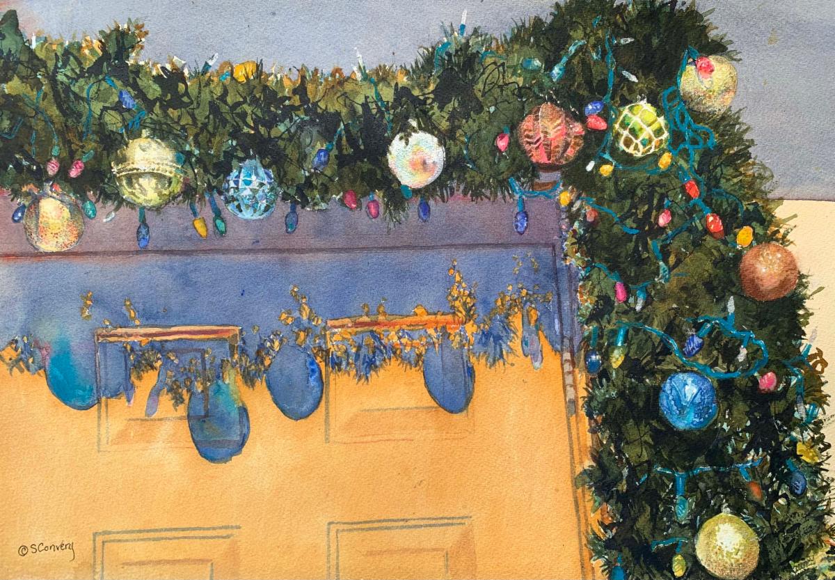
Title: Florida Christmas
Media: Watercolor and ink
Size: 28" x 22 framed
Price: $1111
Frame: White
| |
|
|
Title: Something to Crow About
Media: Mixed Media on Arches
Size: 15" x 22" framed 22" x 28"
Price: $555
Frame: Gold
Watercolor, ink, gouache, stencils, so many marks and so much fun! A celebration of the Chinese year of the Rooster.
| |
Want to see past issues of my newsletters? Visit this link on my website. | |
Subscription Information: You are receiving this email because you subscribed to my mailing list, downloaded a resource, purchased one of my products/programs, or opt-ed in some other way.
Thank you for being part of the Cr8V Soul Arts Tribe!
NOTE: Unsubscribing means you won't receive any more emails from me including information about your paid products and programs.
| | | | |