25 Years and Still Standing

As we enter our 25th year, we want to celebrate the exciting collaborations we've had
with amazing artists of the image, word and artisan bindings.

Colour

Photographer - Robert Farber
Text - Johann Wolfgang von Goethe
Binding - Erin Fletcher


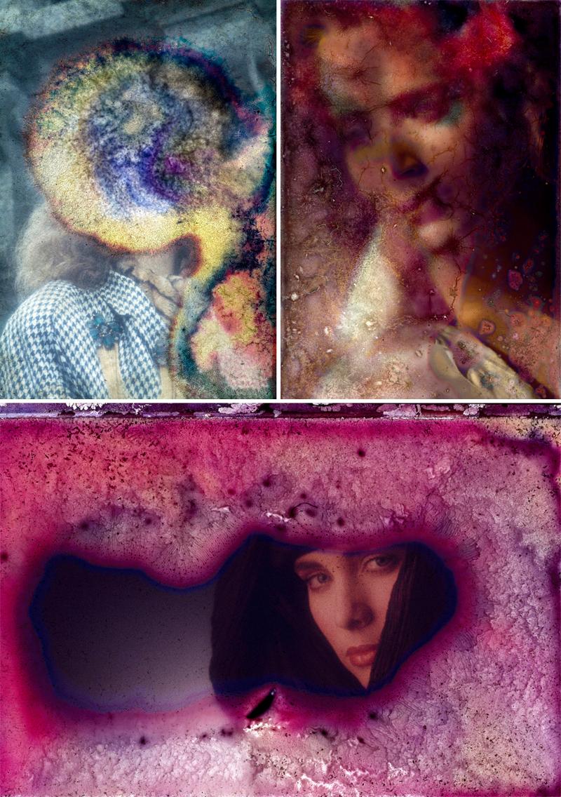
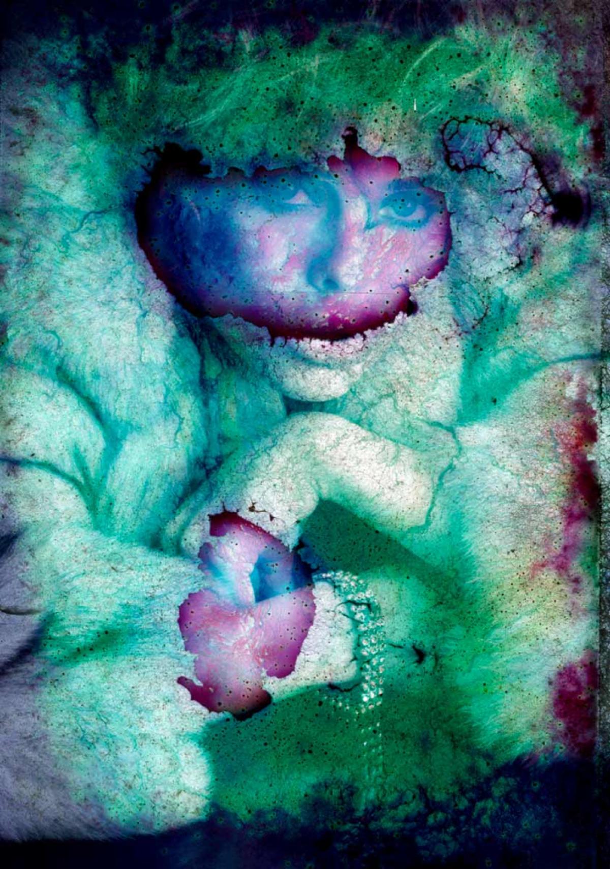
When exploring my archive of images that go back to 1969, I not only rediscovered images that would now be considered classic or vintage, but also a new life in the works themselves, created only by my collaboration with time. The deterioration of the transparencies is the result of the film's chemical reaction from decades of sitting in non-archival plastic sleeves. Other than the natural process of deterioration, no retouching or manipulation was done to the images. - Robert Farber
We put as much attention into the production of our books as we do with the editing of the imagery and the choice of the text. The presentation is a journey from cover to cover and is a culmination of the smallest details being influenced by the contents. We work very closely with the binders to assure that the end result is a reflection of our collective vision. Here are some notes from Erin Fletcher on our collaboration.
When I first gazed upon the photographs that would be included in 'Colour', I was instantly captivated. As I moved closer to the image, subtle blemishes as a result of the degradation began to emerge. At that point, my focus was on these web-like structures, these networks of blips and blobs. Through the design on my binding, I wanted to capture my initial reaction and draw people in to take a closer look. But I also felt that it was important to represent the words of Goethe as well. So how could I marry the work of Robert Farber with 'Goethe’s Theory of Colours'?
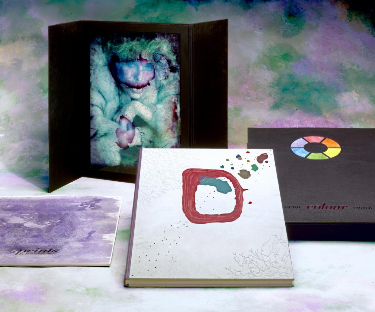
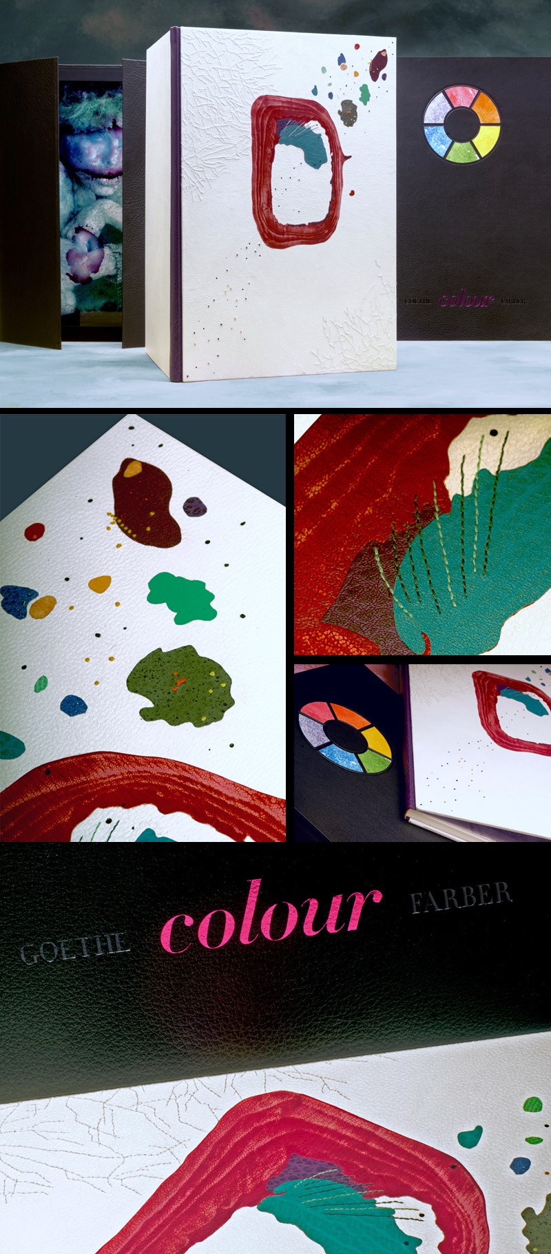
Initially you are presented with a basic color wheel against a black buffalo skin. This symbol provides an instant connection to color theory and the relationship of one color to another. Opening the box you are encountered with a stark white goatskin, which was used to cover the boards of the binding. Creating this high contrast between the box and the binding was no coincidence. It was important for me to remind the viewer of how objects, colors and people relate to one another. Black and white also create a neutral backdrop that does not distract from the design. Harkening back to the color wheel, I chose to represent all six colors and their complimentary companions. This was done at the spine of the binding and by small details, such as the endbands and embroidery floss. For example, on the binding with a red spine, the endbands and floss were green.

The decoration on the binding is largely inspired by elements from the photographs. Particularly the web-like embroidery. I choose to do white embroidery on the white leather to play with the eye and draw the viewer in further. This particular leather was chosen because the embroidery is camouflaged by the grain. Further textures are added through manipulations on the leather onlays. Pieces were painted, sanded and sprinkled.

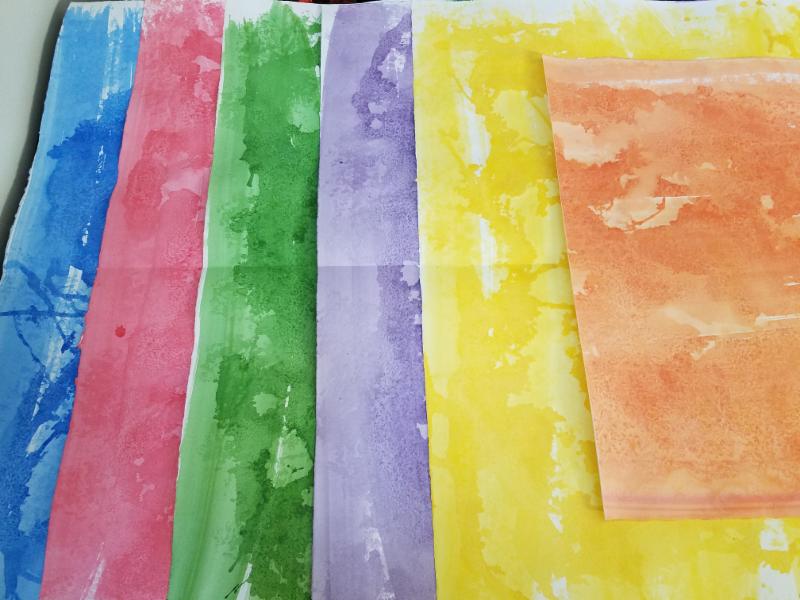
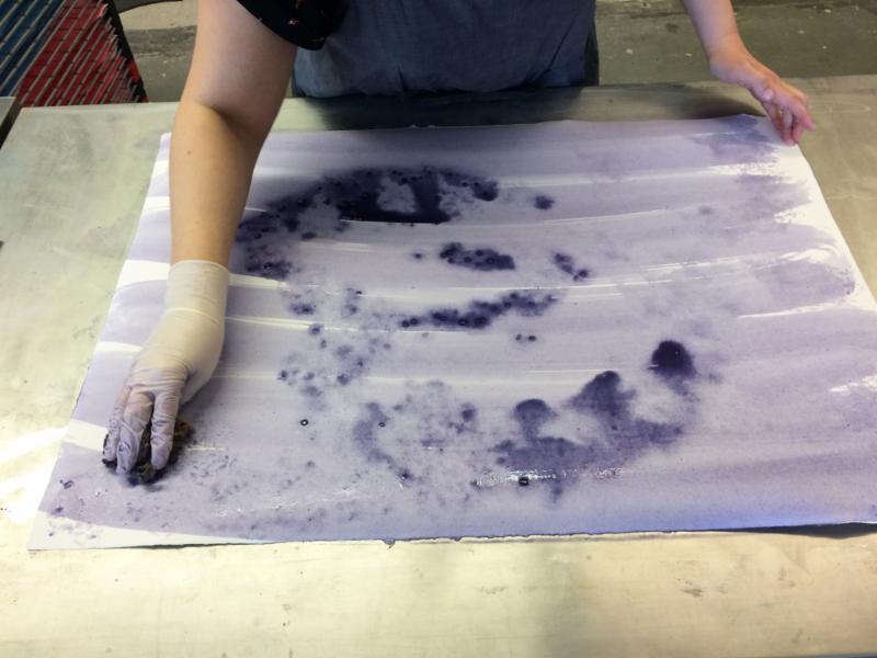
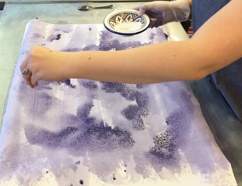
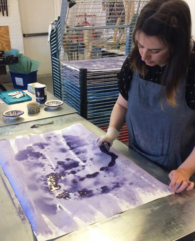
When you open the book, you are faced with a shock of color on the handmade endpapers. Each paper is unique in its appearance, but overall the design reflects the blemishes and irregularity of the photographs. The endpapers are covered in a single color matching the leather spine and manipulated through brushing and sponging the pigment onto the paper. Additionally, the papers were rotated and sprinkled with salt to create a more dynamic decoration.
Overall, I wanted a design that would capture the spirit of the photographs and how they’ve changed over time. Photography is meant to capture a moment in time and can sometimes feel stagnant, but age as given new life to these photographs. The way the film as broken down now become the focal point, but through color theory, the viewer can delve deeper into the photograph and appreciate it on a more profound level.

Special Institutional Pricing Available

For more information please call Pam or Steve at 508-398-3000
VISIT US ON