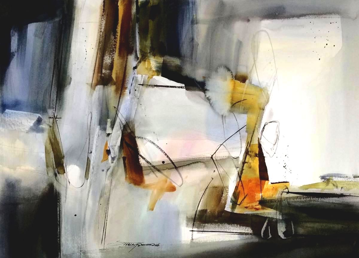
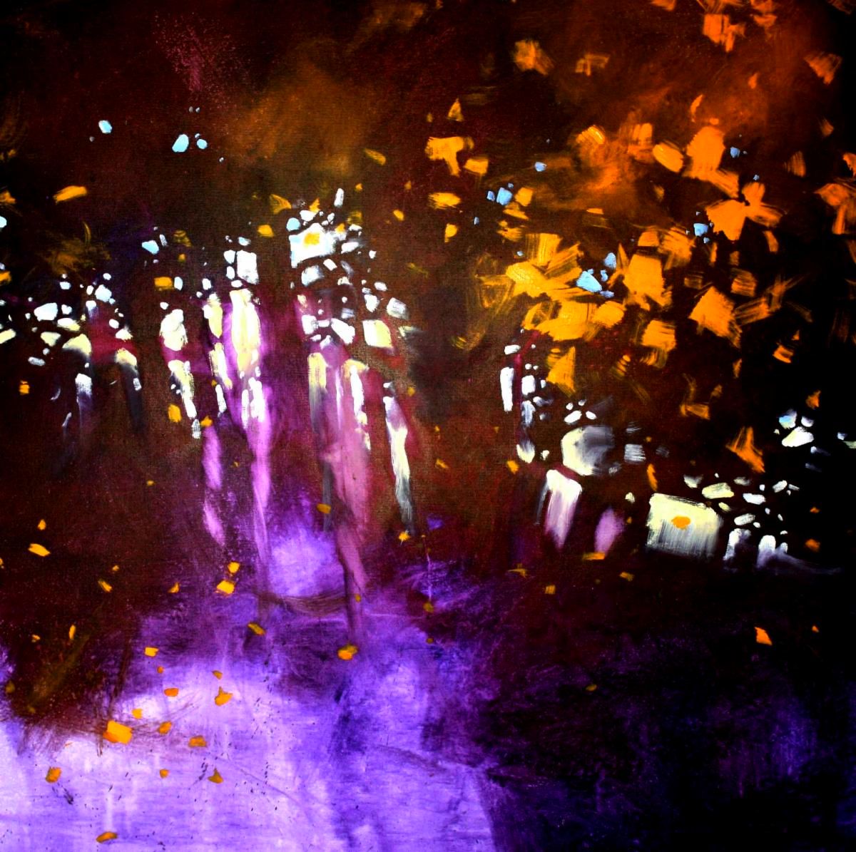
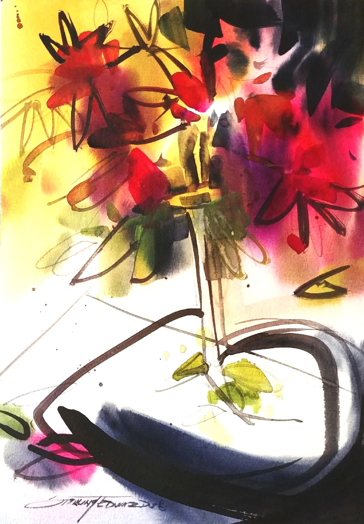
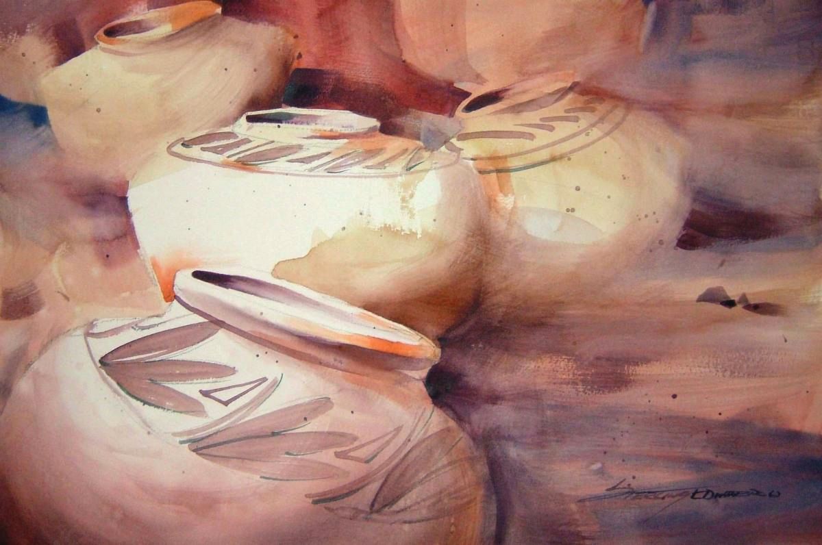
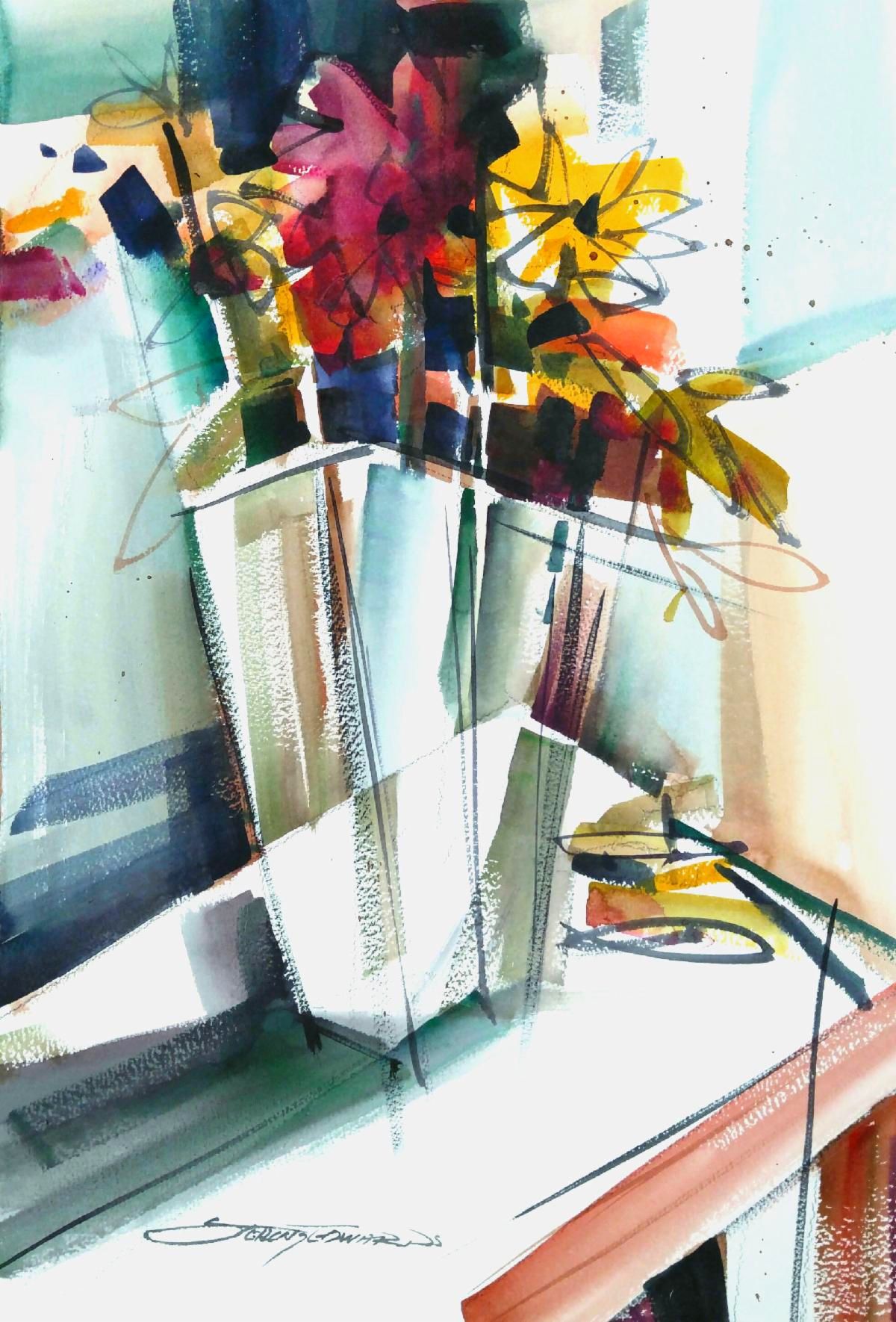
"Obscure", 22" x 30" watercolor
The grays have it
In the Abstract Expressionist watercolor painting above, I intentionally set the stage around a body of colors that were predominantly gray. But rather than just mixing a black and white (using the white of the paper) to come up with my gray tones, I also introduced other colors that that made some of my gray tones a little warmer while others were a little cooler. Some of the grays have a little blue, some a little violet, and some a little ocher color. There is even a slight hint of rose color in a spot or two. Never-the-less, it is still has a basic foundation of gray. The variances in the temperature of the grays, however; make the painting look a little more lively and inviting. But it is still predominantly gray and is neutral enough that it would not clash with the wall colors or furniture in most rooms. This is an important consideration, especially if you sell your work. I know from having owned two art galleries that potential customers are often looking for art that will complement the colors of their rooms and furnishings. I would frequently hear someone say "I love this painting but it doesn't match the colors of our room". Most of the time this meant that I had just lost a sale. I could have done what a lot of artists do and introduced the current trendy colors at the time into my paintings. In fact, I did that years ago and it came back to bite me.
If you recall, it wasn't that many years ago when mauve was the current trendy color. You know, that pinkish-grayish color that totally inundated everything that we wore, or put in our homes and offices. Like most artists at the time, I jumped headfirst on to the bandwagon and followed suit. Life was good; too good. Everything that I painted sold because I always found a creative way to make mauve my main color in the paintings. If I painted a landscape it had mauve in the sunset. If I painted a floral it was mauve colored flowers. I even found a way to put mauve in the shadows on my snow scenes. Then one day I woke up and discovered that mauve was no longer in style. In fact, if you had mauve in your home or on your clothes, or your dog, or your whatever, you were no longer part of the in crowd and were looked upon as out of fashion. What a kick in the you know what. I had this huge body of paintings and lithographs that all had a dominance of mauve. Nobody wanted to buy them. I couldn't even give them away. I truly think that Typhoid Mary would have been more welcome in someone's home than my mauve paintings. Even today I tell my students not to fall into the trendy color trap. It usually ends up being a short lived success story that will come crashing down sooner rather than later.
Skipping ahead a two or three decades I learned that as an artist, I can use what ever colors I want in my paintings because they are exactly that, "my paintings". As a studio painter I usually work from photographs or memory. This allows me the option of making choices. Does it matter if I use the exact color of green that I see in the photograph? Is it going to kill my career if perhaps I use a different green? Absolutely NOT. In fact, I can paint that tree hot pink if I choose because I'm an artist. It wasn't really until I began painting abstract expressionist watercolors, like the painting above, that I began learning how to use gray in my paintings.
Gray is a neutral and gives the viewer what some refer to as a resting place for their eyes. But even better, it makes the colored areas of the painting more vibrant, the dark values look darker, and the areas of white or lighter values glow. I learned this from reading a lot of books by the early abstract expressionist painters and going to art galleries and museums. I don't limit my use of gray to just my abstract paintings however. I frequently use complementary grays in many of my floral and landscape paintings as well. If you take a red and mix and equal amount of green you will create a complementary neutral, or what is commonly referred to as a gray. You can vary the temperature of the gray by merely adding a little more red than green to create a warm gray or do the opposite and add a little more of the green to produce a cooler gray. That's just one example of the many complementary grays that we, as artists, can use to give our paintings a richer and cleaner presentation.
I recently sold an expensive abstract painting at a major art show where I had quite a few pieces for sale. The first piece that sold was a framed watercolor abstract expressionist painting. Guess what; it was predominantly gray. In fact, after the painting sold, and before I could even put a red sticker on the piece, I had another couple ask if they could purchase the piece. They were disappointed when I told them that it had just sold a few minutes earlier. Fortunately, they purchased a different painting that was also one of my abstract expressionist paintings. Yep, you guessed it; it was predominately gray much like the painting above.
Note:
For at least the next few newsletter editorials I have decided to feature a painting in my top center space that I can write about as an example of a specific style or thought process.
We now have a NEW Companion Website:
For several years we have received numerous requests that we offer prints of some of my paintings. To accommodate these requests we have designed a new website that is a companion to our current site.
This new site allows us to offer a large selection of prints of my paintings and even some prints of my photography. Yes, unknown to most, I'm also a photographer. There are also two galleries that feature original watercolors and original acrylic abstracts on paper that are available.
Another great feature of this new site is that you can choose from a variety of sizes and surfaces that you would like for your prints. We hope that you will check it out and be as excited about it as we are.
Of Special Interest
There is a Facebook Group called "Fluid Watercolors" that was started by one of my students in California named Parisa Diba. Parisa is an excellent watercolorist and has developed a beautiful and captivating style of watercolor painting primarily using large brushes. Her paintings have an ethereal and somewhat minimalist presentation which I find super attractive. I have also been told that she is currently working on a book. I will keep you posted when I hear more about that.
Watercolor artists can post on her group site provided they are approved and meet the group criteria. It's a great site that is worthy of checking out.
Gift Certificates
We have received several request for Gift Certificates recently so Diane and I have decided to offer Gift Certificates for $75.00 or $100.00 that can be redeemed for Videos, Live Classes, Art Supplies, and Paintings. The Gift Certificates can be purchased on our website; www.sterlingedwards.com under Art Supplies.
(Not redeemable for live, on location workshops)